
About
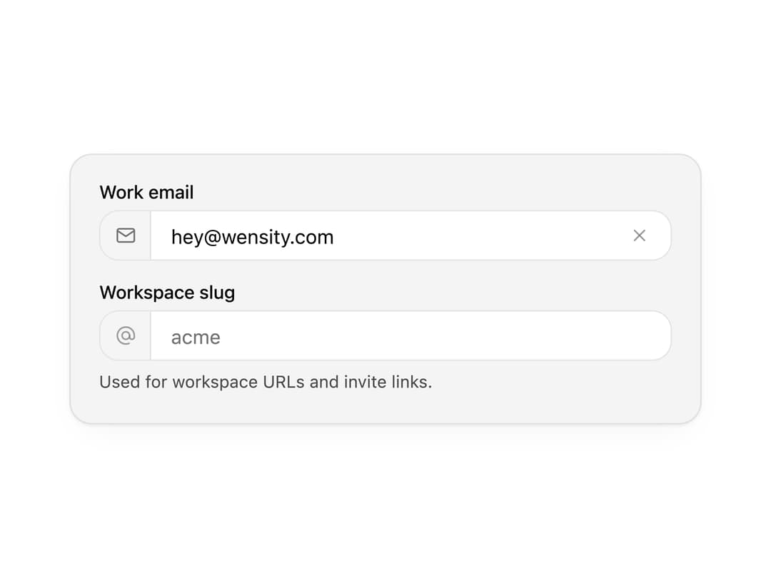
A polished text input with leading and trailing icons, a clear button, sizes and error states. Covers search bars, login forms and settings fields.
Built with React and Tailwind. Copy the prompt and paste it into Claude Code, Cursor or Lovable: your agent adds Input to your project and fits it to your theme.
Code
How Input is used: the demo's code. The component's own source comes with a free account.
Usage.tsx
"use client";

import * as React from "react";
import { IconAt, IconMail } from "@tabler/icons-react";
import { Input } from "@/components/ui/input";

import { clsx, type ClassValue } from "clsx";
import { twMerge } from "tailwind-merge";

function cn(...inputs: ClassValue[]) {
  return twMerge(clsx(inputs));
}

const primitivePreviewCardSurfaceFrameClass = cn(
  "relative isolate overflow-hidden rounded-2xl",
  "border",
);

const primitivePreviewCardSurfaceLightClass = cn(
  "border-black/[0.08] bg-[#f4f4f5]",
  "[box-shadow:0_1px_2px_rgba(0,0,0,.06),0_8px_24px_-12px_rgba(0,0,0,.08)]",
);

const primitivePreviewCardSurfaceClass = cn(
  primitivePreviewCardSurfaceFrameClass,
  primitivePreviewCardSurfaceLightClass,
  // Full static `dark:bg-[#0a0a0b]` kept for Tailwind content scan - same as
  // PRIMITIVE_PREVIEW_CANVAS_DARK_BG / PRIMITIVE_PREVIEW_CANVAS_DARK.
  "dark:border-white/[0.06] dark:bg-[#0a0a0b] dark:[box-shadow:0_1px_2px_rgba(0,0,0,.4),0_8px_24px_-12px_rgba(0,0,0,.6)]",
);

const wensityCardSurfaceClass = primitivePreviewCardSurfaceClass;

function PreviewPanel({
  children,
  className,
}: {
  children: React.ReactNode;
  className?: string;
}) {
  return (
    <div
      className={cn(
        wensityCardSurfaceClass,
        "w-full max-w-md p-5",
        className,
      )}
    >
      {children}
    </div>
  );
}

export function InputPreview() {
  return (
    <PreviewPanel>
      <Input
        label="Work email"
        type="email"
        autoComplete="email"
        placeholder="you@company.com"
        defaultValue="hey@wensity.com"
        leftIcon={<IconMail stroke={1.75} />}
        clearable
      />
      <div className="mt-4">
        <Input
          label="Workspace slug"
          placeholder="acme"
          hint="Used for workspace URLs and invite links."
          leftIcon={<IconAt stroke={1.75} />}
        />
      </div>
    </PreviewPanel>
  );
}

export default function Demo() {
  return <InputPreview />;
}
Dependencies
More by Wensity Labs
View all

Sidebar
363
Calendar
259
Button
116
Color Picker
92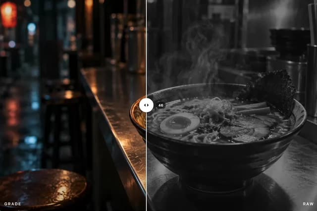
Image Comparison Slider
79
AI Prompt Input
74
Text Morphing
54
Carousel
50
More in Forms
View all

Premium Auth
555

Form
17

Contact Card
1.1K
Authentication Card
51

Book A Demo 1
87

Login 1
61
SignInPage
736

Login Card
33

