
About
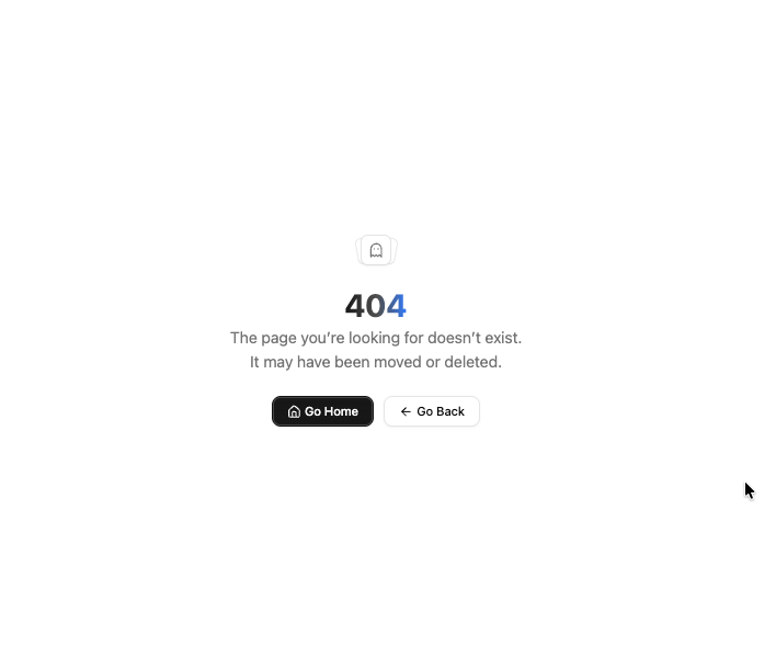
An empty state component that displays messages when no content is available.
Built with React and Tailwind. Copy the prompt and paste it into Claude Code, Cursor or Lovable: your agent adds Empty to your project and fits it to your theme.
Code
How Empty is used: the demo's code. The component's own source comes with a free account.
Usage.tsx
"use client";

import { ArrowLeft, Home, Ghost } from "lucide-react";
import { cn } from "@/lib/utils";
import { Button } from "../components/ui/button";
import {
  Empty,
  EmptyContent,
  EmptyDescription,
  EmptyHeader,
  EmptyMedia,
  EmptyTitle,
} from "../components/ui/empty";

interface NotFound404Props {
  title?: string;
  description?: string;
  className?: string;
}

export default function NotFound404({
  title = "Page Not Found",
  description = "The page you’re looking for doesn’t exist. It may have been moved or deleted.",
  className,
}: NotFound404Props) {
  const handleHomeClick = () => {
    window.location.href = "/";
  };

  const handleBackClick = () => {
    window.history.back();
  };

  return (
    <div
      className={cn(
        "relative min-h-screen w-full overflow-hidden bg-background flex items-center justify-center px-6",
        className
      )}
    >
      <Empty>
        <EmptyHeader>
          <EmptyMedia variant="icon">
            <Ghost className="h-16 w-16 text-muted-foreground" />
          </EmptyMedia>
          <EmptyTitle className="text-4xl font-bold bg-gradient-to-r from-primary via-primary/80 to-blue-500 bg-clip-text text-transparent">
            404
          </EmptyTitle>
          <EmptyDescription className="text-lg">{description}</EmptyDescription>
        </EmptyHeader>
        <EmptyContent>
          <div className="flex flex-col items-center justify-center gap-3 sm:flex-row">
            <Button onClick={handleHomeClick} className="btn-default group">
              <Home className="h-4 w-4 mr-1 transition-transform group-hover:scale-110" />
              Go Home
            </Button>

            <Button onClick={handleBackClick} variant="outline" className="group">
              <ArrowLeft className="h-4 w-4 mr-1 transition-transform group-hover:-translate-x-1" />
              Go Back
            </Button>
          </div>
        </EmptyContent>
      </Empty>
    </div>
  );
}
Dependencies
More by Jesus Lopez
View all
welcome
164
More in Buttons
View all
Button
74

Button
1
Button
7
Native Button
27
Texture Button
101

Button
66

HeroUI Button Group
1
Base Button
1


