
About
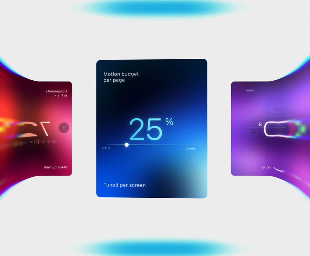
A ring of glowing stat cards that turns in 3D, its side cards flaring through a wide lens with cyan rims, mirrored backs and colour-matched glows. Drag, click or use the arrow keys. More like this, plus a designer your coding agent can use, at studios.lou15.com/?ref=21st
Built with React and Tailwind. Copy the prompt and paste it into Claude Code, Cursor or Lovable: your agent adds Warp Carousel to your project and fits it to your theme.
Code
How Warp Carousel is used: the demo's code. The component's own source comes with a free account.
Usage.tsx
"use client";

import * as React from "react";
import { WarpCarousel } from "@/components/ui/warp-carousel";

/** Warp Carousel filling the preview. */
export default function WarpCarouselDemo() {
  return (
    <main className="relative h-screen min-h-[340px] w-full overflow-hidden" style={{ backgroundColor: "#efefef" }}>
      <WarpCarousel style={{ width: "100%", height: "100%" }} />
    </main>
  );
}
More by Louis Studios
View all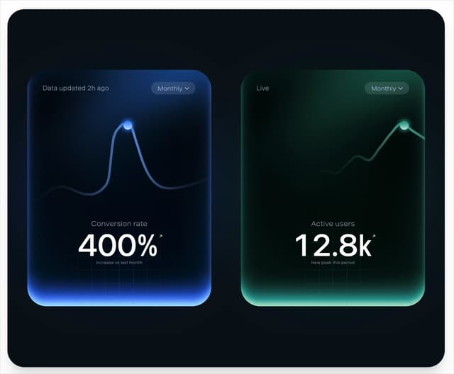

Peak Chart
180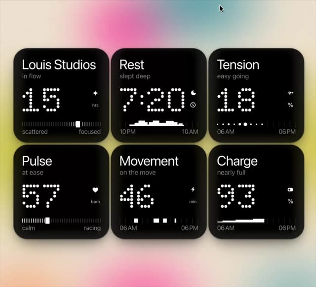
Dot Tiles
136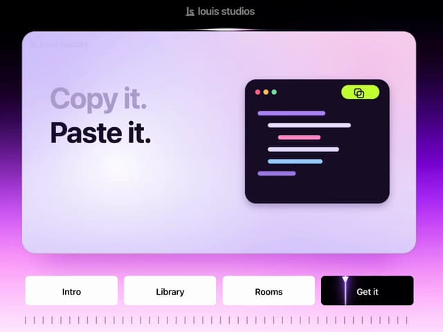
Chapter Player
91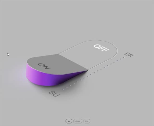
Glow Rocker
75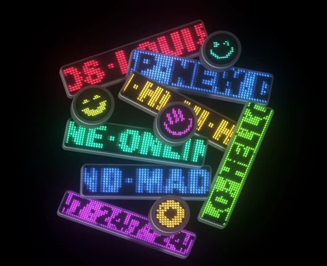
LED Badges
68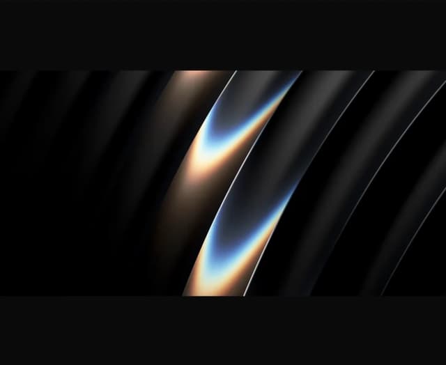
Chrome Arcs
57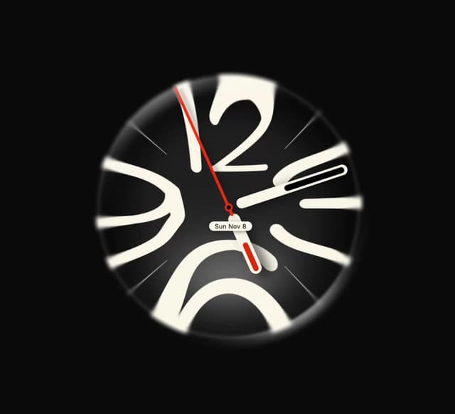
Lens Clock
51
Assistant Wall
50
More in Shaders
View all
Glass Fold
437

Shader Animation
3.8K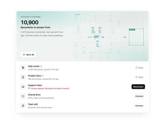

Illos Knowledge Sources
43
Wave
715

Phosphor 30
308
Black Hole
41

Paper design shader Background
696

Line Shader Homlu UI
52
