
About
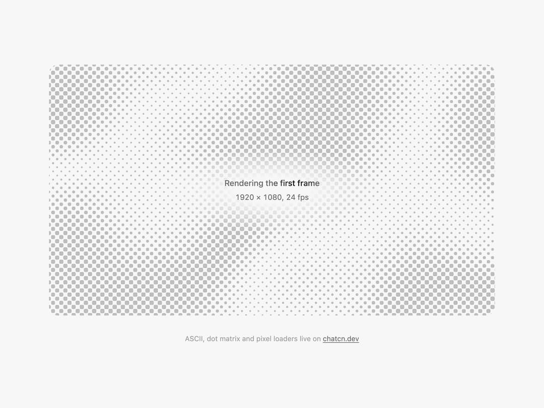
An empty media panel while something renders: halftone dots ride a slow diagonal swell behind the label. For video, image and canvas placeholders.
Built with React and Tailwind. Copy the prompt and paste it into Claude Code, Cursor or Lovable: your agent adds Halftone Loader to your project and fits it to your theme.
Code
How Halftone Loader is used: the demo's code. The component's own source comes with a free account.
Usage.tsx
"use client"

import * as React from "react"
import { HalftoneLoader } from "@/components/ui/halftone-loader"

const FIT_CSS = "html,body{overflow:hidden}[data-fit-small] [data-fit-hide]{display:none!important}"

/**
 * 21st shows a demo in a small frame: about 674 by 421 on a component page, 358 by 224 on a
 * phone and 245 by 139 on a profile card. A demo taller than its frame gets scrollbars, which
 * render white on dark pages. FitFrame fills the frame exactly instead.
 *
 * - "scale": the content shrinks until it fits, centered. For visuals such as orbs.
 * - "crop": the content stays at full size from the top and fades out at the bottom. For text
 *   that streams in, where a changing scale would make the page breathe.
 *
 * Anything marked `data-fit-hide` (state buttons, the chatcn.dev line) drops out in frames
 * shorter than `hideBelow`, so a profile card shows the visual alone.
 */
function FitFrame({
  children,
  mode = "scale",
  hideBelow = 360,
}: {
  children: React.ReactNode
  mode?: "scale" | "crop"
  hideBelow?: number
}) {
  const content = React.useRef<HTMLDivElement>(null)
  const [cropped, setCropped] = React.useState(false)

  React.useLayoutEffect(() => {
    const el = content.current
    if (!el) return
    const measure = () => {
      const vw = window.innerWidth
      const vh = window.innerHeight
      el.toggleAttribute("data-fit-small", vh < hideBelow)
      // Layout sizes ignore the transform, so measuring never feeds back.
      const w = Math.max(el.offsetWidth, el.scrollWidth)
      const h = Math.max(el.offsetHeight, el.scrollHeight)
      const scale = mode === "scale" ? Math.min(1, vw / w, vh / h) : 1
      el.style.transform = scale < 1 ? `scale(${scale})` : ""
      setCropped(mode === "crop" && h > vh + 1)
    }
    measure()
    const observer = new ResizeObserver(measure)
    observer.observe(el)
    window.addEventListener("resize", measure)
    return () => {
      observer.disconnect()
      window.removeEventListener("resize", measure)
    }
  }, [mode, hideBelow])

  const fade = "linear-gradient(to bottom, #000 calc(100% - 40px), transparent)"
  return (
    <div
      className="flex w-full justify-center overflow-hidden"
      style={{
        height: "100dvh",
        alignItems: mode === "crop" ? "flex-start" : "center",
        maskImage: cropped ? fade : undefined,
        WebkitMaskImage: cropped ? fade : undefined,
      }}
    >
      <style>{FIT_CSS}</style>
      <div
        ref={content}
        className="w-full shrink-0"
        style={{ transformOrigin: mode === "crop" ? "top center" : "center" }}
      >
        {children}
      </div>
    </div>
  )
}

/** An empty canvas panel while the first frame of a video renders. */
function HalftoneLoaderDemo() {
  return (
    <div className="bg-(color:--chatcn-inset) rounded-(--chatcn-radius-xl) w-full max-w-3xl overflow-hidden">
      <HalftoneLoader label="Rendering the first frame" className="aspect-video">
        <span className="text-[0.8125rem]/[1.25rem] text-(color:--chatcn-fg-subtle) tabular-nums">
          1920 × 1080, 24 fps
        </span>
      </HalftoneLoader>
    </div>
  )
}

/** The line under each 21st demo that points back to the kit. */
function MoreOn({ slug, children }: { slug: string; children: React.ReactNode }) {
  return (
    <p data-fit-hide className="text-[0.75rem]/[1rem] text-(color:--chatcn-fg-faint) text-center text-balance">
      {children}{" "}
      <a
        href={`https://chatcn.dev/docs/components/${slug}`}
        target="_blank"
        rel="noopener"
        className="text-(color:--chatcn-fg-subtle) hover:text-(color:--chatcn-fg) underline underline-offset-2"
      >
        chatcn.dev
      </a>
    </p>
  )
}

/** An empty canvas panel while the first frame of a video renders. */
export default function HalftoneLoaderPreview() {
  return (
    <FitFrame>
      <div className="flex w-full flex-col items-center justify-center gap-8 p-6">
        <HalftoneLoaderDemo />
        <MoreOn slug="halftone-loader">ASCII, dot matrix and pixel loaders live on</MoreOn>
      </div>
    </FitFrame>
  )
}
Dependencies
More by Aaditya
View all
Dither Orb
6
Voice Orb
2
Particle Text
1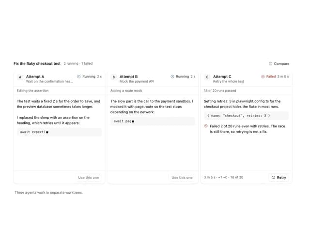
Agent Lanes
1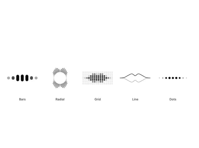
Audio Visualizer
1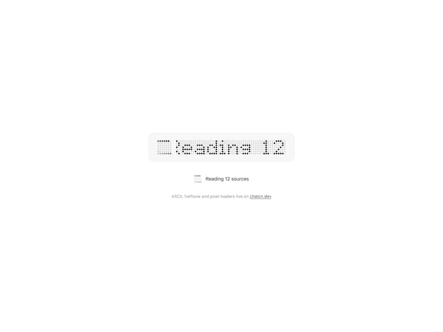
Dot Matrix Loader
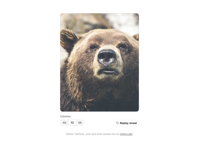
ASCII Reveal
Halftone Reveal