
About
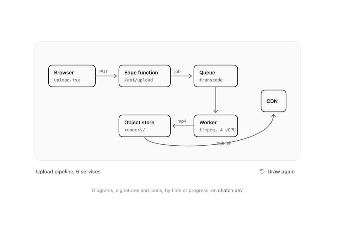
Draws any SVG as if by pen: diagrams as an agent lays them out, signatures, icons. Driven by time or by real progress, with fills and text fading in after their strokes.
Built with React and Tailwind. Copy the prompt and paste it into Claude Code, Cursor or Lovable: your agent adds Line Draw Reveal to your project and fits it to your theme.
Code
How Line Draw Reveal is used: the demo's code. The component's own source comes with a free account.
Usage.tsx
"use client"

import * as React from "react"
import { forwardRef, createElement, type SVGAttributes, type ForwardRefExoticComponent, type RefAttributes } from "react"
import { cn } from "@/lib/utils"
import { LineDrawReveal } from "@/components/ui/line-draw-reveal"

const reducedMotion = () =>
  typeof window !== "undefined" && window.matchMedia("(prefers-reduced-motion: reduce)").matches

/** Calls `callback` every `ms`, for demos that replay on their own. Reduced motion never does. */
function useEvery(callback: () => void, ms: number) {
  const latest = React.useRef(callback)
  React.useEffect(() => {
    latest.current = callback
  })
  React.useEffect(() => {
    if (reducedMotion()) return
    const id = window.setInterval(() => latest.current(), ms)
    return () => window.clearInterval(id)
  }, [ms])
}

/** Progress events as an agent lays out a diagram: uneven steps, the way real work arrives. */
const EVENTS: [number, number][] = [
  [350, 0.08],
  [650, 0.19],
  [500, 0.31],
  [900, 0.46],
  [420, 0.58],
  [760, 0.71],
  [380, 0.83],
  [640, 1],
]

const FIT_CSS = "html,body{overflow:hidden}[data-fit-small] [data-fit-hide]{display:none!important}"

/**
 * 21st shows a demo in a small frame: about 674 by 421 on a component page, 358 by 224 on a
 * phone and 245 by 139 on a profile card. A demo taller than its frame gets scrollbars, which
 * render white on dark pages. FitFrame fills the frame exactly instead.
 *
 * - "scale": the content shrinks until it fits, centered. For visuals such as orbs.
 * - "crop": the content stays at full size from the top and fades out at the bottom. For text
 *   that streams in, where a changing scale would make the page breathe.
 *
 * `minWidth` lays out a wide demo (a table, a two column panel) at that width and scales it down
 * to the frame, instead of letting it collapse to a narrow layout. The frame centers it, so it
 * shrinks evenly on both sides.
 *
 * Anything marked `data-fit-hide` (state buttons, the chatcn.dev line) drops out in frames
 * shorter than `hideBelow`, so a profile card shows the visual alone.
 */
function FitFrame({
  children,
  mode = "scale",
  hideBelow = 360,
  minWidth,
}: {
  children: React.ReactNode
  mode?: "scale" | "crop"
  hideBelow?: number
  minWidth?: string
}) {
  const content = React.useRef<HTMLDivElement>(null)
  const [cropped, setCropped] = React.useState(false)

  React.useLayoutEffect(() => {
    const el = content.current
    if (!el) return
    const measure = () => {
      const vw = window.innerWidth
      const vh = window.innerHeight
      el.toggleAttribute("data-fit-small", vh < hideBelow)
      // Layout sizes ignore the transform, so measuring never feeds back.
      const w = Math.max(el.offsetWidth, el.scrollWidth)
      const h = Math.max(el.offsetHeight, el.scrollHeight)
      const scale = mode === "scale" ? Math.min(1, vw / w, vh / h) : 1
      el.style.transform = scale < 1 ? `scale(${scale})` : ""
      setCropped(mode === "crop" && h > vh + 1)
    }
    measure()
    const observer = new ResizeObserver(measure)
    observer.observe(el)
    window.addEventListener("resize", measure)
    return () => {
      observer.disconnect()
      window.removeEventListener("resize", measure)
    }
  }, [mode, hideBelow])

  const fade = "linear-gradient(to bottom, #000 calc(100% - 40px), transparent)"
  return (
    <div
      className="flex w-full justify-center overflow-hidden"
      style={{
        height: "100dvh",
        alignItems: mode === "crop" ? "flex-start" : "center",
        maskImage: cropped ? fade : undefined,
        WebkitMaskImage: cropped ? fade : undefined,
      }}
    >
      <style>{FIT_CSS}</style>
      <div
        ref={content}
        className="w-full shrink-0"
        style={{ transformOrigin: mode === "crop" ? "top center" : "center", minWidth }}
      >
        {children}
      </div>
    </div>
  )
}

/* -------------------------------------------------------------------------------------------------
 * Drawings for the line draw examples. Shapes are listed in drawing order; text and arrow heads
 * wait for the shape they belong to with `data-draw-after`.
 * -----------------------------------------------------------------------------------------------*/

interface Box {
  x: number
  y: number
  w: number
  label: string
  note: string
}

const H = 56

const BOXES: Box[] = [
  { x: 16, y: 40, w: 120, label: "Browser", note: "upload.tsx" },
  { x: 196, y: 40, w: 132, label: "Edge function", note: "/api/upload" },
  { x: 388, y: 40, w: 112, label: "Queue", note: "transcode" },
  { x: 388, y: 168, w: 112, label: "Worker", note: "ffmpeg, 4 vCPU" },
  { x: 196, y: 168, w: 132, label: "Object store", note: "renders/" },
  { x: 560, y: 104, w: 64, label: "CDN", note: "" },
]

/** The architecture an agent proposes for video uploads, as boxes and arrows. */
function UploadDiagram() {
  const nodes: React.ReactNode[] = []
  let index = 0
  const box = (b: Box) => {
    const i = index++
    nodes.push(
      <rect
        key={`r-${b.label}`}
        x={b.x}
        y={b.y}
        width={b.w}
        height={H}
        rx={10}
        className="fill-(color:--chatcn-card)"
        strokeWidth={1.5}
      />,
      <text
        key={`t-${b.label}`}
        data-draw-after={i}
        x={b.x + 14}
        y={b.y + (b.note ? 24 : 33)}
        className="fill-(color:--chatcn-fg)"
        stroke="none"
        style={{ font: "500 13px var(--font-sans, sans-serif)" }}
      >
        {b.label}
      </text>,
    )
    if (b.note)
      nodes.push(
        <text
          key={`n-${b.label}`}
          data-draw-after={i}
          x={b.x + 14}
          y={b.y + 42}
          className="fill-(color:--chatcn-fg-subtle)"
          stroke="none"
          style={{ font: "400 11px var(--font-mono, monospace)" }}
        >
          {b.note}
        </text>,
      )
  }
  const arrow = (d: string, head: string, label?: [number, number, string]) => {
    const i = index++
    nodes.push(<path key={`a-${d}`} d={d} strokeWidth={1.5} className="text-(color:--chatcn-fg-muted)" />)
    nodes.push(
      <path
        key={`h-${d}`}
        data-draw="false"
        data-draw-after={i}
        d={head}
        strokeWidth={1.5}
        className="text-(color:--chatcn-fg-muted)"
      />,
    )
    if (label)
      nodes.push(
        <text
          key={`l-${d}`}
          data-draw-after={i}
          x={label[0]}
          y={label[1]}
          className="fill-(color:--chatcn-fg-subtle)"
          stroke="none"
          style={{ font: "400 11px var(--font-sans, sans-serif)" }}
        >
          {label[2]}
        </text>,
      )
  }
  const [browser, edge, queue, worker, store, cdn] = BOXES as [Box, Box, Box, Box, Box, Box]
  box(browser)
  arrow("M136 68 H190", "M184 63 L190 68 L184 73", [146, 60, "PUT"])
  box(edge)
  arrow("M328 68 H382", "M376 63 L382 68 L376 73", [338, 60, "job"])
  box(queue)
  arrow("M444 96 V162", "M439 156 L444 162 L449 156")
  box(worker)
  arrow("M388 196 H334", "M340 191 L334 196 L340 201", [346, 188, "mp4"])
  box(store)
  arrow("M262 224 C 262 262, 592 262, 592 166", "M587 172 L592 166 L597 172", [446, 244, "publish"])
  box(cdn)
  return <>{nodes}</>
}

/**
 * The only shimmer in chatcn: a status label such as "Thinking". Static under reduced motion.
 * Pass `active={false}` to settle it into plain subtle text.
 */
function ShimmerText({
  active = true,
  className,
  ...props
}: React.ComponentProps<"span"> & { active?: boolean }) {
  return (
    <span
      data-slot="shimmer-text"
      className={cn("font-medium", active ? "chatcn-shimmer" : "text-(color:--chatcn-fg-subtle)", className)}
      {...props}
    />
  )
}

type ButtonVariant = "solid" | "outline" | "ghost" | "subtle"

type ButtonSize = "xs" | "sm" | "md" | "lg" | "icon-xs" | "icon-sm" | "icon-md" | "icon-lg"

interface ButtonProps extends React.ComponentProps<"button"> {
  variant?: ButtonVariant
  size?: ButtonSize
}

const base = cn(
  "chatcn-focus inline-flex shrink-0 items-center justify-center gap-1.5 font-medium whitespace-nowrap select-none",
  "ease-(--chatcn-ease-standard) transition-[background-color,color,box-shadow,scale] duration-150",
  "active:scale-(--chatcn-press-scale) active:duration-100 disabled:pointer-events-none disabled:opacity-50",
  "[&_svg]:pointer-events-none [&_svg]:shrink-0",
)

const variants: Record<ButtonVariant, string> = {
  solid: "bg-(color:--chatcn-primary) text-(color:--chatcn-primary-fg) hover:bg-(color:--chatcn-primary-hover)",
  outline: "bg-(color:--chatcn-card) text-(color:--chatcn-fg) shadow-(--chatcn-shadow-xs) hover:bg-(color:--chatcn-fill-hover)",
  ghost: "text-(color:--chatcn-fg-muted) hover:bg-(color:--chatcn-fill-hover) hover:text-(color:--chatcn-fg)",
  subtle: "bg-(color:--chatcn-fill) text-(color:--chatcn-fg) hover:bg-(color:--chatcn-fill-hover)",
}

// Heights follow the control scale: 24, 28, 32, 36. Radii stay concentric inside 12 px surfaces.
const sizes: Record<ButtonSize, string> = {
  xs: "h-6 rounded-(--chatcn-radius-sm) px-2 text-[0.75rem]/[1rem] [&_svg]:size-3.5",
  sm: "h-7 rounded-(--chatcn-radius-sm) px-2.5 text-[0.8125rem]/[1.25rem] [&_svg]:size-3.5",
  md: "h-8 rounded-(--chatcn-radius-md) px-3 text-[0.875rem]/[1.25rem] tracking-[-0.003em] [&_svg]:size-4",
  lg: "h-9 rounded-(--chatcn-radius-md) px-3.5 text-[0.875rem]/[1.25rem] tracking-[-0.003em] [&_svg]:size-4",
  "icon-xs": "size-6 rounded-(--chatcn-radius-sm) active:scale-(--chatcn-press-scale-icon) [&_svg]:size-3.5",
  "icon-sm": "size-7 rounded-(--chatcn-radius-sm) active:scale-(--chatcn-press-scale-icon) [&_svg]:size-3.5",
  "icon-md": "size-8 rounded-(--chatcn-radius-md) active:scale-(--chatcn-press-scale-icon) [&_svg]:size-4",
  "icon-lg": "size-9 rounded-(--chatcn-radius-md) active:scale-(--chatcn-press-scale-icon) [&_svg]:size-4",
}

/** Class names for anything that should look like a button, such as a link. */
function buttonVariants({
  variant = "ghost",
  size = "md",
}: {
  variant?: ButtonVariant
  size?: ButtonSize
} = {}) {
  return cn(base, variants[variant], sizes[size])
}

function Button({
  variant = "ghost",
  size = "md",
  type = "button",
  className,
  ...props
}: ButtonProps) {
  return (
    <button
      type={type}
      data-slot="button"
      data-variant={variant}
      className={cn(buttonVariants({ variant, size }), className)}
      {...props}
    />
  )
}

interface IconProps extends SVGAttributes<SVGSVGElement> {
  /** Width and height. Number means px. Default 24. */
  size?: number | string
  /** Stroke width in viewBox units (24 grid). Default 1.5. */
  strokeWidth?: number | string
  /** Keep the rendered stroke at `strokeWidth` px at any size. */
  absoluteStrokeWidth?: boolean
  /** Stroke color. Default currentColor. */
  color?: string
  /** Accessible name. Renders <title> and sets role="img"; without it the icon is aria-hidden. */
  title?: string
}

type Icon = ForwardRefExoticComponent<IconProps & RefAttributes<SVGSVGElement>>

/** Shape elements an icon may contain. */
type IconElement = "path" | "circle" | "rect" | "ellipse" | "line" | "polyline" | "polygon"

/** An icon's drawing: a flat list of [element, attributes] pairs, lucide compatible. */
type IconNode = ReadonlyArray<readonly [IconElement, Readonly<Record<string, string>>]>

const toPascal = (name: string): string =>
  name
    .split("-")
    .map((part) => part.charAt(0).toUpperCase() + part.slice(1))
    .join("")

/**
 * Builds a React icon component from an icon node.
 * `name` is the kebab-case icon name, used for the class `chatcn-icon-<name>` and displayName.
 */
function createIcon(name: string, iconNode: IconNode): Icon {
  // biome-ignore lint/correctness/noComponentHookFactories: runs once per icon at module load
  const Component = forwardRef<SVGSVGElement, IconProps>(function ChatcnIcon(
    {
      size = 24,
      strokeWidth = 1.5,
      absoluteStrokeWidth = false,
      color = "currentColor",
      title,
      className,
      children,
      ...rest
    },
    ref,
  ) {
    const stroke = absoluteStrokeWidth
      ? (Number(strokeWidth) * 24) / Number.parseFloat(String(size))
      : strokeWidth
    const labelled = Boolean(title || rest["aria-label"] || rest["aria-labelledby"])
    return createElement(
      "svg",
      {
        ref,
        xmlns: "http://www.w3.org/2000/svg",
        width: size,
        height: size,
        viewBox: "0 0 24 24",
        fill: "none",
        stroke: color,
        strokeWidth: stroke,
        strokeLinecap: "round",
        strokeLinejoin: "round",
        "data-slot": "icon",
        className: className
          ? `chatcn-icon chatcn-icon-${name} ${className}`
          : `chatcn-icon chatcn-icon-${name}`,
        ...(labelled ? { role: "img" } : { "aria-hidden": true }),
        ...rest,
      },
      title ? createElement("title", null, title) : null,
      ...iconNode.map(([tag, attrs], i) => createElement(tag, { key: i, ...attrs })),
      children,
    )
  })
  Component.displayName = `${toPascal(name)}Icon`
  return Component
}

const iconNode: IconNode = [
  ["path", {"d":"M5.49 17.46A8.5 8.5 0 1 0 6.54 5.49"}],
  ["path", {"d":"m8.21 8.65-2.94-.26a2 2 0 0 1-1.82-2.16l.26-2.94"}],
]

const RotateCcwIcon: Icon = /* @__PURE__ */ createIcon("rotate-ccw", iconNode)

/** The line under each 21st demo that points back to the kit. */
function MoreOn({ slug, children }: { slug: string; children: React.ReactNode }) {
  return (
    <p data-fit-hide className="text-[0.75rem]/[1rem] text-(color:--chatcn-fg-faint) text-center text-balance">
      {children}{" "}
      <a
        href={`https://chatcn.dev/docs/components/${slug}`}
        target="_blank"
        rel="noopener"
        className="text-(color:--chatcn-fg-subtle) hover:text-(color:--chatcn-fg) underline underline-offset-2"
      >
        chatcn.dev
      </a>
    </p>
  )
}

/**
 * An agent draws the upload pipeline it proposes, stroke by stroke, as its progress comes in.
 * It draws again every few seconds.
 */
export default function LineDrawRevealPreview() {
  const [run, setRun] = React.useState(0)
  const [progress, setProgress] = React.useState(0)
  const [done, setDone] = React.useState(false)
  useEvery(() => setRun((r) => r + 1), 8500)

  React.useEffect(() => {
    setProgress(0)
    setDone(false)
    const timers: number[] = []
    let at = 400
    for (const [wait, p] of EVENTS) {
      at += wait
      timers.push(window.setTimeout(() => setProgress(p), at))
    }
    return () => {
      for (const t of timers) window.clearTimeout(t)
    }
  }, [run])

  return (
    <FitFrame minWidth="37rem">
      <div className="flex w-full flex-col items-center justify-center gap-6 p-6">
        <figure className="flex w-full max-w-2xl flex-col gap-3">
          <div className="bg-(color:--chatcn-bg-subtle) rounded-(--chatcn-radius-xl) shadow-(--chatcn-shadow-border) p-5">
            <LineDrawReveal
              key={run}
              progress={progress}
              onComplete={() => setDone(true)}
              viewBox="0 0 640 264"
              label="Upload pipeline: browser to edge function to queue, a worker transcodes into the object store, served by the CDN"
              className="text-(color:--chatcn-fg) block w-full"
            >
              <UploadDiagram />
            </LineDrawReveal>
          </div>
          <figcaption
            data-fit-hide
            className="flex min-h-8 items-center justify-between gap-3 px-1"
          >
            <span className="text-[0.8125rem]/[1.25rem] text-(color:--chatcn-fg-muted) tabular-nums" aria-live="polite">
              {done ? (
                "Upload pipeline, 6 services"
              ) : (
                <ShimmerText>{`Drawing the diagram, ${Math.round(progress * 100)}%`}</ShimmerText>
              )}
            </span>
            <Button size="sm" variant="ghost" onClick={() => setRun((r) => r + 1)} disabled={!done}>
              <RotateCcwIcon />
              Draw again
            </Button>
          </figcaption>
        </figure>
        <MoreOn slug="line-draw-reveal">
          Diagrams, signatures and icons, by time or progress, on
        </MoreOn>
      </div>
    </FitFrame>
  )
}
More by Aaditya
View all
Pixel Orb
9
Dither Orb
9
Dot Matrix Loader
8
Halftone Loader
6
ASCII 3D
5
Wireframe Globe
5
Audio Visualizer
5
LED Matrix
4