
About
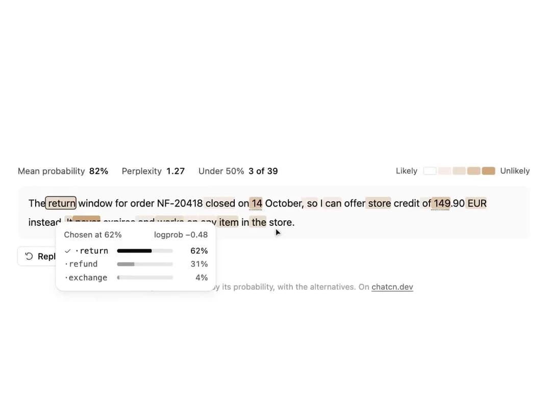
A model reply with every token shaded by its probability, low ones underlined too. Point at a token or walk with the arrow keys to see the alternatives it nearly chose; mean probability and perplexity on top.
Built with React and Tailwind. Copy the prompt and paste it into Claude Code, Cursor or Lovable: your agent adds Logprob View to your project and fits it to your theme.
Code
How Logprob View is used: the demo's code. The component's own source comes with a free account.
Usage.tsx
"use client"

import * as React from "react"
import { cn } from "@/lib/utils"
import { Icon, IconNode, LogprobToken, LogprobView, createIcon } from "@/components/ui/logprob-view"

/** How long a choice holds a tour before it carries on. */
const RESUME_MS = 5000

const reducedMotion = () => window.matchMedia("(prefers-reduced-motion: reduce)").matches

type Row = [token: string, p: number, alts?: [string, number][]]

const ln = (p: number) => Math.log(p)

/** Builds tokens from probabilities; the chosen token is listed among its alternatives. */
function build(rows: Row[]): LogprobToken[] {
  return rows.map(([token, p, alts = []]) => ({
    token,
    logprob: ln(p),
    top: [[token, p] as [string, number], ...alts]
      .sort((a, b) => b[1] - a[1])
      .map(([t, q]) => ({ token: t, logprob: ln(q) })),
  }))
}

/** A support reply where the model is sure of the policy and unsure of the date and the amount. */
const reply = build([
  ["The", 0.97, [["Your", 0.02]]],
  [
    " return",
    0.62,
    [
      [" refund", 0.31],
      [" exchange", 0.04],
    ],
  ],
  [" window", 0.96, [[" period", 0.03]]],
  [" for", 0.99],
  [" order", 0.98],
  [" NF", 0.99],
  ["-", 0.99],
  ["204", 0.97],
  ["18", 0.98],
  [
    " closed",
    0.71,
    [
      [" ended", 0.22],
      [" expired", 0.05],
    ],
  ],
  [" on", 0.93, [[" 3", 0.04]]],
  [
    " 14",
    0.38,
    [
      [" 12", 0.29],
      [" 15", 0.18],
      [" 11", 0.09],
    ],
  ],
  [" October", 0.97],
  [",", 0.88, [[".", 0.11]]],
  [" so", 0.81, [[" but", 0.12]]],
  [" I", 0.95],
  [
    " can",
    0.74,
    [
      ["'m", 0.12],
      [" can't", 0.08],
    ],
  ],
  [" offer", 0.92],
  [
    " store",
    0.57,
    [
      [" a", 0.33],
      [" you", 0.06],
    ],
  ],
  [" credit", 0.99],
  [" of", 0.86, [[" for", 0.11]]],
  [
    " 149",
    0.44,
    [
      [" 129", 0.21],
      [" 159", 0.17],
      [" 139", 0.11],
    ],
  ],
  [".", 0.97],
  ["90", 0.93, [["00", 0.05]]],
  [
    " EUR",
    0.68,
    [
      [" euros", 0.24],
      ["€", 0.06],
    ],
  ],
  [" instead", 0.91],
  [".", 0.96],
  [
    " It",
    0.58,
    [
      [" The", 0.27],
      [" Credit", 0.09],
    ],
  ],
  [
    " never",
    0.21,
    [
      [" does", 0.41],
      [" won't", 0.23],
      [" doesn't", 0.12],
    ],
  ],
  [" expires", 0.94],
  [" and", 0.83, [[",", 0.1]]],
  [
    " works",
    0.66,
    [
      [" applies", 0.21],
      [" can", 0.09],
    ],
  ],
  [" on", 0.88, [[" for", 0.1]]],
  [" any", 0.79, [[" your", 0.15]]],
  [
    " item",
    0.52,
    [
      [" order", 0.39],
      [" purchase", 0.07],
    ],
  ],
  [" in", 0.9],
  [" the", 0.62, [[" our", 0.35]]],
  [" store", 0.94],
  [".", 0.99],
])

/** The tokens the model was least sure of, in reading order: the ones worth a second look. */
const DOUBTS = reply
  .map((t, i) => ({ i, p: Math.exp(t.logprob) }))
  .filter((t) => t.p < 0.75)
  .map((t) => t.i)
  .slice(0, 4)

const CARD_MS = 950

const TOKEN_MS = 55

const FIT_CSS = "html,body{overflow:hidden}[data-fit-small] [data-fit-hide]{display:none!important}"

/**
 * 21st shows a demo in a small frame: about 674 by 421 on a component page, 358 by 224 on a
 * phone and 245 by 139 on a profile card. A demo taller than its frame gets scrollbars, which
 * render white on dark pages. FitFrame fills the frame exactly instead.
 *
 * - "scale": the content shrinks until it fits, centered. For visuals such as orbs.
 * - "crop": the content stays at full size from the top and fades out at the bottom. For text
 *   that streams in, where a changing scale would make the page breathe.
 *
 * `minWidth` lays out a wide demo (a table, a two column panel) at that width and scales it down
 * to the frame, instead of letting it collapse to a narrow layout. The frame centers it, so it
 * shrinks evenly on both sides.
 *
 * Anything marked `data-fit-hide` (state buttons, the chatcn.dev line) drops out in frames
 * shorter than `hideBelow`, so a profile card shows the visual alone.
 */
function FitFrame({
  children,
  mode = "scale",
  hideBelow = 360,
  minWidth,
}: {
  children: React.ReactNode
  mode?: "scale" | "crop"
  hideBelow?: number
  minWidth?: string
}) {
  const content = React.useRef<HTMLDivElement>(null)
  const [cropped, setCropped] = React.useState(false)

  React.useLayoutEffect(() => {
    const el = content.current
    if (!el) return
    const measure = () => {
      const vw = window.innerWidth
      const vh = window.innerHeight
      el.toggleAttribute("data-fit-small", vh < hideBelow)
      // Layout sizes ignore the transform, so measuring never feeds back.
      const w = Math.max(el.offsetWidth, el.scrollWidth)
      const h = Math.max(el.offsetHeight, el.scrollHeight)
      const scale = mode === "scale" ? Math.min(1, vw / w, vh / h) : 1
      el.style.transform = scale < 1 ? `scale(${scale})` : ""
      setCropped(mode === "crop" && h > vh + 1)
    }
    measure()
    const observer = new ResizeObserver(measure)
    observer.observe(el)
    // Content that changes inside a fixed width box (a headline that cycles words) never resizes
    // the box itself, so changes below it measure again on the next frame.
    let frame = 0
    const mutations = new MutationObserver(() => {
      cancelAnimationFrame(frame)
      frame = requestAnimationFrame(measure)
    })
    mutations.observe(el, { subtree: true, childList: true, characterData: true })
    window.addEventListener("resize", measure)
    return () => {
      observer.disconnect()
      mutations.disconnect()
      cancelAnimationFrame(frame)
      window.removeEventListener("resize", measure)
    }
  }, [mode, hideBelow])

  const fade = "linear-gradient(to bottom, #000 calc(100% - 40px), transparent)"
  return (
    <div
      className="flex w-full justify-center overflow-hidden"
      style={{
        height: "100dvh",
        alignItems: mode === "crop" ? "flex-start" : "center",
        maskImage: cropped ? fade : undefined,
        WebkitMaskImage: cropped ? fade : undefined,
      }}
    >
      <style>{FIT_CSS}</style>
      <div
        ref={content}
        className="w-full shrink-0"
        style={{ transformOrigin: mode === "crop" ? "top center" : "center", minWidth }}
      >
        {children}
      </div>
    </div>
  )
}

type ButtonVariant = "solid" | "outline" | "ghost" | "subtle"

type ButtonSize = "xs" | "sm" | "md" | "lg" | "icon-xs" | "icon-sm" | "icon-md" | "icon-lg"

interface ButtonProps extends React.ComponentProps<"button"> {
  variant?: ButtonVariant
  size?: ButtonSize
}

const base = cn(
  "chatcn-focus inline-flex shrink-0 items-center justify-center gap-1.5 font-medium whitespace-nowrap select-none",
  "ease-(--chatcn-ease-standard) transition-[background-color,color,box-shadow,scale] duration-150",
  "active:scale-(--chatcn-press-scale) active:duration-100 disabled:pointer-events-none disabled:opacity-50",
  "[&_svg]:pointer-events-none [&_svg]:shrink-0",
)

const variants: Record<ButtonVariant, string> = {
  solid: "bg-(color:--chatcn-primary) text-(color:--chatcn-primary-fg) hover:bg-(color:--chatcn-primary-hover)",
  outline: "bg-(color:--chatcn-card) text-(color:--chatcn-fg) shadow-(--chatcn-shadow-xs) hover:bg-(color:--chatcn-fill-hover)",
  ghost: "text-(color:--chatcn-fg-muted) hover:bg-(color:--chatcn-fill-hover) hover:text-(color:--chatcn-fg)",
  subtle: "bg-(color:--chatcn-fill) text-(color:--chatcn-fg) hover:bg-(color:--chatcn-fill-hover)",
}

// Heights follow the control scale: 24, 28, 32, 36. Radii stay concentric inside 12 px surfaces.
const sizes: Record<ButtonSize, string> = {
  xs: "h-6 rounded-(--chatcn-radius-sm) px-2 text-[0.75rem]/[1rem] [&_svg]:size-3.5",
  sm: "h-7 rounded-(--chatcn-radius-sm) px-2.5 text-[0.8125rem]/[1.25rem] [&_svg]:size-3.5",
  md: "h-8 rounded-(--chatcn-radius-md) px-3 text-[0.875rem]/[1.25rem] tracking-[-0.003em] [&_svg]:size-4",
  lg: "h-9 rounded-(--chatcn-radius-md) px-3.5 text-[0.875rem]/[1.25rem] tracking-[-0.003em] [&_svg]:size-4",
  "icon-xs": "size-6 rounded-(--chatcn-radius-sm) active:scale-(--chatcn-press-scale-icon) [&_svg]:size-3.5",
  "icon-sm": "size-7 rounded-(--chatcn-radius-sm) active:scale-(--chatcn-press-scale-icon) [&_svg]:size-3.5",
  "icon-md": "size-8 rounded-(--chatcn-radius-md) active:scale-(--chatcn-press-scale-icon) [&_svg]:size-4",
  "icon-lg": "size-9 rounded-(--chatcn-radius-md) active:scale-(--chatcn-press-scale-icon) [&_svg]:size-4",
}

/** Class names for anything that should look like a button, such as a link. */
function buttonVariants({
  variant = "ghost",
  size = "md",
}: {
  variant?: ButtonVariant
  size?: ButtonSize
} = {}) {
  return cn(base, variants[variant], sizes[size])
}

function Button({
  variant = "ghost",
  size = "md",
  type = "button",
  className,
  ...props
}: ButtonProps) {
  return (
    <button
      type={type}
      data-slot="button"
      data-variant={variant}
      className={cn(buttonVariants({ variant, size }), className)}
      {...props}
    />
  )
}

const iconNode: IconNode = [
  ["path", {"d":"M5.49 17.46A8.5 8.5 0 1 0 6.54 5.49"}],
  ["path", {"d":"m8.21 8.65-2.94-.26a2 2 0 0 1-1.82-2.16l.26-2.94"}],
]

const RotateCcwIcon: Icon = /* @__PURE__ */ createIcon("rotate-ccw", iconNode)

/** The line under each 21st demo that points back to the kit. */
function MoreOn({ slug, children }: { slug: string; children: React.ReactNode }) {
  return (
    <p data-fit-hide className="text-[0.75rem]/[1rem] text-(color:--chatcn-fg-faint) text-center text-balance">
      {children}{" "}
      <a
        href={`https://chatcn.dev/docs/components/${slug}`}
        target="_blank"
        rel="noopener"
        className="text-(color:--chatcn-fg-subtle) hover:text-(color:--chatcn-fg) underline underline-offset-2"
      >
        chatcn.dev
      </a>
    </p>
  )
}

/**
 * A support reply streams in shaded by how sure the model was of each token, then the card opens
 * on each doubtful one in turn: the date and the amount it nearly wrote differently. A click holds the tour for a few seconds.
 */
export default function LogprobViewPreview() {
  const [count, setCount] = React.useState(0)
  const [card, setCard] = React.useState<number | null>(null)
  const [run, setRun] = React.useState(0)
  // A ref, so taking over never restarts the stream.
  const auto = React.useRef(true)
  const resume = React.useRef(0)
  /** Stops the tour, then starts it again from the top a few seconds later. */
  const hold = () => {
    auto.current = false
    window.clearTimeout(resume.current)
    resume.current = window.setTimeout(() => {
      auto.current = true
      setRun((r) => r + 1)
    }, RESUME_MS)
  }
  React.useEffect(() => () => window.clearTimeout(resume.current), [])

  React.useEffect(() => {
    if (reducedMotion()) {
      setCount(reply.length)
      return
    }
    setCount(0)
    setCard(null)
    const timers: number[] = []
    let n = 0
    const stream = window.setInterval(() => {
      n += 1
      setCount(n)
      if (n < reply.length) return
      window.clearInterval(stream)
      if (!auto.current) return
      // Each step checks again, so a click mid tour keeps the card the reader opened.
      const later = (ms: number, step: () => void) =>
        timers.push(window.setTimeout(() => auto.current && step(), ms))
      DOUBTS.forEach((i, k) => later(300 + k * CARD_MS, () => setCard(i)))
      later(300 + DOUBTS.length * CARD_MS + 500, () => setRun((r) => r + 1))
    }, TOKEN_MS)
    return () => {
      window.clearInterval(stream)
      for (const t of timers) window.clearTimeout(t)
    }
  }, [run])

  const done = count >= reply.length
  return (
    // Wide enough that the summary row never wraps while it says Streaming.
    <FitFrame minWidth="46rem">
      <div className="flex w-full flex-col items-center justify-center gap-6 p-6">
        <div className="flex w-full max-w-3xl flex-col gap-3">
          <LogprobView
            // Opening the card at a token is a mount time choice, so each step mounts afresh.
            key={card ?? "none"}
            tokens={reply.slice(0, count)}
            status={done ? "done" : "streaming"}
            defaultActiveIndex={card ?? undefined}
            onPointerDown={() => {
              hold()
            }}
          />
          <Button
            data-fit-hide
            variant="outline"
            size="sm"
            className="self-start"
            disabled={!done}
            onClick={() => {
              hold()
              setRun((r) => r + 1)
            }}
          >
            <RotateCcwIcon aria-hidden />
            Replay reply
          </Button>
        </div>
        <MoreOn slug="logprob-view">
          Every token shaded by its probability, with the alternatives. On
        </MoreOn>
      </div>
    </FitFrame>
  )
}
More by Aaditya
View all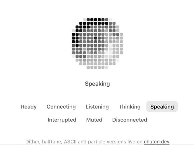
Pixel Orb
9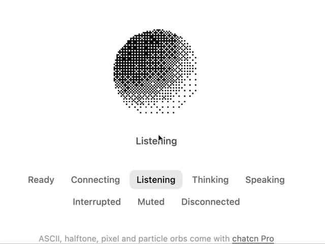
Dither Orb
9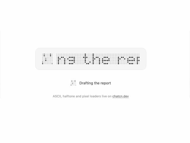
Dot Matrix Loader
8
Halftone Loader
6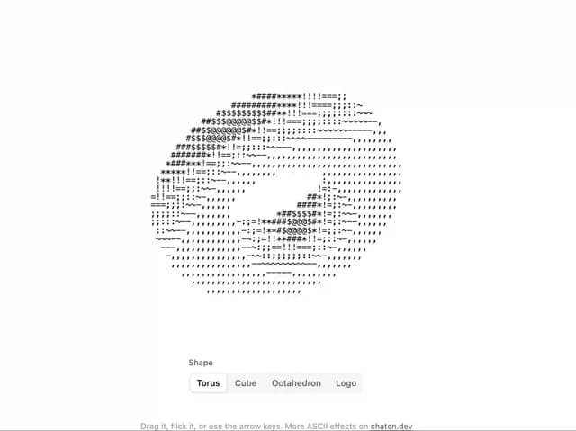
ASCII 3D
5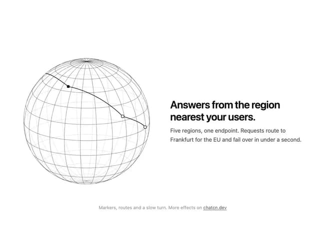
Wireframe Globe
5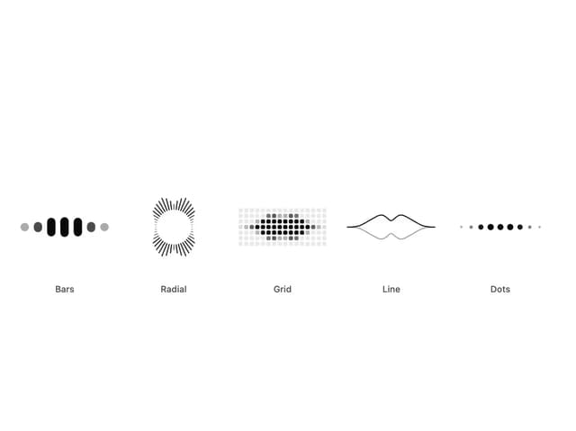
Audio Visualizer
5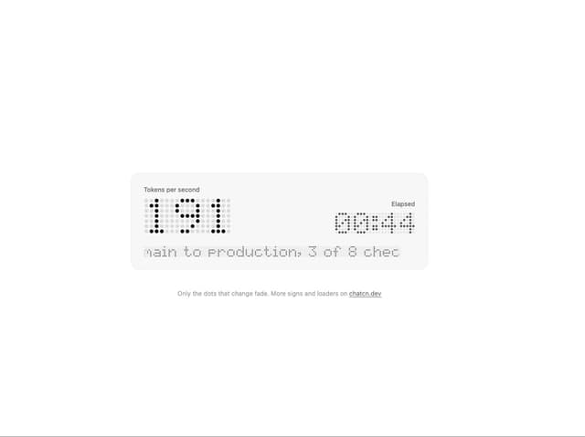
LED Matrix
4
More in AI chats
View all

AI Actions
336

Aquarium Prompt
24
Attachments
33
Message Thread
55
Agent Chat
18
Color Picker
159
Chat Bubble
194
Commit
27


