
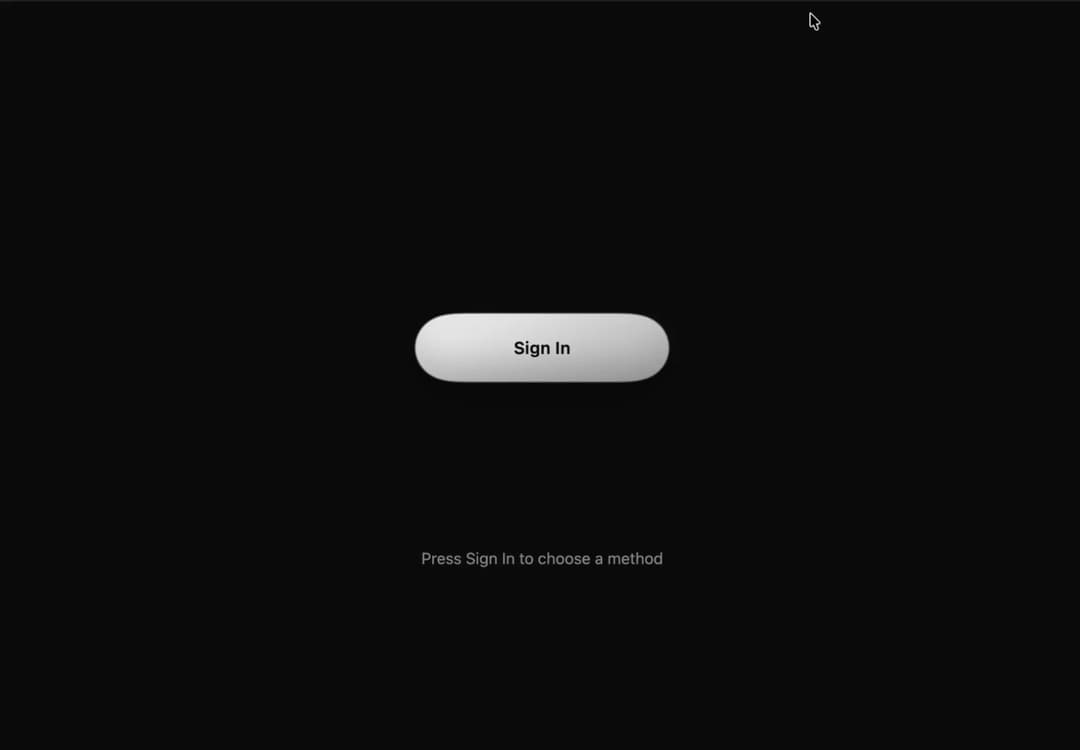
About
Button Sig In option access with effect
Built with React and Tailwind. Copy the prompt and paste it into Claude Code, Cursor or Lovable: your agent adds Button Sign In to your project and fits it to your theme.
Code
How Button Sign In is used: the demo's code. The component's own source comes with a free account.
Usage.tsx
import { useEffect, useRef, useState } from "react";
import type { CSSProperties, ReactElement } from "react";

type Provider = { id: string; label: string; cls: string; y: number; icon: ReactElement };

const iconProps = { className: "wsi-i", viewBox: "0 0 24 24" } as const;

// Vertical offsets (px) of each option once the button has split.
const PROVIDERS: Provider[] = [
  {
    id: "google", label: "Google", cls: "a", y: -138,
    icon: <svg {...iconProps}><path d="M21.35 11.1H12v2.9h5.35c-.5 2.4-2.5 3.9-5.35 3.9a6 6 0 1 1 0-12c1.5 0 2.8.55 3.85 1.45l2.1-2.1A9 9 0 1 0 12 21c5.2 0 8.6-3.65 8.6-8.8 0-.4-.05-.8-.1-1.1z" /></svg>,
  },
  {
    id: "github", label: "GitHub", cls: "b", y: -46,
    icon: <svg {...iconProps}><path d="M12 .297c-6.63 0-12 5.373-12 12 0 5.303 3.438 9.8 8.205 11.385.6.113.82-.258.82-.577 0-.285-.01-1.04-.015-2.04-3.338.724-4.042-1.61-4.042-1.61C4.422 18.07 3.633 17.7 3.633 17.7c-1.087-.744.084-.729.084-.729 1.205.084 1.838 1.236 1.838 1.236 1.07 1.835 2.809 1.305 3.495.998.108-.776.417-1.305.76-1.605-2.665-.3-5.466-1.332-5.466-5.93 0-1.31.465-2.38 1.235-3.22-.135-.303-.54-1.523.105-3.176 0 0 1.005-.322 3.3 1.23.96-.267 1.98-.399 3-.405 1.02.006 2.04.138 3 .405 2.28-1.552 3.285-1.23 3.285-1.23.645 1.653.24 2.873.12 3.176.765.84 1.23 1.91 1.23 3.22 0 4.61-2.805 5.625-5.475 5.92.42.36.81 1.096.81 2.22 0 1.606-.015 2.896-.015 3.286 0 .315.21.69.825.57C20.565 22.092 24 17.592 24 12.297c0-6.627-5.373-12-12-12" /></svg>,
  },
  {
    id: "x", label: "X", cls: "c", y: 46,
    icon: <svg {...iconProps}><path d="M18.244 2.25h3.308l-7.227 8.26 8.502 11.24H16.17l-5.214-6.817L4.99 21.75H1.68l7.73-8.835L1.254 2.25H8.08l4.713 6.231zm-1.161 17.52h1.833L7.084 4.126H5.117z" /></svg>,
  },
  {
    id: "email", label: "Email", cls: "d", y: 138,
    icon: <svg {...iconProps}><path d="M20 4H4a2 2 0 0 0-2 2v12a2 2 0 0 0 2 2h16a2 2 0 0 0 2-2V6a2 2 0 0 0-2-2zm0 4-8 5-8-5V6l8 5 8-5z" /></svg>,
  },
];

export default function WaterSignIn() {
  const [split, setSplit] = useState(false);
  const [picked, setPicked] = useState<number | null>(null);
  const [loading, setLoading] = useState(false);
  const timer = useRef<ReturnType<typeof setTimeout> | undefined>(undefined);

  useEffect(() => () => clearTimeout(timer.current), []);

  const toggle = (on: boolean) => {
    clearTimeout(timer.current);
    setPicked(null);
    setLoading(false);
    setSplit(on);
  };

  const pick = (i: number) => {
    if (picked !== null) return;
    setPicked(i);
    // Unpicked bars shrink into droplets, flow into the chosen bar, then it becomes the spinner.
    // Let the droplets merge first, then morph into the spinner.
    timer.current = setTimeout(() => setLoading(true), 1900);
  };

  const stageClass = ["wsi-stage", split && "split", picked !== null && "picked", loading && "loading"]
    .filter(Boolean)
    .join(" ");
  const stageStyle = picked !== null ? ({ "--py": `${PROVIDERS[picked].y}px` } as CSSProperties) : undefined;

  return (
    <div className="wsi">
      <style>{CSS}</style>

      <svg width="0" height="0" style={{ position: "absolute" }} aria-hidden="true">
        <defs>
          <filter id="wsi-goo" x="-20%" y="-20%" width="140%" height="140%">
            <feGaussianBlur in="SourceGraphic" stdDeviation="12" result="b" />
            <feColorMatrix in="b" mode="matrix" values="1 0 0 0 0  0 1 0 0 0  0 0 1 0 0  0 0 0 18 -7" />
          </filter>
        </defs>
      </svg>

      <main className={split ? "splitted" : undefined}>
        <div className={stageClass} style={stageStyle}>
          <div className="goo">
            {PROVIDERS.map((p, i) => (
              <div key={p.id} className={`blob ${p.cls}${picked === i ? " is-picked" : ""}`} />
            ))}
            <div className="drip" />
          </div>
          <div className="spin" aria-hidden="true" />

          <button className="main" type="button" onClick={() => toggle(true)}>
            Sign In
          </button>

          {PROVIDERS.map((p, i) => (
            <button
              key={p.id}
              className={`opt ${p.cls}`}
              type="button"
              aria-pressed={picked === i}
              onClick={() => pick(i)}
            >
              {p.icon}
              {p.label}
            </button>
          ))}
        </div>

        <div className="status" aria-live="polite">
          {picked !== null ? (
            <>Connecting to <b>{PROVIDERS[picked].label}</b>…</>
          ) : split ? (
            "Choose how to sign in"
          ) : (
            "Press Sign In to choose a method"
          )}
        </div>
        <button className="reset" type="button" onClick={() => toggle(false)}>
          Merge back
        </button>
      </main>
    </div>
  );
}

const CSS = `
.wsi{--bg:#f1f1f1;--ink:#111;--muted:#6a6a6a;--a:#2b2b2b;--b:#0a0a0a;--hi:#5c5c5c;--on:#fff;--on2:rgba(255,255,255,.3);--ease:cubic-bezier(.34,1.25,.64,1);
 box-sizing:border-box;position:fixed;inset:0;width:100%;height:100vh;height:100dvh;overflow:hidden;display:grid;place-items:center;
 padding:max(16px,env(safe-area-inset-top)) max(16px,env(safe-area-inset-right)) max(16px,env(safe-area-inset-bottom)) max(16px,env(safe-area-inset-left));
 background:var(--bg);color:var(--ink);
 font-family:"Sora","Segoe UI",system-ui,sans-serif}
@media (prefers-color-scheme:dark){.wsi{--bg:#0a0a0a;--ink:#f1f1f1;--muted:#8f8f8f;--a:#e4e4e4;--b:#a6a6a6;--hi:#fff;--on:#0a0a0a;--on2:rgba(0,0,0,.25)}}
.wsi *{box-sizing:border-box}
html,body,#root{margin:0;height:100%;overflow:hidden}
.wsi main{text-align:center;width:100%;display:flex;flex-direction:column;align-items:center}
.wsi-stage{position:relative;flex:none;width:min(300px,100%);height:340px;margin:0 auto;transform-origin:center top}
.wsi .goo{position:absolute;inset:0;filter:url(#wsi-goo) drop-shadow(0 10px 14px rgba(0,0,0,.18))}
.wsi .a{--y:-138px;--d:.08s}.wsi .b{--y:-46px;--d:0s}.wsi .c{--y:46px;--d:0s}.wsi .d{--y:138px;--d:.08s}

/* Water blobs. Base state = merging back (smooth, no overshoot). */
.wsi .blob{position:absolute;top:50%;left:50%;width:240px;height:60px;margin:-30px 0 0 -120px;border-radius:30px;will-change:transform;
 background:linear-gradient(160deg,var(--hi) -40%,var(--a) 30%,var(--b) 110%);
 box-shadow:inset 0 7px 10px rgba(255,255,255,.16),inset 0 -9px 14px rgba(0,0,0,.28);
 transition:transform 1.1s cubic-bezier(.65,0,.35,1),width .9s ease,margin-left .9s ease;transition-delay:calc(.08s - var(--d))}
.wsi-stage.split .blob{transform:translateY(var(--y));transition:transform .9s var(--ease),width .6s ease,margin-left .6s ease;transition-delay:var(--d)}
.wsi .drip{position:absolute;top:50%;left:50%;width:30px;height:30px;margin:-15px 0 0 -15px;border-radius:50%;background:var(--a);transform:scale(0)}
.wsi-stage.split .drip{animation:wsi-drip 1s ease-in-out}
@keyframes wsi-drip{0%{transform:scale(.2)}40%{transform:scale(1.7,1.2)}100%{transform:scale(0)}}

.wsi button{font:inherit;cursor:pointer;border:0;color:var(--on);background:transparent;position:absolute;top:50%;left:50%;width:240px;height:60px;margin:-30px 0 0 -120px;border-radius:30px;font-weight:600;font-size:16px;letter-spacing:.02em;display:flex;align-items:center;justify-content:center;gap:10px;-webkit-tap-highlight-color:transparent}
.wsi button:focus-visible{outline:3px solid var(--ink);outline-offset:4px}
.wsi-i{width:20px;height:20px;fill:currentColor;flex:none}

.wsi .main{transition:opacity .5s .6s,transform .15s}
.wsi .main:active{transform:scale(.95)}
.wsi-stage.split .main{opacity:0;pointer-events:none;transition:opacity .25s,transform .15s}

.wsi .opt{opacity:0;pointer-events:none;will-change:transform;transition:transform 1.1s cubic-bezier(.65,0,.35,1),opacity .25s;transition-delay:calc(.08s - var(--d)),0s}
.wsi-stage.split .opt{opacity:1;pointer-events:auto;transform:translateY(var(--y));transition:transform .9s var(--ease),opacity .2s;transition-delay:var(--d),.4s}
.wsi .opt:active{filter:brightness(1.12)}
.wsi .opt[aria-pressed="true"],.wsi .opt[aria-pressed="true"]:focus-visible{outline:none;box-shadow:none}

/* Picked: the other droplets flow into the chosen one, then it becomes a spinner. */
.wsi-stage.split.picked .blob:not(.is-picked){width:60px;margin-left:-30px;transform:translateY(var(--py));
 transition:width .45s cubic-bezier(.45,0,.2,1),margin-left .45s cubic-bezier(.45,0,.2,1);transition-delay:0s;
 animation:wsi-fall .95s cubic-bezier(.45,0,.25,1) calc(.3s + var(--d)) both}
@keyframes wsi-fall{
 0%{transform:translateY(var(--y)) scale(1,1)}
 18%{transform:translateY(var(--y)) scale(1.08,.9)}
 55%{transform:translateY(calc(var(--y) + (var(--py) - var(--y)) * .6)) scale(.82,1.28)}
 85%{transform:translateY(var(--py)) scale(.95,1.1)}
 100%{transform:translateY(var(--py)) scale(1,1)}}
.wsi-stage.split.picked .blob.is-picked{animation:wsi-absorb .7s ease-out 1s}
@keyframes wsi-absorb{0%{scale:1}30%{scale:1.05 1.25}60%{scale:.98 .94}100%{scale:1}}
.wsi-stage.split.picked .opt{pointer-events:none;transition-delay:0s,0s}
.wsi-stage.split.picked .opt:not([aria-pressed="true"]){opacity:0;transition:opacity .15s}
.wsi-stage.split.loading .opt{opacity:0}
.wsi-stage.loading .blob{width:60px;margin-left:-30px}
.wsi .spin{position:absolute;left:50%;top:calc(50% + var(--py,0px));width:28px;height:28px;margin:-14px 0 0 -14px;border:3px solid var(--on2);border-top-color:var(--on);border-radius:50%;opacity:0;pointer-events:none;transition:opacity .25s}
.wsi-stage.loading .spin{opacity:1;transition:opacity .4s .25s;animation:wsi-spin .8s linear infinite}
@keyframes wsi-spin{to{transform:rotate(360deg)}}

.wsi .status{margin-top:18px;min-height:24px;color:var(--muted);font-size:15px}
.wsi .status b{color:var(--ink)}
.wsi .reset{position:static;width:auto;height:auto;margin:6px 0 0;color:var(--muted);text-decoration:underline;font-size:14px;font-weight:400;display:inline-block;opacity:0;pointer-events:none;transition:opacity .3s;border-radius:6px}
.wsi .splitted .reset{opacity:1;pointer-events:auto}

/* Short screens (landscape phones): scale the stage down and shrink its layout box too. */
@media (max-height:520px){.wsi-stage{transform:scale(.75);margin-bottom:-85px}}
@media (max-height:420px){.wsi-stage{transform:scale(.6);margin-bottom:-136px}}

@media (prefers-reduced-motion:reduce){.wsi *{transition-duration:.01s!important;animation-duration:.01s!important}.wsi-stage.loading .spin{animation-duration:1.6s!important}}
`;More by pstzx
View all
Button Payment
63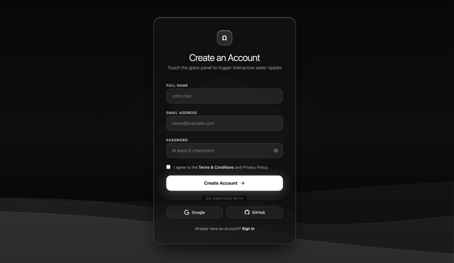
Sign In Water Effect Glass
19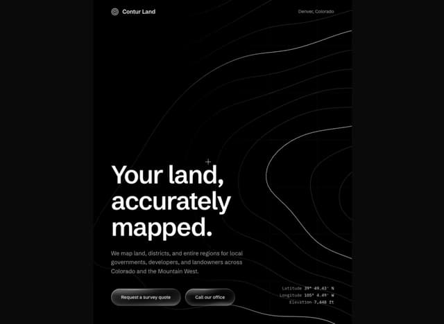
Contour Land Map
15
Contour line Mountain
12
21 st Contour Line
7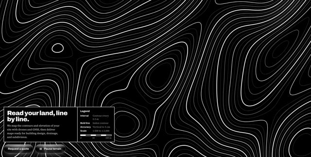
Contour line map
7
Button New & Search
6
Dashboard Analytics 3D
More in Cards
View all
Stats cards with links
92

Course Design Cards
1.2K

Statistics Card 7
316
Statistics Card 2
295

Interactive Tech Stack Bento Grid with Hover Effects
503
Card
57

Item
10

Card Studio
8
