
About
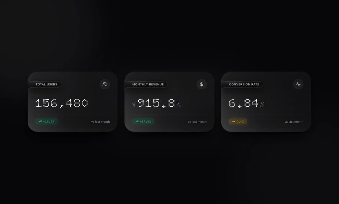
Monochrome Glass Dashboard A minimalist, single-viewport (100dvh) analytics dashboard featuring three interactive metric cards crafted with a borderless micro-dot glassmorphism aesthetic and a monochrome black-and-white palette.
Built with React and Tailwind. Copy the prompt and paste it into Claude Code, Cursor or Lovable: your agent adds Card Dashboard Analytic to your project and fits it to your theme.
Code
How Card Dashboard Analytic is used: the demo's code. The component's own source comes with a free account.
Usage.tsx
import React, { useState, useEffect, useRef, useCallback } from 'react';
type TrendStatus = 'up' | 'down' | 'flat';
interface MetricVariation {
value: string;
trend: string;
status: TrendStatus;
}
interface BalanceItem {
level: number; // -4 to +4 (0 = neutral axis)
number: string;
}
interface CardConfig {
id: number;
label: string;
prefix?: string;
suffix?: string;
variations: MetricVariation[];
balanceTitle: string;
periods: string[];
balanceItems: BalanceItem[];
}
const CARDS_DATA: CardConfig[] = [
{
id: 0,
label: 'Total Users',
variations: [
{ value: '148,920', trend: '+14.2%', status: 'up' },
{ value: '156,480', trend: '+18.9%', status: 'up' },
{ value: '156,480', trend: '0.0%', status: 'flat' },
{ value: '151,310', trend: '-3.3%', status: 'down' },
],
balanceTitle: 'STATISTICAL BALANCE — TOTAL USERS',
periods: ['MON', 'TUE', 'WED', 'THU', 'FRI', 'SAT', 'SUN'],
balanceItems: [
{ level: 2, number: '+18.4K' },
{ level: 3, number: '+22.1K' },
{ level: -1, number: '-4.2K' },
{ level: 4, number: '+26.8K' },
{ level: 1, number: '+12.5K' },
{ level: 0, number: '0.0K' },
{ level: 3, number: '+24.9K' },
],
},
{
id: 1,
label: 'Monthly Revenue',
prefix: '$',
suffix: 'K',
variations: [
{ value: '842.5', trend: '+21.8%', status: 'up' },
{ value: '915.8', trend: '+27.4%', status: 'up' },
{ value: '889.2', trend: '-2.9%', status: 'down' },
{ value: '889.2', trend: '0.0%', status: 'flat' },
],
balanceTitle: 'STATISTICAL BALANCE — MONTHLY REVENUE (USD)',
periods: ['W-1', 'W-2', 'W-3', 'W-4', 'W-5', 'W-6', 'W-7'],
balanceItems: [
{ level: 3, number: '+$124K' },
{ level: -2, number: '-$48K' },
{ level: 2, number: '+$96K' },
{ level: 4, number: '+$162K' },
{ level: 1, number: '+$54K' },
{ level: -1, number: '-$19K' },
{ level: 4, number: '+$178K' },
],
},
{
id: 2,
label: 'Conversion Rate',
suffix: '%',
variations: [
{ value: '6.84', trend: '-0.4%', status: 'down' },
{ value: '6.84', trend: '0.0%', status: 'flat' },
{ value: '8.15', trend: '+1.3%', status: 'up' },
{ value: '7.91', trend: '-0.2%', status: 'down' },
],
balanceTitle: 'STATISTICAL BALANCE — CONVERSION RATE',
periods: ['Q1', 'Q2', 'Q3', 'Q4', 'Q5', 'Q6', 'Q7'],
balanceItems: [
{ level: -2, number: '-0.6%' },
{ level: 1, number: '+0.4%' },
{ level: 0, number: '0.0%' },
{ level: 3, number: '+1.2%' },
{ level: -1, number: '-0.3%' },
{ level: 2, number: '+0.9%' },
{ level: -1, number: '-0.4%' },
],
},
];
/**
* Renders text split into individual staggered wave characters
*/
const WaveText: React.FC<{
text: string;
phase: 'idle' | 'erasing' | 'revealing';
delayStep?: number;
baseDelay?: number;
}> = ({ text, phase, delayStep = 45, baseDelay = 0 }) => {
if (phase === 'idle') {
return <>{text}</>;
}
return (
<>
{Array.from(text).map((char, idx) => (
<span
key={`${phase}-${idx}-${char}`}
className={`wave-char ${
phase === 'erasing' ? 'wave-erase-out' : 'wave-reveal-in'
}`}
style={{ animationDelay: `${baseDelay + idx * delayStep}ms` }}
>
{char === ' ' ? '\u00A0' : char}
</span>
))}
</>
);
};
/**
* Flush-left Matte Liquid Obsidian Badge with unified SVG contour
*/
const LiquidMatteBadge: React.FC<{
label: string;
index: number;
compact?: boolean;
}> = ({ label, index, compact = false }) => {
const badgeRef = useRef<HTMLSpanElement>(null);
const [dims, setDims] = useState({ w: 170, h: 32 });
const measure = useCallback(() => {
if (badgeRef.current) {
const { offsetWidth, offsetHeight } = badgeRef.current;
if (offsetWidth > 0 && offsetHeight > 0) {
setDims({ w: offsetWidth, h: offsetHeight });
}
}
}, []);
useEffect(() => {
measure();
window.addEventListener('resize', measure);
return () => window.removeEventListener('resize', measure);
}, [measure, label, compact]);
const flare = 16;
const totalH = dims.h + flare * 2;
const r = dims.h / 2;
const gradId = `liquid-matte-grad-${index}`;
const sheenId = `liquid-matte-sheen-${index}`;
const pathD = [
`M 0 0`,
`Q 0 ${flare} ${flare} ${flare}`,
`L ${Math.max(flare + 4, dims.w - r)} ${flare}`,
`A ${r} ${r} 0 0 1 ${Math.max(flare + 4, dims.w - r)} ${flare + dims.h}`,
`L ${flare} ${flare + dims.h}`,
`Q 0 ${flare + dims.h} 0 ${totalH}`,
`Z`,
].join(' ');
const flushSpacing = compact
? '-ml-5 sm:-ml-6 pl-5 sm:pl-6'
: '-ml-6 sm:-ml-8 pl-6 sm:pl-8';
return (
<span
ref={badgeRef}
className={`liquid-matte-badge ${flushSpacing} pr-4 py-1 text-[11px] sm:text-xs font-medium tracking-wider uppercase text-neutral-300 group-hover:text-white inline-flex items-center`}
>
<svg
className="liquid-badge-shape"
viewBox={`0 0 ${dims.w} ${totalH}`}
preserveAspectRatio="none"
aria-hidden="true"
>
<defs>
<linearGradient id={gradId} x1="0%" y1="0%" x2="100%" y2="100%">
<stop offset="0%" stopColor="#19191e" />
<stop offset="52%" stopColor="#09090b" />
<stop offset="100%" stopColor="#141418" />
</linearGradient>
<radialGradient id={sheenId} cx="22%" cy="22%" r="75%">
<stop offset="0%" stopColor="rgba(255,255,255,0.14)" />
<stop offset="48%" stopColor="rgba(255,255,255,0.02)" />
<stop offset="100%" stopColor="rgba(255,255,255,0)" />
</radialGradient>
</defs>
<path d={pathD} fill={`url(#${gradId})`} />
<path d={pathD} fill={`url(#${sheenId})`} />
<path
d={pathD}
fill="none"
className="liquid-badge-stroke"
strokeWidth="1"
vectorEffect="non-scaling-stroke"
/>
</svg>
{label}
</span>
);
};
export default function App() {
const [selectedCard, setSelectedCard] = useState<number | null>(null);
const [variationIdx, setVariationIdx] = useState<number[]>([0, 0, 0]);
const [wavePhase, setWavePhase] = useState<
('idle' | 'erasing' | 'revealing')[]
>(['idle', 'idle', 'idle']);
const animatingRef = useRef<boolean[]>([false, false, false]);
const activeTurnRef = useRef<number>(0);
const triggerCardWave = useCallback((cardIdx: number) => {
if (animatingRef.current[cardIdx]) return;
animatingRef.current[cardIdx] = true;
setWavePhase((prev) => {
const next = [...prev];
next[cardIdx] = 'erasing';
return next;
});
const eraseDuration = 560;
setTimeout(() => {
setVariationIdx((prev) => {
const next = [...prev];
next[cardIdx] =
(next[cardIdx] + 1) % CARDS_DATA[cardIdx].variations.length;
return next;
});
setWavePhase((prev) => {
const next = [...prev];
next[cardIdx] = 'revealing';
return next;
});
const revealDuration = 650;
setTimeout(() => {
setWavePhase((prev) => {
const next = [...prev];
next[cardIdx] = 'idle';
return next;
});
animatingRef.current[cardIdx] = false;
}, revealDuration);
}, eraseDuration);
}, []);
useEffect(() => {
const interval = setInterval(() => {
triggerCardWave(activeTurnRef.current);
activeTurnRef.current = (activeTurnRef.current + 1) % CARDS_DATA.length;
}, 3400);
return () => clearInterval(interval);
}, [triggerCardWave]);
const handleCardClick = (idx: number) => {
triggerCardWave(idx);
setSelectedCard(idx);
};
const renderCardIcon = (idx: number) => {
if (idx === 0) {
return (
<svg
xmlns="http://www.w3.org/2000/svg"
className="w-4 h-4 sm:w-5 sm:h-5"
viewBox="0 0 24 24"
fill="none"
stroke="currentColor"
strokeWidth="1.75"
strokeLinecap="round"
strokeLinejoin="round"
>
<path d="M16 21v-2a4 4 0 0 0-4-4H6a4 4 0 0 0-4 4v2" />
<circle cx="9" cy="7" r="4" />
<path d="M22 21v-2a4 4 0 0 0-3-3.87" />
<path d="M16 3.13a4 4 0 0 1 0 7.75" />
</svg>
);
}
if (idx === 1) {
return (
<svg
xmlns="http://www.w3.org/2000/svg"
className="w-4 h-4 sm:w-5 sm:h-5"
viewBox="0 0 24 24"
fill="none"
stroke="currentColor"
strokeWidth="1.75"
strokeLinecap="round"
strokeLinejoin="round"
>
<line x1="12" y1="2" x2="12" y2="22" />
<path d="M17 5H9.5a3.5 3.5 0 0 0 0 7h5a3.5 3.5 0 0 1 0 7H6" />
</svg>
);
}
return (
<svg
xmlns="http://www.w3.org/2000/svg"
className="w-4 h-4 sm:w-5 sm:h-5"
viewBox="0 0 24 24"
fill="none"
stroke="currentColor"
strokeWidth="1.75"
strokeLinecap="round"
strokeLinejoin="round"
>
<path d="M22 12h-4l-3 9L9 3l-3 9H2" />
</svg>
);
};
const renderTrendBadge = (status: TrendStatus, trend: string, phase: 'idle' | 'erasing' | 'revealing') => {
if (status === 'up') {
return (
<div className="inline-flex items-center gap-1.5 px-2.5 py-0.5 rounded-full bg-emerald-500/15 border border-emerald-400/30 shadow-[0_0_15px_rgba(16,185,129,0.2)] text-xs font-dot font-bold tracking-wider text-emerald-300 transition-all duration-300">
<svg
xmlns="http://www.w3.org/2000/svg"
className="w-3.5 h-3.5 text-emerald-400"
viewBox="0 0 24 24"
fill="none"
stroke="currentColor"
strokeWidth="2.5"
strokeLinecap="round"
strokeLinejoin="round"
>
<polyline points="22 7 13.5 15.5 8.5 10.5 2 17" />
<polyline points="16 7 22 7 22 13" />
</svg>
<span>
<WaveText text={trend} phase={phase} delayStep={38} />
</span>
</div>
);
}
if (status === 'down') {
return (
<div className="inline-flex items-center gap-1.5 px-2.5 py-0.5 rounded-full bg-rose-500/15 border border-rose-400/30 shadow-[0_0_15px_rgba(244,63,94,0.2)] text-xs font-dot font-bold tracking-wider text-rose-300 transition-all duration-300">
<svg
xmlns="http://www.w3.org/2000/svg"
className="w-3.5 h-3.5 text-rose-400"
viewBox="0 0 24 24"
fill="none"
stroke="currentColor"
strokeWidth="2.5"
strokeLinecap="round"
strokeLinejoin="round"
>
<polyline points="22 17 13.5 8.5 8.5 13.5 2 7" />
<polyline points="16 17 22 17 22 11" />
</svg>
<span>
<WaveText text={trend} phase={phase} delayStep={38} />
</span>
</div>
);
}
return (
<div className="inline-flex items-center gap-1.5 px-2.5 py-0.5 rounded-full bg-amber-400/15 border border-amber-300/30 shadow-[0_0_15px_rgba(251,191,36,0.2)] text-xs font-dot font-bold tracking-wider text-amber-300 transition-all duration-300">
<svg
xmlns="http://www.w3.org/2000/svg"
className="w-3.5 h-3.5 text-amber-400"
viewBox="0 0 24 24"
fill="none"
stroke="currentColor"
strokeWidth="2.5"
strokeLinecap="round"
strokeLinejoin="round"
>
<line x1="4" y1="12" x2="20" y2="12" />
<polyline points="16 8 20 12 16 16" />
</svg>
<span>
<WaveText text={trend} phase={phase} delayStep={38} />
</span>
</div>
);
};
const activeFocusData =
selectedCard !== null ? CARDS_DATA[selectedCard] : null;
const dotRows = [4, 3, 2, 1, 0, -1, -2, -3, -4];
return (
<div className="h-[100dvh] w-full overflow-hidden bg-[#070709] text-white flex flex-col items-center justify-center p-4 sm:p-6 lg:p-8 relative antialiased selection:bg-white selection:text-black">
{/* Embedded Font & Glassmorphism Styles */}
<style>{`
@import url('https://fonts.googleapis.com/css2?family=Doto:wght@600;700;800&family=Inter:wght@300;400;500;600;700&display=swap');
.font-dot {
font-family: 'Doto', monospace;
}
.bg-grid-pattern {
background-image: radial-gradient(rgba(255, 255, 255, 0.04) 1px, transparent 0);
background-size: 32px 32px;
}
.glass-card {
background:
radial-gradient(rgba(255, 255, 255, 0.08) 0.45px, transparent 0.65px),
radial-gradient(circle at 0% 100%, rgba(255, 255, 255, 0.16) 0%, rgba(255, 255, 255, 0.04) 38%, transparent 72%),
linear-gradient(145deg, rgba(255, 255, 255, 0.055) 0%, rgba(255, 255, 255, 0.015) 100%);
background-size: 4px 4px, 100% 100%, 100% 100%;
backdrop-filter: blur(24px);
-webkit-backdrop-filter: blur(24px);
border: none;
box-shadow:
0 24px 48px -12px rgba(0, 0, 0, 0.85),
inset 16px -16px 36px -12px rgba(255, 255, 255, 0.08);
transition: transform 0.35s cubic-bezier(0.16, 1, 0.3, 1),
background 0.35s ease,
box-shadow 0.35s ease,
opacity 0.35s ease,
filter 0.35s ease;
}
.glass-card:hover {
transform: translateY(-4px);
background:
radial-gradient(rgba(255, 255, 255, 0.11) 0.45px, transparent 0.65px),
radial-gradient(circle at 0% 100%, rgba(255, 255, 255, 0.22) 0%, rgba(255, 255, 255, 0.06) 42%, transparent 76%),
linear-gradient(145deg, rgba(255, 255, 255, 0.075) 0%, rgba(255, 255, 255, 0.025) 100%);
background-size: 4px 4px, 100% 100%, 100% 100%;
box-shadow:
0 30px 56px -12px rgba(0, 0, 0, 0.92),
inset 20px -20px 44px -10px rgba(255, 255, 255, 0.12);
}
.glass-card.card-selected {
transform: translateY(-4px) scale(1.015);
background:
radial-gradient(rgba(255, 255, 255, 0.14) 0.45px, transparent 0.65px),
radial-gradient(circle at 0% 100%, rgba(255, 255, 255, 0.28) 0%, rgba(255, 255, 255, 0.08) 45%, transparent 78%),
linear-gradient(145deg, rgba(255, 255, 255, 0.095) 0%, rgba(255, 255, 255, 0.03) 100%);
background-size: 4px 4px, 100% 100%, 100% 100%;
box-shadow:
0 32px 64px -12px rgba(0, 0, 0, 0.95),
inset 22px -22px 48px -10px rgba(255, 255, 255, 0.16);
}
.glass-card.card-dimmed {
opacity: 0.45;
transform: scale(0.985);
filter: blur(0.4px);
}
.liquid-matte-badge {
position: relative;
z-index: 1;
background: transparent;
transition: color 0.35s ease;
}
.liquid-badge-shape {
position: absolute;
top: -16px;
left: 0;
width: 100%;
height: calc(100% + 32px);
pointer-events: none;
z-index: -1;
filter: drop-shadow(0 10px 18px rgba(0, 0, 0, 0.9));
}
.liquid-badge-stroke {
stroke: rgba(255, 255, 255, 0.16);
transition: stroke 0.35s ease;
}
.group:hover .liquid-badge-stroke {
stroke: rgba(255, 255, 255, 0.28);
}
@keyframes pulseSlow {
0%, 100% { opacity: 0.45; transform: scale(1); }
50% { opacity: 0.7; transform: scale(1.05); }
}
.ambient-glow {
animation: pulseSlow 8s ease-in-out infinite;
}
@keyframes balancePanelIn {
0% {
opacity: 0;
transform: translateY(14px) scale(0.97);
filter: blur(6px);
}
100% {
opacity: 1;
transform: translateY(0) scale(1);
filter: blur(0px);
}
}
.balance-panel-enter {
animation: balancePanelIn 0.42s cubic-bezier(0.16, 1, 0.3, 1) forwards;
}
.wave-char {
display: inline-block;
will-change: transform, opacity, filter;
}
.wave-erase-out {
animation: waveEraseOut 0.42s cubic-bezier(0.4, 0, 0.2, 1) forwards;
}
.wave-reveal-in {
animation: waveRevealIn 0.48s cubic-bezier(0.16, 1, 0.3, 1) forwards;
}
@keyframes waveEraseOut {
0% {
opacity: 1;
transform: translateY(0) scale(1);
filter: blur(0px);
}
45% {
opacity: 0.7;
transform: translateY(-9px) scale(1.06);
filter: blur(1.5px);
}
100% {
opacity: 0;
transform: translateY(10px) scale(0.82);
filter: blur(5px);
}
}
@keyframes waveRevealIn {
0% {
opacity: 0;
transform: translateY(-10px) scale(0.82);
filter: blur(5px);
}
55% {
opacity: 0.9;
transform: translateY(4px) scale(1.04);
filter: blur(0.8px);
}
100% {
opacity: 1;
transform: translateY(0) scale(1);
filter: blur(0px);
}
}
`}</style>
{/* Background Dot Grid & Ambient Monochrome Lighting */}
<div className="fixed inset-0 bg-grid-pattern pointer-events-none" />
<div className="fixed -top-32 -left-32 w-96 h-96 sm:w-[32rem] sm:h-[32rem] bg-white/[0.08] rounded-full blur-[120px] pointer-events-none ambient-glow" />
<div
className="fixed -bottom-40 -right-32 w-96 h-96 sm:w-[36rem] sm:h-[36rem] bg-neutral-400/[0.07] rounded-full blur-[130px] pointer-events-none ambient-glow"
style={{ animationDelay: '4s' }}
/>
<div className="fixed top-1/2 left-1/2 -translate-x-1/2 -translate-y-1/2 w-[40rem] h-64 bg-white/[0.03] rounded-full blur-[100px] pointer-events-none" />
{/* Main Centered Single-Viewport Container */}
<main className="w-full max-w-6xl mx-auto relative z-10 flex flex-col justify-center max-h-full">
{/* 3-Card Metric Grid */}
<div
className={`grid grid-cols-1 md:grid-cols-3 transition-all duration-300 ${
selectedCard !== null ? 'gap-3.5 lg:gap-5' : 'gap-5 lg:gap-7'
}`}
>
{CARDS_DATA.map((card, idx) => {
const currentMetric = card.variations[variationIdx[idx]];
const isSelected = selectedCard === idx;
const isDimmed = selectedCard !== null && selectedCard !== idx;
return (
<article
key={card.id}
onClick={() => handleCardClick(idx)}
title="Click to focus statistical balance"
className={`glass-card cursor-pointer rounded-[2.5rem] flex flex-col justify-between relative overflow-hidden group ${
selectedCard !== null
? 'p-5 sm:p-6'
: 'p-6 sm:p-8'
} ${isSelected ? 'card-selected' : ''} ${
isDimmed ? 'card-dimmed' : ''
}`}
>
{/* Card Header: Flush-Left Matte Liquid Badge & Glass Icon */}
<div
className={`flex items-center justify-between relative z-10 ${
selectedCard !== null ? 'mb-4' : 'mb-6 sm:mb-8'
}`}
>
<LiquidMatteBadge
label={card.label}
index={idx}
compact={selectedCard !== null}
/>
<div className="w-9 h-9 sm:w-10 sm:h-10 rounded-[1.25rem] bg-white/[0.06] border border-white/15 flex items-center justify-center text-white/90 group-hover:bg-white group-hover:text-black transition-colors duration-300">
{renderCardIcon(idx)}
</div>
</div>
{/* Primary Dot-Matrix Metric Value */}
<div
className={`relative z-10 ${
selectedCard !== null ? 'mb-3.5' : 'mb-5 sm:mb-6'
}`}
>
<div className="flex items-baseline gap-1">
{card.prefix && (
<span
className={`font-dot font-semibold text-neutral-400 ${
selectedCard !== null
? 'text-xl sm:text-2xl'
: 'text-2xl sm:text-3xl'
}`}
>
{card.prefix}
</span>
)}
<h2
className={`font-dot font-bold tracking-wider text-white tabular-nums ${
selectedCard !== null
? 'text-3xl sm:text-4xl'
: 'text-4xl sm:text-5xl'
}`}
>
<WaveText
text={currentMetric.value}
phase={wavePhase[idx]}
delayStep={45}
/>
{card.suffix && (
<span
className={`font-semibold text-neutral-400 ml-0.5 ${
selectedCard !== null
? 'text-xl sm:text-2xl'
: 'text-2xl sm:text-3xl'
}`}
>
{card.suffix}
</span>
)}
</h2>
</div>
</div>
{/* Card Footer: Status-Colored Badge */}
<div
className={`flex items-center justify-between border-t border-white/[0.08] relative z-10 ${
selectedCard !== null ? 'pt-3' : 'pt-4'
}`}
>
{renderTrendBadge(
currentMetric.status,
currentMetric.trend,
wavePhase[idx]
)}
<span className="text-xs text-neutral-400">
vs last month
</span>
</div>
</article>
);
})}
</div>
{/* Center Dot-Matrix Statistical Balance Focus Panel */}
{activeFocusData && (
<section
key={activeFocusData.id}
className="balance-panel-enter mt-4 sm:mt-5 mx-auto w-full max-w-3xl glass-card rounded-[2.25rem] p-4 sm:p-6 relative overflow-hidden"
>
{/* Focus Header */}
<div className="flex items-center justify-between mb-3.5 relative z-10">
<div className="flex items-center gap-2.5">
<span className="w-2 h-2 rounded-full bg-white shadow-[0_0_10px_rgba(255,255,255,0.85)]" />
<h3 className="font-dot text-xs sm:text-sm font-bold tracking-[0.16em] uppercase text-white">
{activeFocusData.balanceTitle}
</h3>
</div>
<button
type="button"
onClick={() => setSelectedCard(null)}
aria-label="Close balance focus"
className="w-8 h-8 rounded-full bg-white/[0.06] hover:bg-white hover:text-black text-neutral-300 flex items-center justify-center transition-colors duration-300"
>
<svg
xmlns="http://www.w3.org/2000/svg"
className="w-4 h-4"
viewBox="0 0 24 24"
fill="none"
stroke="currentColor"
strokeWidth="2"
strokeLinecap="round"
strokeLinejoin="round"
>
<line x1="18" y1="6" x2="6" y2="18" />
<line x1="6" y1="6" x2="18" y2="18" />
</svg>
</button>
</div>
{/* Center Dot-Based Statistical Balance Matrix */}
<div className="py-3 sm:py-4 px-3 sm:px-6 rounded-[1.5rem] bg-black/45 relative z-10">
<div className="grid grid-cols-7 gap-2 sm:gap-5 items-center justify-items-center">
{activeFocusData.balanceItems.map((item, colIdx) => (
<div
key={colIdx}
className="flex flex-col items-center gap-1 sm:gap-1.5"
>
{dotRows.map((rowVal) => {
const isAxis = rowVal === 0;
const isSurplusActive =
item.level > 0 && rowVal > 0 && rowVal <= item.level;
const isDeficitActive =
item.level < 0 && rowVal < 0 && rowVal >= item.level;
const isNeutralCenter = item.level === 0 && isAxis;
let dotClass =
'rounded-full transition-all duration-300 ';
if (isSurplusActive) {
dotClass +=
'w-2 h-2 sm:w-2.5 sm:h-2.5 bg-emerald-400 shadow-[0_0_10px_rgba(52,211,153,0.75)]';
} else if (isDeficitActive) {
dotClass +=
'w-2 h-2 sm:w-2.5 sm:h-2.5 bg-rose-400 shadow-[0_0_10px_rgba(251,113,133,0.75)]';
} else if (isNeutralCenter) {
dotClass +=
'w-2 h-2 sm:w-2.5 sm:h-2.5 bg-amber-300 shadow-[0_0_10px_rgba(252,211,77,0.75)]';
} else if (isAxis) {
dotClass += 'w-1.5 h-1.5 bg-white/35';
} else {
dotClass +=
'w-1 h-1 sm:w-1.5 sm:h-1.5 bg-white/[0.08]';
}
return <span key={rowVal} className={dotClass} />;
})}
</div>
))}
</div>
</div>
{/* Bottom Dot-Matrix Numbers Row */}
<div className="grid grid-cols-7 gap-1.5 sm:gap-4 mt-3.5 pt-3 border-t border-white/[0.08] text-center relative z-10">
{activeFocusData.balanceItems.map((item, colIdx) => {
const numColor =
item.level > 0
? 'text-emerald-300'
: item.level < 0
? 'text-rose-300'
: 'text-amber-300';
return (
<div
key={colIdx}
className="flex flex-col items-center gap-0.5"
>
<span
className={`font-dot text-[11px] sm:text-sm font-bold tracking-wider ${numColor}`}
>
<WaveText
text={item.number}
phase="revealing"
delayStep={30}
baseDelay={colIdx * 25}
/>
</span>
<span className="text-[9px] sm:text-[11px] font-medium tracking-widest uppercase text-neutral-400">
{activeFocusData.periods[colIdx]}
</span>
</div>
);
})}
</div>
</section>
)}
</main>
</div>
);
}More by pstzx
View all
Button Payment
106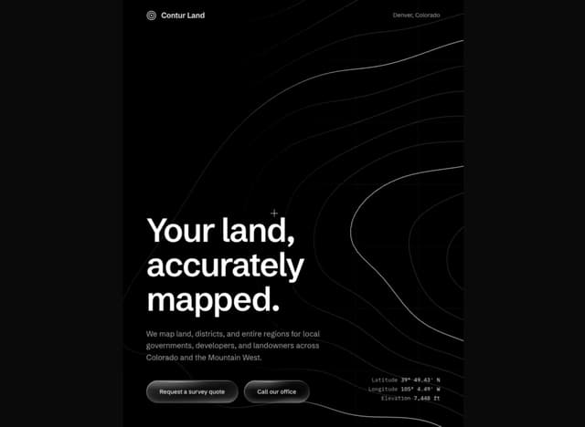
Contour Land Map
29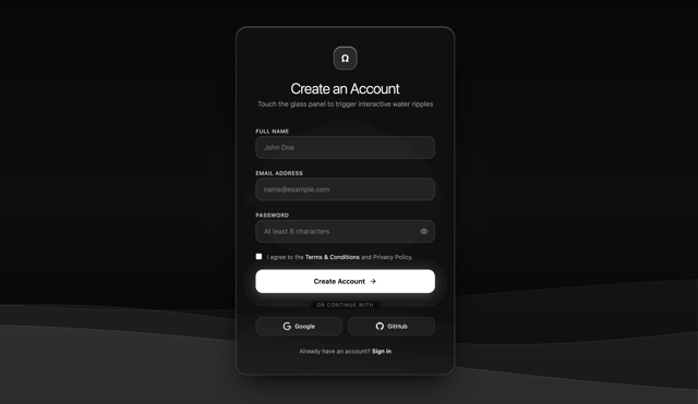
Sign In Water Effect Glass
25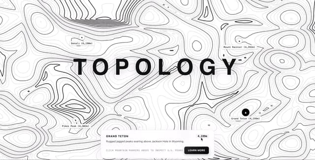
Contour line Mountain
22
21 st Contour Line
12
Contour line map
11
Loading Screen Glass
8
Button New & Search
8
More in Shaders
View all
Glass Fold
485

Illos Knowledge Sources
52

Shader Animation
3.9K

Phosphor 30
311

Paper design shader Background
699

NeonRGBTextEffect
153
LightSpeed
242
Black Hole
42

