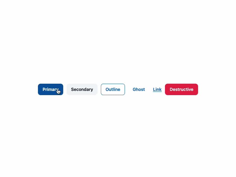
About
A configurable button with multiple variants, color tones, sizes, shapes and styles (solid, gradient, light, outline), plus built-in loading spinner and leading/trailing icon slots.
Built with React and Tailwind. Copy the prompt and paste it into Claude Code, Cursor or Lovable: your agent adds Qahera Button to your project and fits it to your theme.
Code
How Qahera Button is used: the demo's code. The component's own source comes with a free account.
Usage.tsx
import Button from "@/components/ui/button";

export default function ButtonDemo() {
  return (
    <div className="flex flex-wrap items-center gap-3 p-6">
      <Button variant="primary">Primary</Button>
      <Button variant="secondary">Secondary</Button>
      <Button variant="outline">Outline</Button>
      <Button variant="ghost">Ghost</Button>
      <Button variant="link">Link</Button>
      <Button variant="destructive">Destructive</Button>
    </div>
  );
}
More by alwkala
View all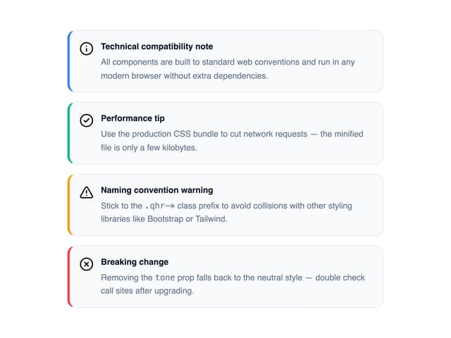

Callout
7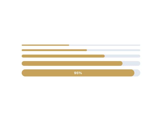
Progress Bar
1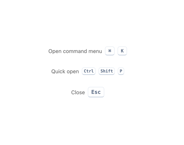
Kbd
Pagination
Back To Top
Checkbox
Seal
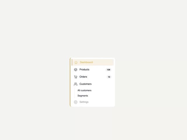
Egyptian Sidebar Menu
More in Buttons
View all
Texture Button
109
Button
15

Notification Button
117

Eclipse Button
44

HeroUI Button Group
2
Button Save
50

Minimal Button
14

App Store Button
486


