About
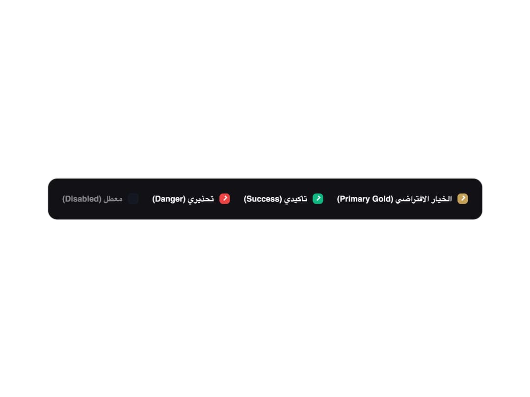
A styled checkbox input with an optional label and helper description text, including success/danger tone variants and a disabled state.
Built with React and Tailwind. Copy the prompt and paste it into Claude Code, Cursor or Lovable: your agent adds Checkbox to your project and fits it to your theme.
Code
How Checkbox is used: the demo's code. The component's own source comes with a free account.
Usage.tsx
import Checkbox from "@/components/ui/checkbox";

export default function CheckboxDemo() {
  return (
    <div
      data-theme="dark"
      dir="rtl"
      className="flex flex-wrap items-center gap-6 rounded-2xl border p-6"
      style={{ background: "#121216", borderColor: "rgba(255,255,255,0.08)" }}
    >
      <Checkbox defaultChecked label="الخيار الافتراضي (Primary Gold)" />
      <Checkbox
        defaultChecked
        className="qhr-checkbox--success"
        label="تأكيدي (Success)"
      />
      <Checkbox
        defaultChecked
        className="qhr-checkbox--danger"
        label="تحذيري (Danger)"
      />
      <Checkbox disabled label="معطل (Disabled)" />
    </div>
  );
}
More by alwkala
View all

Callout
7
Progress Bar
1
Kbd
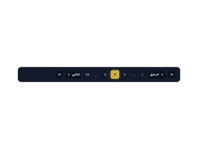
Pagination
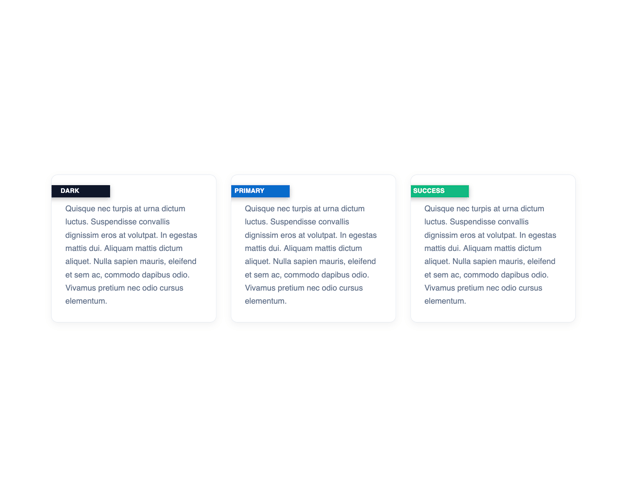
Ribbon
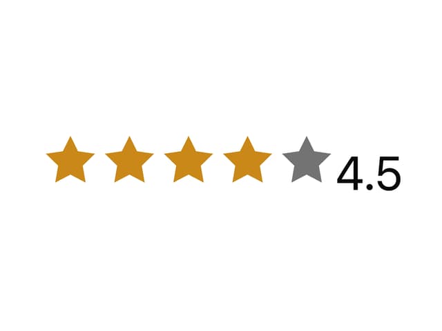
Rating
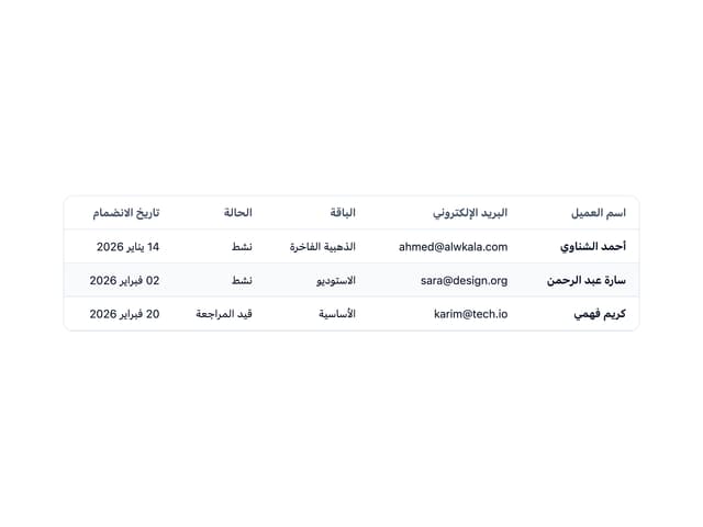
Data Table
Navbar
More in Forms
View all

Login 1
63

Form
18

Premium Auth
570

Contact Card
1.1K

Book A Demo 1
91

Card Studio
47

Login Card
35
Authentication Card
52
