
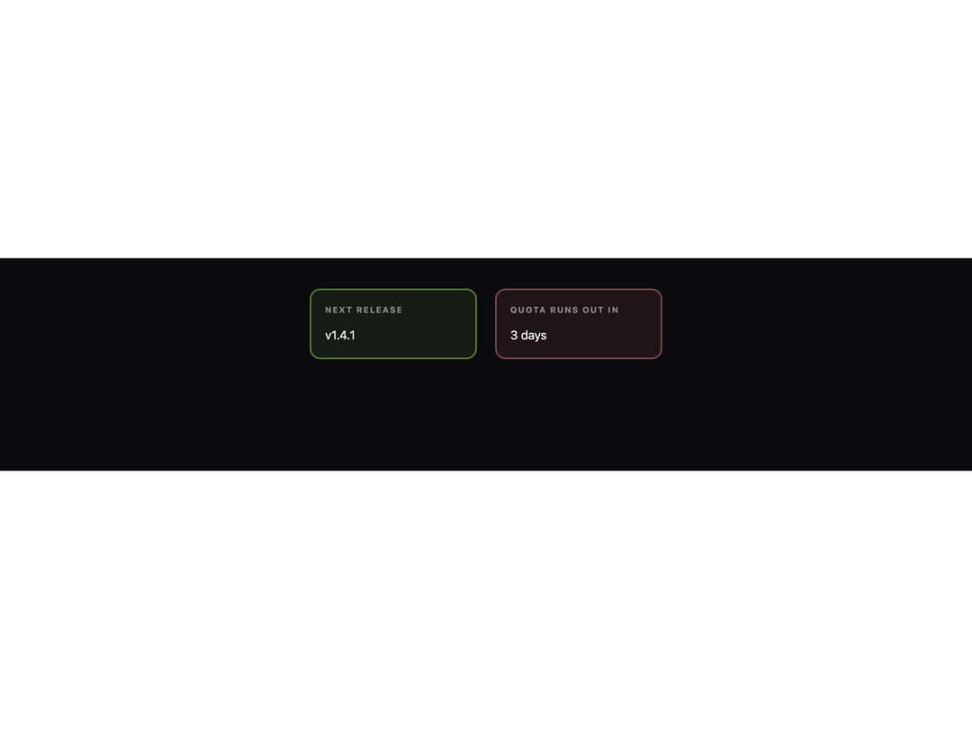
About
A dark glass surface panel for a self-contained block of content, with an optional label, display-type title, header actions slot, and a footer separated by a hairline — ported to React from the oyna-ui Vue component library by azabroflovski.
Built with React and Tailwind. Copy the prompt and paste it into Claude Code, Cursor or Lovable: your agent adds Card to your project and fits it to your theme.
Code
How Card is used: the demo's code. The component's own source comes with a free account.
Usage.tsx
import Card from "@/components/ui/oyna-card";

export default function CardSignalDemo() {
  return (
    <div className="flex min-h-[280px] w-full flex-wrap items-start justify-center gap-6 bg-[#0b0b0f] p-10">
      <Card signal="accent" label="Next release" style={{ width: 220 }}>
        v1.4.1
      </Card>
      <Card signal="danger" label="Quota runs out in" style={{ width: 220 }}>
        3 days
      </Card>
    </div>
  );
}
More by azabroflovski
View all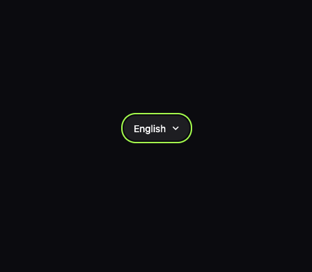
Select
1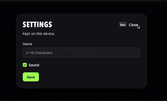
Dialog
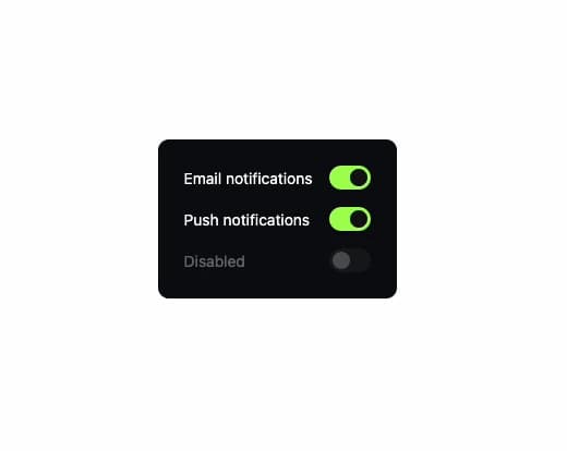
Switch
Checkbox
Bar Chart
More in Cards
View all

Statistics Card 7
294

Course Design Cards
1.1K
Statistics Card 2
267

Card
17
Stats cards with links
122

Card Studio
14
The Item one
3

Interactive Tech Stack Bento Grid with Hover Effects
23
