
About
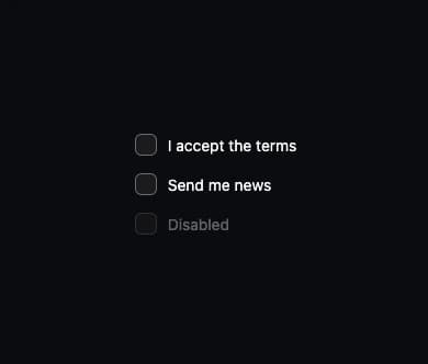
A labelled checkbox for forms (accept terms, opt into a list, etc.) with a real hidden input for keyboard and screen-reader support and a custom animated check box; ported from the oyna-ui Vue component library by azabroflovski to React.
Built with React and Tailwind. Copy the prompt and paste it into Claude Code, Cursor or Lovable: your agent adds Checkbox to your project and fits it to your theme.
Code
How Checkbox is used: the demo's code. The component's own source comes with a free account.
Usage.tsx
import Checkbox from "@/components/ui/checkbox";
import { useState } from "react";

export default function CheckboxDemo() {
  const [agree, setAgree] = useState(false);
  const [news, setNews] = useState(true);

  return (
    <div
      style={{ background: "var(--o-bg)", color: "var(--o-text)" }}
      className="flex w-full h-screen items-center justify-center"
    >
      <div className="flex flex-col gap-4">
        <Checkbox checked={agree} onCheckedChange={setAgree}>
          I accept the terms
        </Checkbox>
        <Checkbox checked={news} onCheckedChange={setNews}>
          Send me news
        </Checkbox>
        <Checkbox disabled>Disabled</Checkbox>
      </div>
    </div>
  );
}
More by azabroflovski
View all
Select
1
Dialog
Switch
Card
Bar Chart
More in Forms
View all

Premium Auth
517

Contact Card
1K

Book A Demo 1
70

Login 1
52

Form
16
Login Card
26
Authentication Card
47

Login Form
7

