About
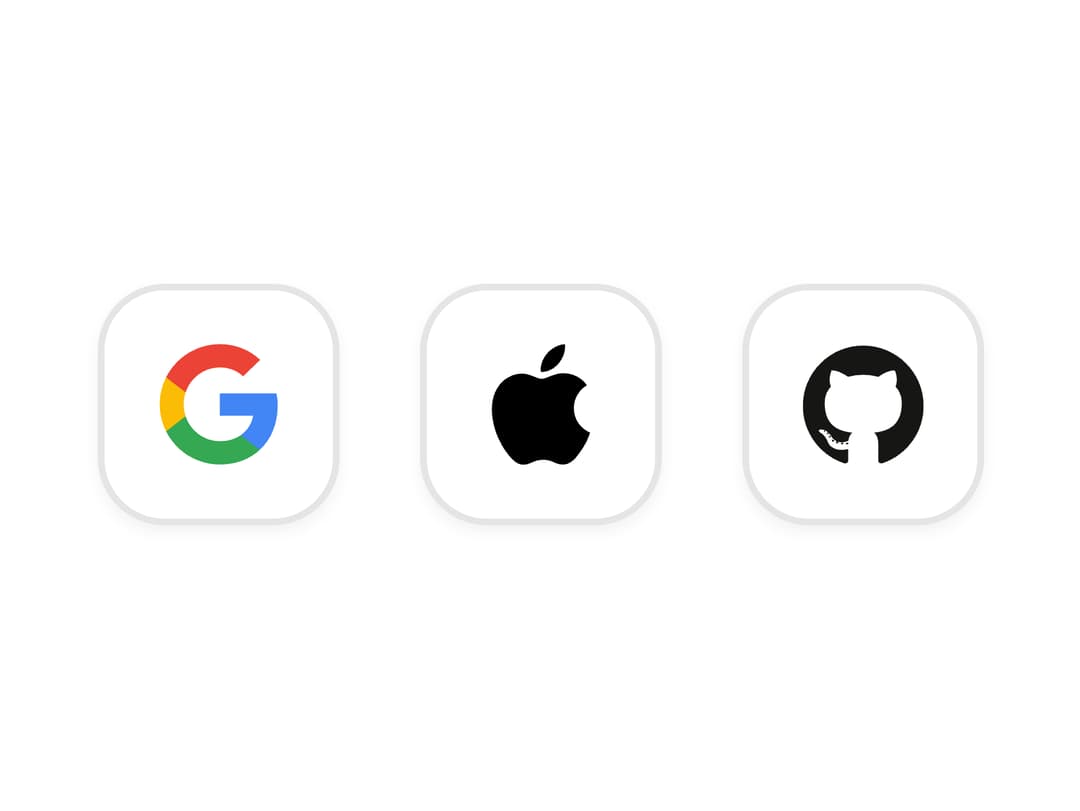
A sign-in button for a third-party provider like Google, GitHub, Slack or Apple, with the correct brand logo, color and label, plus icon-only and custom-provider SSO variants.
Built with React and Tailwind. Copy the prompt and paste it into Claude Code, Cursor or Lovable: your agent adds Social Button to your project and fits it to your theme.
Code
How Social Button is used: the demo's code. The component's own source comes with a free account.
Usage.tsx
import { SocialButton } from "@/components/ui/social-button";

export default function SocialButtonIconOnlyDemo() {
  return (
    <div className="flex gap-3">
      <SocialButton brand="google" appearance="white" iconOnly />
      <SocialButton brand="apple" appearance="white" iconOnly />
      <SocialButton brand="github" appearance="white" iconOnly />
      {/* The brand name stays as the accessible name when the label is hidden */}
    </div>
  );
}
More by boardui
View all

Notification Center

Spinner

Dropdown
Icon Button
Chip
More in Sign-in
View all
SignInPage
732

Modern & Stunning sign in
1.7K

Sign In Form
211
Clean & Minimal sign in
657
Sign In
103
Sign In Card
20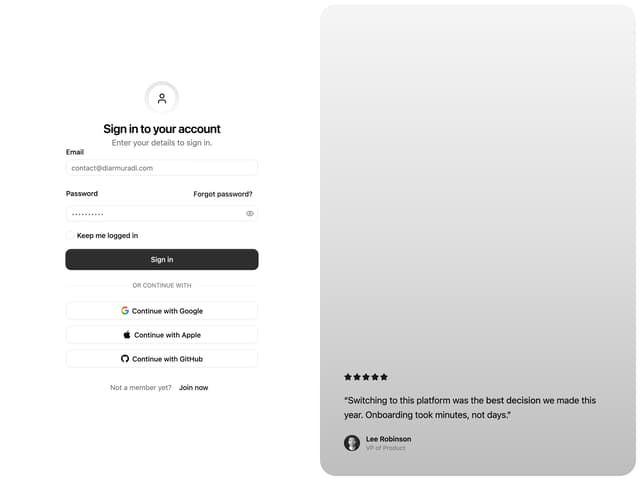

Split Sign In Form
107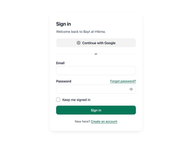
Sign In Auth Card
10


