
About
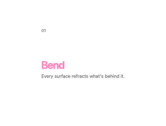
A stack of glass cards that pin to the top as you scroll, shrinking and dimming as each new card lands on top of it.
Built with React and Tailwind. Copy the prompt and paste it into Claude Code, Cursor or Lovable: your agent adds Glass Scroll Stack to your project and fits it to your theme.
Code
How Glass Scroll Stack is used: the demo's code. The component's own source comes with a free account.
Usage.tsx
"use client";

import {
  GlassScrollStack,
  GlassScrollStackItem,
} from "@/components/ui/glass-scroll-stack";

const cards = [
  {
    title: "Bend",
    body: "Every surface refracts what's behind it.",
    accent: "#ff7ab6",
  },
  {
    title: "Tune",
    body: "Index of refraction, thickness, surface profile.",
    accent: "#7aa8ff",
  },
  {
    title: "Ship",
    body: "Install with the shadcn CLI and make it yours.",
    accent: "#ffc46b",
  },
  {
    title: "Repeat",
    body: "Fifty components and counting.",
    accent: "#5ef0c0",
  },
];

export default function GlassScrollStackDemo() {
  return (
    <GlassScrollStack
      height={380}
      className="w-full max-w-md px-1 pt-2"
      stackTop={12}
    >
      {cards.map((c, i) => (
        <GlassScrollStackItem
          key={c.title}
          className="flex h-56 flex-col justify-between"
        >
          <span className="text-[13px] font-semibold opacity-60">0{i + 1}</span>
          <div>
            <div
              className="text-[34px] font-semibold tracking-[-0.04em]"
              style={{ color: c.accent }}
            >
              {c.title}
            </div>
            <p className="text-[15px] opacity-75">{c.body}</p>
          </div>
        </GlassScrollStackItem>
      ))}
    </GlassScrollStack>
  );
}
More by deepraj21
View all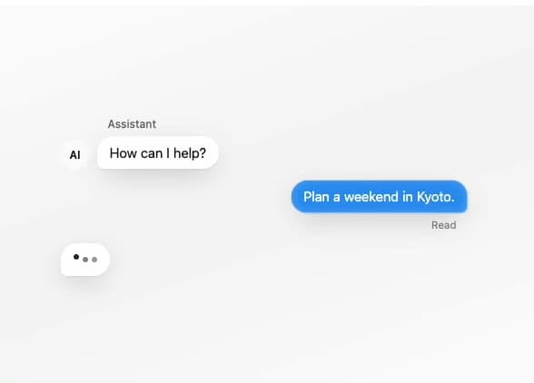
Glass Message
1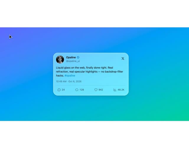
Glass Tweet Card
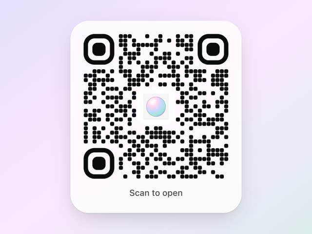
Glass QR Code
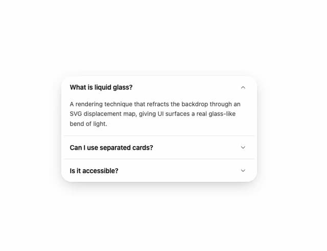
Glass Accordion
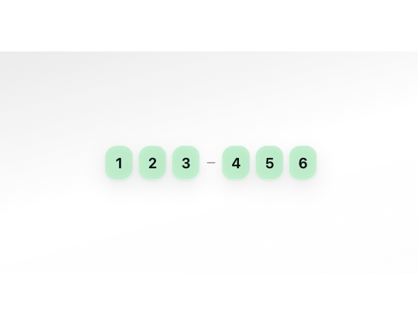
Glass OTP Input
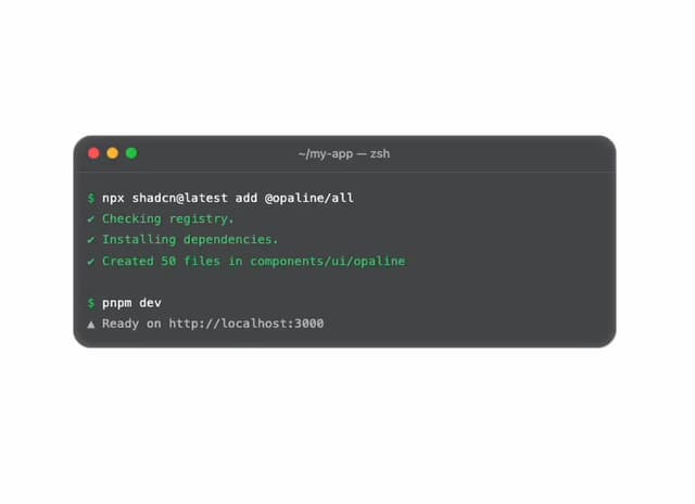
Glass Terminal
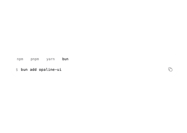
Glass Snippet
Glass Textarea
More in Cards
View all

Statistics Card 7
294

Course Design Cards
1.1K
Statistics Card 2
267
Stats cards with links
122

Card
17
The Item one
3

Card Studio
14
Card
56
