
About
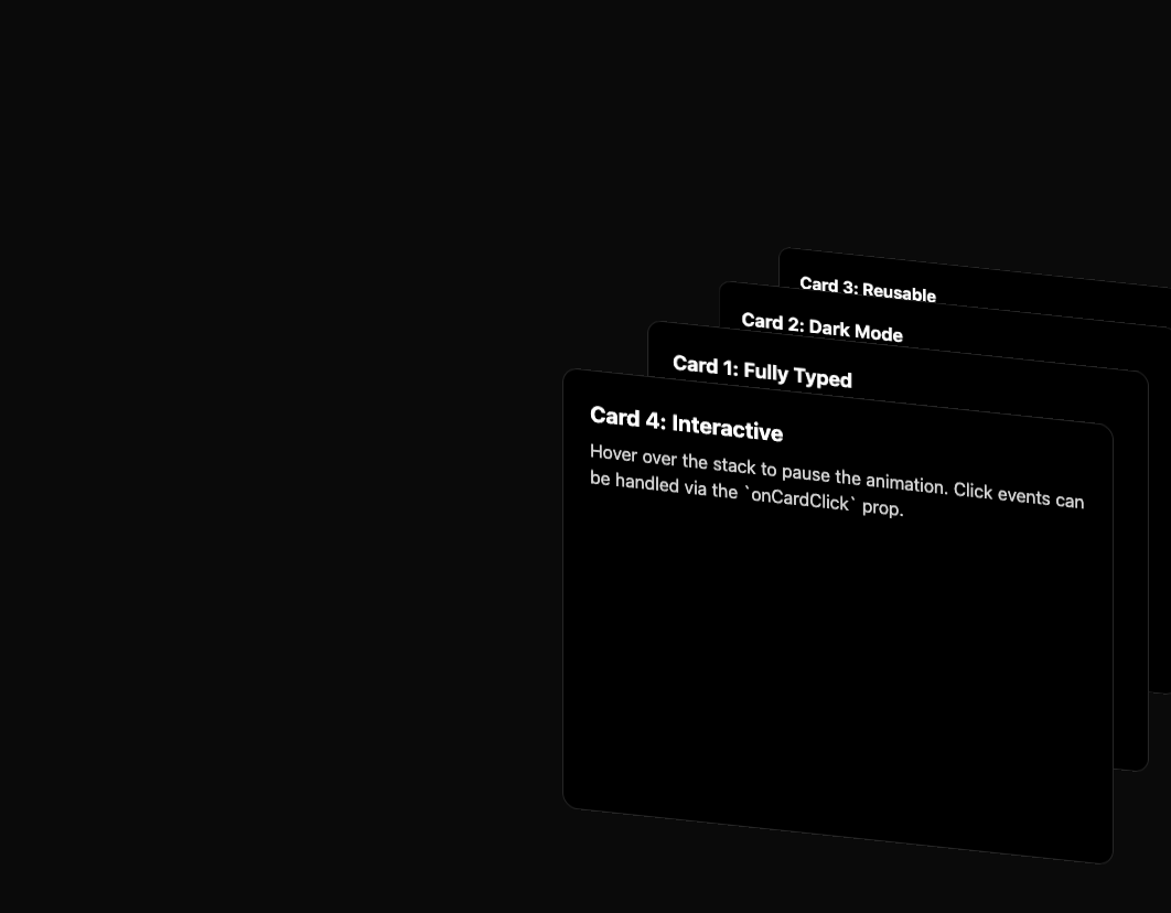
here is card swap component
Built with React and Tailwind. Copy the prompt and paste it into Claude Code, Cursor or Lovable: your agent adds card-swap to your project and fits it to your theme.
Code
How card-swap is used: the demo's code. The component's own source comes with a free account.
Usage.tsx
'use client';

import React from 'react';
import CardSwap, { Card } from '@/components/ui/card-swap';

function CardSwapDemo() {
  return (
    <div className="flex w-full h-full items-center justify-center bg-white dark:bg-neutral-950 p-4">

      <div
        className="relative w-full max-w-4xl"
        style={{ height: '600px' }}
      >
        <CardSwap
          cardDistance={60}
          verticalDistance={70}
          delay={4000}
          pauseOnHover={true}
          easing="power"
        >
          <Card>
            <h3 className="text-xl font-bold mb-2">Card 1: Fully Typed</h3>
            <p className="text-neutral-300">
              This component is now strongly typed with TypeScript for better
              developer experience and safety.
            </p>
          </Card>
          <Card>
            <h3 className="text-xl font-bold mb-2">Card 2: Dark Mode</h3>
            <p className="text-neutral-300">
              Integrated dark mode support ensures a consistent look and feel
              across different themes.
            </p>
          </Card>
          <Card>
            <h3 className="text-xl font-bold mb-2">Card 3: Reusable</h3>
            <p className="text-neutral-300">
              Refactored into a self-contained component, ready for production
              use anywhere in your application.
            </p>
          </Card>
          <Card>
            <h3 className="text-xl font-bold mb-2">Card 4: Interactive</h3>
            <p className="text-neutral-300">
              Hover over the stack to pause the animation. Click events can be
              handled via the `onCardClick` prop.
            </p>
          </Card>
        </CardSwap>
      </div>
    </div>
  );
}

export default CardSwapDemo;
Dependencies
More by deleted
View all

Splash Cursor
1.3K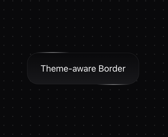
Star Border
728
Tilted Scroll
433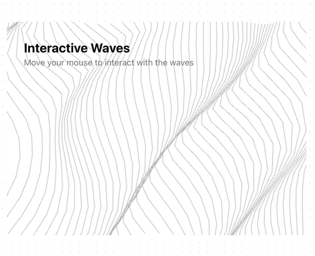
Waves Background
362
Squares Background
326
Prism
218
Grid Motion
183
Circular Gallery
173
More in Cards
View all

Course Design Cards
1.1K
Stats cards with links
119

Statistics Card 2
258
Card
55

Card Studio
9
Statistics Card 7
288
The Item one
3

Weather Card
52
