
About
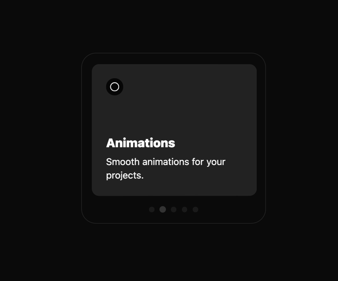
A simple minimalistic carousel slider with 3d effect
Built with React and Tailwind. Copy the prompt and paste it into Claude Code, Cursor or Lovable: your agent adds Carousel to your project and fits it to your theme.
Code
How Carousel is used: the demo's code. The component's own source comes with a free account.
Usage.tsx
import { Component } from "@/components/ui/carousel";

const DemoOne = () => {
  return (
    <div className="flex w-full h-screen justify-center items-center">
      <div style={{ height: '600px', position: 'relative' }}>
        <Component
          baseWidth={300}
          autoplay={true}
          autoplayDelay={3000}
          pauseOnHover={true}
          loop={true}
          round={false}
        />
      </div>
    </div>
  );
};

export { DemoOne };
Dependencies
More by deleted
View all

Splash Cursor
1.3K
Star Border
728
Tilted Scroll
433
Waves Background
362
Squares Background
326
Prism
218
Grid Motion
183
Circular Gallery
173
More in Cards
View all

Course Design Cards
1.1K
Stats cards with links
79

Statistics Card 2
258
Card
55

Card Studio
9
Statistics Card 7
288
The Item one
3

Weather Card
52
