
About
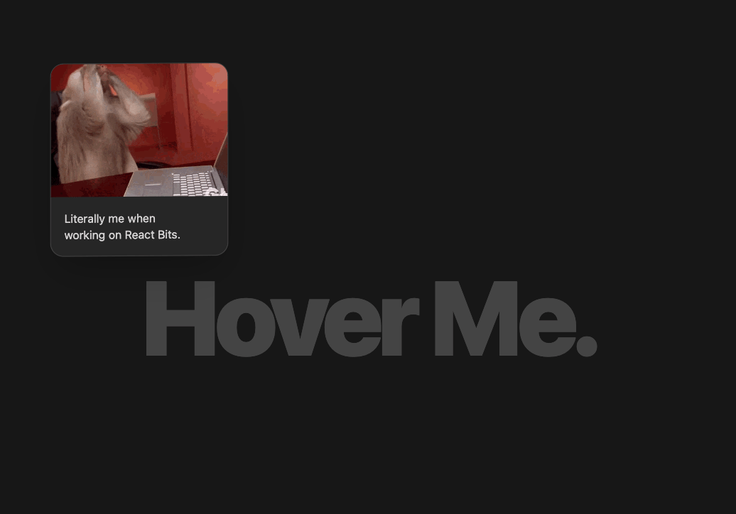
Cursor follow with gif/image animation
Built with React and Tailwind. Copy the prompt and paste it into Claude Code, Cursor or Lovable: your agent adds Follow Cursor to your project and fits it to your theme.
Code
How Follow Cursor is used: the demo's code. The component's own source comes with a free account.
Usage.tsx
import { useState, useEffect, FC } from 'react';
import { FollowCursor } from "@/components/ui/follow-cursor";

const DemoOne: FC = () => {
  const [isDarkMode, setIsDarkMode] = useState(true);

  useEffect(() => {
    const mediaQuery = window.matchMedia('(prefers-color-scheme: dark)');
    const handleChange = () => {
      const darkMode = mediaQuery.matches;
      setIsDarkMode(darkMode);
      document.documentElement.classList.toggle('dark', darkMode);
    };
    handleChange();
    mediaQuery.addEventListener('change', handleChange);
    return () => mediaQuery.removeEventListener('change', handleChange);
  }, []);

  const pageBgColor = isDarkMode ? "bg-neutral-900" : "bg-neutral-100";

  const cardBg = isDarkMode ? "bg-neutral-800" : "bg-white";
  const cardTextColor = isDarkMode ? "text-neutral-300" : "text-neutral-700";
  const cardBorder = isDarkMode ? "border-neutral-700" : "border-neutral-300";


  const bgTextColor = isDarkMode ? "text-[rgba(255,255,255,0.07)]" : "text-[rgba(0,0,0,0.07)]";


  const gifUrl = "https://cdn.21st.dev/assets/mirror/7e/7e800ed734248297bdcc10f04d4a82e0070871468f3851fe388d0623dc4b66fd.gif";

  return (
    <div className={`w-full h-screen overflow-hidden relative
                   ${pageBgColor}
                   transition-colors duration-300 cursor-none select-none`}>

    <div className="absolute inset-0 flex justify-center items-center pointer-events-none z-0">
      <h1 className={`text-[12vw] lg:text-[10rem] font-black tracking-tighter opacity-20`}>
      Hover Me.
      </h1>
    </div>


      <FollowCursor
        offsetX={30}
        offsetY={-30}
        cardWidth="240px"
        cardHeight="auto"
        rotationFactor={25}
        enableTilt={true}
        animationConfig={{ mass: 0.6, tension: 350, friction: 35 }}
        hoverScale={1.05}
        perspective="1200px"
        cardClassName={`shadow-2xl rounded-2xl overflow-hidden
                        ${cardBg} ${cardBorder} ${cardTextColor}
                        border flex flex-col`}
        style={{ zIndex: 10 }}
      >
        <img
          src={gifUrl}
          alt="Monkey typing on laptop"
          className="w-full h-auto object-cover aspect-[4/3]"
        />
        <div className="p-4">
          <p className="text-sm">
            Literally me when
          </p>
          <p className="text-sm">
            working on React Bits.
          </p>
        </div>
      </FollowCursor>

    </div>
  );
};

export { DemoOne };
Dependencies
More by deleted
View all

Splash Cursor
1.3K
Star Border
728
Tilted Scroll
433
Waves Background
362
Squares Background
326
Prism
218
Grid Motion
183
Circular Gallery
173
More in Cards
View all
Stats cards with links
120

Course Design Cards
1.1K

Statistics Card 2
258
Card
56

Card Studio
9
Statistics Card 7
289
The Item one
3

Weather Card
52
