
About
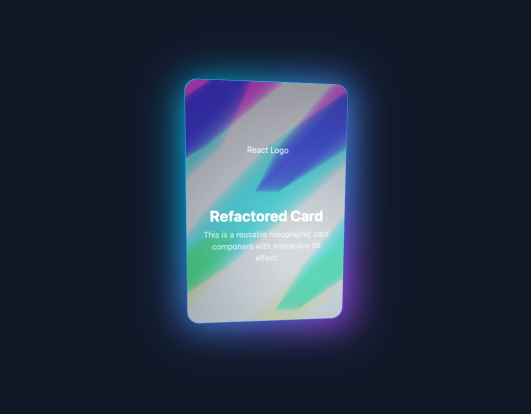
here is holographic reusable card
Built with React and Tailwind. Copy the prompt and paste it into Claude Code, Cursor or Lovable: your agent adds holographic-card to your project and fits it to your theme.
Code
How holographic-card is used: the demo's code. The component's own source comes with a free account.
Usage.tsx
import React from 'react';
import HolographicCard from '@/components/ui/holographic-card';
import Image from 'next/image';

function HolographicCardDemo() {
  return (
    <main className="flex min-h-screen w-full items-center justify-center bg-gray-900 p-4">
      <style jsx global>{`
        :root {
          --hc-card-radius: 24px;
        }
        .hc-wrapper {
          perspective: 600px;
          transform: translate3d(0,0,0.1px);
          position: relative;
        }
        .hc-wrapper::before {
          content: '';
          position: absolute;
          inset: -15px;
          background: radial-gradient(circle at 50% 50%, #00c1ffff 1%, #073aff00 76%), conic-gradient(from 124deg at 50% 50%, #c137ffff 0%, #07c6ffff 40%, #07c6ffff 60%, #c137ffff 100%);
          border-radius: inherit;
          transition: all 0.6s ease;
          filter: contrast(1.5) saturate(1.5) blur(40px);
          transform: scale(0.85);
          opacity: 0.5;
        }
        .hc-wrapper.active::before {
          filter: contrast(1) saturate(1) blur(40px);
          transform: scale(0.95);
          opacity: 1;
        }
        .hc-card {
          width: 320px;
          height: 480px;
          border-radius: var(--hc-card-radius);
          position: relative;
          background: radial-gradient(farthest-side circle at var(--pointer-x) var(--pointer-y), hsla(266, 100%, 90%, var(--card-opacity, 0)) 4%, hsla(266, 0%, 60%, 0) 100%), radial-gradient(35% 52% at 55% 20%, #00ffaac4 0%, #073aff00 100%), radial-gradient(100% 100% at 50% 50%, #00c1ffff 1%, #073aff00 76%), conic-gradient(from 124deg at 50% 50%, #c137ffff 0%, #07c6ffff 40%, #07c6ffff 60%, #c137ffff 100%);
          overflow: hidden;
          transform-style: preserve-3d;
          transition: transform 1s ease;
          transform: rotateY(var(--rotate-y, 0deg)) rotateX(var(--rotate-x, 0deg));
        }
        .hc-card.active {
          transition: transform 0.1s ease;
        }
        .hc-card * {
          transform-style: preserve-3d;
        }
        .hc-inside {
          position: absolute;
          inset: 1px;
          border-radius: var(--hc-card-radius);
          background: linear-gradient(145deg, #2d2333 0%, #3a5e74 100%);
          transform: translateZ(0.1px);
          overflow: hidden;
        }
        .hc-shine {
          position: absolute;
          inset: 0;
          z-index: 3;
          background: repeating-linear-gradient(0deg, hsl(53, 100%, 69%) calc(5% * 1), hsl(93, 100%, 69%) calc(5% * 2), hsl(176, 100%, 76%) calc(5% * 3), hsl(228, 100%, 74%) calc(5% * 4), hsl(283, 100%, 73%) calc(5% * 5), hsl(2, 100%, 73%) calc(5% * 6), hsl(53, 100%, 69%) calc(5% * 7)), repeating-linear-gradient(-45deg, #0e152e 0%, hsl(180, 10%, 60%) 3.8%, hsl(180, 29%, 66%) 4.5%, hsl(180, 10%, 60%) 5.2%, #0e152e 10%, #0e152e 12%);
          background-position: 0 var(--background-y, 50%), var(--background-x, 50%) var(--background-y, 50%);
          background-size: 500% 500%, 300% 300%;
          background-blend-mode: color-dodge;
          filter: brightness(0.8) contrast(1.5) saturate(0.8);
          opacity: 0.5;
          mix-blend-mode: color-dodge;
        }
        .hc-glare {
          position: absolute;
          inset: 0;
          z-index: 4;
          background: radial-gradient(farthest-corner circle at var(--pointer-x) var(--pointer-y), hsla(0,0%,100%,0.8) 10%, hsla(0,0%,100%,0) 80%);
          mix-blend-mode: overlay;
          opacity: calc(var(--pointer-from-center, 0) * 0.7 + 0.3);
        }
        .hc-content-wrapper {
          position: relative;
          z-index: 5;
          width: 100%;
          height: 100%;
          padding: 2rem;
          color: white;
          transform: translateZ(1px);
        }
      `}</style>
      <HolographicCard>
        <div className="flex flex-col h-full items-center justify-center text-center">
            <Image
              src="https://raw.githubusercontent.com/firat/logo/master/react.png"
              width={100}
              height={100}
              alt="React Logo"
              className="mb-6 opacity-80"
            />
            <h2 className="text-3xl font-bold text-white mb-2">Refactored Card</h2>
            <p className="text-white/70">
              This is a reusable holographic card component with interactive tilt effect.
            </p>
        </div>
      </HolographicCard>
    </main>
  );
}

export default HolographicCardDemo;More by deleted
View all

Splash Cursor
1.3K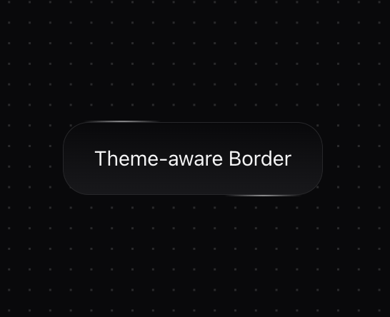
Star Border
728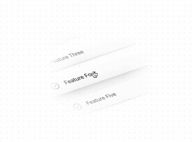
Tilted Scroll
433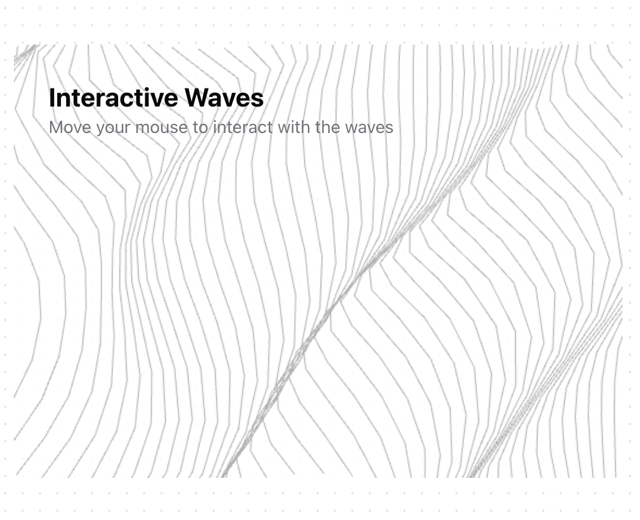
Waves Background
362
Squares Background
326
Prism
218
Grid Motion
183
Circular Gallery
173
More in Cards
View all

Statistics Card 2
263
Card
70
Stats cards with links
39

Course Design Cards
1.1K
The Item one
3

Card Studio
7
Statistics Card 7
290

Item
10
