
About
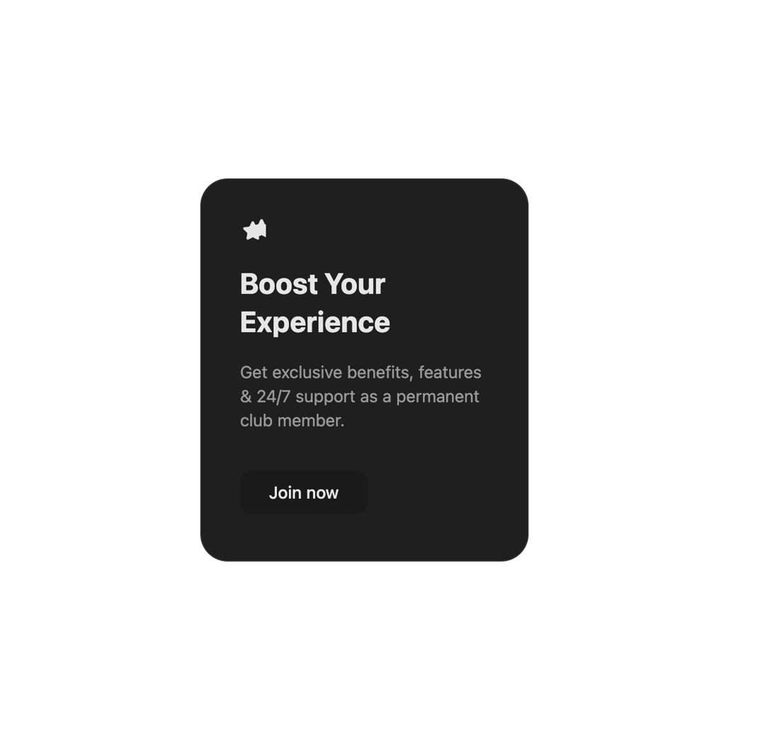
The shiny futuristic spotlight card
Built with React and Tailwind. Copy the prompt and paste it into Claude Code, Cursor or Lovable: your agent adds Spotlight Card to your project and fits it to your theme.
Code
How Spotlight Card is used: the demo's code. The component's own source comes with a free account.
Usage.tsx
import React, { useState, useEffect } from 'react';
import { SpotlightCard } from "@/components/ui/spotlight-card";

const SparkleIcon = () => (
  <svg
    width="24"
    height="24"
    viewBox="0 0 24 24"
    fill="none"
    xmlns="http://www.w3.org/2000/svg"
  >
    <path
      fillRule="evenodd"
      clipRule="evenodd"
      d="M10.7833 3.99612C11.2336 3.01258 12.7664 3.01258 13.2167 3.99612L14.7733 7.42065C14.966 7.84278 15.4087 8.12516 15.8953 8.17513L19.7828 8.57147C20.8149 8.67566 21.1441 9.94056 20.3542 10.686L17.4819 13.4326C17.1352 13.7663 16.9806 14.2389 17.0658 14.6973L17.7679 18.5204C17.9547 19.5392 16.901 20.2523 15.9922 19.7997L12.5855 18.0664C12.1802 17.8596 11.8198 17.8596 11.4145 18.0664L8.00782 19.7997C7.09899 20.2523 6.04533 19.5392 6.23211 18.5204L6.93424 14.6973C7.0194 14.2389 6.86477 13.7663 6.51813 13.4326L3.64579 10.686C2.8559 9.94056 3.18509 8.67566 4.21719 8.57147L8.10471 8.17513C8.59134 8.12516 9.03402 7.84278 9.22668 7.42065L10.7833 3.99612Z"
      fill="var(--icon-color)"
    />
    <path
      fillRule="evenodd"
      clipRule="evenodd"
      d="M18.7833 1.99612C19.2336 1.01258 20.7664 1.01258 21.2167 1.99612L22.7733 5.42065C22.966 5.84278 23.4087 6.12516 23.8953 6.17513L27.7828 6.57147C28.8149 6.67566 29.1441 7.94056 28.3542 8.686L25.4819 11.4326C25.1352 11.7663 24.9806 12.2389 25.0658 12.6973L25.7679 16.5204C25.9547 17.5392 24.901 18.2523 23.9922 17.7997L20.5855 16.0664C20.1802 15.8596 19.8198 15.8596 19.4145 16.0664L16.0078 17.7997C15.099 18.2523 14.0453 17.5392 14.2321 16.5204L14.9342 12.6973C15.0194 12.2389 14.8648 11.7663 14.5181 11.4326L11.6458 8.686C10.8559 7.94056 11.1851 6.67566 12.2172 6.57147L16.1047 6.17513C16.5913 6.12516 17.034 5.84278 17.2267 5.42065L18.7833 1.99612Z"
      fill="var(--icon-color)"
    />
  </svg>
);


const SpotlightCardDemo = () => {
  const [isDark, setIsDark] = useState(true); // Start with 'dark' theme to match the image default

  useEffect(() => {
    // Manages the 'dark' class on the root HTML element
    if (isDark) {
      document.documentElement.classList.add("dark");
    } else {
      document.documentElement.classList.remove("dark");
    }
  }, [isDark]);

  const toggleTheme = () => {
    setIsDark(!isDark);
  };

  return (
    // Main container background: black by default (matching image), white in light mode
    <div className="flex w-full min-h-screen flex-col justify-center items-center p-4 transition-colors duration-300 bg-black dark:bg-white">
      <div className="absolute top-4 right-4">
        <button
          onClick={toggleTheme}
          // Button styling uses direct Tailwind classes that respond to dark mode
          className="p-2 rounded-full border border-gray-700 dark:border-gray-300 bg-gray-900 dark:bg-gray-100 text-white dark:text-black"
        >
        </button>
      </div>

      <SpotlightCard
        className="w-[300px] h-[350px] gap-4"
        // spotlightColor="rgba(0, 229, 255, 0.2)" // Optional: override default spotlight color
      >
        <SparkleIcon />
        <h2 className="text-2xl font-bold" style={{ color: 'var(--heading-text)' }}>Boost Your Experience</h2>
        <p className="text-sm" style={{ color: 'var(--paragraph-text)' }}>
          Get exclusive benefits, features & 24/7 support as a permanent club member.
        </p>
        <button className="mt-4 px-6 py-2 rounded-lg text-sm font-medium transition-colors"
                style={{
                  backgroundColor: 'var(--button-bg)',
                  color: 'var(--button-text)'
                }}>
          Join now
        </button>
      </SpotlightCard>
    </div>
  );
};

export { SpotlightCardDemo };More by deleted
View all

Splash Cursor
1.3K
Star Border
728
Tilted Scroll
433
Waves Background
362
Squares Background
326
Prism
218
Grid Motion
183
Circular Gallery
173
More in Features
View all

Features 8
3K

Feature Sections
52

Grid Feature Cards
1.9K
Features Card
199
Feature with image
149
Feature Modern
20
Feature with advantages
278
Features 1
278


