
About
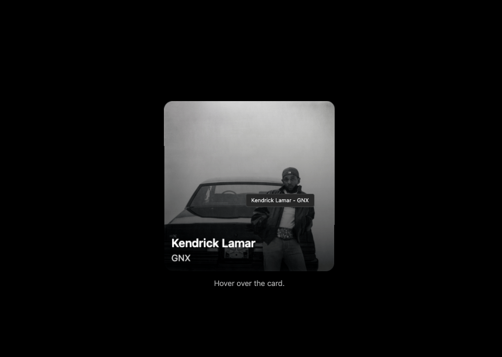
A 3d tilted card
Built with React and Tailwind. Copy the prompt and paste it into Claude Code, Cursor or Lovable: your agent adds Tilted Card to your project and fits it to your theme.
Code
How Tilted Card is used: the demo's code. The component's own source comes with a free account.
Usage.tsx
import { useState, useEffect, FC } from 'react';
import { TiltedCard } from "@/components/ui/tilted-card";

const DemoOne: FC = () => {
  const [isDarkMode, setIsDarkMode] = useState(true);

  useEffect(() => {
    const mediaQuery = window.matchMedia('(prefers-color-scheme: dark)');
    const handleChange = () => {
      const darkMode = mediaQuery.matches;
      setIsDarkMode(darkMode);
      document.documentElement.classList.toggle('dark', darkMode);
    };
    handleChange();
    mediaQuery.addEventListener('change', handleChange);
    return () => mediaQuery.removeEventListener('change', handleChange);
  }, []);

  const imageSrcVal = "https://i.scdn.co/image/ab67616d0000b273d9985092cd88bffd97653b58";
  const altTextVal = "Kendrick Lamar - GNX Album Cover";
  const captionTextVal = "Kendrick Lamar - GNX";
  const containerHeightVal = "300px";
  const containerWidthVal = "300px";
  const imageHeightVal = "100%";
  const imageWidthVal = "100%";
  const rotateAmplitudeVal = 12;
  const scaleOnHoverVal = 1.15;
  const showMobileWarningVal = false;
  const showTooltipVal = true;
  const displayOverlayContentVal = true;

  // Page uses Tailwind's dark: prefix directly
  const pageClasses = "bg-white text-black dark:bg-black dark:text-white";

  // Overlay theming using Tailwind's dark: prefix
  const overlayBgGradient = "from-neutral-200/80 to-transparent dark:from-black/80 dark:to-transparent";
  const overlayPrimaryTextColor = "text-black dark:text-white";
  const overlaySecondaryTextColor = 'text-neutral-700 dark:text-neutral-300';

  // Tooltip theming directly using Tailwind classes with dark: prefix
  // This will be passed to TiltedCard's tooltipClassName prop
  const tooltipThemeClassesForProp = "bg-white text-neutral-800 border border-neutral-300 dark:bg-neutral-800 dark:text-neutral-200 dark:border-neutral-700";

  const overlayContentJsx = (
    <div className={`absolute inset-0 flex flex-col justify-end p-4
                    bg-gradient-to-t ${overlayBgGradient}
                    rounded-b-[15px]`}>
      <p className={`text-lg font-semibold ${overlayPrimaryTextColor} drop-shadow-sm`}>
        Kendrick Lamar
      </p>
      <p className={`text-sm ${overlaySecondaryTextColor} drop-shadow-sm`}>
        GNX
      </p>
    </div>
  );

  return (
    <div className={`flex flex-col w-full min-h-screen justify-center items-center
                   p-4 ${pageClasses} transition-colors duration-300`}>

      <TiltedCard
        imageSrc={imageSrcVal}
        altText={altTextVal}
        captionText={captionTextVal}
        containerHeight={containerHeightVal}
        containerWidth={containerWidthVal}
        imageHeight={imageHeightVal}
        imageWidth={imageWidthVal}
        rotateAmplitude={rotateAmplitudeVal}
        scaleOnHover={scaleOnHoverVal}
        showMobileWarning={showMobileWarningVal}
        showTooltip={showTooltipVal}
        displayOverlayContent={displayOverlayContentVal}
        overlayContent={overlayContentJsx}
        tooltipClassName={tooltipThemeClassesForProp} // Pass the fully formed Tailwind string
      />

       <p className={`text-center text-sm mt-8 text-neutral-600 dark:text-neutral-400`}>
        Hover over the card.
      </p>
    </div>
  );
};

export { DemoOne };
Dependencies
More by deleted
View all

Splash Cursor
1.3K
Star Border
728
Tilted Scroll
433
Waves Background
362
Squares Background
326
Prism
218
Grid Motion
183
Circular Gallery
173
More in Cards
View all

Statistics Card 2
263
Stats cards with links
39
Card
70

Course Design Cards
1.1K
The Item one
3

Card Studio
7
Statistics Card 7
291
Item
10
