
About
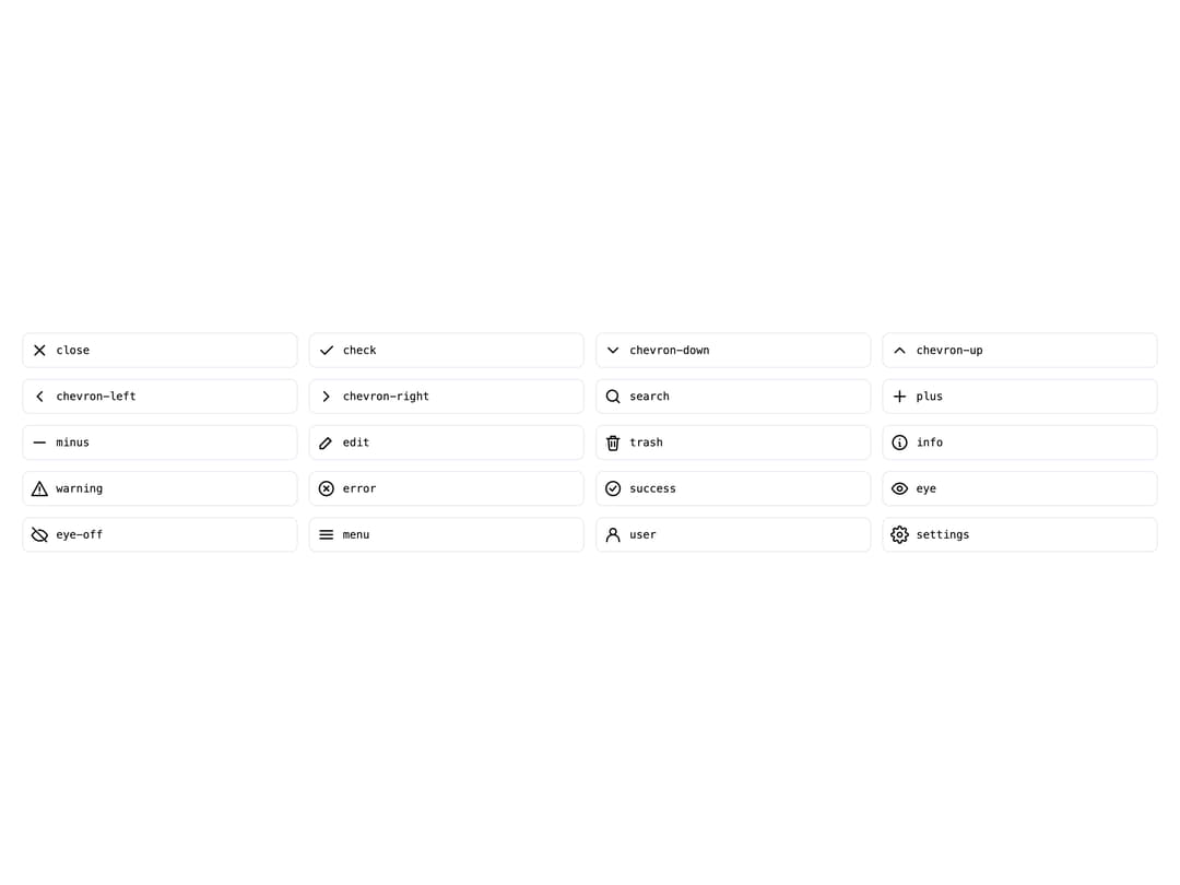
A lightweight SVG icon component that renders any icon from a small built-in outline icon set by name, with configurable size and color.
Built with React and Tailwind. Copy the prompt and paste it into Claude Code, Cursor or Lovable: your agent adds Icon to your project and fits it to your theme.
Code
How Icon is used: the demo's code. The component's own source comes with a free account.
Usage.tsx
import Icon from "@/components/ui/icon";

const ICON_NAMES = [
  "close",
  "check",
  "chevron-down",
  "chevron-up",
  "chevron-left",
  "chevron-right",
  "search",
  "plus",
  "minus",
  "edit",
  "trash",
  "info",
  "warning",
  "error",
  "success",
  "eye",
  "eye-off",
  "menu",
  "user",
  "settings",
] as const;

export default function IconAllDemo() {
  return (
    <div className="grid w-full grid-cols-4 gap-3 p-6">
      {ICON_NAMES.map((name) => (
        <div
          key={name}
          className="flex items-center gap-2 rounded-md border p-2"
          style={{ borderColor: "var(--tatva-color-border)" }}
        >
          <Icon name={name} label={name} />
          <span className="font-mono text-xs">{name}</span>
        </div>
      ))}
    </div>
  );
}
More by dixant
View all
Tooltip
Pagination

Skeleton
Radio Group
More in Galleries
View all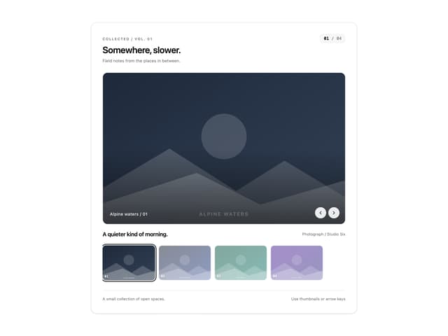
Thumbnail image viewer
99

Animated Gallery
1.5K

Image Gallery
130
Editorial Collage Hero
499

Elastic Gallery
1.1K

Astryx Aspect Ratio
4
Layout Grid
906

File Upload
20

