
About
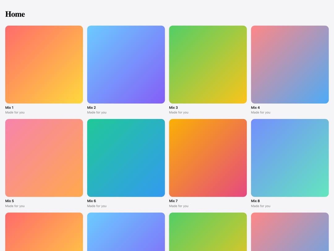
A floating iOS-style tab bar with a liquid-glass selection indicator that stretches between tabs and magnifies the active icon as it settles.
Built with React and Tailwind. Copy the prompt and paste it into Claude Code, Cursor or Lovable: your agent adds Glass Tab Bar to your project and fits it to your theme.
Code
How Glass Tab Bar is used: the demo's code. The component's own source comes with a free account.
Usage.tsx
"use client";

import GlassTabBarDemoTarget from "@/components/ui/glass-tab-bar";
import { useState } from "react";

const I = {
  home: (
    <svg viewBox="0 0 24 24">
      <path d="M4 10.5 12 4l8 6.5V20h-5v-6H9v6H4z" />
    </svg>
  ),
  library: (
    <svg viewBox="0 0 24 24">
      <path d="M5 4v16M9 4v16M13.5 5l4.5 14.5" />
    </svg>
  ),
  radio: (
    <svg viewBox="0 0 24 24">
      <circle cx="12" cy="12" r="2" />
      <path d="M7.8 7.8a6 6 0 0 0 0 8.4M16.2 7.8a6 6 0 0 1 0 8.4M5 5a10 10 0 0 0 0 14M19 5a10 10 0 0 1 0 14" />
    </svg>
  ),
  profile: (
    <svg viewBox="0 0 24 24">
      <circle cx="12" cy="8.5" r="3.5" />
      <path d="M5 20c1-3.5 3.8-5.5 7-5.5s6 2 7 5.5" />
    </svg>
  ),
};

const ALBUMS = [
  ["#ff6b6b", "#ffd93d"],
  ["#6bcBff", "#845ef7"],
  ["#51cf66", "#fcc419"],
  ["#ff8787", "#4dabf7"],
  ["#f783ac", "#ffa94d"],
  ["#20c997", "#339af0"],
  ["#fab005", "#e64980"],
  ["#748ffc", "#63e6be"],
];

export default function Demo() {
  const [tab, setTab] = useState("home");
  return (
    <div className="relative h-full min-h-[34rem] w-full overflow-hidden bg-[#f5f5f7]">
      <div className="h-full overflow-y-auto px-5 pb-32 pt-8">
        <p className="font-[family-name:Geist] text-[1.9rem] font-bold tracking-[-0.02em] text-black">
          {tab[0].toUpperCase() + tab.slice(1)}
        </p>
        <div className="mt-5 grid grid-cols-2 gap-4 sm:grid-cols-4">
          {ALBUMS.concat(ALBUMS).map(([a, b], i) => (
            <div key={i}>
              <div
                className="aspect-square rounded-xl"
                style={{ background: `linear-gradient(135deg, ${a}, ${b})` }}
              />
              <p className="mt-1.5 text-[0.8125rem] font-medium text-black">
                Mix {i + 1}
              </p>
              <p className="text-[0.75rem] text-[#8e8e93]">Made for you</p>
            </div>
          ))}
        </div>
      </div>
      <div className="pointer-events-none absolute inset-x-0 bottom-5 flex justify-center">
        <div className="pointer-events-auto">
          <GlassTabBarDemoTarget
            value={tab}
            onChange={setTab}
            tabs={[
              { id: "home", label: "Home", icon: I.home },
              { id: "library", label: "Library", icon: I.library },
              { id: "radio", label: "Radio", icon: I.radio },
              { id: "profile", label: "Profile", icon: I.profile },
            ]}
            side={
              <button type="button" aria-label="Search">
                <svg viewBox="0 0 24 24">
                  <circle cx="11" cy="11" r="6.5" />
                  <path d="M16 16l4 4" />
                </svg>
              </button>
            }
          />
        </div>
      </div>
    </div>
  );
}
More by ham7a311
View all
Wave Mesh
137
Route Globe
125
Glass Tiles
109
Glyph Swell
50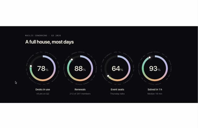
Orbit Ring Stats
47
Ask Bar
38
Glass Ribbons
30
Intent Label
29
More in Navigation
View all

Sidebar
348

Pagination
102

Oversized 404 Numeral
69

Breadcramb
41

Sidebar
355
Navbar with Theme Toggle
57
Dorpdown Navigation
235
Navbar
7

