
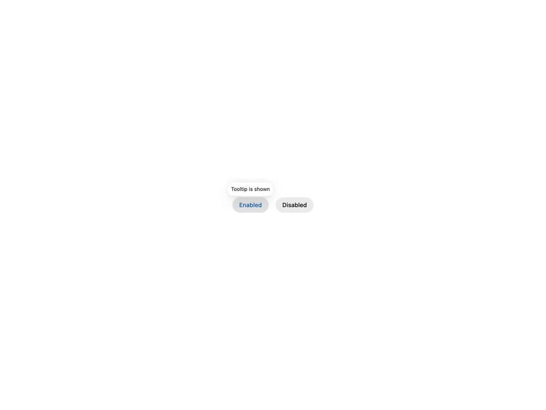
Accessible tooltip built on React Aria, from HeroUI v3. Shows informative text when users hover over or focus an element. Supports an optional arrow indicator, four placements (top/bottom/left/right), custom open/close delays, controlled offset, a disabled state, custom non-button triggers (avatars, chips, icons), custom-styled content, and a render-prop escape hatch. Compound API: Tooltip / Tooltip.Trigger / Tooltip.Content / Tooltip.Arrow, with delay, closeDelay, trigger, isDisabled, showArrow, offset and placement props.
Built with React and Tailwind. Copy the prompt and paste it into Claude Code, Cursor or Lovable: your agent adds Tooltip to your project and fits it to your theme.
Code
How Tooltip is used: the demo's code. The component's own source comes with a free account.
Usage.tsx
"use client"

import { Button, Tooltip } from "@/components/ui/heroui-tooltip"

export default function Demo() {
  return (
    <div className="flex items-center justify-center gap-4 p-12">
      <Tooltip delay={0}>
        <Button variant="secondary">Enabled</Button>
        <Tooltip.Content>
          <p>Tooltip is shown</p>
        </Tooltip.Content>
      </Tooltip>

      <Tooltip delay={0} isDisabled>
        <Button variant="tertiary">Disabled</Button>
        <Tooltip.Content>
          <p>You won't see this</p>
        </Tooltip.Content>
      </Tooltip>
    </div>
  )
}
Dependencies
More by Hero Ui
View all

DatePicker
472
Chip
448
The Pagination
366
HeroUI Table
123
HeroUI Color Picker
115
Skeleton
106
HeroUI Disclosure Group
98
HeroUI AlertDialog
84
More in Buttons
View all
Button
16
Texture Button
110

Notification Button
118

Eclipse Button
44
HeroUI Button Group
2

Button
132
Button Save
50

Minimal Button
14


