
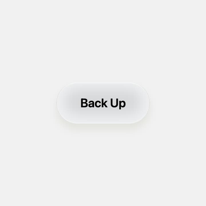
About
A soft, pillowy action button. Press it and the label rolls away into a filling progress track, then a check rises beside Done and the label rolls back, all on one spring. Controlled or timed progress, keyboard support, reduced motion, every colour a prop. More like this, plus a designer your coding agent can use, at studios.lou15.com/?ref=21st
Built with React and Tailwind. Copy the prompt and paste it into Claude Code, Cursor or Lovable: your agent adds Progress Pill to your project and fits it to your theme.
Code
How Progress Pill is used: the demo's code. The component's own source comes with a free account.
Usage.tsx
"use client";

import * as React from "react";
import { ProgressPill } from "@/components/ui/progress-pill";

/** A soft, pillowy button: press it and the label rolls away into a filling progress track, then a check rises beside Done and it rolls back. */
export default function ProgressPillDemo() {
  return (
    <main className="relative h-screen min-h-[340px] w-full overflow-hidden" style={{ backgroundColor: "#f1f1f1" }}>
      <ProgressPill label="Back Up" doneLabel="Done" duration={3} style={{ width: "100%", height: "100%" }} />
    </main>
  );
}
More by Louis Studios
View all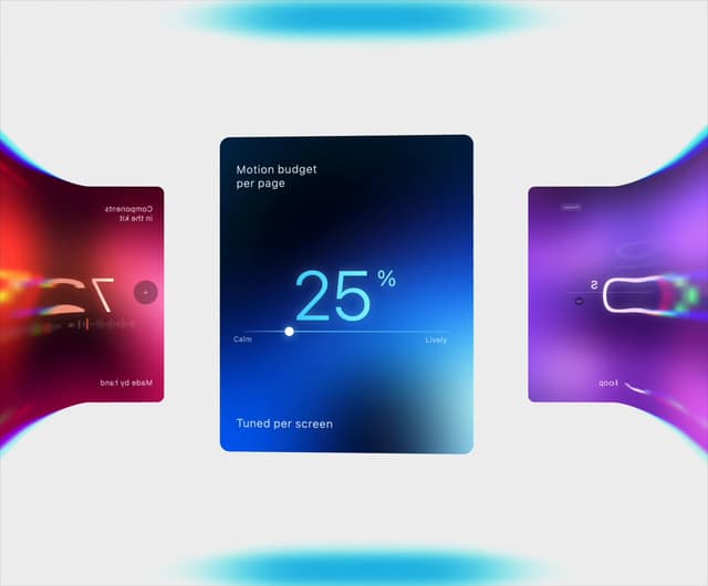

Warp Carousel
643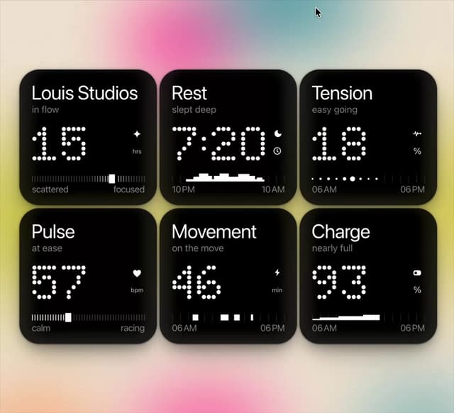
Dot Tiles
132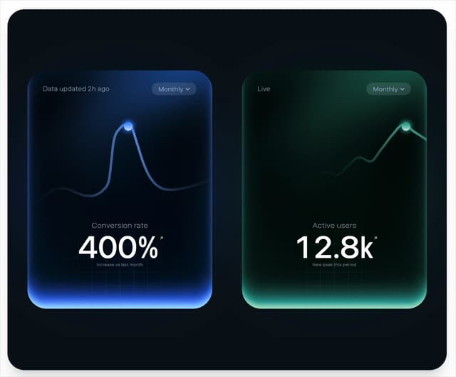
Peak Chart
118
Chapter Player
87
Glow Rocker
69
LED Badges
66
Chrome Arcs
53
Lens Clock
49
More in Buttons
View all
Button
10

Button
1
Texture Button
103

Eclipse Button
42
Native Button
12
Button
77
Button


Notification Button
113


