About
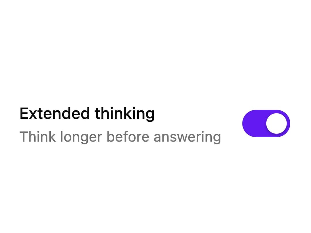
A labeled switch control with a hint line whose thumb stretches as it travels and sparks a few pixels when turned on.
Built with React and Tailwind. Copy the prompt and paste it into Claude Code, Cursor or Lovable: your agent adds Toggle to your project and fits it to your theme.
Code
How Toggle is used: the demo's code. The component's own source comes with a free account.
Usage.tsx
import UiToggle from "@/components/ui/ui-toggle";

export default function UiToggleDemo() {
  return (
    <div className="flex w-full max-w-sm items-center justify-center p-10">
      <UiToggle defaultChecked hint="Think longer before answering">
        Extended thinking
      </UiToggle>
    </div>
  );
}
More by lumesec
View all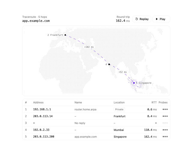

Geo Traceroute
79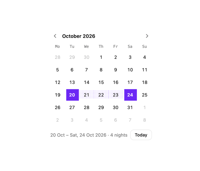
Date Picker
25
Region Picker
20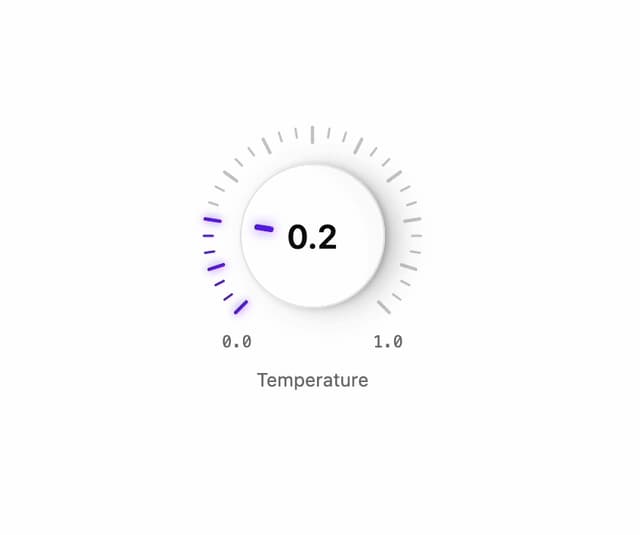
Rotary Dial
19
Pixel Toaster
14
Command Palette
11
Effort Slider
8
Pixel Select
7