
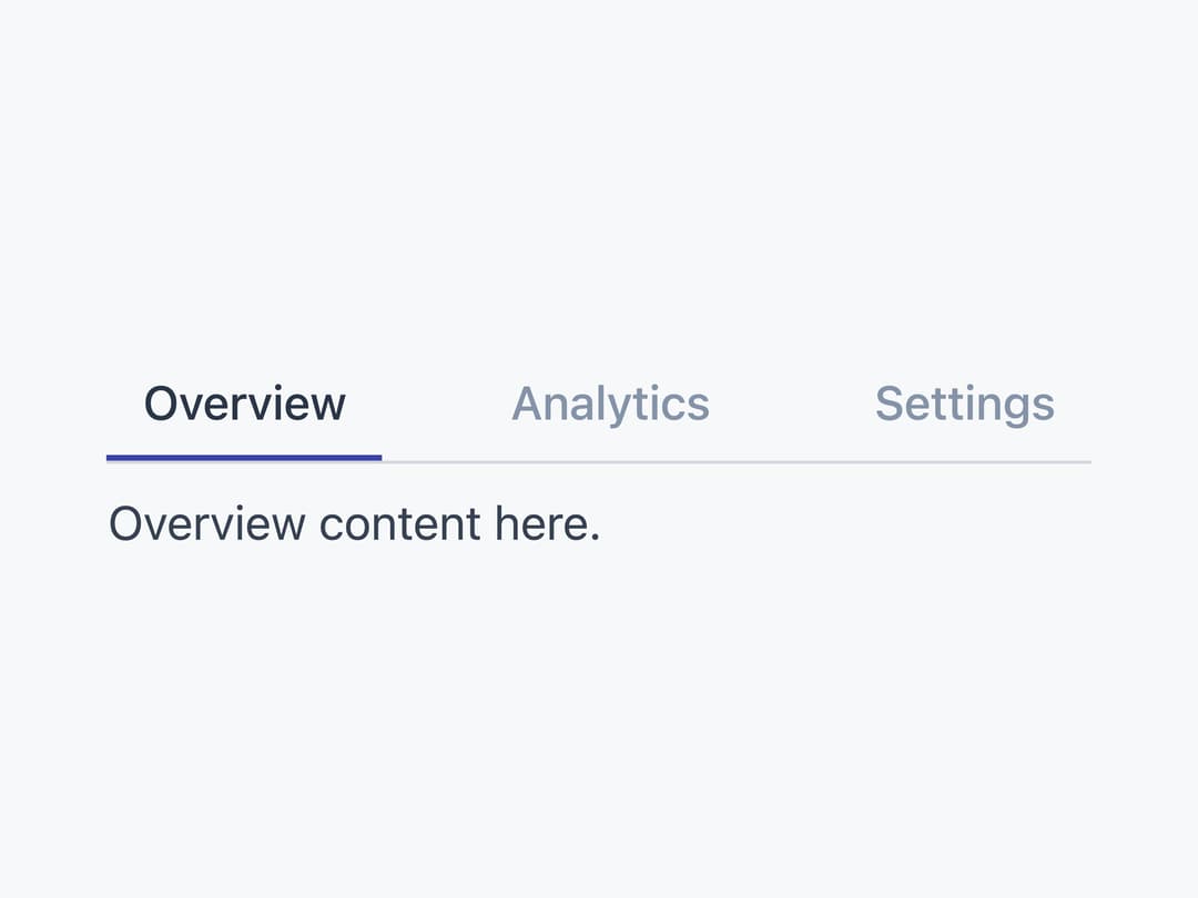
About
A tabbed interface for switching between peer sections of content on the same page, with underline (line) and compact (pill) visual styles in horizontal or vertical orientation.
Built with React and Tailwind. Copy the prompt and paste it into Claude Code, Cursor or Lovable: your agent adds Tabs to your project and fits it to your theme.
Code
How Tabs is used: the demo's code. The component's own source comes with a free account.
Usage.tsx
import { Tabs, TabsList, TabsTrigger, TabsContent } from "@/components/ui/tabs";

export default function TabsDemo() {
  return (
    <Tabs defaultValue="overview">
      <TabsList variant="line">
        <TabsTrigger value="overview">Overview</TabsTrigger>
        <TabsTrigger value="analytics">Analytics</TabsTrigger>
        <TabsTrigger value="settings">Settings</TabsTrigger>
      </TabsList>
      <TabsContent value="overview">Overview content here.</TabsContent>
      <TabsContent value="analytics">Analytics content here.</TabsContent>
      <TabsContent value="settings">Settings content here.</TabsContent>
    </Tabs>
  );
}
Dependencies
More by Mahmoud Ilyan
View all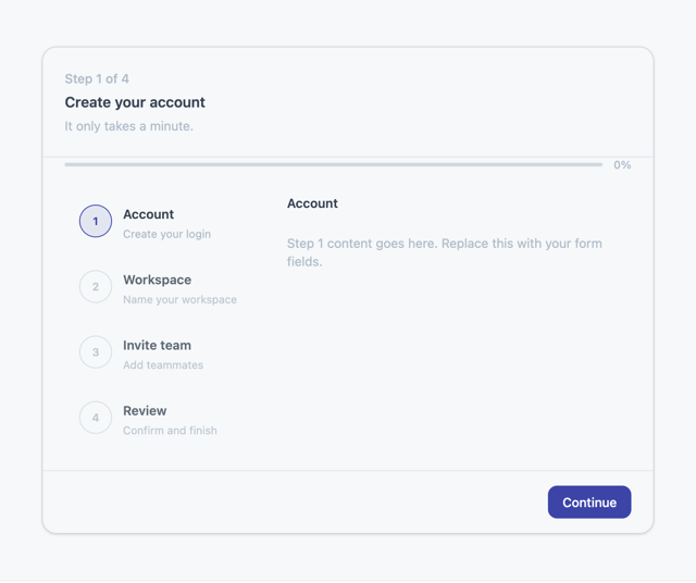
Steps
5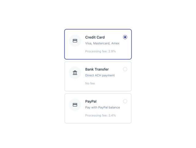
Radio Card
1
Switch
1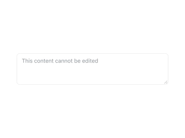
Textarea
Progress
KPI Card
Checkbox Card
Slider
More in Navigation
View all

Liquid Glass Expandable Sidebar
76

Footer with Big Wordmark
40

Sidebar
392

Oversized 404 Numeral
78
Navbar with Theme Toggle
67

NavBar
2

Pagination
109
Tabs like bookmark
82
