
About
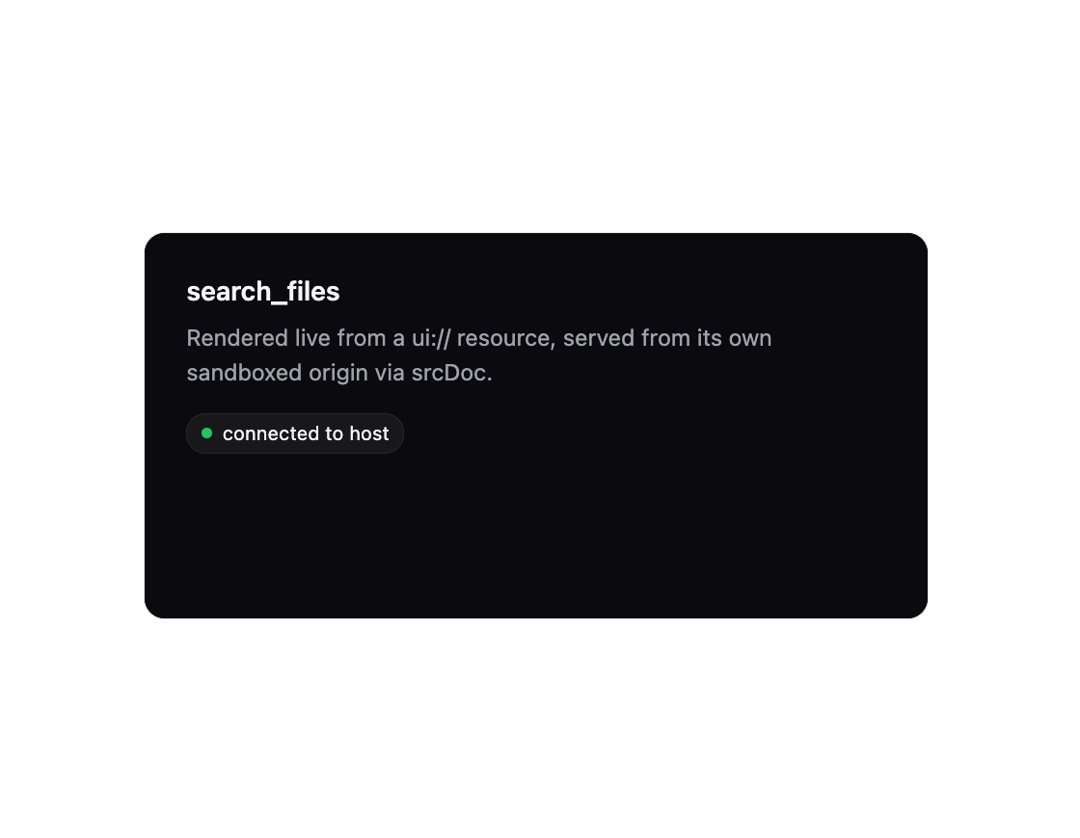
A sandboxed iframe host that renders an MCP (Model Context Protocol) app's ui:// resource and speaks the SEP-1865 postMessage/JSON-RPC handshake, proxying tool calls and streaming tool input/results into the embedded app.
Built with React and Tailwind. Copy the prompt and paste it into Claude Code, Cursor or Lovable: your agent adds MCP App Frame to your project and fits it to your theme.
Code
How MCP App Frame is used: the demo's code. The component's own source comes with a free account.
Usage.tsx
"use client";

import { McpAppFrame } from "@/components/ui/mcp-app-frame";

const demoResourceHtml = `<!doctype html>
<html>
  <head>
    <style>
      body { margin: 0; padding: 24px; font-family: system-ui, sans-serif; background: #0b0b0f; color: #f5f5f5; }
      h1 { font-size: 15px; margin: 0 0 8px; font-weight: 600; }
      p { font-size: 13px; line-height: 1.5; color: #a1a1aa; margin: 0; }
      .badge { display: inline-flex; align-items: center; gap: 6px; font-size: 11px; padding: 4px 8px; border-radius: 999px; background: #18181b; border: 1px solid #27272a; margin-top: 14px; }
      .dot { width: 6px; height: 6px; border-radius: 999px; background: #22c55e; }
    </style>
  </head>
  <body>
    <h1>search_files</h1>
    <p>Rendered live from a ui:// resource, served from its own sandboxed origin via srcDoc.</p>
    <div class="badge"><span class="dot"></span> connected to host</div>
  </body>
</html>`;

export default function McpAppFrameDemo() {
  return (
    <div className="flex w-full items-center justify-center bg-background p-6">
      <McpAppFrame
        html={demoResourceHtml}
        hostContext={{ theme: "dark" }}
        height={220}
        className="w-full max-w-md"
      />
    </div>
  );
}
Dependencies
More by mayurrawte
View all
MCP Scope Inspector
2
Feedback Buttons
2
Skeleton
2
Tooltip
1
Accordion
1
MCP Resource Browser
Counter
Dropdown Menu