
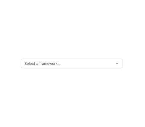
About
A keyboard-accessible custom select dropdown for choosing one option from a list of labeled values, with a styled trigger button, animated popover list, and a checkmark on the selected option.
Built with React and Tailwind. Copy the prompt and paste it into Claude Code, Cursor or Lovable: your agent adds Select Dropdown to your project and fits it to your theme.
Code
How Select Dropdown is used: the demo's code. The component's own source comes with a free account.
Usage.tsx
import Select from "@/components/ui/select";

const options = [
  { value: "react", label: "React" },
  { value: "vue", label: "Vue" },
  { value: "angular", label: "Angular" },
  { value: "svelte", label: "Svelte" },
];

export default function SelectDemo() {
  return (
    <div className="w-full max-w-sm">
      <Select options={options} placeholder="Select a framework..." />
    </div>
  );
}
Dependencies
More by mayurrawte
View all
MCP Scope Inspector
2
Feedback Buttons
2
Tooltip
2
Skeleton
2
Streaming Text
1
Accordion
1
MCP Tool Call Card
MCP Resource Browser
More in Forms
View all

Login 1
64

Premium Auth
571

Contact Card
1.1K

Form
18

Book A Demo 1
91
Authentication Card
52

Card Studio
47

Login Card
35
