
About
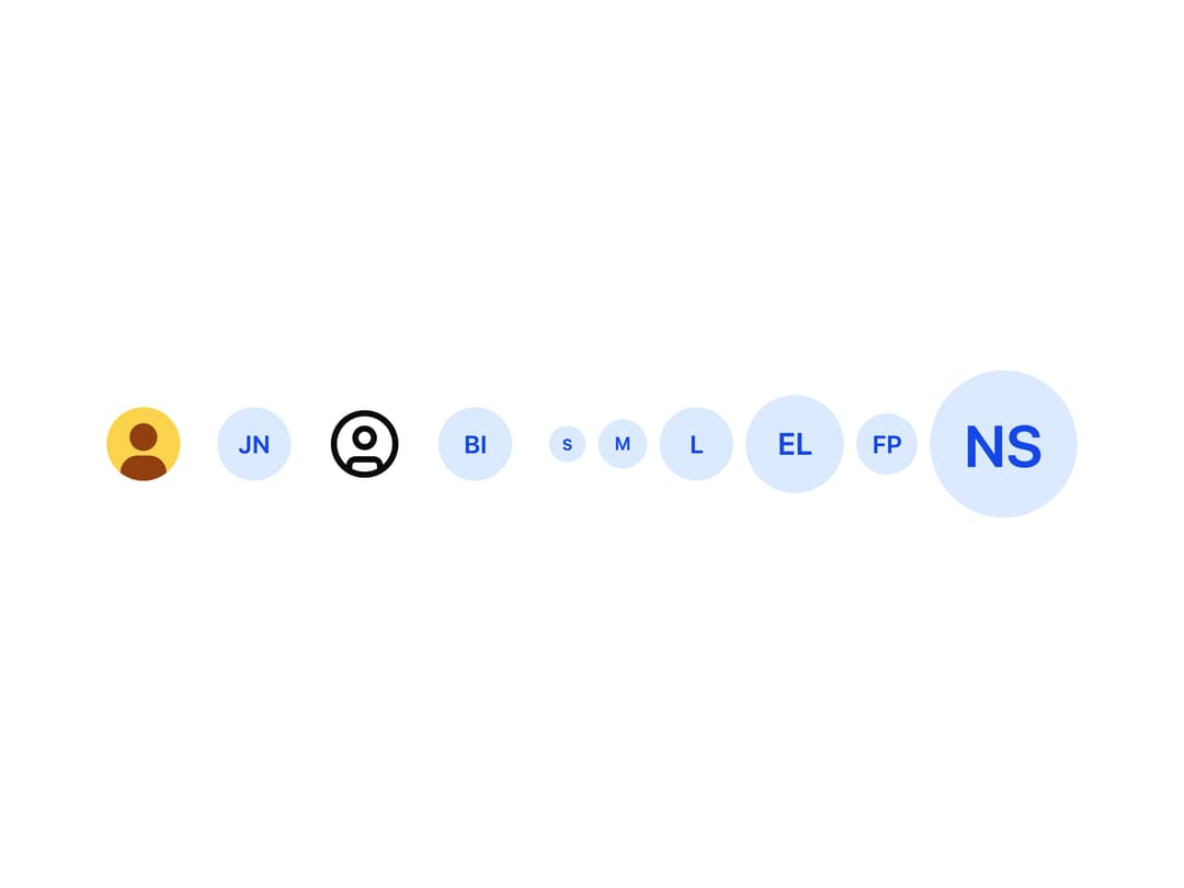
A circular or square profile picture that shows a person's photo, falls back to their initials or a generic user icon, and can display an online/offline/busy/away status dot.
Built with React and Tailwind. Copy the prompt and paste it into Claude Code, Cursor or Lovable: your agent adds Avatar to your project and fits it to your theme.
Code
How Avatar is used: the demo's code. The component's own source comes with a free account.
Usage.tsx
import Avatar from "@/components/ui/avatar";

const photo =
  "data:image/svg+xml," +
  encodeURIComponent(
    `<svg xmlns="http://www.w3.org/2000/svg" viewBox="0 0 64 64"><rect width="64" height="64" fill="#fcd34d"/><circle cx="32" cy="26" r="12" fill="#92400e"/><rect x="12" y="42" width="40" height="30" rx="15" fill="#92400e"/></svg>`,
  );

export default function Basic() {
  return (
    <div className="flex flex-wrap items-center gap-6">
      <Avatar name="Jana Nováková" size="lg" src={photo} />
      <Avatar name="Jana Nováková" size="lg" />
      <Avatar size="lg" />
      {/* A picture that fails to load falls back to the initials - here one
          that is no image at all, so the demo needs no failing request */}
      <Avatar name="Broken Image" size="lg" src="data:," />
      <div className="flex items-center gap-2">
        <Avatar name="Small" size="sm" />
        <Avatar name="Medium" size="md" />
        <Avatar name="Large" size="lg" />
        <Avatar name="Extra Large" size="xl" />
        {/* The sizes of a design - in pixels */}
        <Avatar name="Forty Pixels" size={40} />
        <Avatar name="Ninety Six" size={96} />
      </div>
    </div>
  );
}
Dependencies
More by robertlib
View all
Timeline
1
Collapsible Content
Form Description
Chip
Switch

Form Error
Select
Spinner