
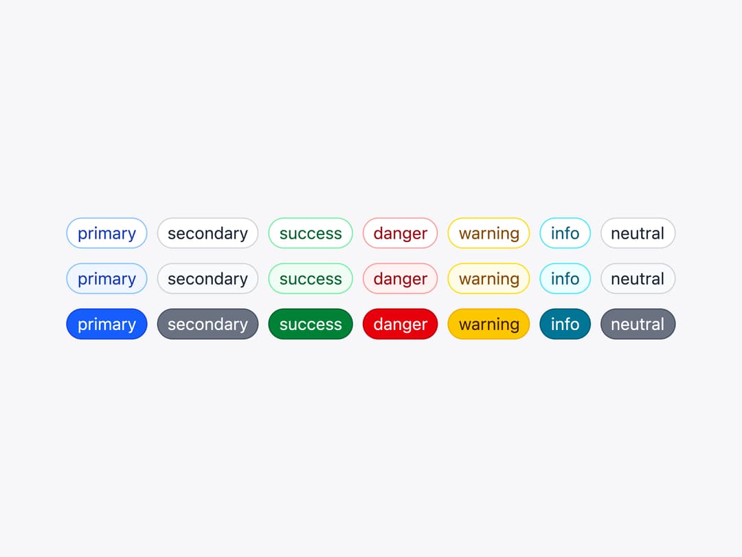
About
A small rounded label for a status or tag that can optionally be toggled (selected/pressed) or dismissed with a built-in remove button.
Built with React and Tailwind. Copy the prompt and paste it into Claude Code, Cursor or Lovable: your agent adds Chip to your project and fits it to your theme.
Code
How Chip is used: the demo's code. The component's own source comes with a free account.
Usage.tsx
import Chip from "@/components/ui/chip";

const colors = [
  "primary",
  "secondary",
  "success",
  "danger",
  "warning",
  "info",
  "neutral",
] as const;

export default function ChipDemo() {
  return (
    <div className="space-y-3">
      {(["default", "outline", "solid"] as const).map((variant) => (
        <div className="flex flex-wrap gap-2" key={variant}>
          {colors.map((color) => (
            <Chip color={color} key={color} variant={variant}>
              {color}
            </Chip>
          ))}
        </div>
      ))}
    </div>
  );
}
Dependencies
More by robertlib
View all
Timeline
1
Avatar
Collapsible Content
Form Description
Switch
Form Error
Select
Spinner