
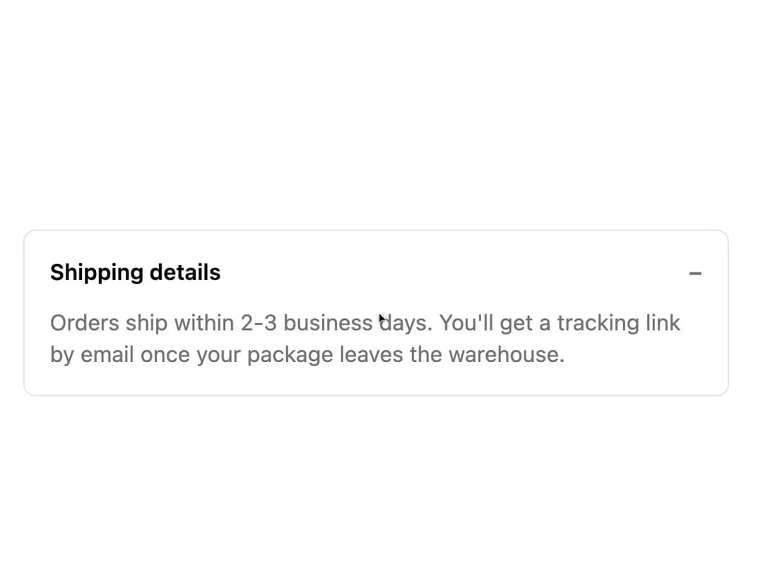
About
A wrapper that animates its children open and closed by height, for building accordions, expandable panels, and show-more sections.
Built with React and Tailwind. Copy the prompt and paste it into Claude Code, Cursor or Lovable: your agent adds Collapsible Content to your project and fits it to your theme.
Code
How Collapsible Content is used: the demo's code. The component's own source comes with a free account.
Usage.tsx
import * as React from "react";
import CollapsibleContent from "@/components/ui/collapsible-content";
export default function CollapsibleContentDemo() {
const [isOpen, setIsOpen] = React.useState(true);
return (
<div className="w-full max-w-md rounded-md border bg-card p-4 text-card-foreground">
<button
aria-controls="collapsible-demo-content"
aria-expanded={isOpen}
className="flex w-full items-center justify-between text-left text-sm font-semibold"
onClick={() => setIsOpen((open) => !open)}
type="button"
>
Shipping details
<span className="text-muted-foreground">{isOpen ? "\u2212" : "+"}</span>
</button>
<CollapsibleContent id="collapsible-demo-content" isOpen={isOpen}>
<p className="pt-3 text-sm text-muted-foreground">
Orders ship within 2-3 business days. You'll get a tracking link
by email once your package leaves the warehouse.
</p>
</CollapsibleContent>
</div>
);
}
More by robertlib
View all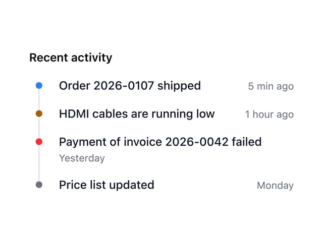
Timeline
1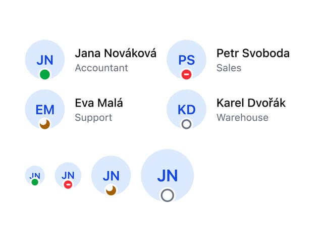
Avatar
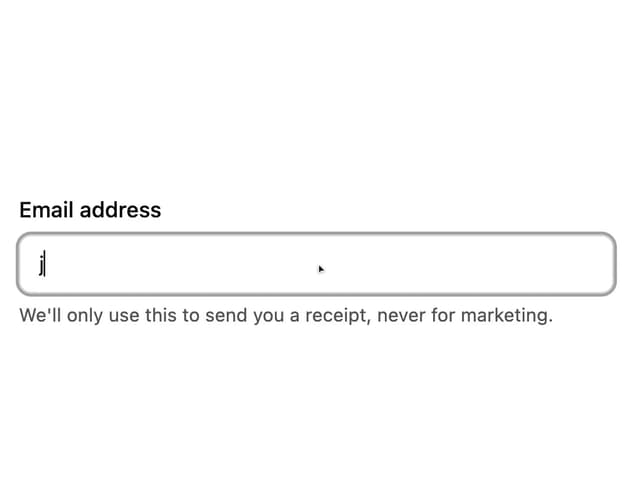
Form Description
Chip
Switch

Form Error
Select
Spinner