
About
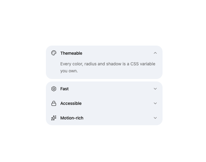
A horizontal-stack accordion whose active row detaches into a rounded pill, with neighbouring icon rows rounding their corners to meet it.
Built with React and Tailwind. Copy the prompt and paste it into Claude Code, Cursor or Lovable: your agent adds Icon Accordion to your project and fits it to your theme.
Code
How Icon Accordion is used: the demo's code. The component's own source comes with a free account.
Usage.tsx
import { IconAccordion } from "@/components/ui/icon-accordion";
import { BoltIcon, LockIcon, PaletteIcon, SparklesIcon } from "lucide-react";

const items = [
  {
    icon: <PaletteIcon className="size-4" />,
    title: "Themeable",
    description: "Every color, radius and shadow is a CSS variable you own.",
  },
  {
    icon: <BoltIcon className="size-4" />,
    title: "Fast",
    description:
      "No runtime CSS-in-JS. Components ship as plain React and Tailwind.",
  },
  {
    icon: <LockIcon className="size-4" />,
    title: "Accessible",
    description:
      "Built on Base UI primitives with full keyboard and screen-reader support.",
  },
  {
    icon: <SparklesIcon className="size-4" />,
    title: "Motion-rich",
    description:
      "Spring physics everywhere, respecting prefers-reduced-motion.",
  },
];

export default function IconAccordionDemo() {
  return (
    <div className="w-full max-w-md">
      <IconAccordion items={items} defaultValue={0} />
    </div>
  );
}
Dependencies
More by sidiora-labs
View all
Preview Rail
2
Expandable Tabs
1
Morphing Modal
1
Not Found

Text Cascade
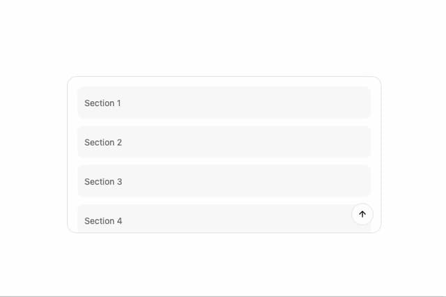
Smooth Scroll

Swap
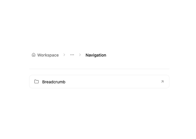
Motion Breadcrumb
More in Features
View all

Grid Feature Cards
1.9K

Feature Sections
61
Features Card
209

Features 8
3.1K
Features 1
279

Feature 72
124
Features 2
324
Feature with advantages
281

