
About
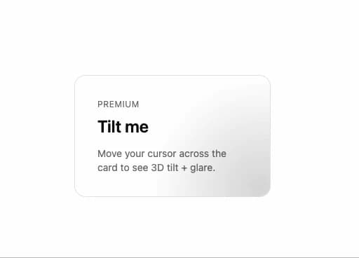
A card wrapper that tilts in 3D toward the pointer with an optional cursor-tracking glare, for product cards or feature tiles that want a subtle hover effect.
Built with React and Tailwind. Copy the prompt and paste it into Claude Code, Cursor or Lovable: your agent adds Tilt Card to your project and fits it to your theme.
Code
How Tilt Card is used: the demo's code. The component's own source comes with a free account.
Usage.tsx
import { TiltCard } from "@/components/ui/tilt-card";

export function TiltCardPreview() {
  return (
    <div className="flex items-center justify-center p-6">
      <TiltCard className="w-[280px] border border-border bg-card p-8">
        <div className="text-xs uppercase tracking-wider text-muted-foreground">
          Premium
        </div>
        <h3 className="mt-2 text-2xl font-semibold text-foreground">Tilt me</h3>
        <p className="mt-3 text-sm text-muted-foreground">
          Move your cursor across the card to see 3D tilt + glare.
        </p>
      </TiltCard>
    </div>
  );
}

export default TiltCardPreview;
Dependencies
More by sidiora-labs
View all
Preview Rail
2
Expandable Tabs
1
Morphing Modal
1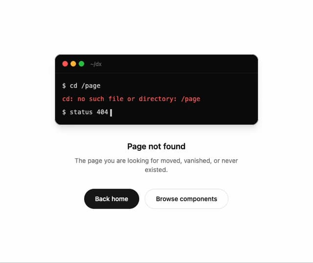
Not Found
Text Cascade
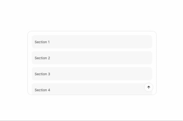
Smooth Scroll
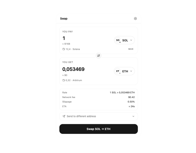
Swap
Motion Breadcrumb
More in Cards
View all

Statistics Card 7
295

Course Design Cards
1.1K

Interactive Tech Stack Bento Grid with Hover Effects
89
The Item one
3
Stats cards with links
81
Card
56
Statistics Card 2
269

Weather Card
55
