
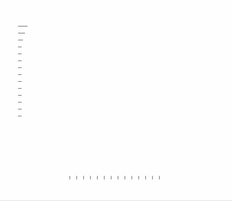
About
A vertical or horizontal link navigation rail made of small tick marks that reveals a destination's preview card on hover, tap, or keyboard focus.
Built with React and Tailwind. Copy the prompt and paste it into Claude Code, Cursor or Lovable: your agent adds Preview Rail to your project and fits it to your theme.
Code
How Preview Rail is used: the demo's code. The component's own source comes with a free account.
Usage.tsx
import { PreviewRail } from "@/components/ui/preview-rail";

export const previewRailItems = [
  {
    id: "dashboard",
    label: "Dashboard",
    description: "Return to your workspace overview and recent activity.",
    href: "#dashboard",
  },
  {
    id: "components",
    label: "Components",
    description: "Browse motion primitives for React and Next.js.",
    href: "#components",
  },
  {
    id: "blocks",
    label: "Blocks",
    description: "Explore composed, product-ready interface blocks.",
    href: "#blocks",
  },
  {
    id: "playground",
    label: "Playground",
    description: "Tune motion values and preview behavior live.",
    href: "#playground",
  },
  {
    id: "docs",
    label: "Documentation",
    description: "Read installation, usage, and API reference notes.",
    href: "#docs",
  },
  {
    id: "changelog",
    label: "Changelog",
    description: "Review newly launched components and improvements.",
    href: "#changelog",
  },
  {
    id: "sponsors",
    label: "Sponsors",
    description: "Support continued development of the open-source library.",
    href: "#sponsors",
  },
  {
    id: "pro",
    label: "DX Pro",
    description: "Get premium components and lifetime access.",
    href: "#pro",
  },
  {
    id: "examples",
    label: "Examples",
    description: "See components composed in practical interface patterns.",
    href: "#examples",
  },
  {
    id: "templates",
    label: "Templates",
    description: "Start from polished layouts built with DX UI components.",
    href: "#templates",
  },
  {
    id: "guides",
    label: "Guides",
    description: "Learn how to combine motion primitives effectively.",
    href: "#guides",
  },
  {
    id: "community",
    label: "Community",
    description: "Discover what other builders are creating with DX UI.",
    href: "#community",
  },
  {
    id: "github",
    label: "GitHub",
    description: "View the source, report issues, and contribute improvements.",
    href: "#github",
  },
  {
    id: "about",
    label: "About",
    description: "Learn more about the ideas and people behind DX UI.",
    href: "#about",
  },
];

export function PreviewRailPreview() {
  return (
    <div className="flex w-full flex-col gap-8">
      <PreviewRail
        items={previewRailItems}
        defaultActiveId="docs"
        className="mx-auto h-[360px] w-full max-w-2xl"
      />
      <PreviewRail
        items={previewRailItems}
        orientation="horizontal"
        defaultActiveId="docs"
        className="mx-auto h-[280px] w-full max-w-2xl"
      />
    </div>
  );
}

export default PreviewRailPreview;
Dependencies
More by sidiora-labs
View all
Expandable Tabs
1
Morphing Modal
1
Not Found

Text Cascade
Smooth Scroll
Swap
Motion Breadcrumb
Wallet Card
More in Navigation
View all

Sidebar
269

Tabs
15
Pagination
108

Breadrcrumb
23

Sidebar
344
Footer
447

Pagination
90
Pagination with Arrows
5
