
About
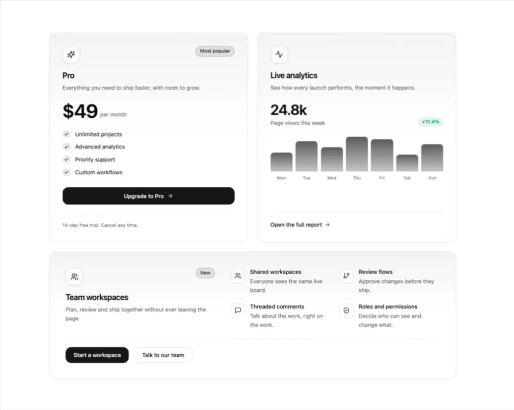
A premium Bento-grid ready card featuring an interactive 3D perspective tilt effect and a mouse-tracking neon glow border. Fully accessible, type-safe, and perfect for highlighting feature sections.
Built with React and Tailwind. Copy the prompt and paste it into Claude Code, Cursor or Lovable: your agent adds 3D Animated Tilt & Dynamic Glow Card to your project and fits it to your theme.
Code
How 3D Animated Tilt & Dynamic Glow Card is used: the demo's code. The component's own source comes with a free account.
Usage.tsx
// This is a file with a demo for your component
// That's what users will see in the preview
// Create new files in this directory to add more demos

import { useState } from "react";
import { Activity, ArrowRight, Check, GitBranch, MessageSquare, ShieldCheck, Sparkles, Users } from "lucide-react";
import { TiltGlowCard } from "@/components/ui/3d-animated-tilt-dynamic-glow-card";

/* ==========================================================================
   Demo data
   ========================================================================== */

const PRO_FEATURES = ["Unlimited projects", "Advanced analytics", "Priority support", "Custom workflows"];

const WEEK = [
  { day: "Mon", value: 42 },
  { day: "Tue", value: 68 },
  { day: "Wed", value: 54 },
  { day: "Thu", value: 86 },
  { day: "Fri", value: 72 },
  { day: "Sat", value: 38 },
  { day: "Sun", value: 61 },
];

const TEAM_FEATURES = [
  { icon: Users, title: "Shared workspaces", text: "Everyone sees the same live board." },
  { icon: GitBranch, title: "Review flows", text: "Approve changes before they ship." },
  { icon: MessageSquare, title: "Threaded comments", text: "Talk about the work, right on the work." },
  { icon: ShieldCheck, title: "Roles and permissions", text: "Decide who can see and change what." },
];

const ACCENT = "hsl(262 83% 58%)";

// end of demo data


/* ==========================================================================
   Demo
   ========================================================================== */

// ONLY DEFAULT EXPORT WILL BE TREATED AS A DEMO
export default function DemoOne() {
  const [upgraded, setUpgraded] = useState(false);

  return (
    <div className="flex min-h-screen w-full items-center justify-center bg-background px-4 py-16 text-foreground sm:px-6">
      <div className="grid w-full max-w-5xl grid-cols-1 gap-6 md:grid-cols-2">
        {/* A pricing card */}
        <TiltGlowCard
          icon={<Sparkles size={20} />}
          badge="Most popular"
          title="Pro"
          subtitle="Everything you need to ship faster, with room to grow."
          accentColor={ACCENT}
          footer={<p className="text-xs text-muted-foreground">14-day free trial. Cancel any time.</p>}
        >
          <p className="flex items-end gap-1.5">
            <span className="text-5xl font-semibold tracking-tight">$49</span>
            <span className="pb-1.5 text-sm text-muted-foreground">per month</span>
          </p>

          <ul className="mt-6 space-y-3">
            {PRO_FEATURES.map((feature) => (
              <li key={feature} className="flex items-center gap-3 text-sm">
                <span aria-hidden="true" className="flex h-5 w-5 shrink-0 items-center justify-center rounded-full bg-primary/10 text-primary">
                  <Check size={12} strokeWidth={3} />
                </span>
                {feature}
              </li>
            ))}
          </ul>

          <button
            type="button"
            onClick={() => setUpgraded((u) => !u)}
            aria-pressed={upgraded}
            className="mt-7 inline-flex h-11 w-full items-center justify-center gap-2 rounded-xl bg-primary text-sm font-medium text-primary-foreground outline-none transition-all duration-200 hover:opacity-90 focus-visible:ring-2 focus-visible:ring-ring focus-visible:ring-offset-2 focus-visible:ring-offset-background active:scale-[0.98]"
          >
            {upgraded ? (
              <>
                <Check size={16} aria-hidden="true" />
                You are on Pro
              </>
            ) : (
              <>
                Upgrade to Pro
                <ArrowRight size={16} aria-hidden="true" />
              </>
            )}
          </button>
        </TiltGlowCard>

        {/* A feature spotlight */}
        <TiltGlowCard
          icon={<Activity size={20} />}
          title="Live analytics"
          subtitle="See how every launch performs, the moment it happens."
          accentColor={ACCENT}
          footer={
            <button
              type="button"
              className="group inline-flex items-center gap-1.5 rounded-md text-sm font-medium outline-none focus-visible:ring-2 focus-visible:ring-ring"
            >
              Open the full report
              <ArrowRight size={15} aria-hidden="true" className="transition-transform duration-200 group-hover:translate-x-1" />
            </button>
          }
        >
          <div className="flex items-end justify-between gap-4">
            <div>
              <p className="text-4xl font-semibold tracking-tight">24.8k</p>
              <p className="mt-1 text-sm text-muted-foreground">Page views this week</p>
            </div>
            <p className="rounded-full bg-emerald-500/10 px-2.5 py-1 text-xs font-medium text-emerald-600 dark:text-emerald-400">+12.4%</p>
          </div>

          <div className="mt-6 flex h-28 items-end gap-2" role="img" aria-label="Bar chart of page views for each day this week">
            {WEEK.map((d) => (
              <div key={d.day} className="flex h-full flex-1 flex-col items-center justify-end gap-2">
                <div className="w-full rounded-t-md bg-gradient-to-t from-primary/25 to-primary/70" style={{ height: `${d.value}%` }} />
                <span className="text-[11px] text-muted-foreground">{d.day}</span>
              </div>
            ))}
          </div>
        </TiltGlowCard>

        {/* The same card in its wide "split" layout */}
        <TiltGlowCard
          className="md:col-span-2"
          layout="split"
          padding="lg"
          icon={<Users size={20} />}
          badge="New"
          title="Team workspaces"
          subtitle="Plan, review and ship together without ever leaving the page."
          accentColor={ACCENT}
          maxTilt={5}
          footer={
            <div className="flex flex-wrap items-center gap-3">
              <button
                type="button"
                className="inline-flex h-10 items-center gap-2 rounded-xl bg-primary px-5 text-sm font-medium text-primary-foreground outline-none transition-opacity hover:opacity-90 focus-visible:ring-2 focus-visible:ring-ring focus-visible:ring-offset-2 focus-visible:ring-offset-background"
              >
                Start a workspace
              </button>
              <button
                type="button"
                className="inline-flex h-10 items-center rounded-xl border border-border bg-background/60 px-5 text-sm font-medium outline-none transition-colors hover:bg-muted focus-visible:ring-2 focus-visible:ring-ring focus-visible:ring-offset-2 focus-visible:ring-offset-background"
              >
                Talk to our team
              </button>
            </div>
          }
        >
          <ul className="grid gap-5 sm:grid-cols-2">
            {TEAM_FEATURES.map(({ icon: Icon, title, text }) => (
              <li key={title} className="flex gap-3">
                <span aria-hidden="true" className="mt-0.5 flex h-9 w-9 shrink-0 items-center justify-center rounded-lg border border-border bg-background/60 text-primary">
                  <Icon size={17} />
                </span>
                <div>
                  <p className="text-sm font-medium">{title}</p>
                  <p className="mt-0.5 text-sm leading-relaxed text-muted-foreground">{text}</p>
                </div>
              </li>
            ))}
          </ul>
        </TiltGlowCard>
      </div>
    </div>
  );
}

// end of demo
More by themeocean
View all

Interactive Tech Stack Bento Grid with Hover Effects
397
Mac-Style Floating Dock
57
Nexus 3D Animated Login - Futuristic Authentication UI
22
Sleek AI Command Menu (CMDK) with Fuzzy Search
4
Expandable Floating Action Button (FAB) AI Dock
2
Multi-State Action Button with Micro-Animations
1
Premium Micro Sparkline Charts for Dashboards
Smart OTP Input with Auto-Focus and Error Shake Effect
More in Cards
View all

Course Design Cards
1.2K
Stats cards with links
128

Statistics Card 2
291

Card Studio
14
Statistics Card 10
281
The Item one
3
Card
70
File Card Collections
1.1K

