
About
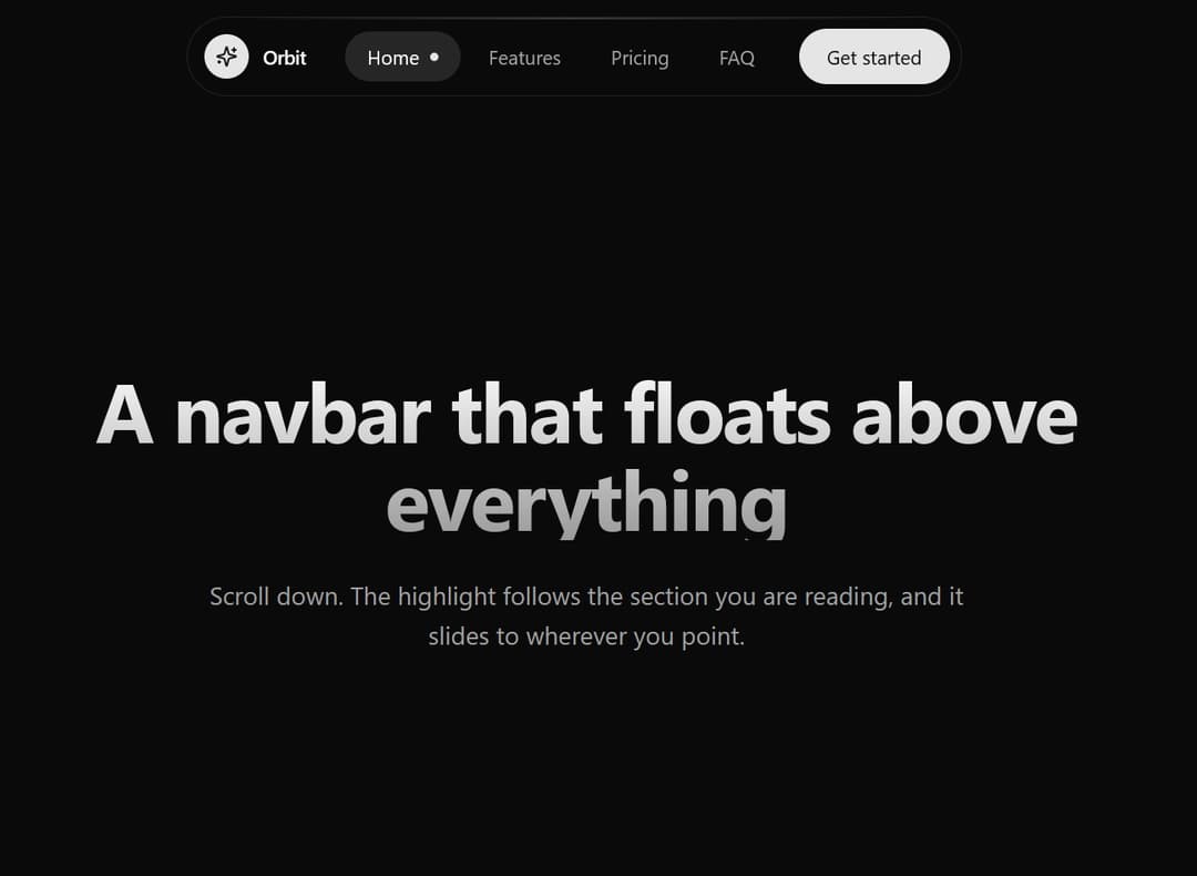
A sleek, responsive floating navigation bar featuring Framer Motion shared-layout pill transitions, mobile drawer menu, and subtle backdrop blur for modern web apps.
Built with React and Tailwind. Copy the prompt and paste it into Claude Code, Cursor or Lovable: your agent adds Floating Glassmorphic Navbar with Morphing Pill Indicator to your project and fits it to your theme.
Code
How Floating Glassmorphic Navbar with Morphing Pill Indicator is used: the demo's code. The component's own source comes with a free account.
Usage.tsx
// This is a file with a demo for your component
// That's what users will see in the preview
// Create new files in this directory to add more demos

import { useEffect, useRef, useState } from "react";
import { Check, Layers, Sparkles, Zap } from "lucide-react";
import { Component } from "@/components/ui/floating-glassmorphic-navbar-with-morphing-pill-indicator";
import type { NavItem } from "@/components/ui/floating-glassmorphic-navbar-with-morphing-pill-indicator";

/* ==========================================================================
   Demo data
   ========================================================================== */

// Kept outside the component so the list is the same object on every render
const NAV_ITEMS: NavItem[] = [
  { label: "Home", href: "#home" },
  { label: "Features", href: "#features" },
  { label: "Pricing", href: "#pricing" },
  { label: "FAQ", href: "#faq" },
];

const FEATURES = [
  { icon: Zap, title: "Fast by default", text: "Pages load in a blink, on any connection." },
  { icon: Layers, title: "Made of simple parts", text: "Mix and match pieces to build exactly what you need." },
  { icon: Sparkles, title: "Details that delight", text: "Small touches that make everyday tools feel good." },
];

const PLANS = [
  { name: "Starter", price: "$0", note: "For trying things out", perks: ["3 projects", "Community support"] },
  { name: "Pro", price: "$24", note: "For people who ship", perks: ["Unlimited projects", "Priority support", "Custom domains"] },
];

const FAQ = [
  { q: "Can I change plans later?", a: "Yes. Upgrade or downgrade whenever you like, and we will adjust your bill from that day." },
  { q: "Is there a free trial?", a: "Every paid plan starts with 14 days free. You can cancel before it ends and pay nothing." },
  { q: "Do you offer discounts for teams?", a: "Teams of ten or more get a volume discount. Reach out and we will put together an offer." },
];

// end of demo data


/* ==========================================================================
   Demo
   ========================================================================== */

// ONLY DEFAULT EXPORT WILL BE TREATED AS A DEMO
export default function DemoOne() {
  const [message, setMessage] = useState<string | null>(null);
  const timer = useRef<number | undefined>(undefined);

  // Smooth scrolling for the links, unless the person prefers reduced motion
  useEffect(() => {
    const reduce = window.matchMedia("(prefers-reduced-motion: reduce)").matches;
    const root = document.documentElement;
    const previous = root.style.scrollBehavior;
    if (!reduce) root.style.scrollBehavior = "smooth";
    return () => {
      root.style.scrollBehavior = previous;
      window.clearTimeout(timer.current);
    };
  }, []);

  const handleCta = () => {
    window.clearTimeout(timer.current);
    setMessage("Thanks! We will be in touch shortly.");
    timer.current = window.setTimeout(() => setMessage(null), 3000);
  };

  return (
    <div className="min-h-screen w-full bg-background text-foreground">
      <Component
        brandName="Orbit"
        brandIcon={<Sparkles size={16} aria-hidden="true" />}
        navItems={NAV_ITEMS}
        ctaLabel="Get started"
        onCtaClick={handleCta}
        trackSections
      />

      {/* Home */}
      <section id="home" className="relative flex min-h-screen scroll-mt-24 items-center justify-center overflow-hidden px-4 pb-16 pt-32 text-center">
        <div aria-hidden="true" className="pointer-events-none absolute inset-0" style={{ background: "radial-gradient(ellipse 60% 50% at 50% 0%, hsl(var(--primary) / 0.12), transparent 70%)" }} />
        <div className="relative mx-auto max-w-3xl">
          <h1 className="bg-gradient-to-b from-foreground to-foreground/60 bg-clip-text text-4xl font-bold leading-[1.05] tracking-tight text-transparent sm:text-6xl">
            A navbar that floats above everything
          </h1>
          <p className="mx-auto mt-6 max-w-xl text-base leading-relaxed text-muted-foreground sm:text-lg">
            Scroll down. The highlight follows the section you are reading, and it slides to wherever you point.
          </p>
        </div>
      </section>

      {/* Features */}
      <section id="features" className="mx-auto min-h-[80vh] max-w-5xl scroll-mt-24 px-4 py-24 sm:px-6">
        <h2 className="text-3xl font-semibold tracking-tight">Features</h2>
        <p className="mt-2 text-muted-foreground">Everything you need, nothing you do not.</p>
        <ul className="mt-10 grid gap-4 md:grid-cols-3">
          {FEATURES.map(({ icon: Icon, title, text }) => (
            <li key={title} className="rounded-2xl border border-border bg-card p-6 text-card-foreground transition-colors hover:border-primary/40">
              <span className="flex h-10 w-10 items-center justify-center rounded-xl bg-muted text-primary">
                <Icon size={18} aria-hidden="true" />
              </span>
              <h3 className="mt-4 font-semibold">{title}</h3>
              <p className="mt-1.5 text-sm leading-relaxed text-muted-foreground">{text}</p>
            </li>
          ))}
        </ul>
      </section>

      {/* Pricing */}
      <section id="pricing" className="mx-auto min-h-[80vh] max-w-5xl scroll-mt-24 px-4 py-24 sm:px-6">
        <h2 className="text-3xl font-semibold tracking-tight">Pricing</h2>
        <p className="mt-2 text-muted-foreground">Start free, pay when you grow.</p>
        <ul className="mt-10 grid gap-4 md:grid-cols-2">
          {PLANS.map((plan) => (
            <li key={plan.name} className="rounded-2xl border border-border bg-card p-6 text-card-foreground">
              <h3 className="font-semibold">{plan.name}</h3>
              <p className="mt-3 text-4xl font-semibold tracking-tight">
                {plan.price}
                <span className="text-sm font-normal text-muted-foreground"> / month</span>
              </p>
              <p className="mt-1 text-sm text-muted-foreground">{plan.note}</p>
              <ul className="mt-5 space-y-2.5">
                {plan.perks.map((perk) => (
                  <li key={perk} className="flex items-center gap-2.5 text-sm">
                    <span aria-hidden="true" className="flex h-5 w-5 items-center justify-center rounded-full bg-primary/10 text-primary">
                      <Check size={12} strokeWidth={3} />
                    </span>
                    {perk}
                  </li>
                ))}
              </ul>
            </li>
          ))}
        </ul>
      </section>

      {/* FAQ */}
      <section id="faq" className="mx-auto min-h-[80vh] max-w-3xl scroll-mt-24 px-4 py-24 sm:px-6">
        <h2 className="text-3xl font-semibold tracking-tight">Questions, answered</h2>
        <div className="mt-10 divide-y divide-border rounded-2xl border border-border bg-card">
          {FAQ.map((item) => (
            <details key={item.q} className="group p-5">
              <summary className="flex cursor-pointer list-none items-center justify-between gap-4 text-sm font-medium outline-none focus-visible:ring-2 focus-visible:ring-ring">
                {item.q}
                <span aria-hidden="true" className="text-muted-foreground transition-transform duration-200 group-open:rotate-45">
                  +
                </span>
              </summary>
              <p className="mt-3 text-sm leading-relaxed text-muted-foreground">{item.a}</p>
            </details>
          ))}
        </div>
      </section>

      {/* Message after pressing the button */}
      {message && (
        <p
          role="status"
          className="fixed bottom-5 left-1/2 z-50 -translate-x-1/2 rounded-xl border border-border bg-card px-4 py-3 text-sm text-card-foreground shadow-xl"
        >
          {message}
        </p>
      )}
    </div>
  );
}

// end of demo
Dependencies
More by themeocean
View all

Interactive Tech Stack Bento Grid with Hover Effects
474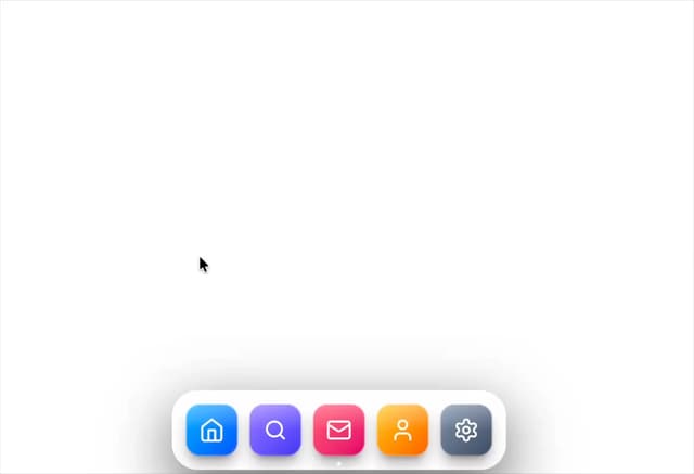
Mac-Style Floating Dock
62
Nexus 3D Animated Login - Futuristic Authentication UI
31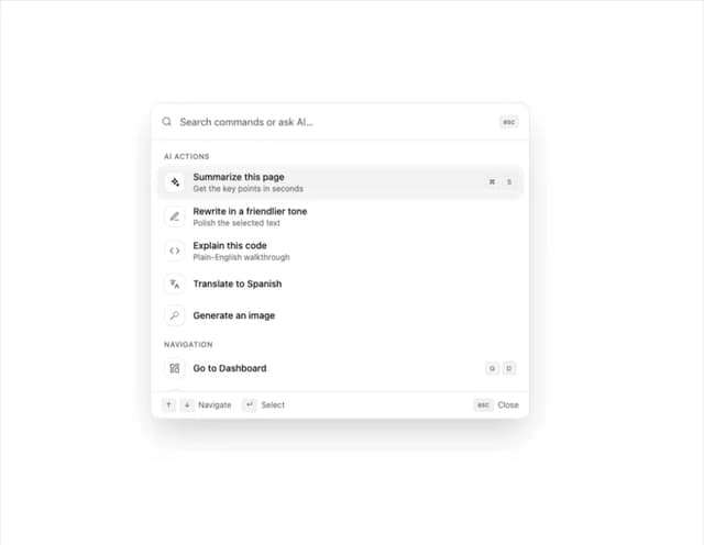
Sleek AI Command Menu (CMDK) with Fuzzy Search
8
3D Animated Tilt & Dynamic Glow Card
8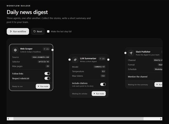
Interactive AI Agent Workflow Node Card
6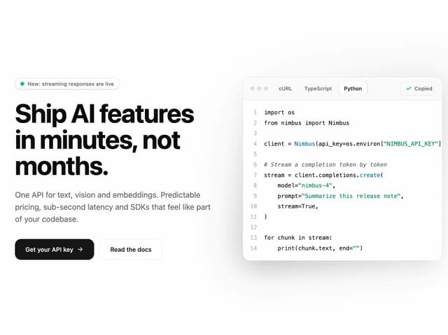
Split Developer Hero with Interactive Code Terminal
5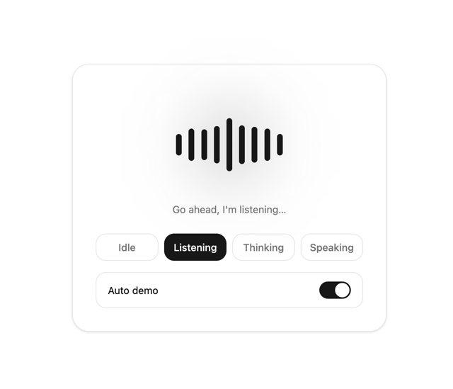
Interactive AI Voice Assistant Audio Visualizer
2
More in Heroes
View all

Responsive Hero Banner
2.1K

SaaS Template
2.6K

Hero
1.3K

Hero 03
356
Centered Hero with Image Fan
1K

Hero Section
438

HeroSectionWithGradient
373
Hero with text and two button
115
