
About
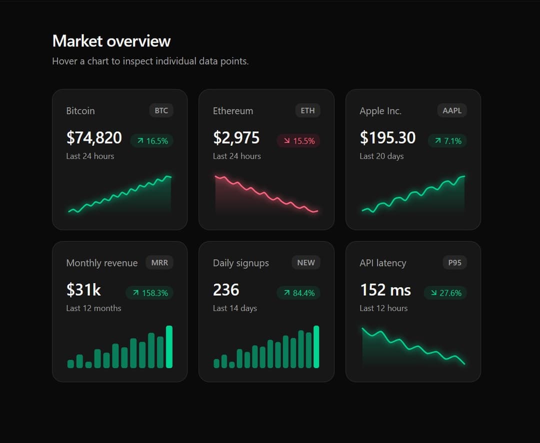
A highly performant, minimalist SVG-based micro-chart component designed for bento grids and dashboard cards. Supports dynamic tooltips, light/dark mode glow effects, and interactive hover states without bulky external chart libraries.
Built with React and Tailwind. Copy the prompt and paste it into Claude Code, Cursor or Lovable: your agent adds Premium Micro Sparkline Charts for Dashboards to your project and fits it to your theme.
Code
How Premium Micro Sparkline Charts for Dashboards is used: the demo's code. The component's own source comes with a free account.
Usage.tsx
// This is a file with a demo for your component
// That's what users will see in the preview
// Create new files in this directory to add more demos

"use client";

import * as React from "react";
import { ArrowDownRight, ArrowUpRight } from "lucide-react";
import { Sparkline, type SparklineTone, type SparklineType } from "@/components/ui/remium-micro-sparkline-charts-for-dashboards";


/* ------------------------------------------------------------------ */
/* Mock data                                                           */
/* ------------------------------------------------------------------ */

const usd = (v: number) => v.toLocaleString("en-US", { style: "currency", currency: "USD", maximumFractionDigits: v < 1000 ? 2 : 0 });

interface Metric {
  label: string;
  ticker: string;
  data: number[];
  type: SparklineType;
  format: (v: number) => string;
  tone?: SparklineTone;
  unit: string;
}

const METRICS: Metric[] = [
  { label: "Bitcoin", ticker: "BTC", type: "line", format: usd, unit: "hour",
    data: [64210, 64880, 64120, 65300, 66450, 65980, 67210, 66840, 68120, 67650, 69300, 68720, 70150, 69480, 71200, 70640, 72300, 71850, 73100, 72480, 74200, 73650, 75100, 74820] },
  { label: "Ethereum", ticker: "ETH", type: "line", format: usd, unit: "hour",
    data: [3520, 3490, 3510, 3440, 3400, 3425, 3360, 3310, 3340, 3280, 3240, 3265, 3190, 3150, 3180, 3120, 3085, 3110, 3050, 3020, 3045, 2990, 2960, 2975] },
  { label: "Apple Inc.", ticker: "AAPL", type: "line", format: usd, unit: "day",
    data: [182.4, 183.1, 181.9, 184.6, 185.2, 184.1, 186.8, 187.3, 186.2, 188.9, 189.4, 188.1, 190.6, 191.2, 190.3, 192.8, 193.5, 192.1, 194.7, 195.3] },
  { label: "Monthly revenue", ticker: "MRR", type: "bar", format: (v) => `$${v}k`, unit: "month",
    data: [12, 15, 11, 18, 16, 21, 19, 24, 22, 27, 25, 31] },
  { label: "Daily signups", ticker: "NEW", type: "bar", format: (v) => v.toLocaleString("en-US"), unit: "day",
    data: [128, 142, 119, 160, 151, 172, 168, 190, 183, 204, 196, 221, 214, 236] },
  // Lower is better here, so the tone is forced to "positive"
  { label: "API latency", ticker: "P95", type: "line", format: (v) => `${v} ms`, tone: "positive", unit: "hour",
    data: [210, 198, 205, 187, 192, 176, 181, 169, 172, 160, 165, 152] },
];

const BADGE_CLASS = {
  positive: "bg-emerald-500/10 text-emerald-600 dark:text-emerald-400",
  negative: "bg-rose-500/10 text-rose-600 dark:text-rose-400",
  primary: "bg-primary/10 text-primary",
  neutral: "bg-muted text-muted-foreground",
} as const;


/* ------------------------------------------------------------------ */
/* Widget                                                              */
/* ------------------------------------------------------------------ */

function MetricCard({ label, ticker, data, type, format, tone = "auto", unit }: Metric) {
  const [hover, setHover] = React.useState<number | null>(null);

  const first = data[0];
  const last = data[data.length - 1];
  const change = ((last - first) / first) * 100;
  const resolved = tone === "auto" ? (change >= 0 ? "positive" : "negative") : tone;
  const shown = hover !== null ? data[hover] : last;

  return (
    <article className="rounded-2xl border border-border bg-card p-5 text-card-foreground shadow-sm transition-colors hover:border-ring/40">
      <header className="flex items-center justify-between">
        <h2 className="text-sm font-medium text-muted-foreground">{label}</h2>
        <span className="rounded-md bg-muted px-2 py-0.5 text-[11px] font-semibold tracking-wide text-muted-foreground">{ticker}</span>
      </header>

      <div className="mt-3 flex items-end justify-between gap-3">
        <p className="text-2xl font-semibold tracking-tight tabular-nums">{format(shown)}</p>
        <span className={`inline-flex items-center gap-0.5 rounded-full px-2 py-0.5 text-xs font-medium tabular-nums ${BADGE_CLASS[resolved]}`}>
          {change >= 0 ? <ArrowUpRight className="size-3.5" /> : <ArrowDownRight className="size-3.5" />}
          {Math.abs(change).toFixed(1)}%
        </span>
      </div>

      <p className="mt-1 h-4 text-xs text-muted-foreground" aria-live="polite">
        {hover !== null ? `${data.length - 1 - hover === 0 ? "Latest" : `${data.length - 1 - hover} ${unit}s ago`}` : `Last ${data.length} ${unit}s`}
      </p>

      <Sparkline
        className="mt-4"
        data={data}
        type={type}
        tone={resolved}
        height={64}
        aria-label={`${label} trend, ${change >= 0 ? "up" : "down"} ${Math.abs(change).toFixed(1)} percent`}
        onHover={(index) => setHover(index)}
      />
    </article>
  );
}


/* ------------------------------------------------------------------ */
/* Demo                                                                */
/* ------------------------------------------------------------------ */

export default function DemoOne() {
  return (
    <main className="min-h-dvh bg-background px-4 py-10 text-foreground sm:px-6">
      <div className="mx-auto max-w-5xl">
        <div className="mb-8 space-y-1">
          <h1 className="text-2xl font-semibold tracking-tight">Market overview</h1>
          <p className="text-sm text-muted-foreground">Hover a chart to inspect individual data points.</p>
        </div>

        <div className="grid gap-4 sm:grid-cols-2 lg:grid-cols-3">
          {METRICS.map((m) => (
            <MetricCard key={m.ticker} {...m} />
          ))}
        </div>
      </div>
    </main>
  );
}More by themeocean
View all

Interactive Tech Stack Bento Grid with Hover Effects
390
Mac-Style Floating Dock
57
Nexus 3D Animated Login - Futuristic Authentication UI
19
Expandable Floating Action Button (FAB) AI Dock
2
Sleek AI Command Menu (CMDK) with Fuzzy Search
1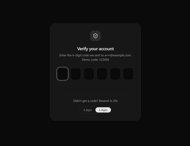
Smart OTP Input with Auto-Focus and Error Shake Effect
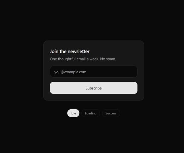
Multi-State Action Button with Micro-Animations
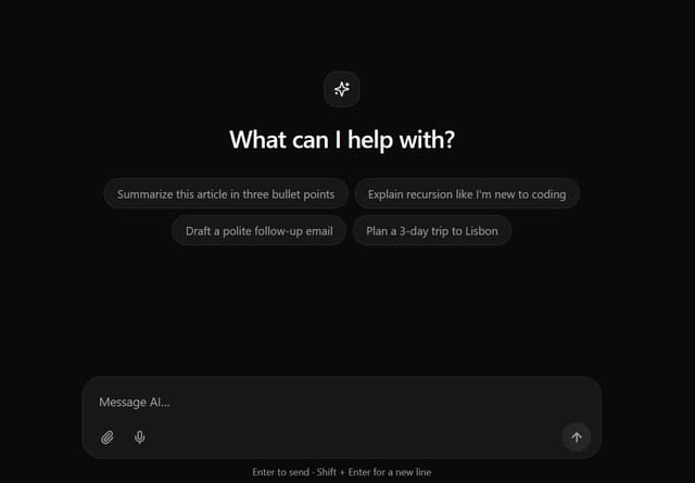
Interactive AI Chat Input with Micro-Interactions