
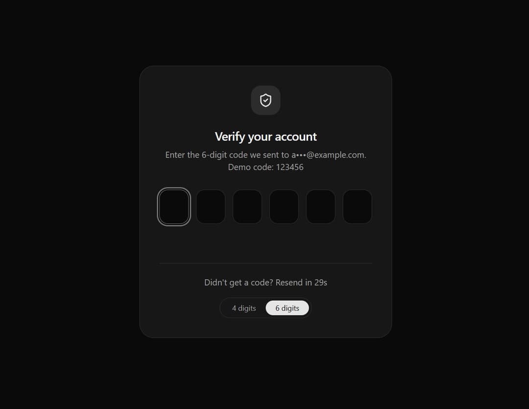
About
An accessible, responsive one-time password (OTP) entry system featuring seamless focus shifting, paste support, and a smooth haptic-style shake animation upon incorrect code validation.
Built with React and Tailwind. Copy the prompt and paste it into Claude Code, Cursor or Lovable: your agent adds Smart OTP Input with Auto-Focus and Error Shake Effect to your project and fits it to your theme.
Code
How Smart OTP Input with Auto-Focus and Error Shake Effect is used: the demo's code. The component's own source comes with a free account.
Usage.tsx
// This is a file with a demo for your component
// That's what users will see in the preview
// Create new files in this directory to add more demos
"use client";
import * as React from "react";
import { CheckCircle2, Loader2, ShieldCheck } from "lucide-react";
import { OTPInput } from "@/components/ui/smart-otp-input-with-auto-focus-and-error-shake-effect";
/* ------------------------------------------------------------------ */
/* Demo */
/* ------------------------------------------------------------------ */
type Status = "idle" | "verifying" | "error" | "success";
// Mock server answer: 123456 for six digits, 1234 for four
const CORRECT_CODE = "123456";
export default function DemoOne() {
const [length, setLength] = React.useState<4 | 6>(6);
const [status, setStatus] = React.useState<Status>("idle");
const [seconds, setSeconds] = React.useState(30);
const [resetKey, setResetKey] = React.useState(0); // remounting clears the slots
const timer = React.useRef<number | undefined>(undefined);
// Resend countdown
React.useEffect(() => {
if (seconds <= 0) return;
const id = window.setTimeout(() => setSeconds((s) => s - 1), 1000);
return () => window.clearTimeout(id);
}, [seconds]);
React.useEffect(() => () => window.clearTimeout(timer.current), []);
const reset = () => {
window.clearTimeout(timer.current);
setStatus("idle");
setResetKey((k) => k + 1);
};
// Simulated verification request
const verify = (code: string) => {
setStatus("verifying");
timer.current = window.setTimeout(
() => setStatus(code === CORRECT_CODE.slice(0, length) ? "success" : "error"),
900
);
};
const resend = () => {
setSeconds(30);
reset();
};
return (
<div className="flex min-h-dvh items-center justify-center bg-background px-4 py-10 text-foreground">
<div className="w-full max-w-md rounded-3xl border border-border bg-card p-6 shadow-sm sm:p-8">
<div className="mx-auto mb-5 grid size-12 place-items-center rounded-2xl bg-primary/10 text-primary">
{status === "success" ? <CheckCircle2 className="size-6 text-emerald-500" /> : <ShieldCheck className="size-6" />}
</div>
<div className="space-y-1.5 text-center">
<h1 className="text-xl font-semibold tracking-tight">
{status === "success" ? "You're verified" : "Verify your account"}
</h1>
<p className="text-sm text-muted-foreground">
Enter the {length}-digit code we sent to a•••@example.com.
<span className="block">Demo code: {CORRECT_CODE.slice(0, length)}</span>
</p>
</div>
<div className="mt-7">
<OTPInput
key={`${length}-${resetKey}`}
length={length}
autoFocus
disabled={status === "success"}
hasError={status === "error"}
isValid={status === "success"}
errorMessage="That code is incorrect. Please try again."
onChange={() => status === "error" && setStatus("idle")}
onComplete={verify}
/>
</div>
{/* Status line */}
<div className="mt-5 flex h-5 items-center justify-center text-sm text-muted-foreground" role="status" aria-live="polite">
{status === "verifying" && (
<span className="flex items-center gap-2"><Loader2 className="size-4 animate-spin" />Verifying…</span>
)}
{status === "success" && <span className="text-emerald-600 dark:text-emerald-400">Code accepted</span>}
</div>
<div className="mt-6 flex flex-col items-center gap-4 border-t border-border pt-5 text-sm">
<p className="text-muted-foreground">
Didn't get a code?{" "}
<button
type="button"
onClick={resend}
disabled={seconds > 0}
className="font-medium text-foreground underline-offset-4 hover:underline focus-visible:outline-none focus-visible:ring-2 focus-visible:ring-ring disabled:cursor-not-allowed disabled:text-muted-foreground disabled:no-underline"
>
{seconds > 0 ? `Resend in ${seconds}s` : "Resend code"}
</button>
</p>
{/* Switch between 4 and 6 slots */}
<div className="inline-flex rounded-full border border-border p-1" role="group" aria-label="Code length">
{([4, 6] as const).map((n) => (
<button
key={n}
type="button"
aria-pressed={length === n}
onClick={() => { setLength(n); reset(); }}
className={
"rounded-full px-4 py-1 text-xs font-medium transition-colors focus-visible:outline-none focus-visible:ring-2 focus-visible:ring-ring " +
(length === n ? "bg-primary text-primary-foreground" : "text-muted-foreground hover:text-foreground")
}
>
{n} digits
</button>
))}
</div>
</div>
</div>
</div>
);
}Dependencies
More by themeocean
View all

Interactive Tech Stack Bento Grid with Hover Effects
390
Mac-Style Floating Dock
57
Nexus 3D Animated Login - Futuristic Authentication UI
19
Expandable Floating Action Button (FAB) AI Dock
2
Sleek AI Command Menu (CMDK) with Fuzzy Search
1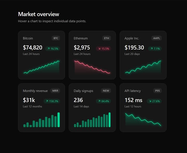
Premium Micro Sparkline Charts for Dashboards
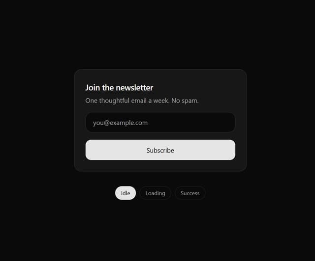
Multi-State Action Button with Micro-Animations
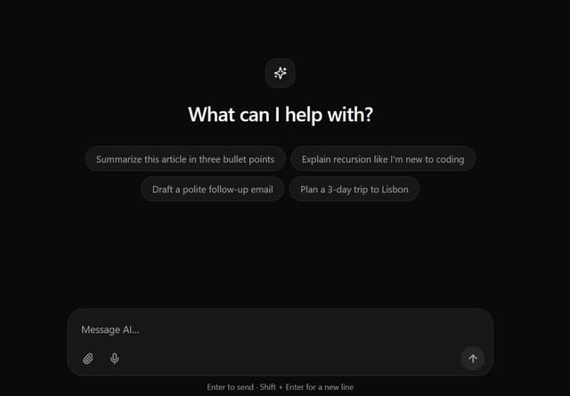
Interactive AI Chat Input with Micro-Interactions