
About
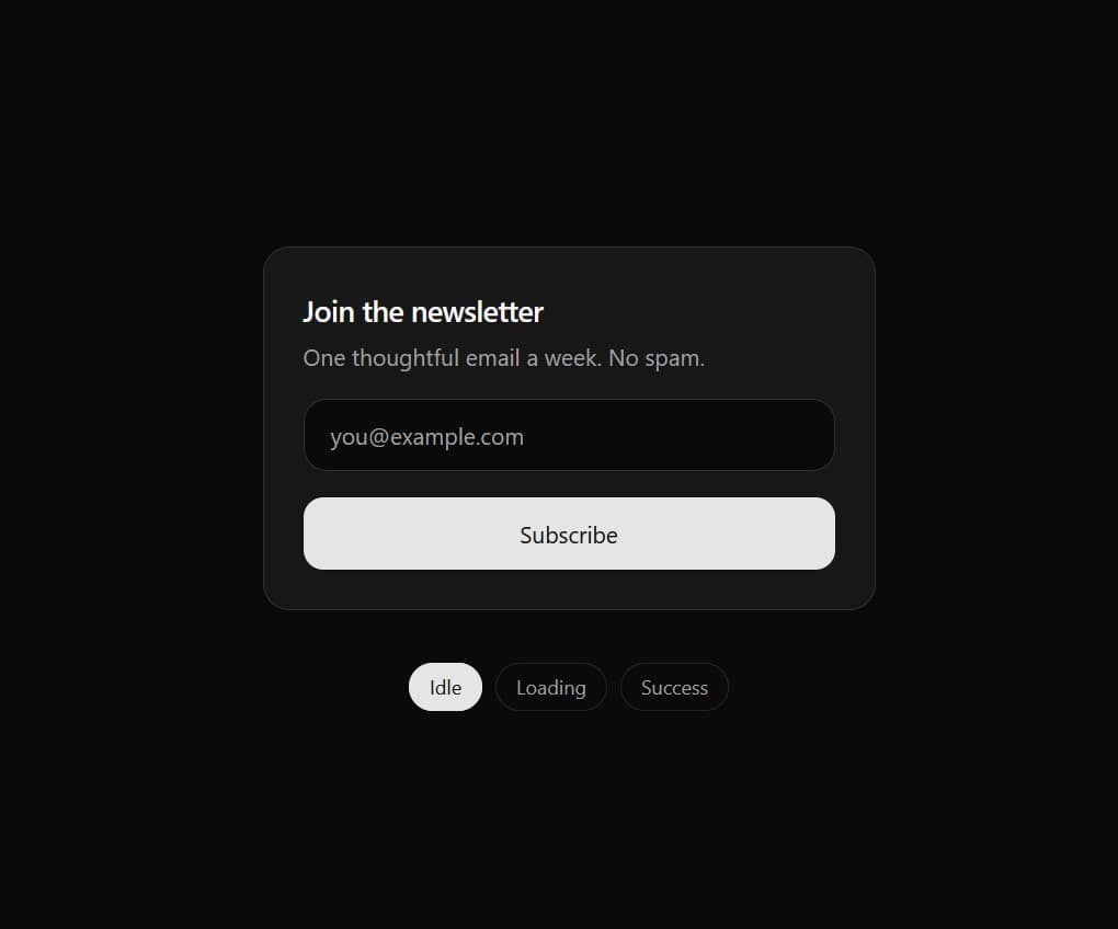
A highly interactive form submission button built with React, Tailwind CSS, and Framer Motion. Transitions smoothly through 'Idle', 'Loading' (with spinner), and 'Success' (with an animated checkmark) states.
Built with React and Tailwind. Copy the prompt and paste it into Claude Code, Cursor or Lovable: your agent adds Multi-State Action Button with Micro-Animations to your project and fits it to your theme.
Code
How Multi-State Action Button with Micro-Animations is used: the demo's code. The component's own source comes with a free account.
Usage.tsx
// This is a file with a demo for your component
// That's what users will see in the preview
// Create new files in this directory to add more demos

"use client";

import * as React from "react";
import { MultiStateSubmitButton, type SubmitState } from "@/components/ui/multi-state-action-button-with-micro-animations";


/* ------------------------------------------------------------------ */
/* Demo                                                                */
/* ------------------------------------------------------------------ */

const STATES: SubmitState[] = ["idle", "loading", "success"];

export default function DemoOne() {
  const [state, setState] = React.useState<SubmitState>("idle");
  const [email, setEmail] = React.useState("");
  const timers = React.useRef<number[]>([]);

  const clearTimers = () => { timers.current.forEach(window.clearTimeout); timers.current = []; };
  React.useEffect(() => clearTimers, []);

  // Simulated request: loading, then success, then back to idle
  const handleSubmit = (e: React.FormEvent) => {
    e.preventDefault();
    if (state !== "idle") return;
    setState("loading");
    timers.current.push(
      window.setTimeout(() => setState("success"), 1800),
      window.setTimeout(() => { setState("idle"); setEmail(""); }, 4200)
    );
  };

  // Manual state preview (stops the simulated flow)
  const preview = (next: SubmitState) => { clearTimers(); setState(next); };

  return (
    <div className="flex min-h-dvh items-center justify-center bg-background px-4 py-10 text-foreground">
      <div className="w-full max-w-sm space-y-8">
        <form onSubmit={handleSubmit} className="space-y-4 rounded-2xl border border-border bg-card p-6 shadow-sm">
          <div className="space-y-1">
            <h1 className="text-lg font-semibold tracking-tight">Join the newsletter</h1>
            <p className="text-sm text-muted-foreground">One thoughtful email a week. No spam.</p>
          </div>

          <input
            type="email"
            required
            value={email}
            onChange={(e) => setEmail(e.target.value)}
            placeholder="you@example.com"
            aria-label="Email address"
            className="h-11 w-full rounded-xl border border-input bg-background px-4 text-sm outline-none transition placeholder:text-muted-foreground focus-visible:ring-2 focus-visible:ring-ring"
          />

          <MultiStateSubmitButton
            type="submit"
            state={state}
            loadingText="Subscribing…"
            successText="You're in"
            className="w-full"
          >
            Subscribe
          </MultiStateSubmitButton>
        </form>

        {/* State preview switcher */}
        <div className="flex items-center justify-center gap-2" role="group" aria-label="Preview button state">
          {STATES.map((s) => (
            <button
              key={s}
              type="button"
              onClick={() => preview(s)}
              aria-pressed={state === s}
              className={
                "rounded-full border px-3 py-1.5 text-xs font-medium capitalize transition-colors focus-visible:outline-none focus-visible:ring-2 focus-visible:ring-ring " +
                (state === s
                  ? "border-primary bg-primary text-primary-foreground"
                  : "border-border text-muted-foreground hover:bg-accent hover:text-accent-foreground")
              }
            >
              {s}
            </button>
          ))}
        </div>
      </div>
    </div>
  );
}
Dependencies
More by themeocean
View all

Interactive Tech Stack Bento Grid with Hover Effects
390
Mac-Style Floating Dock
57
Nexus 3D Animated Login - Futuristic Authentication UI
19
Expandable Floating Action Button (FAB) AI Dock
2
Sleek AI Command Menu (CMDK) with Fuzzy Search
1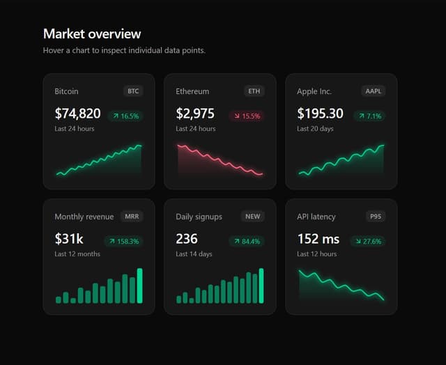
Premium Micro Sparkline Charts for Dashboards
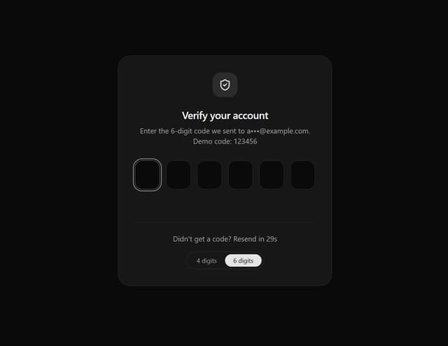
Smart OTP Input with Auto-Focus and Error Shake Effect
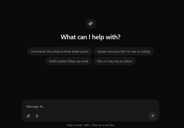
Interactive AI Chat Input with Micro-Interactions
More in Buttons
View all

Button
1
Button
6

App Store Button
471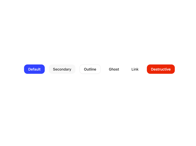

Button
34
Native Button
2

Button
53
Figma File Button
33
Button
74


