

About
A user avatar with a small numeric badge overlaid on its corner to show a count, like unread notifications or pending items.
Built with React and Tailwind. Copy the prompt and paste it into Claude Code, Cursor or Lovable: your agent adds Avatar Counter Indicator to your project and fits it to your theme.
Code
How Avatar Counter Indicator is used: the demo's code. The component's own source comes with a free account.
Usage.tsx
import AvatarCounterIndicator from "@/components/ui/avatar-counter-indicator";

export default function AvatarCounterIndicatorDemo() {
  return (
    <div className="flex items-center justify-center p-10">
      <AvatarCounterIndicator />
    </div>
  );
}
More by uiable
View all

Feature Highlights Grid
427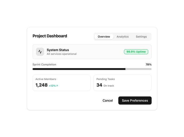
Card Tabs
116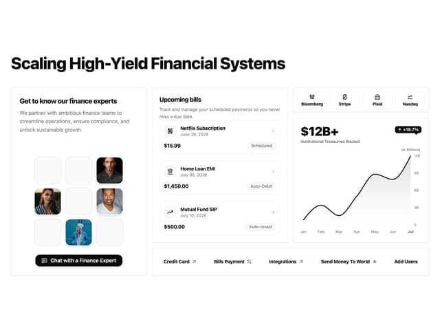
Financial Bento Grid
96
Chart Tooltip
76
Portfolio Showcase Grid
74
Marketing Hero Section
72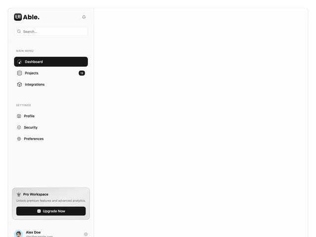
Sidebar with Search and Profile
60
Attachment States
48