About
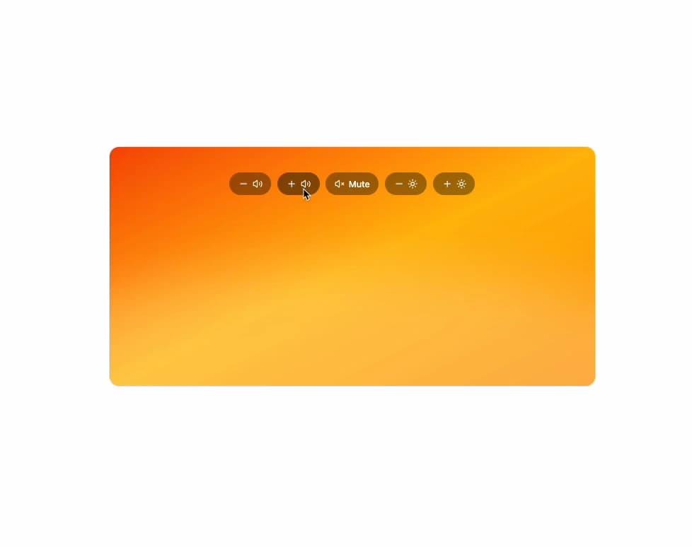
A transient macOS-style on-screen display for volume, brightness or keyboard brightness changes that pops in, auto-hides after a timeout, and announces the new level to screen readers.
Built with React and Tailwind. Copy the prompt and paste it into Claude Code, Cursor or Lovable: your agent adds HUD to your project and fits it to your theme.
Code
How HUD is used: the demo's code. The component's own source comes with a free account.
Usage.tsx
"use client";

import * as React from "react";
import { Hud, useTransientHud } from "@/components/ui/hud";
import { Minus, Plus, Sun, Volume2, VolumeX } from "lucide-react";

type HudKind = "volume" | "brightness" | "keyboard";

export default function HudDemo() {
  const hud = useTransientHud();
  const [kind, setKind] = React.useState<HudKind>("volume");
  const [volume, setVolume] = React.useState(50);
  const [brightness, setBrightness] = React.useState(70);
  const [muted, setMuted] = React.useState(false);
  const value = kind === "volume" ? volume : brightness;
  const bump = (kind: HudKind, delta: number) => {
    setKind(kind);
    if (kind === "volume") {
      setMuted(false);
      setVolume((v) => Math.max(0, Math.min(100, v + delta)));
    } else setBrightness((v) => Math.max(0, Math.min(100, v + delta)));
    hud.show();
  };
  const btn =
    "inline-flex h-9 items-center gap-1.5 rounded-full bg-black/35 px-3.5 text-sm font-medium text-white outline-none backdrop-blur hover:bg-black/45 focus-visible:ring-[3px] focus-visible:ring-white/70";
  return (
    <div className="relative isolate h-[380px] w-full max-w-3xl overflow-hidden rounded-2xl border border-foreground/10">
      <div
        aria-hidden="true"
        className="absolute inset-0 -z-10 dark:brightness-[0.6]"
      >
        <div className="absolute inset-0 bg-linear-to-br from-chart-1 via-chart-4 to-chart-5" />
        <div className="absolute -inset-x-1/4 top-1/2 h-full rounded-[50%] bg-white/25 blur-2xl" />
      </div>
      <div className="flex h-full flex-wrap content-start items-center justify-center gap-2.5 px-4 pt-10">
        <button
          type="button"
          className={btn}
          onClick={() => bump("volume", -10)}
        >
          <Minus className="size-4" aria-hidden="true" />
          <Volume2 className="size-4" aria-hidden="true" />
          <span className="sr-only">Volume down</span>
        </button>
        <button
          type="button"
          className={btn}
          onClick={() => bump("volume", 10)}
        >
          <Plus className="size-4" aria-hidden="true" />
          <Volume2 className="size-4" aria-hidden="true" />
          <span className="sr-only">Volume up</span>
        </button>
        <button
          type="button"
          className={btn}
          onClick={() => {
            setKind("volume");
            setMuted((m) => !m);
            hud.show();
          }}
        >
          <VolumeX className="size-4" aria-hidden="true" />
          Mute
        </button>
        <button
          type="button"
          className={btn}
          onClick={() => bump("brightness", -10)}
        >
          <Minus className="size-4" aria-hidden="true" />
          <Sun className="size-4" aria-hidden="true" />
          <span className="sr-only">Brightness down</span>
        </button>
        <button
          type="button"
          className={btn}
          onClick={() => bump("brightness", 10)}
        >
          <Plus className="size-4" aria-hidden="true" />
          <Sun className="size-4" aria-hidden="true" />
          <span className="sr-only">Brightness up</span>
        </button>
      </div>
      <Hud
        kind={kind}
        value={value}
        muted={muted}
        visible={hud.visible}
        onVisibleChange={hud.onVisibleChange}
      />
    </div>
  );
}
Dependencies
More by vamsiy78
View all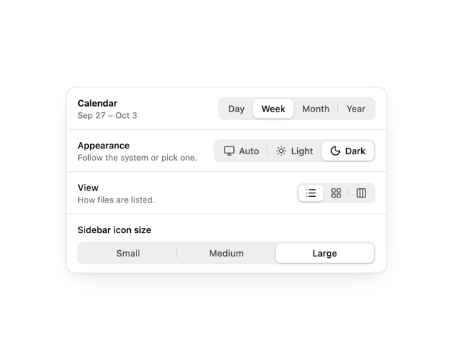

Segmented Control
7
Border Beam
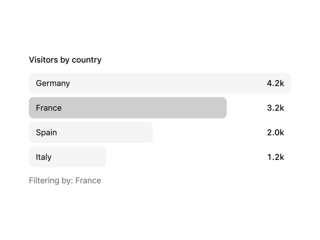
Bar List
API Key Field
Agent Roster