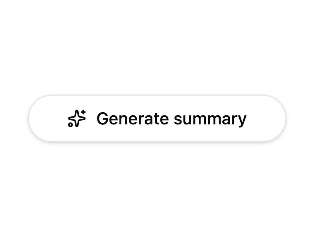
About
A thin animated beam of light that travels around the inside edge of an element's border, used to highlight a featured card or call-to-action button.
Built with React and Tailwind. Copy the prompt and paste it into Claude Code, Cursor or Lovable: your agent adds Border Beam to your project and fits it to your theme.
Code
How Border Beam is used: the demo's code. The component's own source comes with a free account.
Usage.tsx
import { BorderBeam } from "@/components/ui/border-beam";
import { Button } from "@/components/ui/button";
import { Sparkles } from "lucide-react";

export default function BorderBeamButton() {
  return (
    <Button variant="outline" size="lg" className="rounded-full">
      <Sparkles /> Generate summary
      <BorderBeam size={48} duration={4} />
    </Button>
  );
}
Dependencies
More by vamsiy78
View all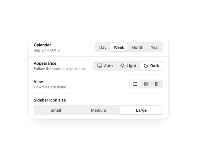

Segmented Control
7
HUD
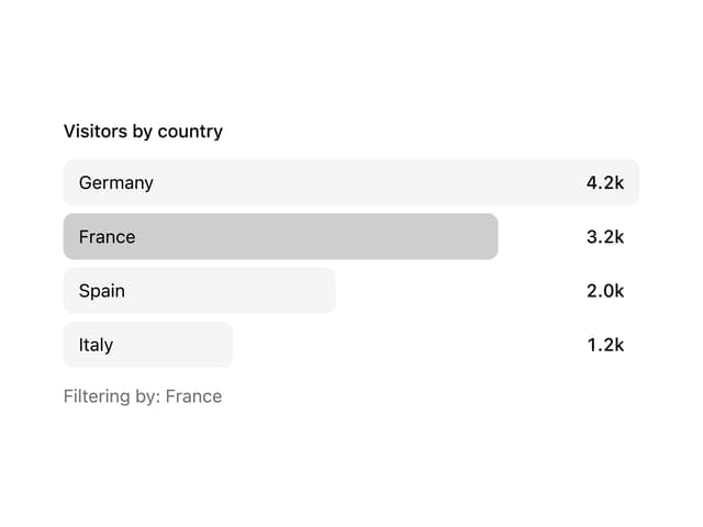
Bar List
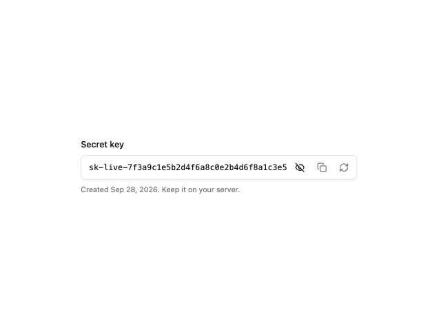
API Key Field
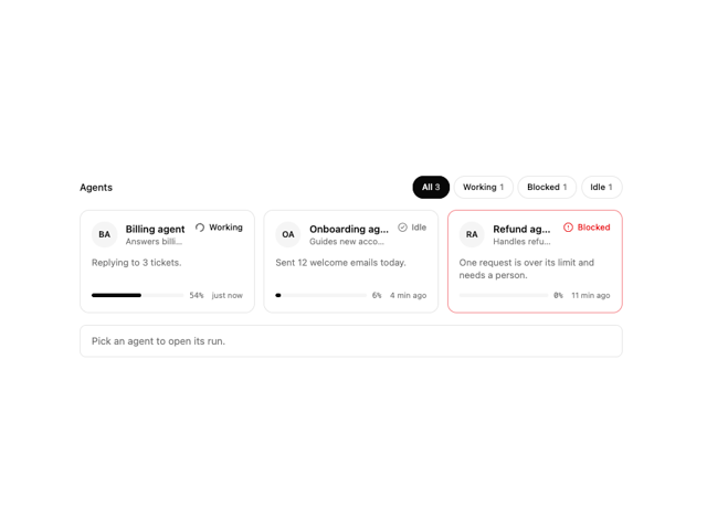
Agent Roster
More in Buttons
View all
Texture Button
108
Button
14

Notification Button
117

HeroUI Button Group
2

Eclipse Button
44
Button Save
50

App Store Button
484

Base Button
1


