
About
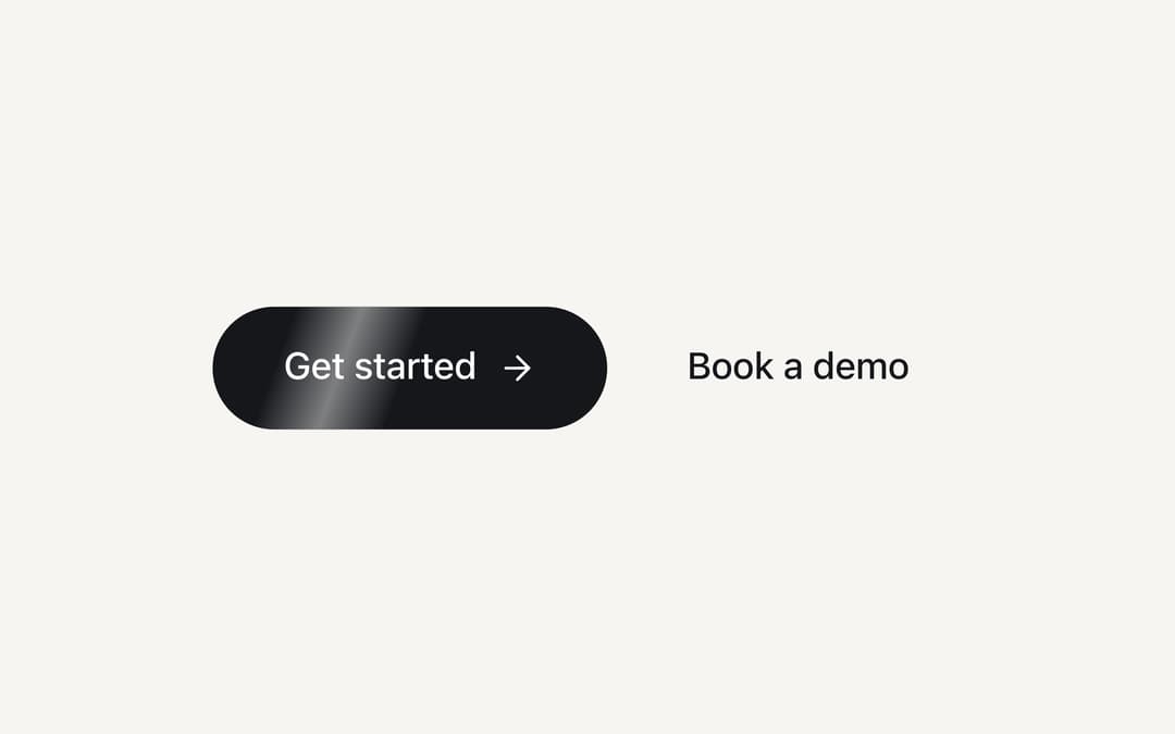
A pill button in the primary colour with a sheen that sweeps between its fill and its label every few seconds. Renders a link when you pass href. From the Midnight Lite template (MIT).
Built with React and Tailwind. Copy the prompt and paste it into Claude Code, Cursor or Lovable: your agent adds Shimmer CTA Button to your project and fits it to your theme.
Code
How Shimmer CTA Button is used: the demo's code. The component's own source comes with a free account.
Usage.tsx
import type { CSSProperties } from "react"
import { ArrowRight } from "lucide-react"

import { ShineButton } from "@/components/ui/shine-button"

const settings = {
  label: "Get started",
  duration: 3.5,
  background: "#f6f5f1",
  primary: "#16171b",
  primaryForeground: "#ffffff",
  text: "#16171b",
}

export default function Demo(props: Partial<typeof settings>) {
  const s = { ...settings, ...props }
  const theme = {
    "--primary": s.primary,
    "--color-primary": s.primary,
    "--primary-foreground": s.primaryForeground,
    "--color-primary-foreground": s.primaryForeground,
    "--ring": s.primary,
    "--color-ring": s.primary,
    "--background": s.background,
    "--color-background": s.background,
    background: s.background,
    fontFamily: "ui-sans-serif, system-ui, -apple-system, 'Segoe UI', sans-serif",
  } as CSSProperties

  return (
    <div className="flex min-h-svh w-full flex-wrap items-center justify-center gap-3 px-6" style={theme}>
      <ShineButton size="xl" duration={s.duration} delay={0.6}>
        {s.label}
        <ArrowRight strokeWidth={1.75} />
      </ShineButton>
      <a href="#" className="inline-flex h-14 items-center rounded-full px-6 text-[17px] font-medium transition-colors hover:bg-black/5" style={{ color: s.text }}>
        Book a demo
      </a>
    </div>
  )
}
Dependencies
More by Vilqor
View all

Card Carousel to Grid
AI Email Reply with Tones
AI Memory Timeline
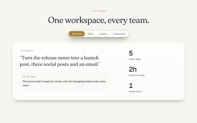
Use Cases Tabs Section

Pricing Section with Toggle
Logo Cloud Marquee
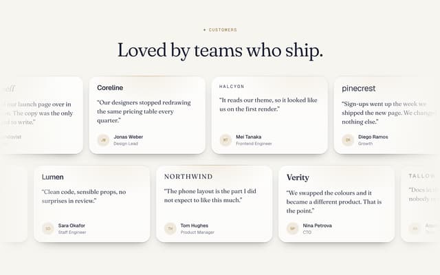
Testimonials Marquee

AI Agent Workflow Diagram
More in Buttons
View all
Texture Button
104
Button
11
Native Button
27

Button
19
Button
78

HeroUI Button Group
5

App Store Button
476

Button
67


