
About
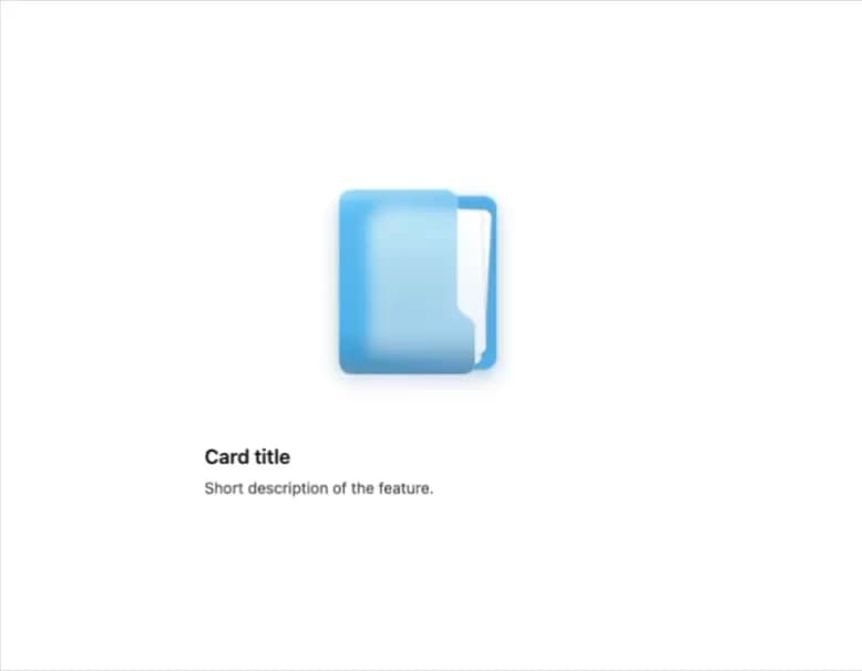
A hoverable illustration of a glassy blue folder on its side with documents sliding out, used in feature cards and empty states for files or document storage.
Built with React and Tailwind. Copy the prompt and paste it into Claude Code, Cursor or Lovable: your agent adds Side Folder to your project and fits it to your theme.
Code
How Side Folder is used: the demo's code. The component's own source comes with a free account.
Usage.tsx
import { SideFolder } from "@/components/ui/side-folder";

export default function SideFolderDemo() {
  return (
    <div className="flex items-center justify-center w-full h-full bg-white p-10">
      <article className="w-full max-w-sm text-neutral-900">
        <SideFolder />
        <h3 className="mt-4 text-lg font-semibold">Card title</h3>
        <p className="mt-1 text-sm text-neutral-600">
          Short description of the feature.
        </p>
      </article>
    </div>
  );
}
More by flohoeller
View all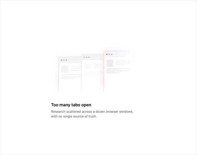
Tab Overload
39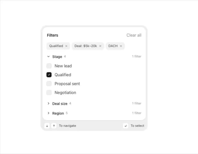
Filter Menu
34
Agent Team
30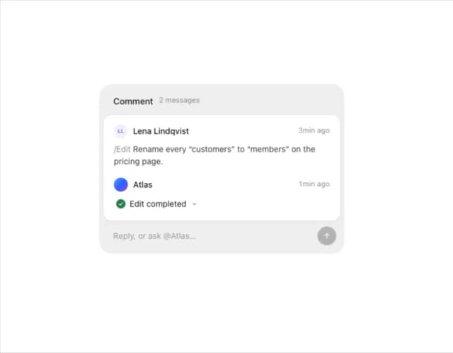
Comment Thread
25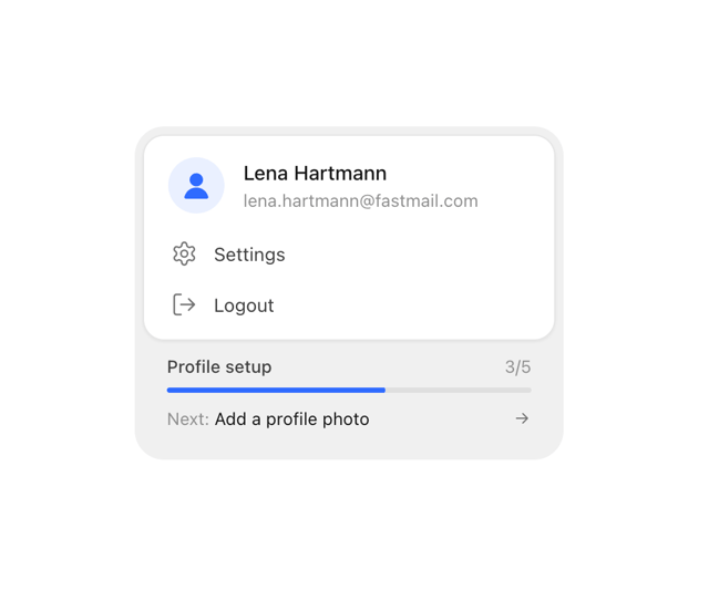
Profile Menu
21
Team Invite
20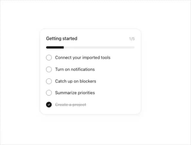
Progress Tracker
20
Integration Grid
17
More in Features
View all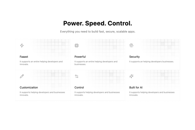

Grid Feature Cards
1.9K

Feature Sections
54

Features 8
3.1K
Features Card
245
Feature Modern
11

Feature 1
118
Feature with image
152
Feature 72
133


