
About
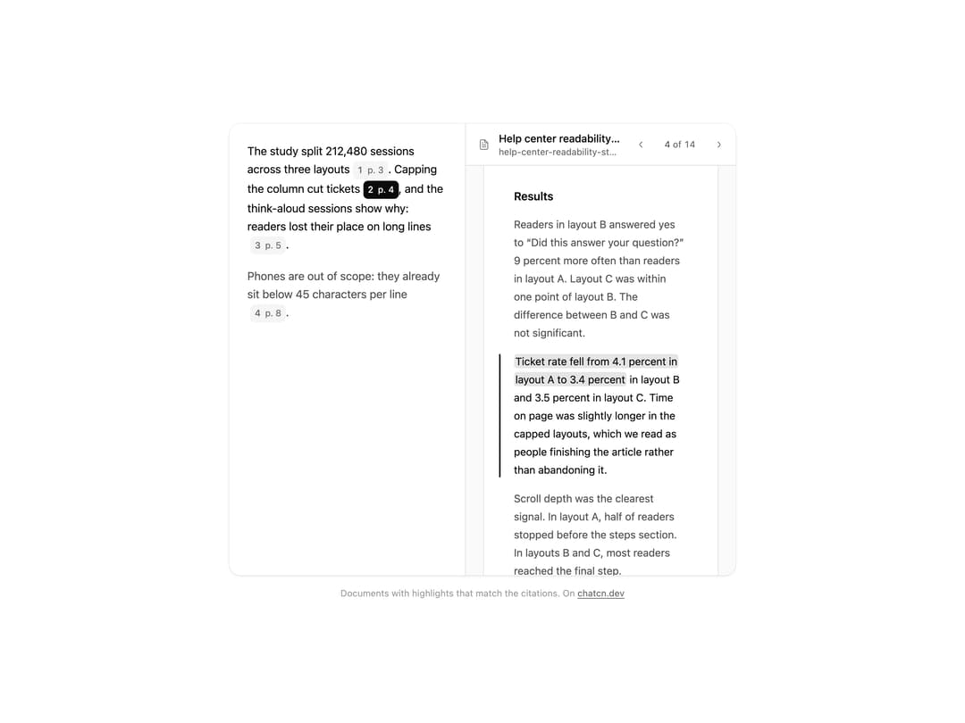
A document viewer for cited answers: the passage a citation points to highlighted on its page, page navigation, the file name and page count, so readers can check a claim at the source.
Built with React and Tailwind. Copy the prompt and paste it into Claude Code, Cursor or Lovable: your agent adds Document Viewer to your project and fits it to your theme.
Code
How Document Viewer is used: the demo's code. The component's own source comes with a free account.
Usage.tsx
"use client"
import * as React from "react"
import { cn } from "@/lib/utils"
import { Dialog as DialogPrimitive } from "@base-ui/react/dialog"
import { DocumentHighlight, DocumentSource, DocumentViewer, FileTextIcon, XIcon, buttonVariants } from "@/components/ui/document-viewer"
const FIT_CSS = "html,body{overflow:hidden}[data-fit-small] [data-fit-hide]{display:none!important}"
/**
* 21st shows a demo in a small frame: about 674 by 421 on a component page, 358 by 224 on a
* phone and 245 by 139 on a profile card. A demo taller than its frame gets scrollbars, which
* render white on dark pages. FitFrame fills the frame exactly instead.
*
* - "scale": the content shrinks until it fits, centered. For visuals such as orbs.
* - "crop": the content stays at full size from the top and fades out at the bottom. For text
* that streams in, where a changing scale would make the page breathe.
*
* `minWidth` lays out a wide demo (a table, a two column panel) at that width and scales it down
* to the frame, instead of letting it collapse to a narrow layout. The frame centers it, so it
* shrinks evenly on both sides.
*
* Anything marked `data-fit-hide` (state buttons, the chatcn.dev line) drops out in frames
* shorter than `hideBelow`, so a profile card shows the visual alone.
*/
function FitFrame({
children,
mode = "scale",
hideBelow = 360,
minWidth,
}: {
children: React.ReactNode
mode?: "scale" | "crop"
hideBelow?: number
minWidth?: string
}) {
const content = React.useRef<HTMLDivElement>(null)
const [cropped, setCropped] = React.useState(false)
React.useLayoutEffect(() => {
const el = content.current
if (!el) return
const measure = () => {
const vw = window.innerWidth
const vh = window.innerHeight
el.toggleAttribute("data-fit-small", vh < hideBelow)
// Layout sizes ignore the transform, so measuring never feeds back.
const w = Math.max(el.offsetWidth, el.scrollWidth)
const h = Math.max(el.offsetHeight, el.scrollHeight)
const scale = mode === "scale" ? Math.min(1, vw / w, vh / h) : 1
el.style.transform = scale < 1 ? `scale(${scale})` : ""
setCropped(mode === "crop" && h > vh + 1)
}
measure()
const observer = new ResizeObserver(measure)
observer.observe(el)
// Content that changes inside a fixed width box (a headline that cycles words) never resizes
// the box itself, so changes below it measure again on the next frame.
let frame = 0
const mutations = new MutationObserver(() => {
cancelAnimationFrame(frame)
frame = requestAnimationFrame(measure)
})
mutations.observe(el, { subtree: true, childList: true, characterData: true })
window.addEventListener("resize", measure)
return () => {
observer.disconnect()
mutations.disconnect()
cancelAnimationFrame(frame)
window.removeEventListener("resize", measure)
}
}, [mode, hideBelow])
const fade = "linear-gradient(to bottom, #000 calc(100% - 40px), transparent)"
return (
<div
className="flex w-full justify-center overflow-hidden"
style={{
height: "100dvh",
alignItems: mode === "crop" ? "flex-start" : "center",
maskImage: cropped ? fade : undefined,
WebkitMaskImage: cropped ? fade : undefined,
}}
>
<style>{FIT_CSS}</style>
<div
ref={content}
className="w-full shrink-0"
style={{ transformOrigin: mode === "crop" ? "top center" : "center", minWidth }}
>
{children}
</div>
</div>
)
}
const CITES: (DocumentHighlight & { label: string })[] = [
{ label: "Method", page: 3, quote: "Layout B capped the column at 75 characters" },
{
label: "Result",
page: 4,
quote: "Ticket rate fell from 4.1 percent in layout A to 3.4 percent",
},
{ label: "Comments", page: 5, quote: "two reread the same line without noticing" },
{ label: "Next step", page: 8, quote: "Revisit mobile separately" },
]
/* -------------------------------------------------------------------------------------------------
* Types
* -----------------------------------------------------------------------------------------------*/
interface SourceDocumentProps extends Omit<React.ComponentProps<"button">, "children"> {
document: DocumentSource
/** Cited page. Shown on the chip and opened in the viewer. */
page?: number
/** The cited passage, highlighted in the viewer. Shown as an excerpt on the card. */
quote?: string
/** Citation number, when the chip stands for a numbered source. */
index?: number
/** Hide the title on the chip, leaving the number and page. Useful for dense answers. */
hideTitle?: boolean
/** Marks the chip whose document is showing in your own viewer. */
active?: boolean
/** `chip` sits inline in an answer; `card` belongs in a sources list. */
variant?: "chip" | "card"
/**
* `dialog` opens the built-in viewer. `none` only calls `onOpen`, so you can show the
* `DocumentViewer` in your own side panel.
*/
viewer?: "dialog" | "none"
onOpen?: () => void
/** Loading and error states for the viewer, while the page text is fetched. */
viewerLoading?: boolean
viewerError?: React.ReactNode
onViewerRetry?: () => void
open?: boolean
defaultOpen?: boolean
onOpenChange?: (open: boolean) => void
}
function kindLabel(doc: DocumentSource) {
const ext = doc.filename?.split(".").pop()?.toUpperCase()
if (ext && ext.length <= 4) return ext
if (doc.mediaType === "application/pdf") return "PDF"
return "Document"
}
type DialogProps = React.ComponentProps<typeof DialogPrimitive.Root>
/* -------------------------------------------------------------------------------------------------
* Motion
*
* Scrim and popup share one duration and curve: 220 ms in, 160 ms out, ease-chatcn-out. The popup
* grows from 0.96 at the center and leaves at 0.98 (exits travel less). Opened or closed from the
* keyboard, nothing animates: Enter and Esc should feel instant.
* -----------------------------------------------------------------------------------------------*/
const InstantContext = React.createContext(false)
/** A keyboard Enter on a button arrives as a click with `detail === 0`. */
function isKeyboardEvent(event: Event | undefined) {
if (!event) return false
if (typeof KeyboardEvent !== "undefined" && event instanceof KeyboardEvent) return true
return event.type === "click" && (event as MouseEvent).detail === 0
}
function Dialog({ onOpenChange, ...props }: DialogProps) {
const [instant, setInstant] = React.useState(false)
return (
<InstantContext.Provider value={instant}>
<DialogPrimitive.Root
onOpenChange={(open, details) => {
setInstant(isKeyboardEvent(details.event))
onOpenChange?.(open, details)
}}
{...props}
/>
</InstantContext.Provider>
)
}
type DialogSize = "sm" | "md" | "lg" | "xl" | "full"
interface DialogContentProps extends React.ComponentProps<typeof DialogPrimitive.Popup> {
size?: DialogSize
/** Render the close button in the corner. On by default. */
showClose?: boolean
/** Classes for the scrim behind the popup. */
backdropClassName?: string
container?: React.ComponentProps<typeof DialogPrimitive.Portal>["container"]
}
const sizes: Record<DialogSize, string> = {
sm: "w-[min(24rem,calc(100vw-2rem))]",
md: "w-[min(32rem,calc(100vw-2rem))]",
lg: "w-[min(44rem,calc(100vw-2rem))]",
xl: "w-[min(64rem,calc(100vw-2rem))]",
full: "h-[calc(100dvh-2rem)] w-[calc(100vw-2rem)]",
}
function DialogContent({
size = "md",
showClose = true,
backdropClassName,
container,
className,
children,
...props
}: DialogContentProps) {
const instant = React.useContext(InstantContext)
return (
<DialogPrimitive.Portal container={container}>
<DialogPrimitive.Backdrop
data-slot="dialog-backdrop"
data-dialog-instant={instant ? "" : undefined}
className={cn(
"bg-(color:--chatcn-scrim) fixed inset-0 z-50",
"ease-(--chatcn-ease-out) transition-opacity duration-220",
"data-[ending-style]:opacity-0 data-[ending-style]:duration-160 data-[starting-style]:opacity-0",
"data-[dialog-instant]:transition-none",
backdropClassName,
)}
/>
<DialogPrimitive.Popup
data-slot="dialog-content"
data-size={size}
data-dialog-instant={instant ? "" : undefined}
className={cn(
"bg-(color:--chatcn-surface) text-(color:--chatcn-fg) shadow-(--chatcn-shadow-xl) rounded-(--chatcn-radius-xl) fixed top-1/2 left-1/2 z-50 -translate-x-1/2 -translate-y-1/2",
"flex max-h-[calc(100dvh-2rem)] origin-center flex-col overflow-hidden outline-none",
sizes[size],
"ease-(--chatcn-ease-out) transition-[opacity,scale] duration-220",
"data-[starting-style]:scale-(--chatcn-enter-scale) data-[starting-style]:opacity-0",
"data-[ending-style]:scale-(--chatcn-exit-scale) data-[ending-style]:opacity-0 data-[ending-style]:duration-160",
"motion-reduce:data-[ending-style]:scale-100",
"data-[dialog-instant]:transition-none",
// Forced colors strip shadows, so the hairline needs a real outline.
"forced-colors:outline-1 forced-colors:outline-solid",
className,
)}
{...props}
>
{children}
{showClose ? (
<DialogPrimitive.Close
aria-label="Close"
data-slot="dialog-close"
className={cn(
buttonVariants({ variant: "ghost", size: "icon-sm" }),
"absolute end-3 top-3 pointer-coarse:size-11",
)}
>
<XIcon />
</DialogPrimitive.Close>
) : null}
</DialogPrimitive.Popup>
</DialogPrimitive.Portal>
)
}
function DialogTitle({ className, ...props }: React.ComponentProps<typeof DialogPrimitive.Title>) {
return (
<DialogPrimitive.Title
data-slot="dialog-title"
className={cn("text-[1rem]/[1.5rem] tracking-[-0.01em] text-(color:--chatcn-fg) pe-8 font-semibold text-balance", className)}
{...props}
/>
)
}
/* -------------------------------------------------------------------------------------------------
* SourceDocument
* -----------------------------------------------------------------------------------------------*/
/**
* A document source with its cited page. Opens the document with the cited passage highlighted
* and scrolled into view, in a dialog by default or wherever you render `DocumentViewer`.
*/
function SourceDocument({
document: doc,
page,
quote,
index,
hideTitle = false,
active = false,
variant = "chip",
viewer = "dialog",
onOpen,
viewerLoading,
viewerError,
onViewerRetry,
open: openProp,
defaultOpen = false,
onOpenChange,
className,
onClick,
...props
}: SourceDocumentProps) {
const [openState, setOpenState] = React.useState(defaultOpen)
const open = openProp ?? openState
const setOpen = (next: boolean) => {
if (openProp === undefined) setOpenState(next)
onOpenChange?.(next)
}
const trigger =
variant === "chip" ? (
<button
type="button"
data-slot="source-document"
data-variant="chip"
aria-haspopup={viewer === "dialog" ? "dialog" : undefined}
aria-pressed={viewer === "none" ? active : undefined}
data-active={active || undefined}
onClick={(event) => {
onClick?.(event)
if (event.defaultPrevented) return
onOpen?.()
if (viewer === "dialog") setOpen(true)
}}
className={cn(
"chatcn-focus rounded-(--chatcn-radius-sm) bg-(color:--chatcn-fill) text-(color:--chatcn-fg-muted) relative ms-1 inline-flex h-6 max-w-64 items-center gap-1.5 px-1.5 align-middle",
// Selected chip: the accent (ink by default) is allowed on selection, so themes recolor it.
"data-[active]:bg-(color:--chatcn-accent) data-[active]:text-(color:--chatcn-accent-fg) data-[active]:[&_span]:text-(color:--chatcn-accent-fg)",
"text-[0.75rem]/[1rem] font-medium select-none",
"ease-(--chatcn-ease-standard) transition-[background-color,color,scale] duration-150",
"hover:bg-(color:--chatcn-fill-active) hover:text-(color:--chatcn-fg) data-[active]:hover:bg-(color:--chatcn-accent) data-[active]:hover:text-(color:--chatcn-accent-fg) active:scale-(--chatcn-press-scale) active:duration-100",
"after:absolute after:-inset-1 after:content-[''] pointer-coarse:after:-inset-2.5",
className,
)}
{...props}
>
<span className="sr-only">Open </span>
{index !== undefined ? (
<span className="text-(color:--chatcn-fg-subtle) tabular-nums">{index}</span>
) : (
<FileTextIcon aria-hidden="true" className="size-3.5 shrink-0" />
)}
{/* Spaces keep the accessible name readable; flex layout ignores them. */}{" "}
{hideTitle ? (
<span className="sr-only">{doc.title}</span>
) : (
<span className="min-w-0 truncate">{doc.title}</span>
)}
{page ? " " : null}
{page ? (
<span className="text-(color:--chatcn-fg-subtle) shrink-0 font-normal tabular-nums">
p. {page}
</span>
) : null}
</button>
) : (
<button
type="button"
data-slot="source-document"
data-variant="card"
aria-haspopup={viewer === "dialog" ? "dialog" : undefined}
onClick={(event) => {
onClick?.(event)
if (event.defaultPrevented) return
onOpen?.()
if (viewer === "dialog") setOpen(true)
}}
className={cn(
"chatcn-focus rounded-(--chatcn-radius-lg) group/doc flex w-full min-w-0 items-start gap-3 p-3 text-start",
"bg-(color:--chatcn-card) shadow-(--chatcn-shadow-xs) ease-(--chatcn-ease-standard) transition-[background-color,box-shadow] duration-150",
"hover:bg-(color:--chatcn-fill-hover)",
className,
)}
{...props}
>
<span
aria-hidden="true"
className="bg-(color:--chatcn-fill) text-(color:--chatcn-fg-subtle) rounded-(--chatcn-radius-sm) grid h-10 min-w-8 shrink-0 place-items-center px-1"
>
<span className="text-[0.75rem]/[1rem] font-medium tracking-tight">
{kindLabel(doc).slice(0, 4)}
</span>
</span>
<span className="flex min-w-0 flex-1 flex-col gap-0.5">
<span className="flex min-w-0 items-baseline gap-2">
<span className="text-[0.875rem]/[1.25rem] tracking-[-0.003em] text-(color:--chatcn-fg) min-w-0 truncate font-medium">
{doc.title}
</span>
{page ? (
<span className="text-[0.75rem]/[1rem] text-(color:--chatcn-fg-subtle) ms-auto shrink-0 tabular-nums">
Page {page}
</span>
) : null}
</span>
{doc.filename ? (
<span className="text-[0.75rem]/[1rem] text-(color:--chatcn-fg-subtle) truncate" dir="ltr">
{doc.filename}
{doc.pageCount ? ` · ${doc.pageCount} ${doc.pageCount === 1 ? "page" : "pages"}` : ""}
</span>
) : null}
{quote ? (
// The passage wears the same edge it has in the viewer, so the click lands somewhere
// you have already seen.
<span className="text-[0.8125rem]/[1.25rem] text-(color:--chatcn-fg-muted) border-(color:--chatcn-border-strong) mt-1.5 line-clamp-2 border-s-2 ps-2.5 text-pretty">
{quote}
</span>
) : null}
</span>
</button>
)
if (viewer !== "dialog") return trigger
return (
<>
{trigger}
<Dialog open={open} onOpenChange={setOpen}>
<DialogContent
size="lg"
showClose={false}
className="h-[min(48rem,calc(100dvh-2rem))] w-[min(52rem,calc(100vw-2rem))]"
>
<DocumentViewer
className="h-full"
document={doc}
highlight={page && quote ? { page, quote } : undefined}
defaultPage={page}
loading={viewerLoading}
error={viewerError}
onRetry={onViewerRetry}
onClose={() => setOpen(false)}
renderTitle={(title) => (
<DialogTitle render={<div />} className="font-normal">
{title}
</DialogTitle>
)}
/>
</DialogContent>
</Dialog>
</>
)
}
const HELP_CENTER_STUDY: DocumentSource = {
id: "doc-help-center-study",
title: "Help center readability study",
filename: "help-center-readability-study-2026.pdf",
mediaType: "application/pdf",
pageCount: 14,
pages: [
{
number: 3,
text: `Method
We rebuilt 40 of the most visited help articles in three layouts and split traffic evenly between them for six weeks. Layout A kept the current full-width column, which runs to about 110 characters per line on a 1440 px screen. Layout B capped the column at 75 characters. Layout C capped it at 60 characters and raised the line height from 1.5 to 1.6.
Each article ended with the existing “Did this answer your question?” prompt. We also logged scroll depth, time on page, and whether the reader opened a support ticket within 24 hours.
In total 212,480 sessions met the inclusion rules: desktop only, article loaded fully, at least 10 seconds on the page.`,
},
{
number: 4,
text: `Results
Readers in layout B answered yes to “Did this answer your question?” 9 percent more often than readers in layout A. Layout C was within one point of layout B. The difference between B and C was not significant.
Ticket rate fell from 4.1 percent in layout A to 3.4 percent in layout B and 3.5 percent in layout C. Time on page was slightly longer in the capped layouts, which we read as people finishing the article rather than abandoning it.
Scroll depth was the clearest signal. In layout A, half of readers stopped before the steps section. In layouts B and C, most readers reached the final step.`,
},
{
number: 5,
text: `Reading comments
We asked 18 participants to read two articles aloud while sharing their screen. Several lost their place when moving from the end of one line to the start of the next in layout A, and two reread the same line without noticing.
No participant commented on the narrower layouts. When asked afterwards, most said the capped articles felt "shorter", even though the text was identical.`,
},
{
number: 8,
text: `Recommendation
Cap help article body text at 70 characters per line, using max-width: 68ch on the article column, and keep line height at 1.6. Tables, code samples and screenshots may extend to the full content width.
Roll the change out to all articles in one release. The template change is small, and running two layouts side by side for longer would delay the ticket savings.
Revisit mobile separately. Phone screens already sit below 45 characters per line at our default size, so the cap has no effect there.`,
},
],
}
function DocumentViewerDemo() {
const [active, setActive] = React.useState(1)
const cite = CITES[active] ?? CITES[1]
return (
<div className="rounded-(--chatcn-radius-xl) bg-(color:--chatcn-card) shadow-(--chatcn-shadow-sm) grid h-[600px] w-full max-w-5xl overflow-hidden md:grid-cols-[minmax(0,1fr)_minmax(0,1.15fr)]">
<div className="text-[0.9375rem]/[1.5rem] tracking-[-0.006em] text-(color:--chatcn-fg) flex flex-col gap-4 p-6">
<p className="text-pretty">
The study split 212,480 sessions across three layouts
<SourceDocument
index={1}
hideTitle
active={active === 0}
document={HELP_CENTER_STUDY}
page={3}
viewer="none"
onOpen={() => setActive(0)}
/>
. Capping the column cut tickets
<SourceDocument
index={2}
hideTitle
active={active === 1}
document={HELP_CENTER_STUDY}
page={4}
viewer="none"
onOpen={() => setActive(1)}
/>
, and the think-aloud sessions show why: readers lost their place on long lines
<SourceDocument
index={3}
hideTitle
active={active === 2}
document={HELP_CENTER_STUDY}
page={5}
viewer="none"
onOpen={() => setActive(2)}
/>
.
</p>
<p className="text-(color:--chatcn-fg-muted) text-pretty">
Phones are out of scope: they already sit below 45 characters per line
<SourceDocument
index={4}
hideTitle
active={active === 3}
document={HELP_CENTER_STUDY}
page={8}
viewer="none"
onOpen={() => setActive(3)}
/>
.
</p>
</div>
<DocumentViewer
className="border-(color:--chatcn-border) min-h-0 border-t md:border-s md:border-t-0"
document={HELP_CENTER_STUDY}
highlight={cite}
/>
</div>
)
}
/** The line under each 21st demo that points back to the kit. */
function MoreOn({ slug, children }: { slug: string; children: React.ReactNode }) {
return (
<p data-fit-hide className="text-[0.75rem]/[1rem] text-(color:--chatcn-fg-faint) text-center text-balance">
{children}{" "}
<a
href={`https://chatcn.dev/docs/components/${slug}`}
target="_blank"
rel="noopener"
className="text-(color:--chatcn-fg-subtle) hover:text-(color:--chatcn-fg) underline underline-offset-2"
>
chatcn.dev
</a>
</p>
)
}
/** The kit's own example, framed for the 21st preview. */
export default function DocumentViewerPreview() {
return (
<FitFrame minWidth="38rem">
<div className="flex w-full flex-col items-center justify-center gap-4 p-6">
<div className="flex w-full max-w-2xl justify-center">
<DocumentViewerDemo />
</div>
<MoreOn slug="document-viewer">Documents with highlights that match the citations. On</MoreOn>
</div>
</FitFrame>
)
}
Dependencies
More by Aadi
View all
Audio Visualizer
13
Dither Orb
12
Voice Orb
8
Agent Lanes
7
Waveform
6
Stat Card
4
Chat Search
3
Plan
3