
About
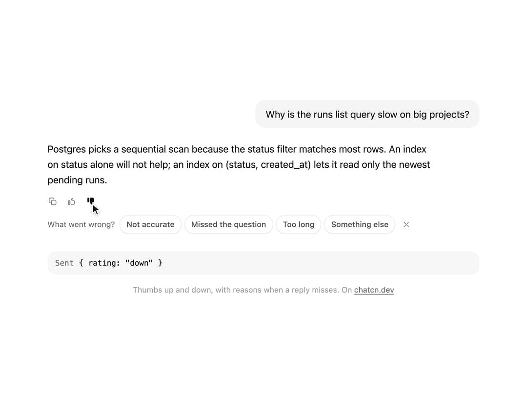
Thumbs up and down for a reply, with inline reason chips when it misses and a quiet thank you.
Built with React and Tailwind. Copy the prompt and paste it into Claude Code, Cursor or Lovable: your agent adds Message Feedback to your project and fits it to your theme.
Code
How Message Feedback is used: the demo's code. The component's own source comes with a free account.
Usage.tsx
"use client"

import * as React from "react"
import { cn } from "@/lib/utils"
import { Tooltip as TooltipPrimitive } from "@base-ui/react/tooltip"
import { Button, ButtonProps, FeedbackValue, Icon, IconNode, MessageFeedback, Tooltip, createIcon } from "@/components/ui/message-feedback"

interface GhostState {
  x: number
  y: number
  shown: boolean
  down: boolean
}

/**
 * A pointer that walks a demo through its clicks, so a preview shows what each control does.
 * `stage` is the positioned box the pointer moves in; targets are found inside it. Sizes come
 * from layout boxes, so a scaled FitFrame never throws the aim off.
 */
function useGhost(stage: React.RefObject<HTMLElement | null>) {
  const [ghost, setGhost] = React.useState<GhostState>({ x: 0, y: 0, shown: false, down: false })

  const find = React.useCallback(
    (target: string | HTMLElement) =>
      typeof target === "string"
        ? stage.current?.querySelector<HTMLElement>(target) ?? null
        : target,
    [stage],
  )

  const moveTo = React.useCallback(
    (target: string | HTMLElement, dx = 0.5, dy = 0.6) => {
      const root = stage.current
      const el = find(target)
      if (!root || !el) return null
      const rr = root.getBoundingClientRect()
      const scale = root.offsetWidth ? rr.width / root.offsetWidth : 1
      const er = el.getBoundingClientRect()
      const x = (er.left - rr.left + er.width * dx) / scale
      const y = (er.top - rr.top + er.height * dy) / scale
      // A hidden pointer fades in a short way off its first target instead of flying in from
      // wherever it was last.
      setGhost((g) => (g.shown ? { x, y, shown: true, down: false } : { x: x + 70, y: y + 46, shown: false, down: false }))
      window.requestAnimationFrame(() =>
        window.requestAnimationFrame(() => setGhost({ x, y, shown: true, down: false })),
      )
      return el
    },
    [stage, find],
  )

  const press = React.useCallback((down: boolean) => setGhost((g) => ({ ...g, down })), [])
  const hide = React.useCallback(() => setGhost((g) => ({ ...g, shown: false, down: false })), [])

  return { ghost, moveTo, press, hide, find }
}

interface Sent {
  rating: FeedbackValue
  reason?: string
}

const reducedMotion = () =>
  typeof window !== "undefined" && window.matchMedia("(prefers-reduced-motion: reduce)").matches

const STOP = Symbol("stop")

/**
 * Runs `script` in a loop with a `wait(ms)` that stops cleanly on unmount or once `active` turns
 * false. Reduced motion never starts it.
 */
function useLoop(
  script: (wait: (ms: number) => Promise<void>) => Promise<void>,
  active = true,
) {
  const ref = React.useRef(script)
  ref.current = script
  React.useEffect(() => {
    if (!active || reducedMotion()) return
    let alive = true
    const timers = new Set<number>()
    const wait = (ms: number) =>
      new Promise<void>((resolve, reject) => {
        const id = window.setTimeout(() => {
          timers.delete(id)
          if (alive) resolve()
          else reject(STOP)
        }, ms)
        timers.add(id)
      })
    ;(async () => {
      try {
        while (alive) await ref.current(wait)
      } catch (error) {
        if (error !== STOP) throw error
      }
    })()
    return () => {
      alive = false
      for (const id of timers) window.clearTimeout(id)
    }
  }, [active])
}

/** Moves to a target, presses and clicks it. Returns the element, or null if it is gone. */
async function tap(
  g: ReturnType<typeof useGhost>,
  target: string | HTMLElement,
  wait: (ms: number) => Promise<void>,
  travel = 700,
) {
  if (!g.moveTo(target)) return null
  await wait(travel)
  g.press(true)
  await wait(130)
  const el = g.find(target)
  el?.click()
  g.press(false)
  return el
}

const FIT_CSS = "html,body{overflow:hidden}[data-fit-small] [data-fit-hide]{display:none!important}"

/**
 * 21st shows a demo in a small frame: about 674 by 421 on a component page, 358 by 224 on a
 * phone and 245 by 139 on a profile card. A demo taller than its frame gets scrollbars, which
 * render white on dark pages. FitFrame fills the frame exactly instead.
 *
 * - "scale": the content shrinks until it fits, centered. For visuals such as orbs.
 * - "crop": the content stays at full size from the top and fades out at the bottom. For text
 *   that streams in, where a changing scale would make the page breathe.
 *
 * `minWidth` lays out a wide demo (a table, a two column panel) at that width and scales it down
 * to the frame, instead of letting it collapse to a narrow layout. The frame centers it, so it
 * shrinks evenly on both sides.
 *
 * Anything marked `data-fit-hide` (state buttons, the chatcn.dev line) drops out in frames
 * shorter than `hideBelow`, so a profile card shows the visual alone.
 */
function FitFrame({
  children,
  mode = "scale",
  hideBelow = 360,
  minWidth,
}: {
  children: React.ReactNode
  mode?: "scale" | "crop"
  hideBelow?: number
  minWidth?: string
}) {
  const content = React.useRef<HTMLDivElement>(null)
  const [cropped, setCropped] = React.useState(false)

  React.useLayoutEffect(() => {
    const el = content.current
    if (!el) return
    const measure = () => {
      const vw = window.innerWidth
      const vh = window.innerHeight
      el.toggleAttribute("data-fit-small", vh < hideBelow)
      // Layout sizes ignore the transform, so measuring never feeds back.
      const w = Math.max(el.offsetWidth, el.scrollWidth)
      const h = Math.max(el.offsetHeight, el.scrollHeight)
      const scale = mode === "scale" ? Math.min(1, vw / w, vh / h) : 1
      el.style.transform = scale < 1 ? `scale(${scale})` : ""
      setCropped(mode === "crop" && h > vh + 1)
    }
    measure()
    const observer = new ResizeObserver(measure)
    observer.observe(el)
    // Content that changes inside a fixed width box (a headline that cycles words) never resizes
    // the box itself, so changes below it measure again on the next frame.
    let frame = 0
    const mutations = new MutationObserver(() => {
      cancelAnimationFrame(frame)
      frame = requestAnimationFrame(measure)
    })
    mutations.observe(el, { subtree: true, childList: true, characterData: true })
    window.addEventListener("resize", measure)
    return () => {
      observer.disconnect()
      mutations.disconnect()
      cancelAnimationFrame(frame)
      window.removeEventListener("resize", measure)
    }
  }, [mode, hideBelow])

  const fade = "linear-gradient(to bottom, #000 calc(100% - 40px), transparent)"
  return (
    <div
      className="flex w-full justify-center overflow-hidden"
      style={{
        height: "100dvh",
        alignItems: mode === "crop" ? "flex-start" : "center",
        maskImage: cropped ? fade : undefined,
        WebkitMaskImage: cropped ? fade : undefined,
      }}
    >
      <style>{FIT_CSS}</style>
      <div
        ref={content}
        className="w-full shrink-0"
        style={{ transformOrigin: mode === "crop" ? "top center" : "center", minWidth }}
      >
        {children}
      </div>
    </div>
  )
}

/**
 * Wrap the app once. After the first tooltip opens, the next ones open instantly, the way
 * native toolbars behave.
 */
function TooltipProvider({
  delay = 500,
  ...props
}: React.ComponentProps<typeof TooltipPrimitive.Provider>) {
  return <TooltipPrimitive.Provider delay={delay} closeDelay={0} {...props} />
}

/* -------------------------------------------------------------------------------------------------
 * Types and context
 * -----------------------------------------------------------------------------------------------*/

type MessageRole = "user" | "assistant" | "system"

type MessageLayout = "auto" | "bubble" | "flat" | "compact"

type MessageState = "streaming" | "done" | "edited" | "error" | "stopped" | "queued"

/* -------------------------------------------------------------------------------------------------
 * Message
 * -----------------------------------------------------------------------------------------------*/

interface MessageProps extends React.ComponentProps<"div"> {
  /** Who wrote it. Named `from` so the ARIA `role` attribute stays free. */
  from: MessageRole
  /**
   * `auto` gives users a subtle bubble and assistants a flat, document-style block. `compact`
   * is the dense log style for agent traces and side panels. Defaults to `auto`.
   */
  layout?: MessageLayout
  /** Lifecycle state. Defaults to `done`. */
  state?: MessageState
  /** Follows a message from the same author: tightens the gap and hides the avatar. */
  grouped?: boolean
  /** The newest message. Keeps its actions visible instead of revealing them on hover. */
  latest?: boolean
  /**
   * Enter animation. Defaults to animating only messages that arrive after the conversation
   * mounted, so restored history appears at once.
   */
  animate?: boolean
  /** Announce the text to screen readers when streaming finishes. Defaults to true. */
  announce?: boolean
}

/** Scroll behavior for imperative calls. `smooth` falls back to instant under reduced motion. */
type ChatcnScrollBehavior = "smooth" | "instant"

/* -------------------------------------------------------------------------------------------------
 * Context
 * -----------------------------------------------------------------------------------------------*/

interface ConversationContextValue {
  scrollRef: (element: HTMLElement | null) => void
  contentRef: (element: HTMLElement | null) => void
  spacerRef: (element: HTMLElement | null) => void
  /** Within the threshold of the bottom. */
  isAtBottom: boolean
  /** Following new content. */
  isSticky: boolean
  /** More than one viewport from the bottom. */
  isFar: boolean
  /** Messages that arrived below while the reader was scrolled up. */
  unread: number
  scrollToBottom: (options?: { behavior?: ChatcnScrollBehavior }) => void
  scrollToTurn: (element: HTMLElement, options?: { behavior?: ChatcnScrollBehavior }) => void
  /** Read text to screen readers through the conversation's polite live region. */
  announce: (text: string) => void
  /** False during the first render, so restored history does not animate in. */
  ready: boolean
}

const ConversationContext = React.createContext<ConversationContextValue | null>(null)

/** Scroll state and controls of the nearest `Conversation`. Returns null outside one. */
function useConversation() {
  return React.useContext(ConversationContext)
}

interface MessageContextValue {
  from: MessageRole
  /** Resolved layout: `auto` becomes `bubble` for users and `flat` for everyone else. */
  layout: Exclude<MessageLayout, "auto">
  state: MessageState
  /** The newest message: its actions stay visible. */
  latest: boolean
}

const MessageContext = React.createContext<MessageContextValue | null>(null)

/**
 * One turn in the conversation. Compose `MessageAvatar`, `MessageContent`, `MessageMeta`,
 * `MessageStatus` and `MessageActions` inside it.
 */
function Message({
  from,
  layout: layoutProp = "auto",
  state = "done",
  grouped = false,
  latest = false,
  animate,
  announce = true,
  className,
  children,
  ...props
}: MessageProps) {
  const conversation = useConversation()
  const layout: MessageContextValue["layout"] =
    layoutProp === "auto" ? (from === "user" ? "bubble" : "flat") : layoutProp
  const [enter] = React.useState(() => animate ?? conversation?.ready ?? false)
  const ref = React.useRef<HTMLDivElement>(null)

  // Screen readers hear the finished reply once, never token by token.
  const previous = React.useRef(state)
  React.useEffect(() => {
    const was = previous.current
    previous.current = state
    if (!announce || was !== "streaming" || state === "streaming") return
    const text = ref.current?.querySelector('[data-slot="message-content"]')?.textContent?.trim()
    if (text) conversation?.announce(text)
  }, [state, announce, conversation])

  const value = React.useMemo(
    () => ({ from, layout, state, latest }),
    [from, layout, state, latest],
  )

  return (
    <MessageContext.Provider value={value}>
      <div
        ref={ref}
        data-slot="message"
        data-role={from}
        data-layout={layout}
        data-message-state={state}
        data-grouped={grouped ? "" : undefined}
        data-latest={latest ? "" : undefined}
        aria-busy={state === "streaming" || undefined}
        className={cn(
          "group/message relative flex min-w-0 flex-col",
          layout === "compact" ? "gap-1" : "gap-2",
          layout === "bubble" ? "items-end" : "items-start",
          from === "system" && layout !== "compact" && "items-center text-center",
          grouped && (layout === "compact" ? "-mt-2" : "-mt-4"),
          // An avatar sits in the start gutter (the end gutter for bubbles).
          layout === "bubble"
            ? "has-[>[data-slot=message-avatar]]:pe-9"
            : "has-[>[data-slot=message-avatar]]:ps-9",
          enter &&
            (from === "user"
              ? "ease-(--chatcn-ease-out-soft) transition-[opacity,translate] duration-200 starting:translate-y-2 starting:opacity-0 motion-reduce:starting:translate-y-0"
              : "ease-(--chatcn-ease-out-soft) transition-opacity duration-150 starting:opacity-0"),
          className,
        )}
        {...props}
      >
        {children}
      </div>
    </MessageContext.Provider>
  )
}

/** Role, layout and state of the nearest `Message`. Returns null outside one. */
function useMessage() {
  return React.useContext(MessageContext)
}

/* -------------------------------------------------------------------------------------------------
 * MessageContent
 * -----------------------------------------------------------------------------------------------*/

/**
 * The text of a message, capped at a 68ch measure. Plain text keeps its line breaks. Markdown
 * renderers drop in as children and inherit the 15/24 prose size.
 */
function MessageContent({ className, children, ...props }: React.ComponentProps<"div">) {
  const ctx = useMessage()
  const layout = ctx?.layout ?? "flat"
  const from = ctx?.from ?? "assistant"
  const state = ctx?.state ?? "done"
  const plain = typeof children === "string"

  return (
    <div
      data-slot="message-content"
      className={cn(
        "text-(color:--chatcn-fg) min-w-0 [overflow-wrap:anywhere]",
        // Bubbles fill their lines: pretty wrapping would leave a wide, half-empty bubble.
        layout !== "bubble" && "text-pretty",
        plain && "whitespace-pre-wrap",
        layout === "bubble" &&
          "text-[0.9375rem]/[1.5rem] tracking-[-0.006em] rounded-(--chatcn-radius-xl) bg-(color:--chatcn-fill) max-w-[80%] px-4 py-2.5 text-start",
        layout === "flat" && "text-[0.9375rem]/[1.5rem] tracking-[-0.006em] w-full max-w-[68ch]",
        layout === "compact" &&
          (from === "user"
            ? "text-[0.875rem]/[1.25rem] tracking-[-0.003em] rounded-(--chatcn-radius-md) bg-(color:--chatcn-fill) max-w-full px-3 py-1.5"
            : "text-[0.875rem]/[1.25rem] tracking-[-0.003em] w-full max-w-[68ch]"),
        from === "system" && "text-[0.8125rem]/[1.25rem] text-(color:--chatcn-fg-muted) max-w-[60ch]",
        // Queued turns are not sent yet: an outline instead of a fill says "pending".
        state === "queued" &&
          from === "user" &&
          "text-(color:--chatcn-fg-muted) border-(color:--chatcn-border-strong) border border-dashed bg-transparent",
        state === "error" && from === "user" && "text-(color:--chatcn-fg-muted)",
        className,
      )}
      {...props}
    >
      {children}
    </div>
  )
}

const ask = "Why is the runs list query slow on big projects?"

const reply =
  "Postgres picks a sequential scan because the status filter matches most rows. An index on status alone will not help; an index on (status, created_at) lets it read only the newest pending runs."

/* -------------------------------------------------------------------------------------------------
 * MessageActions
 * -----------------------------------------------------------------------------------------------*/

interface MessageActionsProps extends React.ComponentProps<"div"> {
  /**
   * Keep the toolbar visible. Defaults to the message's `latest` flag. Older messages reveal
   * their actions on hover or focus, instantly, and always on touch screens.
   */
  visible?: boolean
}

/**
 * Toolbar under a message. Reveal is instant because it happens hundreds of times a day; an
 * animation there only adds lag.
 */
function MessageActions({ visible, className, children, ...props }: MessageActionsProps) {
  const ctx = useMessage()
  const pinned = visible ?? ctx?.latest ?? true
  // A streaming reply has nothing to act on yet.
  if (ctx?.state === "streaming") return null

  return (
    <div
      role="toolbar"
      aria-label="Message actions"
      data-slot="message-actions"
      data-pinned={pinned ? "" : undefined}
      className={cn(
        "-ms-1.5 flex min-h-7 flex-wrap items-center gap-0.5",
        ctx?.layout === "bubble" && "ms-0 -me-1.5 justify-end",
        !pinned &&
          cn(
            "opacity-0 group-focus-within/message:opacity-100 group-hover/message:opacity-100",
            // Stay put while a menu or popover opened from here is open, and on touch screens.
            "has-[[data-popup-open]]:opacity-100 pointer-coarse:opacity-100",
          ),
        className,
      )}
      {...props}
    >
      {children}
    </div>
  )
}

interface CopyButtonProps extends Omit<ButtonProps, "value" | "onCopy"> {
  value: string | (() => string)
  label?: string
  onCopy?: (value: string) => void
}

const iconNode: IconNode = [
  ["path", {"d":"M11.5 9h7a2.5 2.5 0 0 1 2.5 2.5v7a2.5 2.5 0 0 1-2.5 2.5h-7A2.5 2.5 0 0 1 9 18.5v-7A2.5 2.5 0 0 1 11.5 9"}],
  ["path", {"d":"M6 15h-.5A2.5 2.5 0 0 1 3 12.5v-7A2.5 2.5 0 0 1 5.5 3h7A2.5 2.5 0 0 1 15 5.5V6"}],
]

const CopyIcon: Icon = /* @__PURE__ */ createIcon("copy", iconNode)

const iconNode2: IconNode = [
  ["path", {"d":"m4.5 12.75 3.23 3.23a2.5 2.5 0 0 0 3.54 0l8.48-8.48"}],
]

const CheckIcon: Icon = /* @__PURE__ */ createIcon("check", iconNode2)

/** Copy swaps to a check with a 150 ms blur crossfade, holds for 1.5 s and announces itself. */
function CopyButton({
  value,
  label = "Copy",
  onCopy,
  onClick,
  children,
  size = "icon-sm",
  className,
  ...props
}: CopyButtonProps) {
  // A counter, not a flag: copying again while the check shows restarts the 1.5 s hold.
  const [copies, setCopies] = React.useState(0)
  const [copied, setCopied] = React.useState(false)
  React.useEffect(() => {
    if (!copies) return
    setCopied(true)
    const id = window.setTimeout(() => setCopied(false), 1500)
    return () => window.clearTimeout(id)
  }, [copies])

  // Reduced motion keeps the crossfade and drops the scale and blur.
  const layer = cn(
    "ease-(--chatcn-ease-out) absolute transition-[opacity,scale,filter] duration-150",
    "motion-reduce:scale-100 motion-reduce:blur-none motion-reduce:transition-opacity",
  )
  return (
    <Button
      {...props}
      size={size}
      aria-label={children ? undefined : copied ? "Copied" : label}
      onClick={(event) => {
        // Compose with handlers injected by wrappers such as Tooltip instead of replacing them.
        onClick?.(event)
        if (event.defaultPrevented) return
        const text = typeof value === "function" ? value() : value
        navigator.clipboard
          ?.writeText(text)
          .then(() => {
            setCopies((n) => n + 1)
            onCopy?.(text)
          })
          // Clipboard access can be denied (insecure context, permissions). Stay quiet and unchanged.
          .catch(() => {})
      }}
      className={cn("relative", className)}
    >
      {children ? (
        <>
          <span className="relative grid size-3.5 place-items-center">
            <CopyIcon
              className={cn(
                layer,
                copied ? "scale-75 opacity-0 blur-[2px]" : "scale-100 opacity-100",
              )}
            />
            <CheckIcon
              className={cn(
                layer,
                copied ? "scale-100 opacity-100" : "scale-75 opacity-0 blur-[2px]",
              )}
            />
          </span>
          {children}
        </>
      ) : null}
      {children ? null : (
        <>
          <CopyIcon
            className={cn(
              layer,
              copied ? "scale-75 opacity-0 blur-[2px]" : "scale-100 opacity-100",
            )}
          />
          <CheckIcon
            className={cn(
              layer,
              copied ? "scale-100 opacity-100" : "scale-75 opacity-0 blur-[2px]",
            )}
          />
        </>
      )}
      <span aria-live="polite" className="sr-only">
        {copied ? "Copied" : ""}
      </span>
    </Button>
  )
}

/**
 * CopyButton spreads its props after its own click handler, so the tooltip trigger's onClick
 * would replace the copy. Run both instead.
 */
function CopyTrigger({ onClick, onCopy, ...props }: CopyButtonProps) {
  return <CopyButton {...props} onCopy={onCopy} onClickCapture={(event) => onClick?.(event)} />
}

const actionClass = cn(
  "text-(color:--chatcn-fg-subtle) hover:text-(color:--chatcn-fg)",
  // 28 px visual, 44 px hit area on touch.
  "relative pointer-coarse:after:absolute pointer-coarse:after:-inset-2 pointer-coarse:after:content-['']",
)

/* -------------------------------------------------------------------------------------------------
 * MessageActionCopy
 * -----------------------------------------------------------------------------------------------*/

/** Copy with the kit's copy-to-check swap, in the toolbar's size and tone. */
function MessageActionCopy({ label = "Copy", className, ...props }: CopyButtonProps) {
  return (
    <Tooltip content={label}>
      <CopyTrigger
        label={label}
        data-slot="message-action"
        className={cn(actionClass, className)}
        {...props}
      />
    </Tooltip>
  )
}

const REASONS = ["Not accurate", "Missed the question", "Too long", "Something else"]

/** The pointer itself. Put it last inside the stage, which must be `relative`. */
function Ghost({ ghost }: { ghost: GhostState }) {
  return (
    <div
      aria-hidden
      className="pointer-events-none absolute top-0 left-0 z-20"
      style={{
        transform: `translate(${ghost.x}px, ${ghost.y}px)`,
        opacity: ghost.shown ? 1 : 0,
        // Hidden, it jumps; shown, it glides.
        transition: ghost.shown
          ? "transform 620ms cubic-bezier(0.4, 0, 0.2, 1), opacity 220ms ease-out"
          : "opacity 220ms ease-out",
      }}
    >
      <svg
        width="18"
        height="20"
        viewBox="0 0 18 20"
        className="drop-shadow-[0_1px_2px_rgb(0_0_0/0.25)]"
        style={{
          transform: ghost.down ? "scale(0.86)" : "scale(1)",
          transformOrigin: "2px 2px",
          transition: "transform 120ms ease-out",
        }}
      >
        <path
          d="M2 1.5 L2 16 L5.9 12.4 L8.6 18.3 L11.2 17.1 L8.6 11.3 L13.9 11.1 Z"
          className="fill-[oklch(0.2_0_0)] stroke-white dark:fill-white dark:stroke-[oklch(0.2_0_0)]"
          strokeWidth="1.3"
          strokeLinejoin="round"
        />
      </svg>
    </div>
  )
}

/** The line under each 21st demo that points back to the kit. */
function MoreOn({ slug, children }: { slug: string; children: React.ReactNode }) {
  return (
    <p data-fit-hide className="text-[0.75rem]/[1rem] text-(color:--chatcn-fg-faint) text-center text-balance">
      {children}{" "}
      <a
        href={`https://chatcn.dev/docs/components/${slug}`}
        target="_blank"
        rel="noopener"
        className="text-(color:--chatcn-fg-subtle) hover:text-(color:--chatcn-fg) underline underline-offset-2"
      >
        chatcn.dev
      </a>
    </p>
  )
}

/**
 * A reply gets rated: thumbs down asks what went wrong with inline chips, a chip sends it and the
 * row says thanks. The next round rates it up. The card below shows what your app receives.
 * Clicking anything stops the tour so you can rate it yourself.
 */
export default function MessageFeedbackPreview() {
  const stage = React.useRef<HTMLDivElement>(null)
  const g = useGhost(stage)
  const [touring, setTouring] = React.useState(true)
  const [round, setRound] = React.useState(0)
  const [sent, setSent] = React.useState<Sent | null>(null)

  useLoop(async (wait) => {
    setSent(null)
    setRound((r) => r + 1)
    await wait(1100)
    await tap(g, 'button[aria-label="Bad response"]', wait)
    await wait(900)
    await tap(g, '[data-slot="message-feedback-reasons"] button:nth-of-type(2)', wait, 800)
    await wait(300)
    g.hide()
    await wait(3000)
    setSent(null)
    setRound((r) => r + 1)
    await wait(900)
    await tap(g, 'button[aria-label="Good response"]', wait)
    await wait(300)
    g.hide()
    await wait(2800)
  }, touring)

  return (
    <FitFrame minWidth="38rem">
      <div className="flex w-full flex-col items-center justify-center gap-4 p-6">
        <TooltipProvider>
          <div
            ref={stage}
            className="relative flex w-full max-w-2xl flex-col gap-5 overflow-hidden"
            onPointerDown={() => {
              if (!touring) return
              setTouring(false)
              g.hide()
            }}
          >
            <Message from="user">
              <MessageContent>{ask}</MessageContent>
            </Message>
            <div className="min-h-[9.5rem]">
              <Message from="assistant" latest>
                <MessageContent>{reply}</MessageContent>
                <MessageActions>
                  <MessageActionCopy value={reply} label="Copy response" />
                  <MessageFeedback
                    key={round}
                    reasons={REASONS}
                    onValueChange={(rating) => setSent(rating ? { rating } : null)}
                    onReason={(reasons) =>
                      setSent((s) => (s ? { ...s, reason: reasons.join(", ") } : s))
                    }
                  />
                </MessageActions>
              </Message>
            </div>
            <div className="rounded-(--chatcn-radius-lg) bg-(color:--chatcn-inset) text-[0.75rem]/[1rem] flex h-9 items-center gap-2 px-3 font-mono">
              <span className="text-(color:--chatcn-fg-subtle)">Sent</span>
              {sent ? (
                <span className="text-(color:--chatcn-fg)">
                  {`{ rating: "${sent.rating}"${sent.reason ? `, reason: "${sent.reason}"` : ""} }`}
                </span>
              ) : (
                <span className="text-(color:--chatcn-fg-faint)">waiting for a rating</span>
              )}
            </div>
            <Ghost ghost={g.ghost} />
          </div>
        </TooltipProvider>
        <MoreOn slug="message-feedback">Thumbs up and down, with reasons when a reply misses. On</MoreOn>
      </div>
    </FitFrame>
  )
}
Dependencies
More by Aadi
View all
Audio Visualizer
12
Dither Orb
12
Voice Orb
8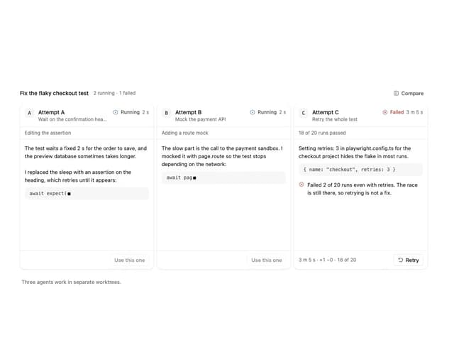
Agent Lanes
7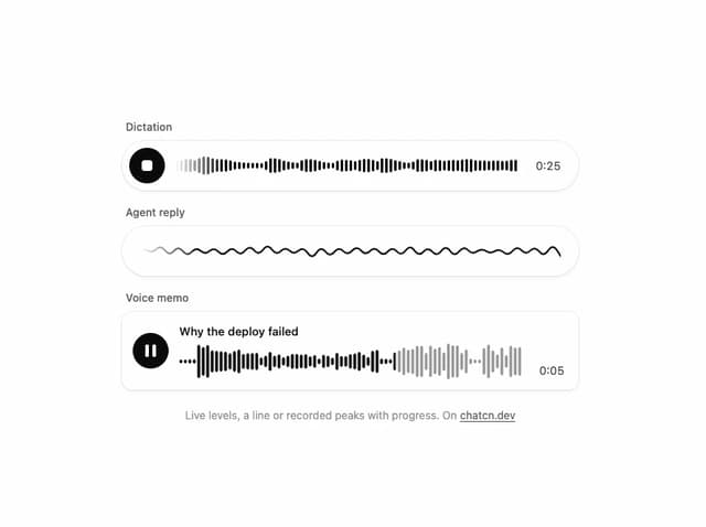
Waveform
5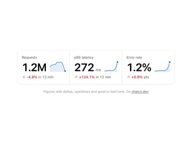
Stat Card
4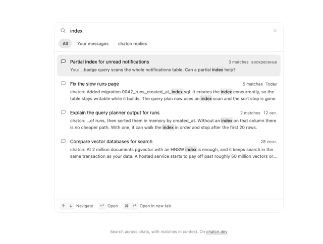
Chat Search
3
Plan
3
More in AI chats
View all

AI Actions
339

Aquarium Prompt
58

Illos Knowledge Sources
42
Commit
34
Chat Bubble
199
Attachments
39
Color Picker
173
Message Thread
58


