
About
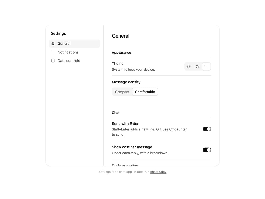
A settings panel for chat apps: tabs for general, notifications and data, theme with system, light and dark, message density, send with Enter and other switches, each with a short hint.
Built with React and Tailwind. Copy the prompt and paste it into Claude Code, Cursor or Lovable: your agent adds Settings Panel to your project and fits it to your theme.
Code
How Settings Panel is used: the demo's code. The component's own source comes with a free account.
Usage.tsx
"use client"

import * as React from "react"
import { forwardRef, createElement, type SVGAttributes, type ForwardRefExoticComponent, type RefAttributes } from "react"
import { cn } from "@/lib/utils"
import { SettingsGroup, SettingsNav, SettingsNavItem, SettingsPane, SettingsPanel, SettingsRow, SettingsSegmented, SettingsSwitch } from "@/components/ui/settings-panel"

const FIT_CSS = "html,body{overflow:hidden}[data-fit-small] [data-fit-hide]{display:none!important}"

/**
 * 21st shows a demo in a small frame: about 674 by 421 on a component page, 358 by 224 on a
 * phone and 245 by 139 on a profile card. A demo taller than its frame gets scrollbars, which
 * render white on dark pages. FitFrame fills the frame exactly instead.
 *
 * - "scale": the content shrinks until it fits, centered. For visuals such as orbs.
 * - "crop": the content stays at full size from the top and fades out at the bottom. For text
 *   that streams in, where a changing scale would make the page breathe.
 *
 * `minWidth` lays out a wide demo (a table, a two column panel) at that width and scales it down
 * to the frame, instead of letting it collapse to a narrow layout. The frame centers it, so it
 * shrinks evenly on both sides.
 *
 * Anything marked `data-fit-hide` (state buttons, the chatcn.dev line) drops out in frames
 * shorter than `hideBelow`, so a profile card shows the visual alone.
 */
function FitFrame({
  children,
  mode = "scale",
  hideBelow = 360,
  minWidth,
}: {
  children: React.ReactNode
  mode?: "scale" | "crop"
  hideBelow?: number
  minWidth?: string
}) {
  const content = React.useRef<HTMLDivElement>(null)
  const [cropped, setCropped] = React.useState(false)

  React.useLayoutEffect(() => {
    const el = content.current
    if (!el) return
    const measure = () => {
      const vw = window.innerWidth
      const vh = window.innerHeight
      el.toggleAttribute("data-fit-small", vh < hideBelow)
      // Layout sizes ignore the transform, so measuring never feeds back.
      const w = Math.max(el.offsetWidth, el.scrollWidth)
      const h = Math.max(el.offsetHeight, el.scrollHeight)
      const scale = mode === "scale" ? Math.min(1, vw / w, vh / h) : 1
      el.style.transform = scale < 1 ? `scale(${scale})` : ""
      setCropped(mode === "crop" && h > vh + 1)
    }
    measure()
    const observer = new ResizeObserver(measure)
    observer.observe(el)
    // Content that changes inside a fixed width box (a headline that cycles words) never resizes
    // the box itself, so changes below it measure again on the next frame.
    let frame = 0
    const mutations = new MutationObserver(() => {
      cancelAnimationFrame(frame)
      frame = requestAnimationFrame(measure)
    })
    mutations.observe(el, { subtree: true, childList: true, characterData: true })
    window.addEventListener("resize", measure)
    return () => {
      observer.disconnect()
      mutations.disconnect()
      cancelAnimationFrame(frame)
      window.removeEventListener("resize", measure)
    }
  }, [mode, hideBelow])

  const fade = "linear-gradient(to bottom, #000 calc(100% - 40px), transparent)"
  return (
    <div
      className="flex w-full justify-center overflow-hidden"
      style={{
        height: "100dvh",
        alignItems: mode === "crop" ? "flex-start" : "center",
        maskImage: cropped ? fade : undefined,
        WebkitMaskImage: cropped ? fade : undefined,
      }}
    >
      <style>{FIT_CSS}</style>
      <div
        ref={content}
        className="w-full shrink-0"
        style={{ transformOrigin: mode === "crop" ? "top center" : "center", minWidth }}
      >
        {children}
      </div>
    </div>
  )
}

interface IconProps extends SVGAttributes<SVGSVGElement> {
  /** Width and height. Number means px. Default 24. */
  size?: number | string
  /** Stroke width in viewBox units (24 grid). Default 1.5. */
  strokeWidth?: number | string
  /** Keep the rendered stroke at `strokeWidth` px at any size. */
  absoluteStrokeWidth?: boolean
  /** Stroke color. Default currentColor. */
  color?: string
  /** Accessible name. Renders <title> and sets role="img"; without it the icon is aria-hidden. */
  title?: string
}

type Icon = ForwardRefExoticComponent<IconProps & RefAttributes<SVGSVGElement>>

/** Shape elements an icon may contain. */
type IconElement = "path" | "circle" | "rect" | "ellipse" | "line" | "polyline" | "polygon"

/** An icon's drawing: a flat list of [element, attributes] pairs, lucide compatible. */
type IconNode = ReadonlyArray<readonly [IconElement, Readonly<Record<string, string>>]>

const toPascal = (name: string): string =>
  name
    .split("-")
    .map((part) => part.charAt(0).toUpperCase() + part.slice(1))
    .join("")

/**
 * Builds a React icon component from an icon node.
 * `name` is the kebab-case icon name, used for the class `chatcn-icon-<name>` and displayName.
 */
function createIcon(name: string, iconNode: IconNode): Icon {
  // biome-ignore lint/correctness/noComponentHookFactories: runs once per icon at module load
  const Component = forwardRef<SVGSVGElement, IconProps>(function ChatcnIcon(
    {
      size = 24,
      strokeWidth = 1.5,
      absoluteStrokeWidth = false,
      color = "currentColor",
      title,
      className,
      children,
      ...rest
    },
    ref,
  ) {
    const stroke = absoluteStrokeWidth
      ? (Number(strokeWidth) * 24) / Number.parseFloat(String(size))
      : strokeWidth
    const labelled = Boolean(title || rest["aria-label"] || rest["aria-labelledby"])
    return createElement(
      "svg",
      {
        ref,
        xmlns: "http://www.w3.org/2000/svg",
        width: size,
        height: size,
        viewBox: "0 0 24 24",
        fill: "none",
        stroke: color,
        strokeWidth: stroke,
        strokeLinecap: "round",
        strokeLinejoin: "round",
        "data-slot": "icon",
        className: className
          ? `chatcn-icon chatcn-icon-${name} ${className}`
          : `chatcn-icon chatcn-icon-${name}`,
        ...(labelled ? { role: "img" } : { "aria-hidden": true }),
        ...rest,
      },
      title ? createElement("title", null, title) : null,
      ...iconNode.map(([tag, attrs], i) => createElement(tag, { key: i, ...attrs })),
      children,
    )
  })
  Component.displayName = `${toPascal(name)}Icon`
  return Component
}

const iconNode: IconNode = [
  ["path", {"d":"m9.17 5.26.2-.98a1.5 1.5 0 0 1 1.47-1.21h2.32a1.5 1.5 0 0 1 1.47 1.21l.2.98a1.5 1.5 0 0 0 .72 1.01l-.37-.21a1.5 1.5 0 0 0 1.24.12l.95-.32a1.5 1.5 0 0 1 1.79.67l1.16 2.01a1.5 1.5 0 0 1-.31 1.88l-.76.66a1.5 1.5 0 0 0-.52 1.13v-.42a1.5 1.5 0 0 0 .52 1.13l.76.66a1.5 1.5 0 0 1 .31 1.88l-1.16 2.01a1.5 1.5 0 0 1-1.79.67l-.95-.32a1.5 1.5 0 0 0-1.24.12l.37-.21a1.5 1.5 0 0 0-.72 1.01l-.2.98a1.5 1.5 0 0 1-1.47 1.21h-2.32a1.5 1.5 0 0 1-1.47-1.21l-.2-.98a1.5 1.5 0 0 0-.72-1.01l.37.21a1.5 1.5 0 0 0-1.24-.12l-.95.32a1.5 1.5 0 0 1-1.79-.67l-1.16-2.01a1.5 1.5 0 0 1 .31-1.88l.76-.66a1.5 1.5 0 0 0 .52-1.13v.42a1.5 1.5 0 0 0-.52-1.13l-.76-.66a1.5 1.5 0 0 1-.31-1.88l1.16-2.01a1.5 1.5 0 0 1 1.79-.67l.95.32a1.5 1.5 0 0 0 1.24-.12l-.37.21a1.5 1.5 0 0 0 .72-1.01"}],
  ["path", {"d":"M9.25 12a2.75 2.75 0 1 0 5.5 0 2.75 2.75 0 1 0-5.5 0"}],
]

const SettingsIcon: Icon = /* @__PURE__ */ createIcon("settings", iconNode)

const iconNode2: IconNode = [
  ["path", {"d":"M6 12.53V9.5a6 6 0 0 1 12 0v3.03a2 2 0 0 0 .21.89l.7 1.41A1.5 1.5 0 0 1 17.57 17H6.43a1.5 1.5 0 0 1-1.34-2.17l.7-1.41a2 2 0 0 0 .21-.89"}],
  ["path", {"d":"M14 20a2.5 2.5 0 0 1-4 0"}],
]

const BellIcon: Icon = /* @__PURE__ */ createIcon("bell", iconNode2)

const iconNode3: IconNode = [
  ["path", {"d":"M3.5 5.5a8.5 3 0 1 0 17 0 8.5 3 0 1 0-17 0"}],
  ["path", {"d":"M3.5 5.5v13a8.5 3 0 0 0 17 0v-13"}],
  ["path", {"d":"M3.5 12a8.5 3 0 0 0 17 0"}],
]

const DatabaseIcon: Icon = /* @__PURE__ */ createIcon("database", iconNode3)

const iconNode4: IconNode = [
  ["path", {"d":"M8 12a4 4 0 1 0 8 0 4 4 0 1 0-8 0"}],
  ["path", {"d":"M19 12h2.25"}],
  ["path", {"d":"m16.95 16.95 1.59 1.59"}],
  ["path", {"d":"M12 19v2.25"}],
  ["path", {"d":"m7.05 16.95-1.59 1.59"}],
  ["path", {"d":"M5 12H2.75"}],
  ["path", {"d":"M7.05 7.05 5.46 5.46"}],
  ["path", {"d":"M12 5V2.75"}],
  ["path", {"d":"m16.95 7.05 1.59-1.59"}],
]

const SunIcon: Icon = /* @__PURE__ */ createIcon("sun", iconNode4)

const iconNode5: IconNode = [
  ["path", {"d":"M11.47 3.27a8.75 8.75 0 1 0 9.26 9.26 6.75 6.75 0 0 1-9.26-9.26"}],
]

const MoonIcon: Icon = /* @__PURE__ */ createIcon("moon", iconNode5)

const iconNode6: IconNode = [
  ["path", {"d":"M5.75 3.5h12.5a3 3 0 0 1 3 3v6.75a3 3 0 0 1-3 3H5.75a3 3 0 0 1-3-3V6.5a3 3 0 0 1 3-3"}],
  ["path", {"d":"M8 20.25h8"}],
]

const MonitorIcon: Icon = /* @__PURE__ */ createIcon("monitor", iconNode6)

type ButtonVariant = "solid" | "outline" | "ghost" | "subtle"

type ButtonSize = "xs" | "sm" | "md" | "lg" | "icon-xs" | "icon-sm" | "icon-md" | "icon-lg"

interface ButtonProps extends React.ComponentProps<"button"> {
  variant?: ButtonVariant
  size?: ButtonSize
}

const base = cn(
  "chatcn-focus inline-flex shrink-0 items-center justify-center gap-1.5 font-medium whitespace-nowrap select-none",
  "ease-(--chatcn-ease-standard) transition-[background-color,color,box-shadow,scale] duration-150",
  "active:scale-(--chatcn-press-scale) active:duration-100 disabled:pointer-events-none disabled:opacity-50",
  "[&_svg]:pointer-events-none [&_svg]:shrink-0",
)

const variants: Record<ButtonVariant, string> = {
  solid: "bg-(color:--chatcn-primary) text-(color:--chatcn-primary-fg) hover:bg-(color:--chatcn-primary-hover)",
  outline: "bg-(color:--chatcn-card) text-(color:--chatcn-fg) shadow-(--chatcn-shadow-xs) hover:bg-(color:--chatcn-fill-hover)",
  ghost: "text-(color:--chatcn-fg-muted) hover:bg-(color:--chatcn-fill-hover) hover:text-(color:--chatcn-fg)",
  subtle: "bg-(color:--chatcn-fill) text-(color:--chatcn-fg) hover:bg-(color:--chatcn-fill-hover)",
}

// Heights follow the control scale: 24, 28, 32, 36. Radii stay concentric inside 12 px surfaces.
const sizes: Record<ButtonSize, string> = {
  xs: "h-6 rounded-(--chatcn-radius-sm) px-2 text-[0.75rem]/[1rem] [&_svg]:size-3.5",
  sm: "h-7 rounded-(--chatcn-radius-sm) px-2.5 text-[0.8125rem]/[1.25rem] [&_svg]:size-3.5",
  md: "h-8 rounded-(--chatcn-radius-md) px-3 text-[0.875rem]/[1.25rem] tracking-[-0.003em] [&_svg]:size-4",
  lg: "h-9 rounded-(--chatcn-radius-md) px-3.5 text-[0.875rem]/[1.25rem] tracking-[-0.003em] [&_svg]:size-4",
  "icon-xs": "size-6 rounded-(--chatcn-radius-sm) active:scale-(--chatcn-press-scale-icon) [&_svg]:size-3.5",
  "icon-sm": "size-7 rounded-(--chatcn-radius-sm) active:scale-(--chatcn-press-scale-icon) [&_svg]:size-3.5",
  "icon-md": "size-8 rounded-(--chatcn-radius-md) active:scale-(--chatcn-press-scale-icon) [&_svg]:size-4",
  "icon-lg": "size-9 rounded-(--chatcn-radius-md) active:scale-(--chatcn-press-scale-icon) [&_svg]:size-4",
}

/** Class names for anything that should look like a button, such as a link. */
function buttonVariants({
  variant = "ghost",
  size = "md",
}: {
  variant?: ButtonVariant
  size?: ButtonSize
} = {}) {
  return cn(base, variants[variant], sizes[size])
}

function Button({
  variant = "ghost",
  size = "md",
  type = "button",
  className,
  ...props
}: ButtonProps) {
  return (
    <button
      type={type}
      data-slot="button"
      data-variant={variant}
      className={cn(buttonVariants({ variant, size }), className)}
      {...props}
    />
  )
}

/** The layout on its own: sections nav, panes, groups and rows. Narrow it to see the nav move on top. */
function SettingsPanelDemo() {
  const [cost, setCost] = React.useState(true)
  return (
    <div className="bg-(color:--chatcn-card) shadow-(--chatcn-shadow-sm) rounded-(--chatcn-radius-xl) w-full max-w-4xl overflow-hidden">
      <SettingsPanel defaultValue="general" className="h-[34rem]">
        <SettingsNav title="Settings">
          <SettingsNavItem value="general" icon={<SettingsIcon />}>
            General
          </SettingsNavItem>
          <SettingsNavItem value="notifications" icon={<BellIcon />}>
            Notifications
          </SettingsNavItem>
          <SettingsNavItem value="data" icon={<DatabaseIcon />}>
            Data controls
          </SettingsNavItem>
        </SettingsNav>

        <SettingsPane value="general" title="General">
          <SettingsGroup title="Appearance">
            <SettingsRow label="Theme" description="System follows your device.">
              <SettingsSegmented
                defaultValue="system"
                options={[
                  { value: "light", label: "Light", icon: <SunIcon />, iconOnly: true },
                  { value: "dark", label: "Dark", icon: <MoonIcon />, iconOnly: true },
                  { value: "system", label: "System", icon: <MonitorIcon />, iconOnly: true },
                ]}
              />
            </SettingsRow>
            <SettingsRow label="Message density">
              <SettingsSegmented
                defaultValue="comfortable"
                options={[
                  { value: "compact", label: "Compact" },
                  { value: "comfortable", label: "Comfortable" },
                ]}
              />
            </SettingsRow>
          </SettingsGroup>
          <SettingsGroup title="Chat">
            <SettingsRow
              label="Send with Enter"
              description="Shift+Enter adds a new line. Off, use Cmd+Enter to send."
            >
              <SettingsSwitch defaultChecked />
            </SettingsRow>
            <SettingsRow
              label="Show cost per message"
              description="Under each reply, with a breakdown."
            >
              <SettingsSwitch checked={cost} onCheckedChange={setCost} />
            </SettingsRow>
            <SettingsRow
              label="Code execution"
              description="Run code in a sandbox to analyze files and check answers."
              disabled
              note="Turned off by your admin"
            >
              <SettingsSwitch />
            </SettingsRow>
          </SettingsGroup>
        </SettingsPane>

        <SettingsPane value="notifications" title="Notifications">
          <SettingsGroup>
            <SettingsRow
              label="When a background task finishes"
              description="A system notification while the tab is hidden."
            >
              <SettingsSwitch defaultChecked />
            </SettingsRow>
            <SettingsRow label="When an agent needs approval">
              <SettingsSwitch defaultChecked />
            </SettingsRow>
            <SettingsRow label="Weekly usage email">
              <SettingsSwitch />
            </SettingsRow>
          </SettingsGroup>
        </SettingsPane>

        <SettingsPane value="data" title="Data controls">
          <SettingsGroup>
            <SettingsRow
              label="Improve the model for everyone"
              description="Use your chats to train future models. Temporary chats are never used."
            >
              <SettingsSwitch />
            </SettingsRow>
            <SettingsRow
              label="Export data"
              description="A zip of every chat and memory, by email."
            >
              <Button size="sm" variant="outline">
                Export
              </Button>
            </SettingsRow>
            <SettingsRow
              label="Delete all chats"
              description="Can't be undone. Shared links stop working."
            >
              <Button size="sm" variant="outline">
                Delete all…
              </Button>
            </SettingsRow>
          </SettingsGroup>
        </SettingsPane>
      </SettingsPanel>
    </div>
  )
}

/** The line under each 21st demo that points back to the kit. */
function MoreOn({ slug, children }: { slug: string; children: React.ReactNode }) {
  return (
    <p data-fit-hide className="text-[0.75rem]/[1rem] text-(color:--chatcn-fg-faint) text-center text-balance">
      {children}{" "}
      <a
        href={`https://chatcn.dev/docs/components/${slug}`}
        target="_blank"
        rel="noopener"
        className="text-(color:--chatcn-fg-subtle) hover:text-(color:--chatcn-fg) underline underline-offset-2"
      >
        chatcn.dev
      </a>
    </p>
  )
}

/** The kit's own example, framed for the 21st preview. */
export default function SettingsPanelPreview() {
  return (
    <FitFrame minWidth="38rem">
      <div className="flex w-full flex-col items-center justify-center gap-4 p-6">
        <div className="flex w-full max-w-2xl justify-center">
          <SettingsPanelDemo />
        </div>
        <MoreOn slug="settings-panel">Settings for a chat app, in tabs. On</MoreOn>
      </div>
    </FitFrame>
  )
}
Dependencies
More by Aadi
View all
Dither Orb
12
Audio Visualizer
9
Voice Orb
8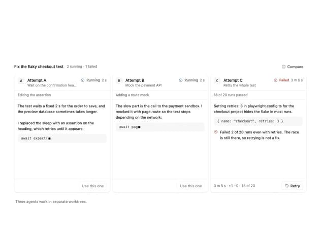
Agent Lanes
6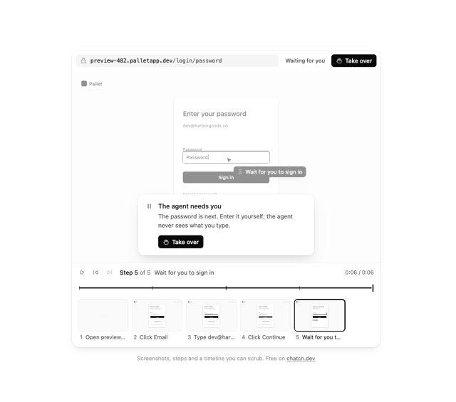
Computer View
3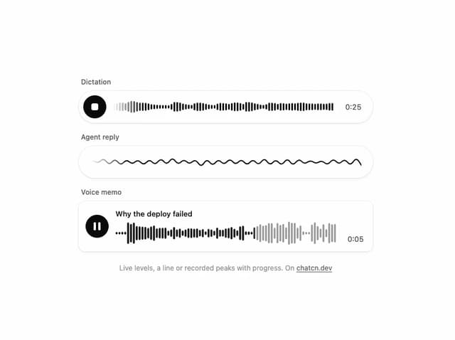
Waveform
2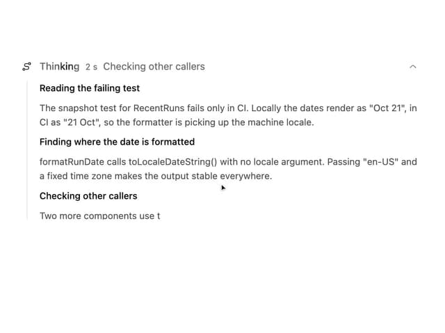
Reasoning
2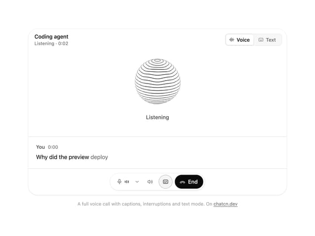
Voice Session
1
More in Forms
View all

Premium Auth
552

Login 1
60

Book A Demo 1
86

Contact Card
1.1K
Authentication Card
50

Form
137

Login 2
10

Form
16
