
About
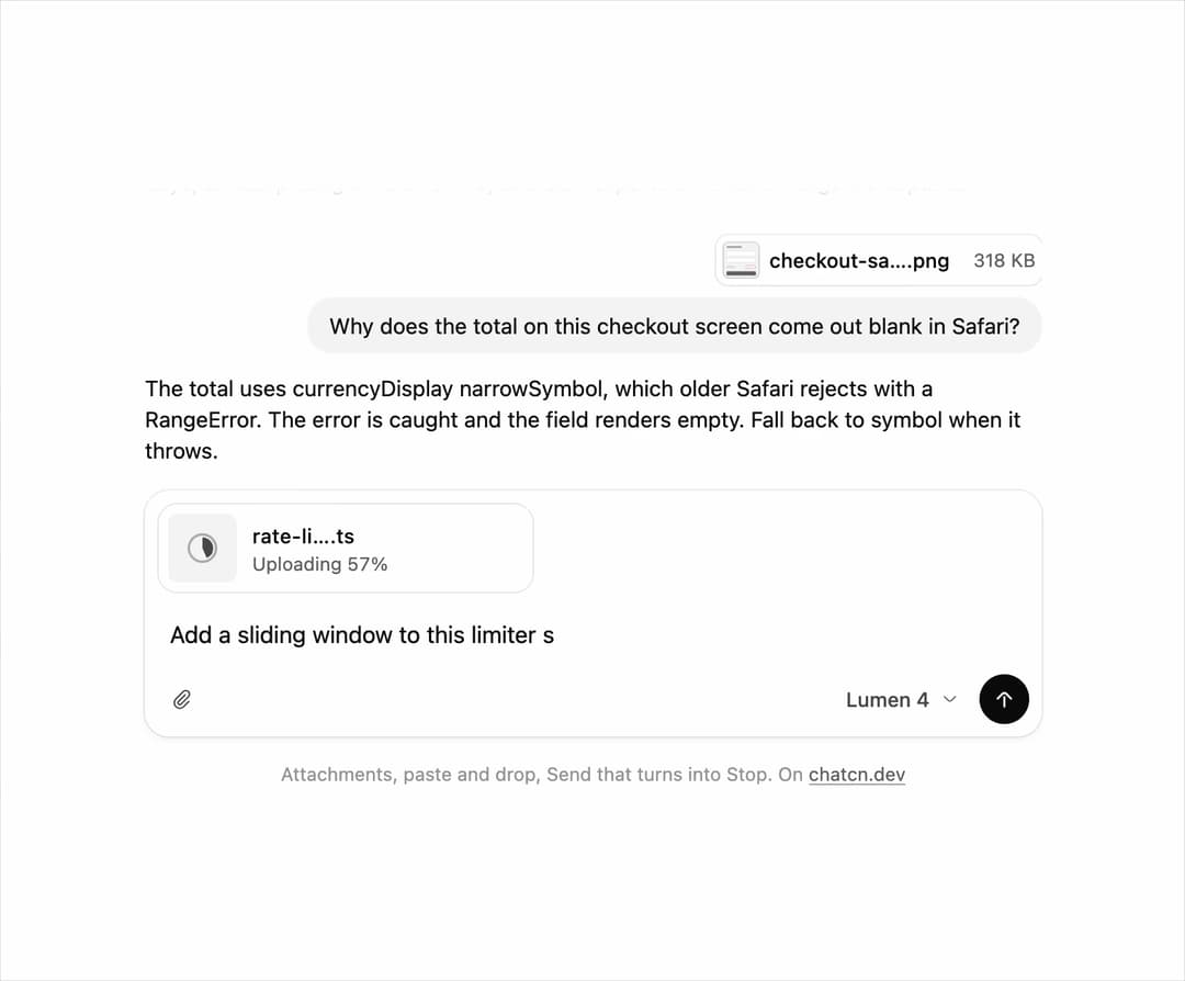
A chat composer for AI apps: attach files with upload progress, toggle tools like web search, pick a model, and Send turns into Stop while the reply streams. Paste and drop work too.
Built with React and Tailwind. Copy the prompt and paste it into Claude Code, Cursor or Lovable: your agent adds Prompt Input to your project and fits it to your theme.
Code
How Prompt Input is used: the demo's code. The component's own source comes with a free account.
Usage.tsx
"use client"
import * as React from "react"
import { cn } from "@/lib/utils"
import { Popover as PopoverPrimitive } from "@base-ui/react/popover"
import { Icon, IconNode, PromptInput, PromptInputActions, PromptInputAttachButton, PromptInputAttachments, PromptInputStatus, PromptInputSubmit, PromptInputTextarea, PromptInputToolbar, PromptInputTools, Spinner, createIcon } from "@/components/ui/prompt-input"
const SEND_AT = 1750
const WRITE_AT = SEND_AT + 800
const WRITE_MS = 1300
const DONE_AT = WRITE_AT + WRITE_MS
const SCENE_MS = DONE_AT + 800
/**
* Opens on the first answer streaming, so the first frame is already in motion, and a still
* taken about 3.5 s in lands on the next question typed out with its file attached.
*/
const START_MS = SCENE_MS - 2000
/** How long a choice holds a tour before it carries on. */
const RESUME_MS = 1800
/** True until `RESUME_MS` after the last `hold()`, for tours with their own state. */
function useHold() {
const [held, setHeld] = React.useState(false)
const timer = React.useRef(0)
React.useEffect(() => () => window.clearTimeout(timer.current), [])
const hold = React.useCallback(() => {
setHeld(true)
window.clearTimeout(timer.current)
timer.current = window.setTimeout(() => setHeld(false), RESUME_MS)
}, [])
return [held, hold] as const
}
const reducedMotion = () => window.matchMedia("(prefers-reduced-motion: reduce)").matches
interface Scene {
prompt: string
file: { name: string; size: number; type: string; previewUrl?: string }
modes: string[]
response: string
}
/** A checkout screen with an empty total, drawn as a tiny SVG so the demo ships no images. */
const checkoutShot = `data:image/svg+xml;utf8,${encodeURIComponent(
`<svg xmlns='http://www.w3.org/2000/svg' viewBox='0 0 112 112'><rect width='112' height='112' fill='whitesmoke'/><rect x='12' y='14' width='46' height='6' rx='3' fill='darkgray'/><rect x='12' y='30' width='88' height='14' rx='3' fill='white' stroke='gainsboro'/><rect x='12' y='50' width='88' height='14' rx='3' fill='white' stroke='gainsboro'/><rect x='12' y='74' width='26' height='5' rx='2.5' fill='gainsboro'/><rect x='70' y='72' width='30' height='9' rx='2' fill='none' stroke='tomato' stroke-dasharray='3 2'/><rect x='12' y='90' width='88' height='12' rx='3' fill='dimgray'/></svg>`,
)}`
/** Three real looking asks, each with the file it is about. */
const SCENES: Scene[] = [
{
prompt:
"Summarize these churn interviews and list the top three reasons people cancelled.",
file: { name: "q3-churn-interviews.pdf", size: 2_410_000, type: "application/pdf" },
modes: [],
response:
"Three reasons came up in 14 of the 22 calls: the mobile app signs people out every few days, annual pricing is hard to find, and CSV exports time out on large workspaces.",
},
{
prompt: "Why does the total on this checkout screen come out blank in Safari?",
file: {
name: "checkout-safari.png",
size: 318_000,
type: "image/png",
previewUrl: checkoutShot,
},
modes: ["web-search"],
response:
"The total uses currencyDisplay narrowSymbol, which older Safari rejects with a RangeError. The error is caught and the field renders empty. Fall back to symbol when it throws.",
},
{
prompt: "Add a sliding window to this limiter so bursts at the minute mark are not let through twice.",
file: { name: "rate-limit.ts", size: 4_200, type: "text/plain" },
modes: [],
response:
"Keep the previous window's count and weight it by how much of that window still overlaps. A burst at 0:59 and another at 1:01 now share one budget instead of two.",
},
]
/** One scene, in ms: type with the file uploading, send, think, write the answer, rest. */
const TYPE_MS = 1400
const STREAM_AT = SEND_AT + 350
const FIT_CSS = "html,body{overflow:hidden}[data-fit-small] [data-fit-hide]{display:none!important}"
/**
* 21st shows a demo in a small frame: about 674 by 421 on a component page, 358 by 224 on a
* phone and 245 by 139 on a profile card. A demo taller than its frame gets scrollbars, which
* render white on dark pages. FitFrame fills the frame exactly instead.
*
* - "scale": the content shrinks until it fits, centered. For visuals such as orbs.
* - "crop": the content stays at full size from the top and fades out at the bottom. For text
* that streams in, where a changing scale would make the page breathe.
*
* `minWidth` lays out a wide demo (a table, a two column panel) at that width and scales it down
* to the frame, instead of letting it collapse to a narrow layout. The frame centers it, so it
* shrinks evenly on both sides.
*
* Anything marked `data-fit-hide` (state buttons, the chatcn.dev line) drops out in frames
* shorter than `hideBelow`, so a profile card shows the visual alone.
*/
function FitFrame({
children,
mode = "scale",
hideBelow = 360,
minWidth,
}: {
children: React.ReactNode
mode?: "scale" | "crop"
hideBelow?: number
minWidth?: string
}) {
const content = React.useRef<HTMLDivElement>(null)
const [cropped, setCropped] = React.useState(false)
React.useLayoutEffect(() => {
const el = content.current
if (!el) return
const measure = () => {
const vw = window.innerWidth
const vh = window.innerHeight
el.toggleAttribute("data-fit-small", vh < hideBelow)
// Layout sizes ignore the transform, so measuring never feeds back.
const w = Math.max(el.offsetWidth, el.scrollWidth)
const h = Math.max(el.offsetHeight, el.scrollHeight)
const scale = mode === "scale" ? Math.min(1, vw / w, vh / h) : 1
el.style.transform = scale < 1 ? `scale(${scale})` : ""
setCropped(mode === "crop" && h > vh + 1)
}
measure()
const observer = new ResizeObserver(measure)
observer.observe(el)
// Content that changes inside a fixed width box (a headline that cycles words) never resizes
// the box itself, so changes below it measure again on the next frame.
let frame = 0
const mutations = new MutationObserver(() => {
cancelAnimationFrame(frame)
frame = requestAnimationFrame(measure)
})
mutations.observe(el, { subtree: true, childList: true, characterData: true })
window.addEventListener("resize", measure)
return () => {
observer.disconnect()
mutations.disconnect()
cancelAnimationFrame(frame)
window.removeEventListener("resize", measure)
}
}, [mode, hideBelow])
const fade = "linear-gradient(to bottom, #000 calc(100% - 40px), transparent)"
return (
<div
className="flex w-full justify-center overflow-hidden"
style={{
height: "100dvh",
alignItems: mode === "crop" ? "flex-start" : "center",
maskImage: cropped ? fade : undefined,
WebkitMaskImage: cropped ? fade : undefined,
}}
>
<style>{FIT_CSS}</style>
<div
ref={content}
className="w-full shrink-0"
style={{ transformOrigin: mode === "crop" ? "top center" : "center", minWidth }}
>
{children}
</div>
</div>
)
}
/* -------------------------------------------------------------------------------------------------
* Helpers
* -----------------------------------------------------------------------------------------------*/
type AttachmentStatus = "uploading" | "processing" | "ready" | "error"
/* -------------------------------------------------------------------------------------------------
* Attachment
* -----------------------------------------------------------------------------------------------*/
interface AttachmentProps extends Omit<React.ComponentProps<"div">, "onError"> {
name: string
/** Bytes. */
size?: number
/** MIME type. Picks the icon together with the extension. */
type?: string
/** Object or remote URL of an image preview. Shown with a hairline outline. */
previewUrl?: string
status?: AttachmentStatus
/** 0 to 1 while `uploading`. */
progress?: number
/** Shown when `status` is `error`. Say how to fix it. Default "Upload failed". */
error?: React.ReactNode
/** `chip`: one line, 32 px. `card`: two lines, 56 px; images become square thumbnails. */
variant?: "chip" | "card"
/** Shows a remove button. Called after the 140 ms exit, so update your list in here. */
onRemove?: () => void
/** Shows Retry on errors. */
onRetry?: () => void
/** Makes the name a button, for example to open a preview. */
onOpen?: () => void
}
const ListContext = React.createContext(false)
function focusNeighbor(from: HTMLElement) {
const list = from.closest("[data-slot=attachment-list]")
const buttons = list
? Array.from(list.querySelectorAll<HTMLElement>("[data-slot=attachment-remove]"))
: []
const index = buttons.indexOf(from)
const next = buttons[index + 1] ?? buttons[index - 1]
if (next) {
next.focus()
return
}
// Last one gone: back to the composer, if there is one.
from
.closest("[data-slot=prompt-input]")
?.querySelector<HTMLElement>("[data-slot=prompt-input-textarea]")
?.focus()
}
/* -------------------------------------------------------------------------------------------------
* Removal: opacity and scale 0.96 over 140 ms, then focus moves to a neighbor so keyboard users
* never land on <body>.
* -----------------------------------------------------------------------------------------------*/
const EXIT_MS = 140
function useExit(onDone?: () => void) {
const [leaving, setLeaving] = React.useState(false)
const timer = React.useRef<number>(undefined)
React.useEffect(() => () => window.clearTimeout(timer.current), [])
const leave = (event: React.MouseEvent<HTMLElement>) => {
if (leaving) return
const button = event.currentTarget
const hadFocus = document.activeElement === button
setLeaving(true)
timer.current = window.setTimeout(() => {
if (hadFocus) focusNeighbor(button)
onDone?.()
}, EXIT_MS)
}
return { leaving, leave }
}
type FileKind = "image" | "code" | "sheet" | "archive" | "video" | "audio" | "text" | "file"
function extensionOf(name: string) {
const dot = name.lastIndexOf(".")
return dot > 0 ? name.slice(dot + 1).toLowerCase() : ""
}
const CODE = new Set([
"ts",
"tsx",
"js",
"jsx",
"mjs",
"py",
"rb",
"go",
"rs",
"java",
"kt",
"swift",
"c",
"cpp",
"h",
"cs",
"php",
"sh",
"sql",
"json",
"yaml",
"yml",
"toml",
"html",
"css",
"prisma",
"graphql",
])
/** Groups a file by MIME type, then by extension, to pick its icon. */
function fileKind(name: string, type = ""): FileKind {
const ext = extensionOf(name)
if (type.startsWith("image/")) return "image"
if (type.startsWith("video/")) return "video"
if (type.startsWith("audio/")) return "audio"
if (CODE.has(ext)) return "code"
if (["csv", "tsv", "xls", "xlsx", "numbers"].includes(ext)) return "sheet"
if (["zip", "tar", "gz", "tgz", "rar", "7z"].includes(ext)) return "archive"
if (["png", "jpg", "jpeg", "gif", "webp", "svg", "avif", "heic"].includes(ext)) return "image"
if (["mp4", "mov", "webm", "mkv"].includes(ext)) return "video"
if (["mp3", "wav", "m4a", "ogg", "flac"].includes(ext)) return "audio"
if (["pdf", "txt", "md", "doc", "docx", "rtf", "pages"].includes(ext) || type.startsWith("text/"))
return "text"
return "file"
}
const iconNode: IconNode = [
["path", {"d":"M7 2.5h5.88a1.5 1.5 0 0 1 1.06.44l5.12 5.12a1.5 1.5 0 0 1 .44 1.06V19a2.5 2.5 0 0 1-2.5 2.5H7A2.5 2.5 0 0 1 4.5 19V5A2.5 2.5 0 0 1 7 2.5"}],
["path", {"d":"M13.5 3.25v3.5a1.75 1.75 0 0 0 1.75 1.75h3.5"}],
["path", {"d":"M8.25 11.75a1.25 1.25 0 1 0 2.5 0 1.25 1.25 0 1 0-2.5 0"}],
["path", {"d":"m7.75 18.5 3-3a1.5 1.5 0 0 1 2.06-.06l3.44 3.06"}],
]
const FileImageIcon: Icon = /* @__PURE__ */ createIcon("file-image", iconNode)
const iconNode2: IconNode = [
["path", {"d":"M7 2.5h5.88a1.5 1.5 0 0 1 1.06.44l5.12 5.12a1.5 1.5 0 0 1 .44 1.06V19a2.5 2.5 0 0 1-2.5 2.5H7A2.5 2.5 0 0 1 4.5 19V5A2.5 2.5 0 0 1 7 2.5"}],
["path", {"d":"M13.5 3.25v3.5a1.75 1.75 0 0 0 1.75 1.75h3.5"}],
["path", {"d":"m10 12-1.5 1.88a1 1 0 0 0 0 1.24L10 17"}],
["path", {"d":"m14 12 1.5 1.88a1 1 0 0 1 0 1.24L14 17"}],
]
const FileCodeIcon: Icon = /* @__PURE__ */ createIcon("file-code", iconNode2)
const iconNode3: IconNode = [
["path", {"d":"M7 2.5h5.88a1.5 1.5 0 0 1 1.06.44l5.12 5.12a1.5 1.5 0 0 1 .44 1.06V19a2.5 2.5 0 0 1-2.5 2.5H7A2.5 2.5 0 0 1 4.5 19V5A2.5 2.5 0 0 1 7 2.5"}],
["path", {"d":"M13.5 3.25v3.5a1.75 1.75 0 0 0 1.75 1.75h3.5"}],
["path", {"d":"M8 13h2"}],
["path", {"d":"M14 13h2"}],
["path", {"d":"M8 17h2"}],
["path", {"d":"M14 17h2"}],
]
const FileSpreadsheetIcon: Icon = /* @__PURE__ */ createIcon("file-spreadsheet", iconNode3)
const iconNode4: IconNode = [
["path", {"d":"M7 2.5h5.88a1.5 1.5 0 0 1 1.06.44l5.12 5.12a1.5 1.5 0 0 1 .44 1.06V19a2.5 2.5 0 0 1-2.5 2.5H7A2.5 2.5 0 0 1 4.5 19V5A2.5 2.5 0 0 1 7 2.5"}],
["path", {"d":"M13.5 3.25v3.5a1.75 1.75 0 0 0 1.75 1.75h3.5"}],
["path", {"d":"M10 5.5h.01"}],
["path", {"d":"M10 8.5h.01"}],
["path", {"d":"M10 11.5h.01"}],
["path", {"d":"M9.5 14h1a1.5 1.5 0 0 1 1.5 1.5V17a1.5 1.5 0 0 1-1.5 1.5h-1A1.5 1.5 0 0 1 8 17v-1.5A1.5 1.5 0 0 1 9.5 14"}],
]
const FileArchiveIcon: Icon = /* @__PURE__ */ createIcon("file-archive", iconNode4)
const iconNode5: IconNode = [
["path", {"d":"M7 2.5h5.88a1.5 1.5 0 0 1 1.06.44l5.12 5.12a1.5 1.5 0 0 1 .44 1.06V19a2.5 2.5 0 0 1-2.5 2.5H7A2.5 2.5 0 0 1 4.5 19V5A2.5 2.5 0 0 1 7 2.5"}],
["path", {"d":"M13.5 3.25v3.5a1.75 1.75 0 0 0 1.75 1.75h3.5"}],
["path", {"d":"M8.75 13H12a1.5 1.5 0 0 1 1.5 1.5V17a1.5 1.5 0 0 1-1.5 1.5H8.75a1.5 1.5 0 0 1-1.5-1.5v-2.5a1.5 1.5 0 0 1 1.5-1.5"}],
["path", {"d":"M16.5 14v3.5"}],
]
const FileVideoCameraIcon: Icon = /* @__PURE__ */ createIcon("file-video-camera", iconNode5)
const iconNode6: IconNode = [
["path", {"d":"M7 2.5h5.88a1.5 1.5 0 0 1 1.06.44l5.12 5.12a1.5 1.5 0 0 1 .44 1.06V19a2.5 2.5 0 0 1-2.5 2.5H7A2.5 2.5 0 0 1 4.5 19V5A2.5 2.5 0 0 1 7 2.5"}],
["path", {"d":"M13.5 3.25v3.5a1.75 1.75 0 0 0 1.75 1.75h3.5"}],
["path", {"d":"M8.5 16a3.5 3.5 0 0 1 7 0"}],
["path", {"d":"M8.5 16v2.5"}],
["path", {"d":"M15.5 16v2.5"}],
]
const FileHeadphoneIcon: Icon = /* @__PURE__ */ createIcon("file-headphone", iconNode6)
const iconNode7: IconNode = [
["path", {"d":"M7 2.5h5.88a1.5 1.5 0 0 1 1.06.44l5.12 5.12a1.5 1.5 0 0 1 .44 1.06V19a2.5 2.5 0 0 1-2.5 2.5H7A2.5 2.5 0 0 1 4.5 19V5A2.5 2.5 0 0 1 7 2.5"}],
["path", {"d":"M13.5 3.25v3.5a1.75 1.75 0 0 0 1.75 1.75h3.5"}],
["path", {"d":"M8.25 12.5h7.5"}],
["path", {"d":"M8.25 16.5h7.5"}],
["path", {"d":"M8.25 8.5H10"}],
]
const FileTextIcon: Icon = /* @__PURE__ */ createIcon("file-text", iconNode7)
const iconNode8: IconNode = [
["path", {"d":"M7 2.5h5.88a1.5 1.5 0 0 1 1.06.44l5.12 5.12a1.5 1.5 0 0 1 .44 1.06V19a2.5 2.5 0 0 1-2.5 2.5H7A2.5 2.5 0 0 1 4.5 19V5A2.5 2.5 0 0 1 7 2.5"}],
["path", {"d":"M13.5 3.25v3.5a1.75 1.75 0 0 0 1.75 1.75h3.5"}],
]
const FileIcon: Icon = /* @__PURE__ */ createIcon("file", iconNode8)
const KIND_ICON: Record<FileKind, React.ComponentType<{ className?: string }>> = {
image: FileImageIcon,
code: FileCodeIcon,
sheet: FileSpreadsheetIcon,
archive: FileArchiveIcon,
video: FileVideoCameraIcon,
audio: FileHeadphoneIcon,
text: FileTextIcon,
file: FileIcon,
}
function percent(progress: number | undefined) {
return Math.round(Math.min(1, Math.max(0, progress ?? 0)) * 100)
}
/** Short type label for the meta line: `PDF`, `TSX`, `PNG`. */
function typeLabel(name: string, type = "") {
const ext = extensionOf(name)
if (ext) return ext.toUpperCase()
const sub = type.split("/")[1]
return sub ? sub.toUpperCase() : "File"
}
const NBSP = "\u00a0"
/** `4200` becomes `4.2 KB`. Decimal units, the way macOS and most upload UIs count. */
function formatBytes(bytes: number) {
if (!Number.isFinite(bytes) || bytes < 0) return ""
if (bytes < 1000) return `${bytes}${NBSP}B`
const units = ["KB", "MB", "GB", "TB"]
let value = bytes / 1000
let unit = 0
while (value >= 1000 && unit < units.length - 1) {
value /= 1000
unit += 1
}
return `${value < 10 ? value.toFixed(1) : Math.round(value)}${NBSP}${units[unit]}`
}
/* -------------------------------------------------------------------------------------------------
* Progress pie: a hairline ring with a wedge that fills with the real bytes, the way Finder shows a
* copy. It can never be mistaken for the spinner, so a percentage beside it is always believable.
* -----------------------------------------------------------------------------------------------*/
// The wedge is a circle of radius 2.75 stroked 5.5 wide: its dash covers a 5.5 px disc.
const PIE_RADIUS = 2.75
const PIE_CIRCUMFERENCE = 2 * Math.PI * PIE_RADIUS
function ProgressRing({
progress,
label,
className,
}: {
progress: number
label: string
className?: string
}) {
const value = percent(progress)
return (
<svg
viewBox="0 0 16 16"
fill="none"
role="progressbar"
aria-label={label}
aria-valuemin={0}
aria-valuemax={100}
aria-valuenow={value}
aria-valuetext={`${value}%`}
data-slot="attachment-progress"
className={cn("size-4 shrink-0 -rotate-90", className)}
>
<circle cx="8" cy="8" r="7" stroke="currentColor" strokeOpacity="0.4" strokeWidth="1.25" />
<circle
cx="8"
cy="8"
r={PIE_RADIUS}
stroke="currentColor"
strokeWidth={PIE_RADIUS * 2}
strokeDasharray={PIE_CIRCUMFERENCE}
strokeDashoffset={PIE_CIRCUMFERENCE * (1 - value / 100)}
// Progress is linear: it maps to bytes, not to a feeling.
className="transition-[stroke-dashoffset] duration-200 ease-linear motion-reduce:transition-none"
/>
</svg>
)
}
const iconNode9: IconNode = [
["path", {"d":"M3 12a9 9 0 1 0 18 0 9 9 0 1 0-18 0"}],
["path", {"d":"M12 7.75v5"}],
["path", {"d":"M12 16.25h.01"}],
]
const CircleAlertIcon: Icon = /* @__PURE__ */ createIcon("circle-alert", iconNode9)
/**
* Remounts its child when `swapKey` changes after the first render, so the new glyph settles in
* with the kit's blur crossfade (opacity, scale 0.9 and 2 px blur, 150 ms) in the same footprint.
*/
function Swap({ swapKey, children }: { swapKey: string; children: React.ReactNode }) {
const first = React.useRef(swapKey)
const changed = first.current !== swapKey
return (
<span
key={swapKey}
className={cn(
"absolute inset-0 grid place-items-center",
changed &&
"ease-(--chatcn-ease-out) transition-[opacity,scale,filter] duration-150 starting:scale-90 starting:opacity-0 starting:blur-[2px] motion-reduce:starting:scale-100 motion-reduce:starting:blur-none",
)}
>
{children}
</span>
)
}
const iconNode10: IconNode = [
["path", {"d":"M5.49 17.46A8.5 8.5 0 1 0 6.54 5.49"}],
["path", {"d":"m8.21 8.65-2.94-.26a2 2 0 0 1-1.82-2.16l.26-2.94"}],
]
const RotateCcwIcon: Icon = /* @__PURE__ */ createIcon("rotate-ccw", iconNode10)
const iconNode11: IconNode = [
["path", {"d":"m6 6 12 12"}],
["path", {"d":"m18 6-3.88 3.88"}],
["path", {"d":"M9.88 14.12 6 18"}],
]
const XIcon: Icon = /* @__PURE__ */ createIcon("x", iconNode11)
let context: CanvasRenderingContext2D | null | undefined
/** A text measurer that matches an element's font, from one shared canvas. */
function measurerFor(element: HTMLElement) {
if (context === undefined) context = document.createElement("canvas").getContext("2d")
const ctx = context
if (!ctx) return null
const style = getComputedStyle(element)
const spacing = Number.parseFloat(style.letterSpacing) || 0
const font = `${style.fontStyle} ${style.fontWeight} ${style.fontSize} ${style.fontFamily}`
return {
spacing,
measure: (value: string) => {
ctx.font = font
if ("letterSpacing" in ctx) ctx.letterSpacing = `${spacing}px`
return ctx.measureText(value).width
},
}
}
/**
* Splits a file name into its stem and extension (with the dot). Dotfiles, and names whose last
* "extension" is really a sentence (`notes v2. final`), keep everything in the stem.
*/
function splitChatcnFileName(name: string): { stem: string; ext: string } {
const dot = name.lastIndexOf(".")
if (dot <= 0 || name.length - dot > 10 || /\s/.test(name.slice(dot))) {
return { stem: name, ext: "" }
}
return { stem: name.slice(0, dot), ext: name.slice(dot) }
}
/**
* The end of the stem worth keeping beside the extension: the last word when it is short
* (`2026` in `quarterly-report-2026.pdf`), else the last four characters.
*/
function stemTail(stem: string) {
const word = /[\s\-_.]([^\s\-_.]{2,8})$/.exec(stem)?.[1]
const tail = word ?? stem.slice(-4).replace(/^[\s\-_.]+/, "")
return stem.length - tail.length >= 4 ? tail : ""
}
const SEPARATORS = /[\s\-_.]+$/
const ELLIPSIS = "…"
/**
* Truncates `text` in the middle so it fits `maxWidth`, as one string, so the ellipsis sits flush
* against both halves: `quarterly-rep…2026.pdf`. The extension is never cut. `measure` returns
* the rendered width of a string. Exported for tests and for canvas or SVG labels.
*/
function middleTruncateChatcn(
text: string,
maxWidth: number,
measure: (value: string) => number,
): string {
if (maxWidth <= 0 || measure(text) <= maxWidth) return text
const { stem, ext } = splitChatcnFileName(text)
const keep = stemTail(stem)
// Prefer a tail that tells similar files apart; drop to the bare extension when room is short.
const tails = keep ? [keep + ext, ext] : [ext]
for (const [index, tail] of tails.entries()) {
const headMax = text.length - tail.length
const minHead = index < tails.length - 1 ? Math.min(6, headMax) : 1
const join = (n: number) => {
const head = text.slice(0, n)
return (head.replace(SEPARATORS, "") || head) + ELLIPSIS + tail
}
let lo = 0
let hi = headMax
while (lo < hi) {
const mid = Math.ceil((lo + hi) / 2)
if (measure(join(mid)) <= maxWidth) lo = mid
else hi = mid - 1
}
if (lo >= minHead) return join(lo)
}
return ELLIPSIS + ext
}
const useIsoLayoutEffect = typeof window === "undefined" ? React.useEffect : React.useLayoutEffect
/**
* Middle truncation that reflows with its container. Render it like this, so the name keeps its
* full width as the element's natural size (chips still hug long names) and screen readers hear
* the whole name, while the eye sees the shortened one:
*
* ```tsx
* const name = useChatcnMiddleTruncate(file.name)
* <span ref={name.ref} title={name.title} className="block min-w-0 overflow-hidden whitespace-nowrap">
* <span ref={name.textRef} style={name.textStyle} aria-hidden="true" dir="auto">{name.text}</span>
* <span dir="auto" className="block h-0 overflow-hidden">{file.name}</span>
* </span>
* ```
*
* Measures with a canvas once per width change (a ResizeObserver feeds the width, so there is
* no layout read in the loop), then checks the rendered line once and corrects a sub-pixel
* overshoot. The part of a glyph that no longer fits is spread as tracking too small to see
* (at most 0.4 px a glyph), so a shortened name ends exactly at its box and whatever sits beside
* it keeps the same gap as beside a full name. Pass `textStyle` to the visible span for that.
* Works in either direction: the text keeps its own direction through `dir="auto"`.
*/
function useChatcnMiddleTruncate(value: string) {
const ref = React.useRef<HTMLSpanElement>(null)
const textRef = React.useRef<HTMLSpanElement>(null)
const [fit, setFit] = React.useState<{ source: string; text: string; tracking?: string }>({
source: value,
text: value,
})
const width = React.useRef(-1)
const corrections = React.useRef(0)
const run = React.useCallback(
(available: number) => {
const element = ref.current
if (!element || available <= 0) return
width.current = available
const measurer = measurerFor(element)
if (!measurer) return
const text = middleTruncateChatcn(value, available, measurer.measure)
let tracking: string | undefined
if (text !== value) {
const slack = available - measurer.measure(text) - 0.5
const extra = Math.min(Math.max(slack / Array.from(text).length, 0), 0.4)
if (extra > 0.01) tracking = `${(measurer.spacing + extra).toFixed(3)}px`
}
setFit((current) =>
current.source === value && current.text === text && current.tracking === tracking
? current
: { source: value, text, tracking },
)
},
[value],
)
useIsoLayoutEffect(() => {
const element = ref.current
if (!element) return
corrections.current = 0
run(element.getBoundingClientRect().width)
const observer = new ResizeObserver(([entry]) => {
const next = entry?.contentRect.width ?? 0
if (Math.abs(next - width.current) < 0.5) return
corrections.current = 0
run(next)
})
observer.observe(element)
// Webfonts change every width: measure again once they are in.
let live = true
if (document.fonts && document.fonts.status !== "loaded") {
document.fonts.ready.then(() => {
if (live && ref.current) run(ref.current.getBoundingClientRect().width)
})
}
return () => {
live = false
observer.disconnect()
}
}, [run])
// Canvas and layout can disagree by a fraction of a pixel (kerning, tabular figures): one check
// per fit, and at most two corrections, so it never loops.
useIsoLayoutEffect(() => {
const element = ref.current
const line = textRef.current
if (!element || !line || fit.text === value || corrections.current >= 2) return
const over = line.getBoundingClientRect().width - element.getBoundingClientRect().width
if (over > 0.25) {
corrections.current += 1
const real = width.current
run(real - over - 0.5)
width.current = real
}
}, [fit, value, run])
const fresh = fit.source === value
const text = fresh ? fit.text : value
const truncated = text !== value
const textStyle: React.CSSProperties | undefined =
fresh && fit.tracking ? { letterSpacing: fit.tracking } : undefined
return { ref, textRef, text, textStyle, truncated, title: truncated ? value : undefined }
}
/**
* A file name that truncates in the middle, flush around the ellipsis, keeping its extension:
* `explain-analyze…queue.txt`. Chips still hug short names; the full name is in the title.
*/
function FileName({ name }: { name: string }) {
const fit = useChatcnMiddleTruncate(name)
return (
<span
ref={fit.ref}
title={fit.title}
data-slot="attachment-name"
className="block min-w-0 overflow-hidden whitespace-nowrap"
>
<span ref={fit.textRef} style={fit.textStyle} aria-hidden="true" dir="auto">
{fit.text}
</span>
<span dir="auto" className="block h-0 overflow-hidden">
{name}
</span>
</span>
)
}
function Attachment({
name,
size,
type,
previewUrl,
status = "ready",
progress,
error,
variant = "chip",
onRemove,
onRetry,
onOpen,
className,
...props
}: AttachmentProps) {
const inList = React.useContext(ListContext)
const { leaving, leave } = useExit(onRemove)
const kind = fileKind(name, type)
const Icon = KIND_ICON[kind]
const card = variant === "card"
const tile = card && previewUrl !== undefined
const busy = status === "uploading" || status === "processing"
const failed = status === "error"
const meta = failed ? (
(error ?? "Upload failed")
) : status === "uploading" ? (
<>
{card ? "Uploading " : null}
<span className="tabular-nums">{percent(progress)}%</span>
</>
) : status === "processing" ? (
"Processing"
) : card ? (
[typeLabel(name, type), size !== undefined ? formatBytes(size) : null]
.filter(Boolean)
.join(" · ")
) : size !== undefined ? (
formatBytes(size)
) : null
const indicator =
status === "uploading" ? (
<ProgressRing progress={progress ?? 0} label={`Uploading ${name}`} />
) : status === "processing" ? (
<Spinner label={`Processing ${name}`} className="size-4" />
) : null
const image = previewUrl ? (
<>
<img
src={previewUrl}
alt={tile ? name : ""}
draggable={false}
className="size-full object-cover"
/>
{/* Hairline so light images never bleed into the surface. */}
<span className="pointer-events-none absolute inset-0 rounded-[inherit] shadow-[inset_0_0_0_1px_var(--chatcn-alpha-400)]" />
</>
) : null
const glyph =
failed && !previewUrl ? (
<CircleAlertIcon />
) : busy ? (
previewUrl ? (
<span className="bg-(color:--chatcn-surface) text-(color:--chatcn-fg) shadow-(--chatcn-shadow-sm) grid size-6 place-items-center rounded-full">
{indicator}
</span>
) : (
indicator
)
) : previewUrl ? null : (
<Icon />
)
const lead = (
<span
data-slot="attachment-preview"
className={cn(
"relative grid shrink-0 place-items-center overflow-hidden",
tile
? "rounded-(--chatcn-radius-lg) size-14"
: card
? "rounded-(--chatcn-radius-sm) size-11"
: "rounded-(--chatcn-radius-xs) size-6",
card && !previewUrl && "bg-(color:--chatcn-fill)",
failed ? "text-(color:--chatcn-red)" : "text-(color:--chatcn-fg-muted)",
"[&_svg]:size-4",
card && !tile && "[&_svg]:size-5",
)}
>
{previewUrl ? image : null}
<Swap swapKey={status}>{glyph}</Swap>
{failed && previewUrl ? (
<span className="absolute inset-0 grid place-items-center">
<span className="bg-(color:--chatcn-surface) text-(color:--chatcn-red) shadow-(--chatcn-shadow-sm) grid size-6 place-items-center rounded-full">
<CircleAlertIcon className="size-4" />
</span>
</span>
) : null}
</span>
)
const iconButton = cn(
"chatcn-focus grid shrink-0 place-items-center outline-none",
"ease-(--chatcn-ease-standard) transition-[background-color,color,opacity] duration-150",
"active:scale-(--chatcn-press-scale-icon) [&_svg]:size-3.5",
// Grow the hit area on touch without growing the glyph.
"relative after:absolute after:-inset-2 after:content-[''] pointer-fine:after:hidden",
)
const retry =
failed && onRetry ? (
<button
type="button"
aria-label={`Retry ${name}`}
onClick={onRetry}
data-slot="attachment-retry"
className={cn(
iconButton,
"rounded-(--chatcn-radius-xs) text-(color:--chatcn-fg-muted) hover:bg-(color:--chatcn-fill-hover) hover:text-(color:--chatcn-fg) size-6",
)}
>
<RotateCcwIcon />
</button>
) : null
const remove = onRemove ? (
<button
type="button"
aria-label={`Remove ${name}`}
onClick={leave}
data-slot="attachment-remove"
className={cn(
iconButton,
tile
? cn(
"bg-(color:--chatcn-fg) text-(color:--chatcn-bg) shadow-(--chatcn-shadow-sm) absolute end-1 top-1 size-5 rounded-full [&_svg]:size-3",
"pointer-fine:opacity-0 pointer-fine:group-focus-within/attachment:opacity-100 pointer-fine:group-hover/attachment:opacity-100",
)
: cn(
"rounded-(--chatcn-radius-xs) text-(color:--chatcn-fg-subtle) hover:bg-(color:--chatcn-fill-hover) hover:text-(color:--chatcn-fg) size-6",
card &&
"absolute end-1.5 top-1.5 pointer-fine:opacity-0 pointer-fine:group-focus-within/attachment:opacity-100 pointer-fine:group-hover/attachment:opacity-100",
),
)}
>
<XIcon strokeWidth={tile ? 2 : 1.5} />
</button>
) : null
const title = onOpen ? (
<button
type="button"
onClick={onOpen}
className="chatcn-focus rounded-(--chatcn-radius-xs) flex min-w-0 text-start outline-none hover:underline"
>
<FileName name={name} />
</button>
) : (
<FileName name={name} />
)
return (
<div
role={inList ? "listitem" : undefined}
aria-invalid={failed || undefined}
data-slot="attachment"
data-variant={variant}
data-attachment-state={status}
className={cn(
"group/attachment relative shrink-0",
"motion-safe:animate-[chatcn-tooltip-in_150ms_var(--chatcn-ease-out)]",
"ease-(--chatcn-ease-out) transition-[opacity,scale] duration-140",
leaving && "pointer-events-none scale-96 opacity-0 motion-reduce:scale-100",
tile
? "rounded-(--chatcn-radius-lg)"
: card
? "rounded-(--chatcn-radius-lg) bg-(color:--chatcn-card) shadow-(--chatcn-shadow-border) flex h-14 w-60 items-center gap-2.5 p-1.5 pe-8"
: "rounded-(--chatcn-radius-md) bg-(color:--chatcn-card) shadow-(--chatcn-shadow-border) inline-flex h-8 max-w-64 items-center gap-1.5 ps-1 pe-1",
className,
)}
{...props}
>
{tile ? (
<>
{onOpen ? (
<button
type="button"
onClick={onOpen}
aria-label={`Open ${name}`}
className="chatcn-focus rounded-(--chatcn-radius-lg) block"
>
{lead}
</button>
) : (
lead
)}
{failed && onRetry ? (
<button
type="button"
aria-label={`Retry ${name}`}
onClick={onRetry}
className="chatcn-focus rounded-(--chatcn-radius-lg) absolute inset-0"
/>
) : null}
{remove}
</>
) : card ? (
<>
{lead}
<span className="flex min-w-0 flex-1 flex-col">
<span className="text-[0.8125rem]/[1.25rem] text-(color:--chatcn-fg) flex min-w-0 font-medium">{title}</span>
<span
className={cn(
"text-[0.75rem]/[1rem] flex min-w-0 items-center gap-1",
failed ? "text-(color:--chatcn-red)" : "text-(color:--chatcn-fg-subtle)",
)}
>
<span className="truncate">{meta}</span>
{retry ? <span className="-my-1 ms-auto">{retry}</span> : null}
</span>
</span>
{remove}
</>
) : (
<>
{lead}
<span className="text-[0.8125rem]/[1.25rem] text-(color:--chatcn-fg) flex min-w-0 font-medium">{title}</span>
{meta ? (
<span
className={cn(
"text-[0.75rem]/[1rem] shrink-0 whitespace-nowrap",
failed ? "text-(color:--chatcn-red)" : "text-(color:--chatcn-fg-subtle)",
)}
>
{meta}
</span>
) : null}
{retry}
{remove}
</>
)}
</div>
)
}
/**
* The only shimmer in chatcn: a status label such as "Thinking". Static under reduced motion.
* Pass `active={false}` to settle it into plain subtle text.
*/
function ShimmerText({
active = true,
className,
...props
}: React.ComponentProps<"span"> & { active?: boolean }) {
return (
<span
data-slot="shimmer-text"
className={cn("font-medium", active ? "chatcn-shimmer" : "text-(color:--chatcn-fg-subtle)", className)}
{...props}
/>
)
}
function Turn({
scene,
phase,
written,
}: {
scene: Scene
phase: "thinking" | "writing" | "done"
written: string
}) {
return (
<div className="flex flex-col gap-3">
<div className="flex flex-col items-end gap-2">
<Attachment
name={scene.file.name}
size={scene.file.size}
type={scene.file.type}
previewUrl={scene.file.previewUrl}
/>
<p className="bg-(color:--chatcn-fill) rounded-(--chatcn-radius-xl) text-[0.875rem]/[1.25rem] tracking-[-0.003em] text-(color:--chatcn-fg) max-w-[85%] px-3.5 py-2 text-pretty">
{scene.prompt}
</p>
</div>
<div className="text-[0.875rem]/[1.25rem] tracking-[-0.003em] text-(color:--chatcn-fg) min-h-5 text-pretty">
{phase === "thinking" ? <ShimmerText>Thinking</ShimmerText> : <p>{written}</p>}
</div>
</div>
)
}
/* -------------------------------------------------------------------------------------------------
* AttachmentList: one row that scrolls sideways, fading only the edge that has more.
* -----------------------------------------------------------------------------------------------*/
const FADE = 24
function AttachmentList({ className, style, children, ...props }: React.ComponentProps<"div">) {
const ref = React.useRef<HTMLDivElement>(null)
const [fade, setFade] = React.useState({ start: false, end: false, rtl: false })
React.useEffect(() => {
const el = ref.current
if (!el) return
const measure = () => {
const rtl = getComputedStyle(el).direction === "rtl"
const scrolled = Math.abs(el.scrollLeft)
const next = {
start: scrolled > 1,
end: scrolled + el.clientWidth < el.scrollWidth - 1,
rtl,
}
setFade((prev) =>
prev.start === next.start && prev.end === next.end && prev.rtl === next.rtl ? prev : next,
)
}
measure()
el.addEventListener("scroll", measure, { passive: true })
const observer = new ResizeObserver(measure)
observer.observe(el)
// Children come and go; watch the content too.
const mutations = new MutationObserver(measure)
mutations.observe(el, { childList: true })
return () => {
el.removeEventListener("scroll", measure)
observer.disconnect()
mutations.disconnect()
}
}, [])
const mask =
fade.start || fade.end
? `linear-gradient(to ${fade.rtl ? "left" : "right"}, ${
fade.start ? "transparent" : "black"
} 0, black ${FADE}px, black calc(100% - ${FADE}px), ${fade.end ? "transparent" : "black"} 100%)`
: undefined
return (
<ListContext.Provider value={true}>
{/* biome-ignore lint/a11y/useSemanticElements: items are divs so they also work outside a list */}
<div
ref={ref}
role="list"
aria-label="Attachments"
data-slot="attachment-list"
className={cn(
"flex [scrollbar-width:none] items-center gap-2 overflow-x-auto overscroll-x-contain [&::-webkit-scrollbar]:hidden",
// Room for the hairline shadows, which overflow clipping would cut.
"p-px",
className,
)}
style={{ maskImage: mask, WebkitMaskImage: mask, ...style }}
{...props}
>
{children}
</div>
</ListContext.Provider>
)
}
/* -------------------------------------------------------------------------------------------------
* Modes
* -----------------------------------------------------------------------------------------------*/
interface ComposerMode {
id: string
label: string
icon?: React.ReactNode
/** One line in the menu under the label. */
description?: string
/** Placeholder for the composer while this mode is on. */
placeholder?: string
disabled?: boolean
}
const iconNode12: IconNode = [
["path", {"d":"M4 10.75a6.75 6.75 0 1 0 13.5 0 6.75 6.75 0 1 0-13.5 0"}],
["path", {"d":"m15.75 15.75 4.5 4.5"}],
["path", {"d":"M10.75 6.25C12 7.5 12.5 9 12.5 10.75s-.5 3.25-1.75 4.5"}],
["path", {"d":"M10.75 6.25C9.5 7.5 9 9 9 10.75s.5 3.25 1.75 4.5"}],
["path", {"d":"M6.5 10.75H15"}],
]
const WebSearchIcon: Icon = /* @__PURE__ */ createIcon("web-search", iconNode12)
const iconNode13: IconNode = [
["path", {"d":"M3 12a9 9 0 1 0 18 0 9 9 0 1 0-18 0"}],
["path", {"d":"m15.03 10.31-1.38 2.87a1 1 0 0 1-.47.47l-2.87 1.38a1 1 0 0 1-1.34-1.34l1.38-2.87a1 1 0 0 1 .47-.47l2.87-1.38a1 1 0 0 1 1.34 1.34"}],
]
const CompassIcon: Icon = /* @__PURE__ */ createIcon("compass", iconNode13)
const iconNode14: IconNode = [
["path", {"d":"M6 4.5h12a3 3 0 0 1 3 3v9a3 3 0 0 1-3 3H6a3 3 0 0 1-3-3v-9a3 3 0 0 1 3-3"}],
["path", {"d":"M13 11h3.5a1.5 1.5 0 0 1 1.5 1.5V15a1.5 1.5 0 0 1-1.5 1.5H13a1.5 1.5 0 0 1-1.5-1.5v-2.5A1.5 1.5 0 0 1 13 11"}],
]
const ArtifactIcon: Icon = /* @__PURE__ */ createIcon("artifact", iconNode14)
const iconNode15: IconNode = [
["path", {"d":"M6 3h12a3 3 0 0 1 3 3v12a3 3 0 0 1-3 3H6a3 3 0 0 1-3-3V6a3 3 0 0 1 3-3"}],
["path", {"d":"M6.75 8.5a1.75 1.75 0 1 0 3.5 0 1.75 1.75 0 1 0-3.5 0"}],
["path", {"d":"m6.5 18 5.59-5.59a2 2 0 0 1 2.82 0L18 15.5"}],
]
const ImageIcon: Icon = /* @__PURE__ */ createIcon("image", iconNode15)
/** The usual four. Pass your own list to `modes` to change or extend it. */
const composerModes: ComposerMode[] = [
{
id: "web-search",
label: "Web search",
icon: <WebSearchIcon />,
description: "Search the web and cite sources",
placeholder: "Search the web…",
},
{
id: "deep-research",
label: "Deep research",
icon: <CompassIcon />,
description: "Read dozens of sources, then write a report",
placeholder: "Describe what to research…",
},
{
id: "canvas",
label: "Canvas",
icon: <ArtifactIcon />,
description: "Draft code or a document side by side",
placeholder: "Describe what to write…",
},
{
id: "image",
label: "Image",
icon: <ImageIcon />,
description: "Create or edit an image",
placeholder: "Describe or edit an image…",
},
]
interface ModeChipsProps extends Omit<React.ComponentProps<"div">, "onChange" | "defaultValue"> {
modes?: ComposerMode[]
value: string[]
onValueChange: (value: string[]) => void
}
/* -------------------------------------------------------------------------------------------------
* ModeChips
* -----------------------------------------------------------------------------------------------*/
const EXIT_MS2 = 140
function ModeChip({ mode, onRemove }: { mode: ComposerMode; onRemove: () => void }) {
const [leaving, setLeaving] = React.useState(false)
const timer = React.useRef<number>(undefined)
React.useEffect(() => () => window.clearTimeout(timer.current), [])
const glyph =
"col-start-1 row-start-1 grid place-items-center transition-[opacity,scale,filter] duration-150 ease-(--chatcn-ease-out) motion-reduce:scale-none! motion-reduce:blur-none!"
return (
<button
type="button"
aria-label={`Turn off ${mode.label.toLowerCase()}`}
data-slot="mode-chip"
onClick={(event) => {
if (leaving) return
const button = event.currentTarget
const hadFocus = document.activeElement === button
setLeaving(true)
timer.current = window.setTimeout(() => {
// Keep keyboard users in the composer when the chip goes away.
if (hadFocus) {
button
.closest("[data-slot=prompt-input]")
?.querySelector<HTMLElement>("[data-slot=prompt-input-textarea]")
?.focus({ preventScroll: true })
}
onRemove()
}, EXIT_MS2)
}}
className={cn(
"chatcn-focus group/mode-chip inline-flex h-8 shrink-0 items-center gap-1.5 rounded-full ps-2 pe-3 select-none",
"text-[0.8125rem]/[1.25rem] text-(color:--chatcn-fg) bg-(color:--chatcn-fill) font-medium shadow-[inset_0_0_0_1px_var(--chatcn-alpha-300)]",
"ease-(--chatcn-ease-out) hover:bg-(color:--chatcn-fill-hover) transition-[background-color,opacity,scale] duration-140",
"motion-safe:animate-[chatcn-tooltip-in_150ms_var(--chatcn-ease-out)]",
"pointer-coarse:h-11",
// In a narrow composer the chip folds to its icon so it never runs under the actions.
"@max-md/prompt-input:ps-2 @max-md/prompt-input:pe-2",
leaving && "pointer-events-none scale-96 opacity-0 motion-reduce:scale-100",
)}
>
{/* The icon turns into a cross on hover or focus: the whole chip is the remove button. */}
<span aria-hidden="true" className="grid size-4 shrink-0 [&_svg]:size-4">
<span
className={cn(
glyph,
"pointer-fine:group-hover/mode-chip:scale-75 pointer-fine:group-hover/mode-chip:opacity-0 pointer-fine:group-hover/mode-chip:blur-[2px]",
"pointer-fine:group-focus-visible/mode-chip:scale-75 pointer-fine:group-focus-visible/mode-chip:opacity-0",
"pointer-coarse:opacity-0",
)}
>
{mode.icon}
</span>
<span
className={cn(
glyph,
"scale-75 opacity-0 blur-[2px]",
"pointer-fine:group-hover/mode-chip:blur-0 pointer-fine:group-hover/mode-chip:scale-100 pointer-fine:group-hover/mode-chip:opacity-100",
"pointer-fine:group-focus-visible/mode-chip:blur-0 pointer-fine:group-focus-visible/mode-chip:scale-100 pointer-fine:group-focus-visible/mode-chip:opacity-100",
"pointer-coarse:blur-0 pointer-coarse:scale-100 pointer-coarse:opacity-100",
)}
>
<XIcon />
</span>
</span>
<span className="@max-md/prompt-input:sr-only">{mode.label}</span>
</button>
)
}
/** Active modes as chips. Clicking a chip turns its mode off, with a 140 ms scale-out. */
function ModeChips({
modes = composerModes,
value,
onValueChange,
className,
...props
}: ModeChipsProps) {
// Removals land after the exit; read the latest value then, not the one from the click.
const latest = React.useRef(value)
latest.current = value
const active = value
.map((id) => modes.find((m) => m.id === id))
.filter((m): m is ComposerMode => m !== undefined)
if (active.length === 0) return null
return (
// biome-ignore lint/a11y/useSemanticElements: a fieldset would add form semantics to a toolbar
<div
role="group"
aria-label="Active tools"
data-slot="mode-chips"
className={cn("flex min-w-0 items-center gap-1", className)}
{...props}
>
{active.map((mode) => (
<ModeChip
key={mode.id}
mode={mode}
onRemove={() => onValueChange(latest.current.filter((v) => v !== mode.id))}
/>
))}
</div>
)
}
/* -------------------------------------------------------------------------------------------------
* Types
* -----------------------------------------------------------------------------------------------*/
type ModelCapability = "vision" | "tools" | "reasoning"
interface ModelOption {
id: string
/** Display name, for example `Claude Sonnet 5.5`. */
name: string
/** Provider id. Models are grouped by it. */
provider: string
/** One line: what the model is good at, or its context size. */
description?: string
capabilities?: ModelCapability[]
/** Adds a quiet New tag. */
isNew?: boolean
disabled?: boolean
/** Why it is unavailable, for example "Upgrade to use". Replaces the description. */
disabledReason?: string
}
interface ModelProvider {
id: string
name: string
}
interface ModelPickerProps {
models: ModelOption[]
/** Provider names and group order. Defaults to provider ids in order of appearance. */
providers?: ModelProvider[]
value?: string
defaultValue?: string
onValueChange?: (id: string) => void
/**
* Provider marks are yours to supply: chatcn bundles no third-party logos. Return a 16 px
* node; it shows in the trigger and the group labels.
*/
renderProviderMark?: (providerId: string) => React.ReactNode
loading?: boolean
disabled?: boolean
/** `sm` is a 28 px trigger for dense toolbars. */
size?: "sm" | "md"
side?: "top" | "bottom"
align?: "start" | "center" | "end"
searchPlaceholder?: string
/** Capability legend under the list. Default true. */
showLegend?: boolean
open?: boolean
onOpenChange?: (open: boolean) => void
className?: string
}
const iconNode16: IconNode = [
["path", {"d":"M2.77 11.36a10.19 10.19 0 0 1 18.46 0 1.5 1.5 0 0 1 0 1.28 10.19 10.19 0 0 1-18.46 0 1.5 1.5 0 0 1 0-1.28"}],
["path", {"d":"M9 12a3 3 0 1 0 6 0 3 3 0 1 0-6 0"}],
]
const EyeIcon: Icon = /* @__PURE__ */ createIcon("eye", iconNode16)
const iconNode17: IconNode = [
["path", {"d":"M19.76 6.79a5.25 5.25 0 0 1-7.16 6.88l-6.22 6.21a1.6 1.6 0 0 1-2.26-2.26l6.21-6.22a5.25 5.25 0 0 1 6.88-7.16l-2.42 2.43 2.54 2.54Z"}],
]
const ToolIcon: Icon = /* @__PURE__ */ createIcon("tool", iconNode17)
const iconNode18: IconNode = [
["path", {"d":"M4 18a2 2 0 1 0 4 0 2 2 0 1 0-4 0"}],
["path", {"d":"M9.5 18h4a3 3 0 0 0 0-6h-3a3 3 0 0 1 0-6h4"}],
["path", {"d":"M17.25 4h1.5A1.25 1.25 0 0 1 20 5.25v1.5A1.25 1.25 0 0 1 18.75 8h-1.5A1.25 1.25 0 0 1 16 6.75v-1.5A1.25 1.25 0 0 1 17.25 4"}],
]
const ReasoningIcon: Icon = /* @__PURE__ */ createIcon("reasoning", iconNode18)
const CAPABILITIES: Record<
ModelCapability,
{ label: string; Icon: React.ComponentType<{ className?: string }> }
> = {
vision: { label: "Vision", Icon: EyeIcon },
tools: { label: "Tools", Icon: ToolIcon },
reasoning: { label: "Reasoning", Icon: ReasoningIcon },
}
/* -------------------------------------------------------------------------------------------------
* Helpers
* -----------------------------------------------------------------------------------------------*/
function matches(model: ModelOption, providerName: string, query: string) {
if (!query) return true
const haystack = [
model.name,
providerName,
model.description ?? "",
...(model.capabilities ?? []).map((c) => CAPABILITIES[c].label),
]
.join(" ")
.toLowerCase()
return query
.toLowerCase()
.split(/\s+/)
.filter(Boolean)
.every((word) => haystack.includes(word))
}
/* -------------------------------------------------------------------------------------------------
* ModelPicker
* -----------------------------------------------------------------------------------------------*/
/**
* Model menu for the composer footer. The trigger shows the current model; the popover groups
* models by provider with capability glyphs, a New tag and a check on the current one. Typing
* filters by name, provider, description or capability ("vision"). Arrow keys move, Enter picks.
*/
/**
* Which edges of a scroll box hide content, so only those edges fade. A callback ref, because the
* list mounts with the popover; re-measured on scroll, resize and whenever `content` changes.
*/
function useScrollFade(content: unknown) {
const node = React.useRef<HTMLElement | null>(null)
const observer = React.useRef<ResizeObserver | null>(null)
const [edges, setEdges] = React.useState({ top: false, bottom: false })
const update = React.useCallback(() => {
const el = node.current
if (!el) return
const top = el.scrollTop > 1
const bottom = el.scrollHeight - el.clientHeight - el.scrollTop > 1
setEdges((prev) => (prev.top === top && prev.bottom === bottom ? prev : { top, bottom }))
}, [])
const ref = React.useCallback(
(el: HTMLElement | null) => {
observer.current?.disconnect()
node.current = el
if (el && typeof ResizeObserver !== "undefined") {
observer.current = new ResizeObserver(update)
observer.current.observe(el)
}
update()
},
[update],
)
React.useLayoutEffect(update, [update, content])
return { ...edges, update, ref }
}
/* -------------------------------------------------------------------------------------------------
* Parts
* -----------------------------------------------------------------------------------------------*/
/**
* Root. Controlled with `open` and `onOpenChange`, or uncontrolled with `defaultOpen`.
* Not modal by default: the page stays scrollable and clickable.
*/
function Popover(props: PopoverPrimitive.Root.Props) {
return <PopoverPrimitive.Root {...props} />
}
/** The button that toggles the popover. Pass `render={<Button />}` to use your own element. */
function PopoverTrigger(props: PopoverPrimitive.Trigger.Props) {
return <PopoverPrimitive.Trigger data-slot="popover-trigger" {...props} />
}
const iconNode19: IconNode = [
["path", {"d":"m6 9.25 4.23 4.23a2.5 2.5 0 0 0 3.54 0L18 9.25"}],
]
const ChevronDownIcon: Icon = /* @__PURE__ */ createIcon("chevron-down", iconNode19)
interface PopoverContentProps extends PopoverPrimitive.Popup.Props {
/** Side of the trigger to open on. Flips when there is no room. Default `bottom`. */
side?: PopoverPrimitive.Positioner.Props["side"]
/** Alignment along that side. Default `center`. */
align?: PopoverPrimitive.Positioner.Props["align"]
/** Gap to the trigger in px. Default 6. */
sideOffset?: PopoverPrimitive.Positioner.Props["sideOffset"]
alignOffset?: PopoverPrimitive.Positioner.Props["alignOffset"]
/** Element to position against instead of the trigger. */
anchor?: PopoverPrimitive.Positioner.Props["anchor"]
/** Portal container. Defaults to `document.body`. */
container?: PopoverPrimitive.Portal.Props["container"]
}
/** Surface shared by popovers and menus: 12 px radius, surface fill, medium shadow. */
const popupSurface = cn(
"bg-(color:--chatcn-surface) text-(color:--chatcn-fg) shadow-(--chatcn-shadow-md) rounded-(--chatcn-radius-lg) outline-none",
"max-h-(--available-height) max-w-(--available-width)",
// Shadows vanish in forced colors; keep an edge.
"forced-colors:outline-1 forced-colors:outline-solid",
)
/* -------------------------------------------------------------------------------------------------
* Motion
*
* Enter: opacity, scale from 0.96 and 4 px of travel away from the trigger, 180 ms ease-(--chatcn-ease-out),
* growing out of the trigger through `--transform-origin`. Exit: 140 ms to scale 0.98, no travel.
* Opened or dismissed with the keyboard, Base UI sets `data-instant` and nothing animates.
* Reduced motion keeps the fade and drops scale and travel.
* -----------------------------------------------------------------------------------------------*/
const popupMotion = cn(
"ease-(--chatcn-ease-out) origin-(--transform-origin) transition-[opacity,scale,translate] duration-180",
"data-[starting-style]:scale-96 data-[starting-style]:opacity-0",
"data-[side=bottom]:data-[starting-style]:-translate-y-1 data-[side=top]:data-[starting-style]:translate-y-1",
"data-[side=left]:data-[starting-style]:translate-x-1 data-[side=right]:data-[starting-style]:-translate-x-1",
"data-[side=inline-end]:data-[starting-style]:-translate-x-1 data-[side=inline-start]:data-[starting-style]:translate-x-1",
"data-[ending-style]:scale-98 data-[ending-style]:opacity-0 data-[ending-style]:duration-140",
"data-[instant]:transition-none",
"motion-reduce:translate-none! motion-reduce:scale-none!",
)
/**
* The floating panel. Portalled and positioned for you. Padding defaults to 4 px, the right inset
* for lists; pass `className="p-3"` for text content.
*/
function PopoverContent({
side = "bottom",
align = "center",
sideOffset = 6,
alignOffset = 0,
anchor,
container,
className,
...props
}: PopoverContentProps) {
return (
<PopoverPrimitive.Portal container={container}>
<PopoverPrimitive.Positioner
side={side}
align={align}
sideOffset={sideOffset}
alignOffset={alignOffset}
anchor={anchor}
className="z-50 outline-none"
>
<PopoverPrimitive.Popup
data-slot="popover-content"
className={cn(
popupSurface,
popupMotion,
"text-[0.875rem]/[1.25rem] tracking-[-0.003em] chatcn-scroll overflow-auto p-1",
className,
)}
{...props}
/>
</PopoverPrimitive.Positioner>
</PopoverPrimitive.Portal>
)
}
const iconNode20: IconNode = [
["path", {"d":"M4 10.75a6.75 6.75 0 1 0 13.5 0 6.75 6.75 0 1 0-13.5 0"}],
["path", {"d":"m15.75 15.75 4.5 4.5"}],
]
const SearchIcon: Icon = /* @__PURE__ */ createIcon("search", iconNode20)
const iconNode21: IconNode = [
["path", {"d":"M4 10.75a6.75 6.75 0 1 0 13.5 0 6.75 6.75 0 1 0-13.5 0"}],
["path", {"d":"m15.75 15.75 4.5 4.5"}],
["path", {"d":"m8.25 8.25 5 5"}],
["path", {"d":"m13.25 8.25-5 5"}],
]
const SearchXIcon: Icon = /* @__PURE__ */ createIcon("search-x", iconNode21)
const iconNode22: IconNode = [
["path", {"d":"M7 10.5h10a3 3 0 0 1 3 3V18a3 3 0 0 1-3 3H7a3 3 0 0 1-3-3v-4.5a3 3 0 0 1 3-3"}],
["path", {"d":"M8 7.5V7a4 4 0 0 1 4-4 4 4 0 0 1 4 4v.5"}],
]
const LockIcon: Icon = /* @__PURE__ */ createIcon("lock", iconNode22)
const iconNode23: IconNode = [
["path", {"d":"m4.5 12.75 3.23 3.23a2.5 2.5 0 0 0 3.54 0l8.48-8.48"}],
]
const CheckIcon: Icon = /* @__PURE__ */ createIcon("check", iconNode23)
function ModelPicker({
models,
providers,
value: valueProp,
defaultValue,
onValueChange,
renderProviderMark,
loading = false,
disabled = false,
size = "md",
side = "bottom",
align = "start",
searchPlaceholder = "Search models…",
showLegend = true,
open: openProp,
onOpenChange,
className,
}: ModelPickerProps) {
const id = React.useId()
const [openState, setOpenState] = React.useState(false)
const open = openProp ?? openState
const setOpen = (next: boolean) => {
if (openProp === undefined) setOpenState(next)
onOpenChange?.(next)
}
const [valueState, setValueState] = React.useState(defaultValue ?? models[0]?.id)
const value = valueProp ?? valueState
const selected = models.find((m) => m.id === value)
const [query, setQuery] = React.useState("")
const [active, setActive] = React.useState<string>()
const inputRef = React.useRef<HTMLInputElement>(null)
const listRef = React.useRef<HTMLDivElement>(null)
const providerList = React.useMemo(() => {
const list: ModelProvider[] = [...(providers ?? [])]
for (const m of models) {
if (!list.some((p) => p.id === m.provider)) list.push({ id: m.provider, name: m.provider })
}
return list
}, [models, providers])
const groups = React.useMemo(
() =>
providerList
.map((provider) => ({
provider,
models: models.filter(
(m) => m.provider === provider.id && matches(m, provider.name, query.trim()),
),
}))
.filter((g) => g.models.length > 0),
[providerList, models, query],
)
const flat = React.useMemo(() => groups.flatMap((g) => g.models), [groups])
const fade = useScrollFade(groups)
const { ref: fadeRef } = fade
const setListRef = React.useCallback(
(el: HTMLDivElement | null) => {
listRef.current = el
fadeRef(el)
},
[fadeRef],
)
const enabled = React.useMemo(() => flat.filter((m) => !m.disabled), [flat])
// Keep the active option valid as the filter changes.
React.useEffect(() => {
if (!open) return
if (active && enabled.some((m) => m.id === active)) return
setActive(enabled.find((m) => m.id === value)?.id ?? enabled[0]?.id)
}, [open, enabled, active, value])
// Keep it in view. `nearest` never scrolls when it already shows.
React.useEffect(() => {
if (!open || !active) return
const el = listRef.current?.querySelector<HTMLElement>(
`[data-model-id="${CSS.escape(active)}"]`,
)
el?.scrollIntoView({ block: "nearest" })
}, [open, active])
const choose = (model: ModelOption) => {
if (model.disabled) return
if (valueProp === undefined) setValueState(model.id)
onValueChange?.(model.id)
setOpen(false)
}
const move = (delta: number) => {
if (enabled.length === 0) return
const index = enabled.findIndex((m) => m.id === active)
const next = (index + delta + enabled.length) % enabled.length
setActive(enabled[next]?.id)
}
const optionId = (modelId: string) => `${id}-option-${modelId}`
const listId = `${id}-list`
return (
<Popover
open={open}
onOpenChange={(next) => {
setOpen(next)
if (!next) setQuery("")
}}
>
<PopoverTrigger
disabled={disabled}
data-slot="model-picker-trigger"
aria-label={
selected ? `Model: ${selected.name}` : loading ? "Loading models" : "Choose a model"
}
aria-busy={loading || undefined}
className={cn(
"chatcn-focus group/model-trigger inline-flex min-w-0 shrink items-center gap-1.5 font-medium whitespace-nowrap select-none",
"text-(color:--chatcn-fg-muted) hover:bg-(color:--chatcn-fill-hover) hover:text-(color:--chatcn-fg) data-[popup-open]:bg-(color:--chatcn-fill-hover) data-[popup-open]:text-(color:--chatcn-fg)",
"ease-(--chatcn-ease-standard) transition-[background-color,color,scale] duration-150 active:scale-(--chatcn-press-scale) active:duration-100",
"disabled:pointer-events-none disabled:opacity-50",
size === "sm"
? "rounded-(--chatcn-radius-sm) text-[0.8125rem]/[1.25rem] h-7 ps-2 pe-1.5"
: "rounded-(--chatcn-radius-md) text-[0.8125rem]/[1.25rem] h-8 ps-2.5 pe-2",
"pointer-coarse:h-11",
className,
)}
>
{selected && renderProviderMark ? (
<span aria-hidden="true" className="grid size-4 shrink-0 place-items-center">
{renderProviderMark(selected.provider)}
</span>
) : null}
{loading && !selected ? <Spinner className="text-(color:--chatcn-fg-subtle)" /> : null}
<span className="truncate">
{selected?.name ?? (loading ? "Loading models" : "Choose a model")}
</span>
<ChevronDownIcon
aria-hidden="true"
className="text-(color:--chatcn-fg-subtle) group-hover/model-trigger:text-(color:--chatcn-fg) size-3.5 shrink-0"
/>
</PopoverTrigger>
<PopoverContent
aria-label="Models"
side={side}
align={align}
// Touch opens on the list so the keyboard does not cover it; everything else searches.
initialFocus={(type) => (type === "touch" ? true : inputRef.current)}
data-slot="model-picker-content"
className="flex w-88 max-w-[calc(100vw-1rem)] flex-col overflow-hidden p-0"
>
<div className="border-(color:--chatcn-border) flex h-10 shrink-0 items-center gap-2 border-b px-3">
<SearchIcon aria-hidden="true" className="text-(color:--chatcn-fg-subtle) size-4 shrink-0" />
<input
ref={inputRef}
value={query}
onChange={(event) => setQuery(event.target.value)}
onKeyDown={(event) => {
if (event.nativeEvent.isComposing) return
if (event.key === "ArrowDown") {
event.preventDefault()
move(1)
} else if (event.key === "ArrowUp") {
event.preventDefault()
move(-1)
} else if (event.key === "Enter") {
event.preventDefault()
const model = enabled.find((m) => m.id === active)
if (model) choose(model)
}
}}
role="combobox"
aria-expanded="true"
aria-controls={listId}
aria-autocomplete="list"
aria-activedescendant={active ? optionId(active) : undefined}
aria-label="Search models"
placeholder={searchPlaceholder}
autoComplete="off"
spellCheck={false}
className="text-[0.875rem]/[1.25rem] tracking-[-0.003em] text-(color:--chatcn-fg) placeholder:text-(color:--chatcn-fg-subtle) pointer-coarse:text-[1rem]/[1.5rem] pointer-coarse:tracking-[-0.01em] h-full min-w-0 flex-1 bg-transparent outline-none"
/>
</div>
<div
ref={setListRef}
id={listId}
role="listbox"
aria-label="Models"
onScroll={fade.update}
data-fade-top={fade.top ? "" : undefined}
data-fade-bottom={fade.bottom ? "" : undefined}
className={cn(
"chatcn-scroll max-h-80 min-h-0 flex-1 scroll-py-1 overflow-y-auto overscroll-contain p-1",
// The row cut by an edge fades out instead of ending mid-glyph.
"data-[fade-bottom]:[--chatcn-fade-bottom:24px] data-[fade-top]:[--chatcn-fade-top:24px]",
"[mask-image:linear-gradient(to_bottom,transparent,#000_var(--chatcn-fade-top,0px),#000_calc(100%-var(--chatcn-fade-bottom,0px)),transparent)]",
)}
>
{loading ? (
<div className="text-[0.8125rem]/[1.25rem] text-(color:--chatcn-fg-subtle) flex h-24 items-center justify-center gap-2">
<Spinner />
Loading models
</div>
) : groups.length === 0 ? (
<div className="flex flex-col items-center gap-1 px-6 py-8 text-center">
<SearchXIcon aria-hidden="true" className="text-(color:--chatcn-fg-subtle) mb-1 size-5" />
<p className="text-[0.8125rem]/[1.25rem] text-(color:--chatcn-fg) font-medium">
No models match “{query.trim()}”
</p>
<p className="text-[0.75rem]/[1rem] text-(color:--chatcn-fg-subtle) text-pretty">
Try a provider or a capability, like vision.
</p>
</div>
) : (
groups.map(({ provider, models: groupModels }) => {
const labelId = `${id}-group-${provider.id}`
return (
// biome-ignore lint/a11y/useSemanticElements: option groups inside a listbox
<div
key={provider.id}
role="group"
aria-labelledby={labelId}
className="not-first:mt-1"
>
<div
id={labelId}
className="text-[0.75rem]/[1rem] text-(color:--chatcn-fg-subtle) flex h-7 items-center gap-1.5 px-2 font-medium select-none"
>
{renderProviderMark ? (
<span aria-hidden="true" className="grid size-3.5 place-items-center">
{renderProviderMark(provider.id)}
</span>
) : null}
{provider.name}
</div>
{groupModels.map((model) => {
const isSelected = model.id === value
const isActive = model.id === active
return (
// biome-ignore lint/a11y/useKeyWithClickEvents: keys are handled on the combobox input
<div
key={model.id}
id={optionId(model.id)}
role="option"
aria-selected={isSelected}
aria-disabled={model.disabled || undefined}
data-model-id={model.id}
data-active={isActive ? "" : undefined}
tabIndex={-1}
onPointerMove={() => {
if (!model.disabled && !isActive) setActive(model.id)
}}
onClick={() => choose(model)}
className={cn(
"group/model-option rounded-(--chatcn-radius-md) flex cursor-default items-center gap-3 px-2 py-1.5 select-none",
"data-[active]:bg-(color:--chatcn-fill-hover) pointer-coarse:min-h-11",
model.disabled && "opacity-55",
)}
>
<span className="flex min-w-0 flex-1 flex-col">
<span className="flex min-w-0 items-center gap-1.5">
<span className="text-[0.875rem]/[1.25rem] tracking-[-0.003em] text-(color:--chatcn-fg) truncate">
{model.name}
</span>
{model.isNew ? (
<span className="text-[0.75rem]/[1rem] text-(color:--chatcn-fg-muted) bg-(color:--chatcn-fill) rounded-(--chatcn-radius-xs) shrink-0 px-1.5 leading-[18px] font-medium">
New
</span>
) : null}
</span>
{model.disabledReason || model.description ? (
<span className="text-[0.75rem]/[1rem] text-(color:--chatcn-fg-subtle) flex min-w-0 items-center gap-1">
{model.disabled ? (
<LockIcon aria-hidden="true" className="size-3 shrink-0" />
) : null}
<span className="truncate">
{model.disabled
? (model.disabledReason ?? model.description)
: model.description}
</span>
</span>
) : null}
</span>
{/* Fixed slots, so each capability lines up in its own column. */}
{/* Quiet until the row is active: names read first, the footer holds the key. */}
<span className="text-(color:--chatcn-fg-faint) group-data-[active]/model-option:text-(color:--chatcn-fg-subtle) flex shrink-0 items-center gap-1.5">
{(Object.keys(CAPABILITIES) as ModelCapability[]).map((c) => {
const { Icon, label } = CAPABILITIES[c]
const has = model.capabilities?.includes(c)
return (
<span
key={c}
title={has ? label : undefined}
className="grid size-3.5 place-items-center"
>
{has ? (
<>
<Icon aria-hidden="true" className="size-3.5" />
<span className="sr-only">{label}</span>
</>
) : null}
</span>
)
})}
</span>
<span
aria-hidden="true"
className="grid size-4 shrink-0 place-items-center"
>
{isSelected ? <CheckIcon className="text-(color:--chatcn-fg) size-4" /> : null}
</span>
</div>
)
})}
</div>
)
})
)}
</div>
{showLegend ? (
<div
aria-hidden="true"
className="border-(color:--chatcn-border) text-[0.75rem]/[1rem] text-(color:--chatcn-fg-subtle) flex h-9 shrink-0 items-center gap-3 border-t px-3"
>
{(Object.keys(CAPABILITIES) as ModelCapability[]).map((c) => {
const { Icon, label } = CAPABILITIES[c]
return (
<span key={c} className="flex items-center gap-1.5">
<Icon className="size-3.5" />
{label}
</span>
)
})}
</div>
) : null}
</PopoverContent>
</Popover>
)
}
/** Fictional models, so no real product is shown with made up specs. */
const models: ModelOption[] = [
{
id: "lumen-4",
name: "Lumen 4",
provider: "lumen",
description: "Careful answers for long tasks",
capabilities: ["vision", "tools", "reasoning"],
},
{
id: "lumen-4-mini",
name: "Lumen 4 Mini",
provider: "lumen",
description: "Quick and low cost",
capabilities: ["vision", "tools"],
},
]
const providers = [{ id: "lumen", name: "Lumen Labs" }]
/** The line under each 21st demo that points back to the kit. */
function MoreOn({ slug, children }: { slug: string; children: React.ReactNode }) {
return (
<p data-fit-hide className="text-[0.75rem]/[1rem] text-(color:--chatcn-fg-faint) text-center text-balance">
{children}{" "}
<a
href={`https://chatcn.dev/docs/components/${slug}`}
target="_blank"
rel="noopener"
className="text-(color:--chatcn-fg-subtle) hover:text-(color:--chatcn-fg) underline underline-offset-2"
>
chatcn.dev
</a>
</p>
)
}
/**
* A composer at work: a question types in while its file uploads, it sends, Send turns into Stop
* while the answer streams above, and the next question starts. Type or click and the tour waits
* a moment, then carries on.
*/
export default function PromptInputPreview() {
const [clock, setClock] = React.useState(START_MS)
const [held, hold] = useHold()
const [edited, setEdited] = React.useState<string | null>(null)
const [model, setModel] = React.useState("lumen-4")
React.useEffect(() => {
if (held) return
setEdited(null)
if (reducedMotion()) {
setClock(DONE_AT + 200)
return
}
const began = performance.now() - clock
const id = window.setInterval(() => setClock(performance.now() - began), 40)
return () => window.clearInterval(id)
// biome-ignore lint/correctness/useExhaustiveDependencies: resumes from the clock it held at.
}, [held])
const run = Math.floor(clock / SCENE_MS)
const scene = SCENES[run % SCENES.length]!
const t = clock % SCENE_MS
const sent = t >= SEND_AT
const chars = [...scene.prompt]
const typed = chars.slice(0, Math.ceil((Math.min(t, TYPE_MS) / TYPE_MS) * chars.length)).join("")
const progress = Math.min(1, 0.22 + (t / 1300) * 0.78)
const status: PromptInputStatus =
t < SEND_AT ? "idle" : t < STREAM_AT ? "submitting" : t < DONE_AT ? "streaming" : "idle"
const phase = t < WRITE_AT ? "thinking" : t < DONE_AT ? "writing" : "done"
const words = scene.response.split(" ")
const shown = Math.ceil((Math.min(Math.max(t - WRITE_AT, 0), WRITE_MS) / WRITE_MS) * words.length)
const written = words.slice(0, shown).join(" ")
const value = edited ?? (sent ? "" : typed)
return (
<FitFrame minWidth="34rem">
{/* Any click or key inside holds the tour, so the recorder's own input stays put. */}
<div
className="flex w-full flex-col items-center gap-4 px-6 py-5"
onPointerDown={hold}
onKeyDown={hold}
>
<div className="flex h-[22rem] w-full max-w-[36rem] flex-col justify-end gap-4">
{/* The latest turn, pinned to the bottom; its top fades as it grows. */}
<div
className="flex min-h-0 flex-1 flex-col justify-end gap-6 overflow-hidden [mask-image:linear-gradient(to_bottom,transparent,#000_2.5rem)]"
>
{(sent ? [run - 1, run] : [run - 2, run - 1]).map((k) => {
const s = SCENES[((k % SCENES.length) + SCENES.length) % SCENES.length]!
const live = k === run
return (
<Turn
key={k}
scene={s}
phase={live ? phase : "done"}
written={live ? written : s.response}
/>
)
})}
</div>
<PromptInput
value={value}
onValueChange={(v) => {
hold()
setEdited(v)
}}
onSubmit={() => {
hold()
setEdited("")
}}
status={status}
onStop={hold}
onFiles={hold}
hasContent={!sent}
>
<PromptInputAttachments>
{!sent ? (
<AttachmentList>
<Attachment
key={scene.file.name}
variant="card"
name={scene.file.name}
size={scene.file.size}
type={scene.file.type}
previewUrl={scene.file.previewUrl}
status={progress < 1 ? "uploading" : "ready"}
progress={progress}
/>
</AttachmentList>
) : null}
</PromptInputAttachments>
<PromptInputTextarea placeholder="Ask about a file, an error or a screenshot…" />
<PromptInputToolbar>
<PromptInputTools>
<PromptInputAttachButton />
<ModeChips value={sent ? [] : scene.modes} onValueChange={hold} />
</PromptInputTools>
<PromptInputActions>
<ModelPicker
models={models}
providers={providers}
value={model}
onValueChange={setModel}
side="top"
align="end"
/>
<PromptInputSubmit />
</PromptInputActions>
</PromptInputToolbar>
</PromptInput>
</div>
<MoreOn slug="prompt-input">
Attachments, paste and drop, Send that turns into Stop. On
</MoreOn>
</div>
</FitFrame>
)
}
Dependencies
More by Aadi
View all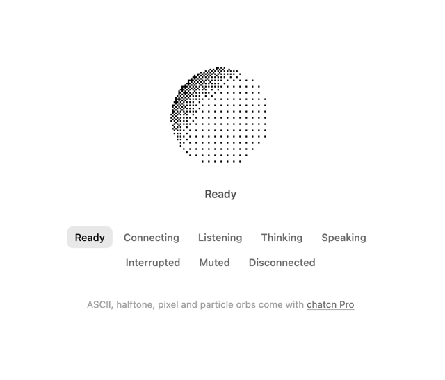
Dither Orb
12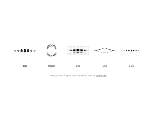
Audio Visualizer
11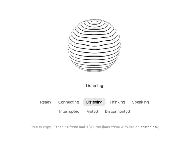
Voice Orb
8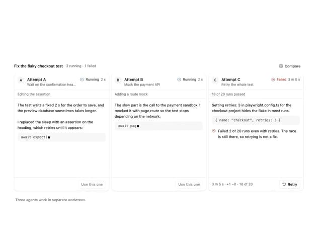
Agent Lanes
6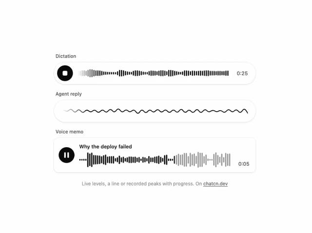
Waveform
4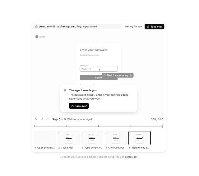
Computer View
3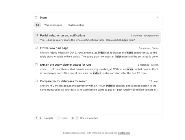
Chat Search
2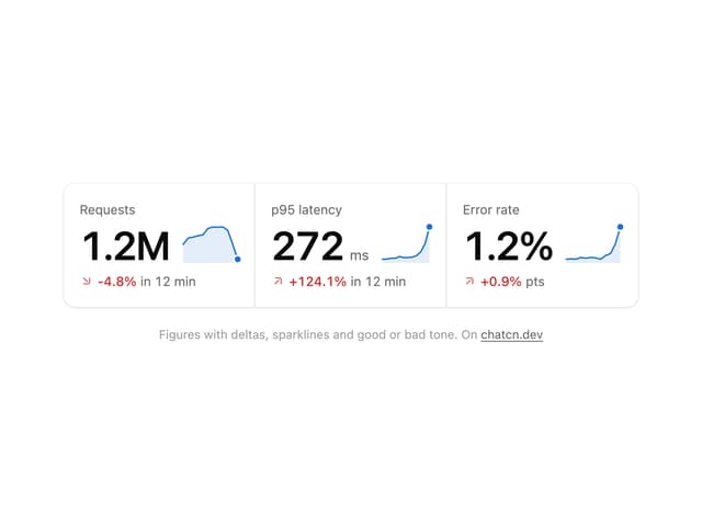
Stat Card
2
More in AI chats
View all

AI Actions
339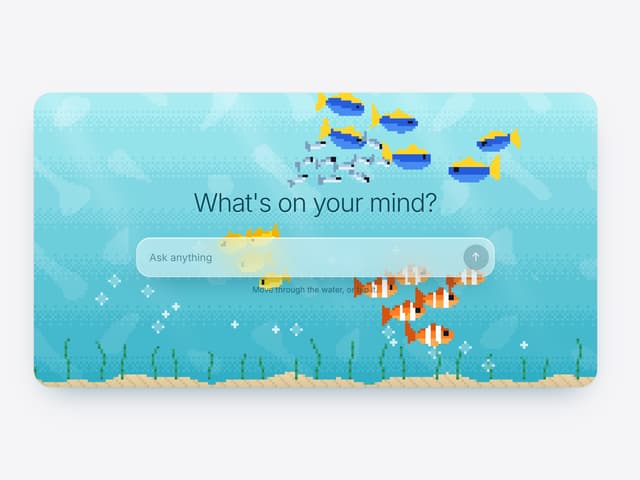

Aquarium Prompt
56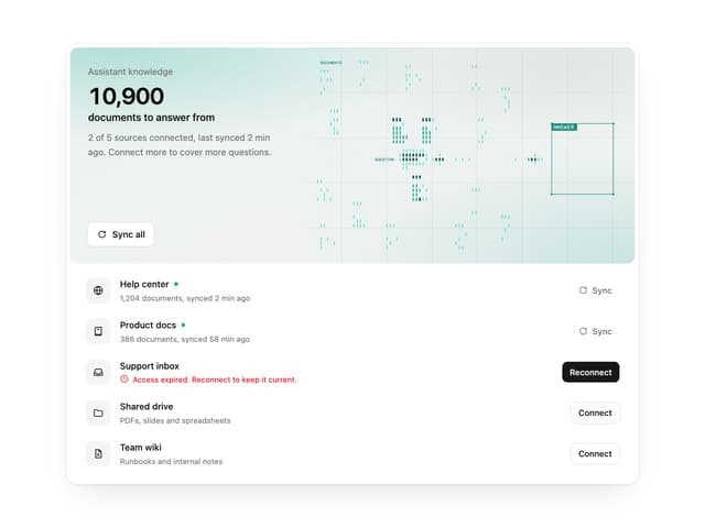

Illos Knowledge Sources
41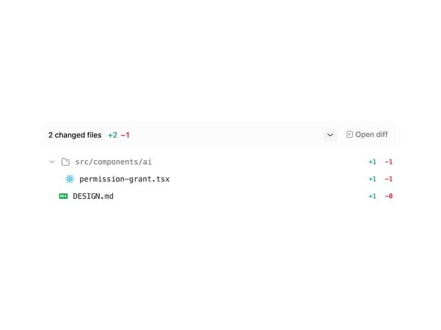
Commit
33
Attachments
39
Color Picker
171
Chat Bubble
199

AI Suggestions
20

