
About
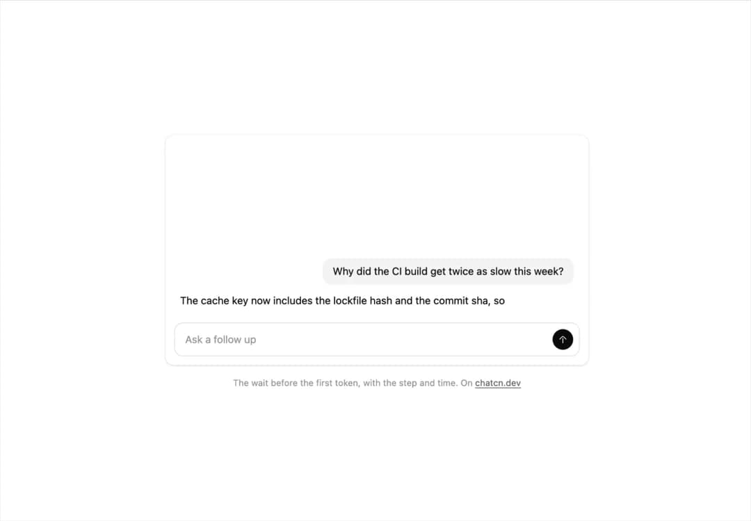
The wait before the first token: a shimmering Thinking with elapsed time that names the current step, then gives way to the streamed answer.
Built with React and Tailwind. Copy the prompt and paste it into Claude Code, Cursor or Lovable: your agent adds Thinking Indicator to your project and fits it to your theme.
Code
How Thinking Indicator is used: the demo's code. The component's own source comes with a free account.
Usage.tsx
"use client"

import * as React from "react"
import { forwardRef, createElement, type SVGAttributes, type ForwardRefExoticComponent, type RefAttributes } from "react"
import { cn } from "@/lib/utils"
import { ThinkingIndicator } from "@/components/ui/thinking-indicator"

const reducedMotion = () => window.matchMedia("(prefers-reduced-motion: reduce)").matches

interface Turn {
  ask: string
  reply: string
  /** When the question lands, ms into the loop. */
  at: number
  /** The step word after the first moments of thinking. */
  step: string
  stepAt: number
  /** When the first words arrive and the indicator goes away. */
  replyAt: number
}

/** Two questions about a slow CI build. Each waits, names its step, then answers. */
const TURNS: Turn[] = [
  {
    ask: "Why did the CI build get twice as slow this week?",
    reply:
      "The cache key now includes the lockfile hash and the commit sha, so every push misses the cache and installs from scratch. Keying on the lockfile alone brings it back to about 3 minutes.",
    at: 300,
    step: "Searching the workflow files",
    stepAt: 2300,
    replyAt: 3900,
  },
  {
    ask: "Which commit changed the key?",
    reply: "a41c9e2, “Bust cache on every deploy”, merged Monday by Priya.",
    at: 7000,
    step: "Reading the git history",
    stepAt: 8300,
    replyAt: 9500,
  },
]

const LOOP_MS = 13500

const FIT_CSS = "html,body{overflow:hidden}[data-fit-small] [data-fit-hide]{display:none!important}"

/**
 * 21st shows a demo in a small frame: about 674 by 421 on a component page, 358 by 224 on a
 * phone and 245 by 139 on a profile card. A demo taller than its frame gets scrollbars, which
 * render white on dark pages. FitFrame fills the frame exactly instead.
 *
 * - "scale": the content shrinks until it fits, centered. For visuals such as orbs.
 * - "crop": the content stays at full size from the top and fades out at the bottom. For text
 *   that streams in, where a changing scale would make the page breathe.
 *
 * `minWidth` lays out a wide demo (a table, a two column panel) at that width and scales it down
 * to the frame, instead of letting it collapse to a narrow layout. The frame centers it, so it
 * shrinks evenly on both sides.
 *
 * Anything marked `data-fit-hide` (state buttons, the chatcn.dev line) drops out in frames
 * shorter than `hideBelow`, so a profile card shows the visual alone.
 */
function FitFrame({
  children,
  mode = "scale",
  hideBelow = 360,
  minWidth,
}: {
  children: React.ReactNode
  mode?: "scale" | "crop"
  hideBelow?: number
  minWidth?: string
}) {
  const content = React.useRef<HTMLDivElement>(null)
  const [cropped, setCropped] = React.useState(false)

  React.useLayoutEffect(() => {
    const el = content.current
    if (!el) return
    const measure = () => {
      const vw = window.innerWidth
      const vh = window.innerHeight
      el.toggleAttribute("data-fit-small", vh < hideBelow)
      // Layout sizes ignore the transform, so measuring never feeds back.
      const w = Math.max(el.offsetWidth, el.scrollWidth)
      const h = Math.max(el.offsetHeight, el.scrollHeight)
      const scale = mode === "scale" ? Math.min(1, vw / w, vh / h) : 1
      el.style.transform = scale < 1 ? `scale(${scale})` : ""
      setCropped(mode === "crop" && h > vh + 1)
    }
    measure()
    const observer = new ResizeObserver(measure)
    observer.observe(el)
    // Content that changes inside a fixed width box (a headline that cycles words) never resizes
    // the box itself, so changes below it measure again on the next frame.
    let frame = 0
    const mutations = new MutationObserver(() => {
      cancelAnimationFrame(frame)
      frame = requestAnimationFrame(measure)
    })
    mutations.observe(el, { subtree: true, childList: true, characterData: true })
    window.addEventListener("resize", measure)
    return () => {
      observer.disconnect()
      mutations.disconnect()
      cancelAnimationFrame(frame)
      window.removeEventListener("resize", measure)
    }
  }, [mode, hideBelow])

  const fade = "linear-gradient(to bottom, #000 calc(100% - 40px), transparent)"
  return (
    <div
      className="flex w-full justify-center overflow-hidden"
      style={{
        height: "100dvh",
        alignItems: mode === "crop" ? "flex-start" : "center",
        maskImage: cropped ? fade : undefined,
        WebkitMaskImage: cropped ? fade : undefined,
      }}
    >
      <style>{FIT_CSS}</style>
      <div
        ref={content}
        className="w-full shrink-0"
        style={{ transformOrigin: mode === "crop" ? "top center" : "center", minWidth }}
      >
        {children}
      </div>
    </div>
  )
}

const WORD_MS = 45

interface IconProps extends SVGAttributes<SVGSVGElement> {
  /** Width and height. Number means px. Default 24. */
  size?: number | string
  /** Stroke width in viewBox units (24 grid). Default 1.5. */
  strokeWidth?: number | string
  /** Keep the rendered stroke at `strokeWidth` px at any size. */
  absoluteStrokeWidth?: boolean
  /** Stroke color. Default currentColor. */
  color?: string
  /** Accessible name. Renders <title> and sets role="img"; without it the icon is aria-hidden. */
  title?: string
}

type Icon = ForwardRefExoticComponent<IconProps & RefAttributes<SVGSVGElement>>

/** Shape elements an icon may contain. */
type IconElement = "path" | "circle" | "rect" | "ellipse" | "line" | "polyline" | "polygon"

/** An icon's drawing: a flat list of [element, attributes] pairs, lucide compatible. */
type IconNode = ReadonlyArray<readonly [IconElement, Readonly<Record<string, string>>]>

const toPascal = (name: string): string =>
  name
    .split("-")
    .map((part) => part.charAt(0).toUpperCase() + part.slice(1))
    .join("")

/**
 * Builds a React icon component from an icon node.
 * `name` is the kebab-case icon name, used for the class `chatcn-icon-<name>` and displayName.
 */
function createIcon(name: string, iconNode: IconNode): Icon {
  // biome-ignore lint/correctness/noComponentHookFactories: runs once per icon at module load
  const Component = forwardRef<SVGSVGElement, IconProps>(function ChatcnIcon(
    {
      size = 24,
      strokeWidth = 1.5,
      absoluteStrokeWidth = false,
      color = "currentColor",
      title,
      className,
      children,
      ...rest
    },
    ref,
  ) {
    const stroke = absoluteStrokeWidth
      ? (Number(strokeWidth) * 24) / Number.parseFloat(String(size))
      : strokeWidth
    const labelled = Boolean(title || rest["aria-label"] || rest["aria-labelledby"])
    return createElement(
      "svg",
      {
        ref,
        xmlns: "http://www.w3.org/2000/svg",
        width: size,
        height: size,
        viewBox: "0 0 24 24",
        fill: "none",
        stroke: color,
        strokeWidth: stroke,
        strokeLinecap: "round",
        strokeLinejoin: "round",
        "data-slot": "icon",
        className: className
          ? `chatcn-icon chatcn-icon-${name} ${className}`
          : `chatcn-icon chatcn-icon-${name}`,
        ...(labelled ? { role: "img" } : { "aria-hidden": true }),
        ...rest,
      },
      title ? createElement("title", null, title) : null,
      ...iconNode.map(([tag, attrs], i) => createElement(tag, { key: i, ...attrs })),
      children,
    )
  })
  Component.displayName = `${toPascal(name)}Icon`
  return Component
}

const iconNode: IconNode = [
  ["path", {"d":"m18.5 11.5-4.73-4.73a2.5 2.5 0 0 0-3.54 0L5.5 11.5"}],
  ["path", {"d":"M12 19v-9"}],
]

const ArrowUpIcon: Icon = /* @__PURE__ */ createIcon("arrow-up", iconNode)

/** The line under each 21st demo that points back to the kit. */
function MoreOn({ slug, children }: { slug: string; children: React.ReactNode }) {
  return (
    <p data-fit-hide className="text-[0.75rem]/[1rem] text-(color:--chatcn-fg-faint) text-center text-balance">
      {children}{" "}
      <a
        href={`https://chatcn.dev/docs/components/${slug}`}
        target="_blank"
        rel="noopener"
        className="text-(color:--chatcn-fg-subtle) hover:text-(color:--chatcn-fg) underline underline-offset-2"
      >
        chatcn.dev
      </a>
    </p>
  )
}

/**
 * The wait before the first token: a sent question, then nothing for 300 ms, then a shimmering
 * "Thinking" with its elapsed time that changes to the current step, and goes away as the answer
 * streams in. Two turns, then it loops.
 */
export default function ThinkingIndicatorPreview() {
  const [t, setT] = React.useState(0)

  React.useEffect(() => {
    if (reducedMotion()) {
      setT(TURNS[0]!.stepAt + 100)
      return
    }
    const start = Date.now()
    const id = window.setInterval(() => setT((Date.now() - start) % LOOP_MS), 50)
    return () => window.clearInterval(id)
  }, [])

  const shown = TURNS.filter((turn) => t >= turn.at)
  const waiting = shown.find((turn) => t < turn.replyAt)

  return (
    <FitFrame minWidth="34rem">
      <div className="flex w-full flex-col items-center justify-center gap-4 p-6">
        <div className="rounded-(--chatcn-radius-lg) bg-(color:--chatcn-card) shadow-(--chatcn-shadow-sm) flex w-full max-w-xl flex-col">
          {/* The thread keeps its height and grows from the bottom, like a chat. */}
          <div className="relative h-64 overflow-hidden [mask-image:linear-gradient(to_bottom,transparent,black_2rem)]">
            <div className="absolute inset-x-0 bottom-0 flex flex-col gap-3 px-5 pb-4">
              {shown.map((turn) => {
                const words = turn.reply.split(" ")
                const count = Math.max(0, Math.floor((t - turn.replyAt) / WORD_MS))
                const streaming = t >= turn.replyAt
                return (
                  <React.Fragment key={turn.at}>
                    <p className="bg-(color:--chatcn-fill) text-(color:--chatcn-fg) text-[0.875rem]/[1.25rem] tracking-[-0.003em] rounded-(--chatcn-radius-lg) max-w-[80%] self-end px-3.5 py-2 text-pretty">
                      {turn.ask}
                    </p>
                    <div className="min-h-6">
                      {streaming ? (
                        <p className="text-(color:--chatcn-fg) text-[0.875rem]/[1.25rem] tracking-[-0.003em] text-pretty">
                          {words.slice(0, count).join(" ")}
                        </p>
                      ) : null}
                      <ThinkingIndicator
                        key={turn.at}
                        active={turn === waiting}
                        variant="timer"
                        label={t >= turn.stepAt ? turn.step : "Thinking"}
                      />
                    </div>
                  </React.Fragment>
                )
              })}
            </div>
          </div>
          <div className="px-3 pb-3">
            <div className="rounded-(--chatcn-radius-lg) border-(color:--chatcn-border) flex items-center gap-2 border py-2 ps-3.5 pe-2">
              <span className="text-[0.875rem]/[1.25rem] tracking-[-0.003em] text-(color:--chatcn-fg-faint) flex-1">Ask a follow up</span>
              <span
                className={cn(
                  "bg-(color:--chatcn-fg) text-(color:--chatcn-bg) flex size-7 items-center justify-center rounded-full transition-opacity",
                  waiting ? "opacity-40" : "opacity-100",
                )}
              >
                <ArrowUpIcon className="size-4" aria-hidden="true" />
              </span>
            </div>
          </div>
        </div>
        <MoreOn slug="thinking-indicator">The wait before the first token, with the step and time. On</MoreOn>
      </div>
    </FitFrame>
  )
}
More by Aadi
View all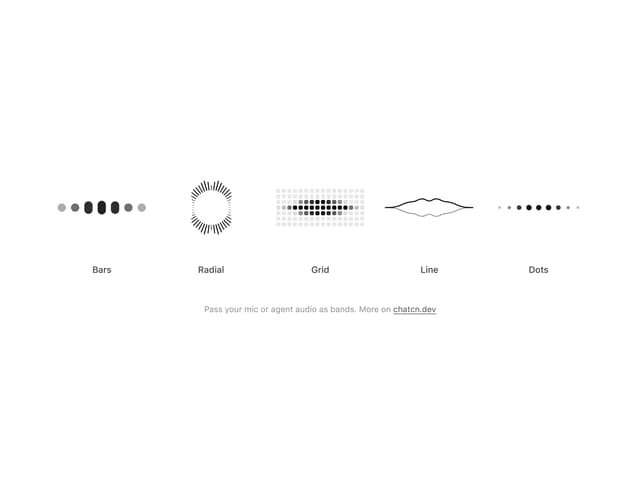
Audio Visualizer
12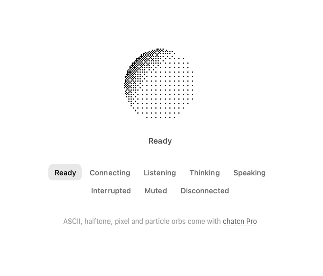
Dither Orb
12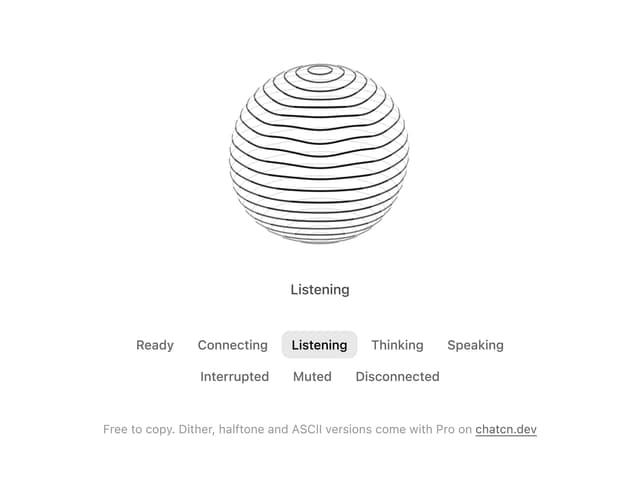
Voice Orb
8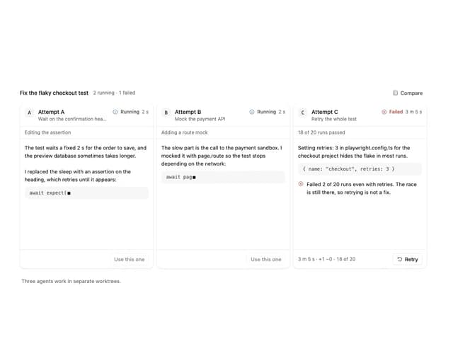
Agent Lanes
7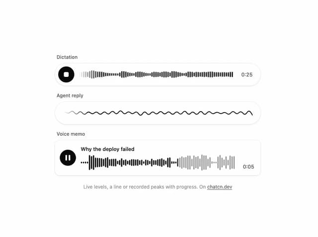
Waveform
5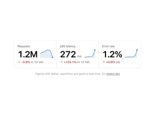
Stat Card
4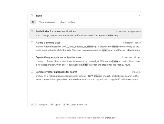
Chat Search
3
Plan
3
More in AI chats
View all

AI Actions
339

Aquarium Prompt
58

Illos Knowledge Sources
42
Commit
34
Chat Bubble
199
Attachments
39
Color Picker
173
Message Thread
58


