
About
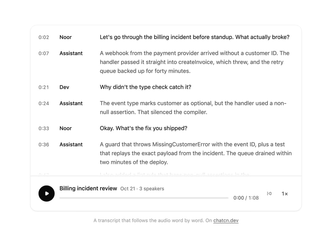
A transcript for calls and recordings: speakers and timestamps per turn, the line being spoken highlighted as the audio plays, click any line to jump to it, and a player with speed control.
Built with React and Tailwind. Copy the prompt and paste it into Claude Code, Cursor or Lovable: your agent adds Transcript to your project and fits it to your theme.
Code
How Transcript is used: the demo's code. The component's own source comes with a free account.
Usage.tsx
"use client"
import * as React from "react"
import { cn } from "@/lib/utils"
import { Menu as MenuPrimitive } from "@base-ui/react/menu"
import { Icon, IconNode, Transcript, TranscriptSegment, createIcon } from "@/components/ui/transcript"
const FIT_CSS = "html,body{overflow:hidden}[data-fit-small] [data-fit-hide]{display:none!important}"
/**
* 21st shows a demo in a small frame: about 674 by 421 on a component page, 358 by 224 on a
* phone and 245 by 139 on a profile card. A demo taller than its frame gets scrollbars, which
* render white on dark pages. FitFrame fills the frame exactly instead.
*
* - "scale": the content shrinks until it fits, centered. For visuals such as orbs.
* - "crop": the content stays at full size from the top and fades out at the bottom. For text
* that streams in, where a changing scale would make the page breathe.
*
* `minWidth` lays out a wide demo (a table, a two column panel) at that width and scales it down
* to the frame, instead of letting it collapse to a narrow layout. The frame centers it, so it
* shrinks evenly on both sides.
*
* Anything marked `data-fit-hide` (state buttons, the chatcn.dev line) drops out in frames
* shorter than `hideBelow`, so a profile card shows the visual alone.
*/
function FitFrame({
children,
mode = "scale",
hideBelow = 360,
minWidth,
}: {
children: React.ReactNode
mode?: "scale" | "crop"
hideBelow?: number
minWidth?: string
}) {
const content = React.useRef<HTMLDivElement>(null)
const [cropped, setCropped] = React.useState(false)
React.useLayoutEffect(() => {
const el = content.current
if (!el) return
const measure = () => {
const vw = window.innerWidth
const vh = window.innerHeight
el.toggleAttribute("data-fit-small", vh < hideBelow)
// Layout sizes ignore the transform, so measuring never feeds back.
const w = Math.max(el.offsetWidth, el.scrollWidth)
const h = Math.max(el.offsetHeight, el.scrollHeight)
const scale = mode === "scale" ? Math.min(1, vw / w, vh / h) : 1
el.style.transform = scale < 1 ? `scale(${scale})` : ""
setCropped(mode === "crop" && h > vh + 1)
}
measure()
const observer = new ResizeObserver(measure)
observer.observe(el)
// Content that changes inside a fixed width box (a headline that cycles words) never resizes
// the box itself, so changes below it measure again on the next frame.
let frame = 0
const mutations = new MutationObserver(() => {
cancelAnimationFrame(frame)
frame = requestAnimationFrame(measure)
})
mutations.observe(el, { subtree: true, childList: true, characterData: true })
window.addEventListener("resize", measure)
return () => {
observer.disconnect()
mutations.disconnect()
cancelAnimationFrame(frame)
window.removeEventListener("resize", measure)
}
}, [mode, hideBelow])
const fade = "linear-gradient(to bottom, #000 calc(100% - 40px), transparent)"
return (
<div
className="flex w-full justify-center overflow-hidden"
style={{
height: "100dvh",
alignItems: mode === "crop" ? "flex-start" : "center",
maskImage: cropped ? fade : undefined,
WebkitMaskImage: cropped ? fade : undefined,
}}
>
<style>{FIT_CSS}</style>
<div
ref={content}
className="w-full shrink-0"
style={{ transformOrigin: mode === "crop" ? "top center" : "center", minWidth }}
>
{children}
</div>
</div>
)
}
const DURATION = 68
const s = (sec: number) => sec * 1000
const SEGMENTS: TranscriptSegment[] = [
{
id: "1",
role: "user",
speaker: "Noor",
at: s(2),
text: "Let's go through the billing incident before standup. What actually broke?",
},
{
id: "2",
role: "assistant",
at: s(7),
text: "A webhook from the payment provider arrived without a customer ID. The handler passed it straight into createInvoice, which threw, and the retry queue backed up for forty minutes.",
},
{ id: "3", role: "user", speaker: "Dev", at: s(21), text: "Why didn't the type check catch it?" },
{
id: "4",
role: "assistant",
at: s(24),
text: "The event type marks customer as optional, but the handler used a non-null assertion. That silenced the compiler.",
},
{ id: "5", role: "user", speaker: "Noor", at: s(33), text: "Okay. What's the fix you shipped?" },
{
id: "6",
role: "assistant",
at: s(36),
text: "A guard that throws MissingCustomerError with the event ID, plus a test that replays the exact payload from the incident. The queue drained within two minutes of the deploy.",
},
{
id: "7",
role: "assistant",
at: s(47),
text: "I also added a lint rule that bans non-null assertions in the webhooks folder.",
},
{
id: "8",
role: "user",
speaker: "Dev",
at: s(54),
text: "Good. Can you write that up as a short postmortem for the channel?",
},
{
id: "9",
role: "assistant",
at: s(58),
text: "Yes. I'll draft it with the timeline, the root cause and the two follow-ups, and share it here in a few minutes.",
},
]
const DEFAULT_RATES = [0.75, 1, 1.25, 1.5, 2]
/* -------------------------------------------------------------------------------------------------
* Types
* -----------------------------------------------------------------------------------------------*/
type AudioPlayerStatus = "loading" | "ready" | "buffering" | "error"
interface AudioPlayerProps
extends Omit<React.ComponentProps<"div">, "title" | "onError" | "onEnded"> {
/** Audio URL. Plays through an internal `<audio>`. Omit it and drive the player yourself. */
src?: string
/** One line above the track, for example the first words of the message. */
title?: React.ReactNode
/** Quiet detail next to the title, for example the voice name. */
meta?: React.ReactNode
/** `default` is a self-contained player. `compact` is a mini player for message actions. */
variant?: "default" | "compact"
playing?: boolean
defaultPlaying?: boolean
onPlayingChange?: (playing: boolean) => void
/** Position in seconds. Controlled; pair with `onSeek`. */
currentTime?: number
/** Called with the new position in seconds when the user scrubs, skips or uses the keys. */
onSeek?: (seconds: number) => void
/** Length in seconds. Read from the file when `src` is set. */
duration?: number
playbackRate?: number
defaultPlaybackRate?: number
onPlaybackRateChange?: (rate: number) => void
/** Speeds offered in the menu. Default 0.75, 1, 1.25, 1.5 and 2. */
rates?: number[]
/**
* `loading` while speech is generated or the file loads, `buffering` while playback stalls,
* `error` when it failed. Derived from the audio element when `src` is set.
*/
status?: AudioPlayerStatus
/** Shown on `error`. Say how to fix it. */
errorText?: React.ReactNode
/** Shows Retry on `error`. */
onRetry?: () => void
/** Peak levels from 0 to 1. Draws the track as a waveform instead of a line. */
peaks?: number[]
/** Seconds the skip back button jumps. `false` hides it. Default 10. Not in `compact`. */
skip?: number | false
onEnded?: () => void
/** Accessible name of the player. Default "Audio player". */
label?: string
}
/** Controlled when the prop is set, internal state otherwise. */
function useControllable<T>(prop: T | undefined, initial: T, onChange?: (value: T) => void) {
const [state, setState] = React.useState(initial)
const value = prop !== undefined ? prop : state
const set = React.useCallback(
(next: T) => {
if (prop === undefined) setState(next)
onChange?.(next)
},
[prop, onChange],
)
return [value, set] as const
}
/** The kit's one spinner. 0.8 s per turn, slowed to 1.2 s under reduced motion. */
function Spinner({ className, label }: { className?: string; label?: string }) {
return (
<svg
viewBox="0 0 16 16"
fill="none"
role={label ? "img" : undefined}
aria-label={label}
aria-hidden={label ? undefined : true}
data-slot="spinner"
className={cn("chatcn-spin size-3.5 shrink-0", className)}
>
<circle cx="8" cy="8" r="6.25" stroke="currentColor" strokeOpacity="0.2" strokeWidth="1.5" />
<path
d="M8 1.75A6.25 6.25 0 0 1 14.25 8"
stroke="currentColor"
strokeWidth="1.5"
strokeLinecap="round"
/>
</svg>
)
}
const iconNode: IconNode = [
["path", {"d":"M5.49 17.46A8.5 8.5 0 1 0 6.54 5.49"}],
["path", {"d":"m8.21 8.65-2.94-.26a2 2 0 0 1-1.82-2.16l.26-2.94"}],
]
const RotateCcwIcon: Icon = /* @__PURE__ */ createIcon("rotate-ccw", iconNode)
const iconNode2: IconNode = [
["path", {"d":"M8.5 5v14"}],
["path", {"d":"M15.5 5v14"}],
]
const PauseIcon: Icon = /* @__PURE__ */ createIcon("pause", iconNode2)
const iconNode3: IconNode = [
["path", {"d":"m9.51 5.75 7.4 4.31a2.25 2.25 0 0 1 0 3.88l-7.4 4.31a2 2 0 0 1-3.01-1.73V7.48a2 2 0 0 1 3.01-1.73"}],
]
const PlayIcon: Icon = /* @__PURE__ */ createIcon("play", iconNode3)
/* -------------------------------------------------------------------------------------------------
* Helpers
* -----------------------------------------------------------------------------------------------*/
function formatTime(seconds: number) {
const total = Math.max(0, Math.floor(Number.isFinite(seconds) ? seconds : 0))
const h = Math.floor(total / 3600)
const m = Math.floor((total % 3600) / 60)
const s = String(total % 60).padStart(2, "0")
return h > 0 ? `${h}:${String(m).padStart(2, "0")}:${s}` : `${m}:${s}`
}
/* -------------------------------------------------------------------------------------------------
* Scrubber
* -----------------------------------------------------------------------------------------------*/
interface ScrubberProps {
value: number
duration: number
disabled: boolean
peaks?: number[]
compact: boolean
onSeek: (seconds: number) => void
onToggle: () => void
}
function spokenDuration(seconds: number) {
const total = Math.max(0, Math.round(seconds))
const m = Math.floor(total / 60)
const s = total % 60
const parts: string[] = []
if (m) parts.push(`${m} ${m === 1 ? "minute" : "minutes"}`)
if (s || !m) parts.push(`${s} ${s === 1 ? "second" : "seconds"}`)
return parts.join(" ")
}
/** Narrowest bar plus gap, in px. Below this the bars would run into each other. */
const BAR_PITCH = 3
/** Down-samples peaks to `n` bars, keeping each bucket's loudest value so no syllable is lost. */
function fitPeaks(peaks: number[], n: number) {
if (n <= 0 || n >= peaks.length) return peaks
const out: number[] = []
for (let i = 0; i < n; i++) {
const from = Math.floor((i * peaks.length) / n)
const to = Math.max(from + 1, Math.floor(((i + 1) * peaks.length) / n))
let max = 0
for (let j = from; j < to; j++) max = Math.max(max, peaks[j] ?? 0)
out.push(max)
}
return out
}
/**
* A static waveform: dim bars, with the played part drawn over them in ink and clipped. The bar
* count follows the width it has, so a narrow player draws fewer bars instead of overflowing.
*/
function Peaks({ peaks, pct }: { peaks: number[]; pct: string }) {
const ref = React.useRef<HTMLDivElement>(null)
const [fit, setFit] = React.useState(peaks.length)
React.useLayoutEffect(() => {
const el = ref.current
if (!el) return
const measure = () => setFit(Math.max(8, Math.floor((el.clientWidth + 2) / BAR_PITCH)))
measure()
const observer = new ResizeObserver(measure)
observer.observe(el)
return () => observer.disconnect()
}, [])
const shown = React.useMemo(() => fitPeaks(peaks, fit), [peaks, fit])
const bars = (tone: string) => (
<div className="flex h-full w-full items-center gap-[2px]">
{shown.map((p, i) => (
<span
key={i}
style={{ height: `${Math.max(12, Math.min(1, Math.max(0, p)) * 100)}%` }}
className={cn("min-w-px flex-1 rounded-full", tone)}
/>
))}
</div>
)
return (
<div
ref={ref}
data-slot="audio-player-peaks"
className="relative h-full w-full min-w-0 overflow-hidden py-1"
>
<div className="h-full">{bars("bg-(color:--chatcn-border-strong)")}</div>
<div
style={{ "--p": pct } as React.CSSProperties}
className="absolute inset-0 py-1 [clip-path:inset(0_calc(100%-var(--p))_0_0)] rtl:[clip-path:inset(0_0_0_calc(100%-var(--p)))]"
>
{bars("bg-(color:--chatcn-fg)")}
</div>
</div>
)
}
/**
* The seek bar: a real `slider` with keyboard steps, pointer capture for dragging and a time
* preview under the pointer. Progress moves with transforms only.
*/
function Scrubber({ value, duration, disabled, peaks, compact, onSeek, onToggle }: ScrubberProps) {
const ref = React.useRef<HTMLDivElement>(null)
const [drag, setDrag] = React.useState<number>()
const [hover, setHover] = React.useState<{ x: number; t: number }>()
const shown = drag ?? value
const ratio = duration > 0 ? Math.min(1, Math.max(0, shown / duration)) : 0
const pct = `${(ratio * 100).toFixed(3)}%`
const timeAt = (clientX: number) => {
const el = ref.current
if (!el || duration <= 0) return { t: 0, x: 0 }
const rect = el.getBoundingClientRect()
const rtl = getComputedStyle(el).direction === "rtl"
const x = Math.min(rect.width, Math.max(0, clientX - rect.left))
const r = rect.width > 0 ? x / rect.width : 0
return { t: (rtl ? 1 - r : r) * duration, x }
}
const seek = (t: number) => onSeek(Math.min(duration, Math.max(0, t)))
const onKeyDown = (event: React.KeyboardEvent<HTMLDivElement>) => {
if (disabled) return
const rtl = getComputedStyle(event.currentTarget).direction === "rtl"
const fwd = rtl ? "ArrowLeft" : "ArrowRight"
const back = rtl ? "ArrowRight" : "ArrowLeft"
let next: number | undefined
if (event.key === fwd || event.key === "ArrowUp") next = value + 5
else if (event.key === back || event.key === "ArrowDown") next = value - 5
else if (event.key === "PageUp" || event.key === "l")
next = value + (event.key === "l" ? 10 : 30)
else if (event.key === "PageDown" || event.key === "j")
next = value - (event.key === "j" ? 10 : 30)
else if (event.key === "Home") next = 0
else if (event.key === "End") next = duration
else if (event.key === " " || event.key === "k") {
event.preventDefault()
onToggle()
return
}
if (next === undefined) return
event.preventDefault()
seek(next)
}
return (
<div
ref={ref}
role="slider"
tabIndex={disabled ? -1 : 0}
aria-label="Seek"
aria-valuemin={0}
aria-valuemax={Math.round(duration)}
aria-valuenow={Math.round(shown)}
aria-valuetext={`${spokenDuration(shown)} of ${spokenDuration(duration)}`}
aria-disabled={disabled || undefined}
data-slot="audio-player-scrubber"
data-dragging={drag !== undefined ? "" : undefined}
onKeyDown={onKeyDown}
onPointerDown={(event) => {
if (disabled || event.button !== 0) return
event.currentTarget.setPointerCapture(event.pointerId)
const { t } = timeAt(event.clientX)
setDrag(t)
seek(t)
}}
onPointerMove={(event) => {
if (disabled) return
const { t, x } = timeAt(event.clientX)
if (event.pointerType === "mouse") setHover({ x, t })
if (drag !== undefined) {
setDrag(t)
seek(t)
}
}}
onPointerUp={() => setDrag(undefined)}
onPointerCancel={() => setDrag(undefined)}
onPointerLeave={() => setHover(undefined)}
className={cn(
"group/scrub chatcn-focus rounded-(--chatcn-radius-xs) relative flex min-w-0 flex-1 cursor-pointer touch-none items-center select-none",
peaks ? "h-8" : compact ? "h-5" : "h-6",
"pointer-coarse:h-11",
disabled && "pointer-events-none cursor-default opacity-50",
)}
>
{peaks && peaks.length > 0 ? (
<Peaks peaks={peaks} pct={pct} />
) : (
<div
className={cn(
"bg-(color:--chatcn-fill-active) relative w-full overflow-hidden rounded-full",
compact ? "h-[3px]" : "h-1",
)}
>
<div
style={{ transform: `scaleX(${ratio})` }}
className="bg-(color:--chatcn-accent) absolute inset-0 origin-left rounded-full rtl:origin-right"
/>
</div>
)}
{/* Thumb. Full-width wrapper so a percentage translate lands on the track position. */}
{peaks ? null : (
<div
aria-hidden="true"
style={{ "--x": pct } as React.CSSProperties}
className="pointer-events-none absolute inset-0 translate-x-(--x) rtl:-translate-x-(--x)"
>
<span
className={cn(
"bg-(color:--chatcn-accent) shadow-(--chatcn-shadow-xs) absolute start-0 top-1/2 size-3 -translate-x-1/2 -translate-y-1/2 rounded-full rtl:translate-x-1/2",
"opacity-0 transition-opacity duration-150",
"group-hover/scrub:opacity-100 group-focus-visible/scrub:opacity-100 group-data-[dragging]/scrub:opacity-100",
"pointer-coarse:opacity-100",
)}
/>
</div>
)}
{hover && !compact ? (
<span
aria-hidden="true"
style={{ transform: `translateX(${hover.x}px) translateX(-50%)` }}
// The offset is measured in physical pixels from the left edge, so this stays physical.
className="bg-(color:--chatcn-fg) text-(color:--chatcn-bg) text-[0.75rem]/[1rem] rounded-(--chatcn-radius-xs) pointer-events-none absolute bottom-full left-0 mb-1 px-1.5 py-0.5 font-medium whitespace-nowrap tabular-nums"
>
{formatTime(hover.t)}
</span>
) : null}
</div>
)
}
const iconNode4: IconNode = [
["path", {"d":"M3 12a9 9 0 1 0 18 0 9 9 0 1 0-18 0"}],
["path", {"d":"M12 7.75v5"}],
["path", {"d":"M12 16.25h.01"}],
]
const CircleAlertIcon: Icon = /* @__PURE__ */ createIcon("circle-alert", iconNode4)
type ButtonVariant = "solid" | "outline" | "ghost" | "subtle"
type ButtonSize = "xs" | "sm" | "md" | "lg" | "icon-xs" | "icon-sm" | "icon-md" | "icon-lg"
interface ButtonProps extends React.ComponentProps<"button"> {
variant?: ButtonVariant
size?: ButtonSize
}
const base = cn(
"chatcn-focus inline-flex shrink-0 items-center justify-center gap-1.5 font-medium whitespace-nowrap select-none",
"ease-(--chatcn-ease-standard) transition-[background-color,color,box-shadow,scale] duration-150",
"active:scale-(--chatcn-press-scale) active:duration-100 disabled:pointer-events-none disabled:opacity-50",
"[&_svg]:pointer-events-none [&_svg]:shrink-0",
)
const variants: Record<ButtonVariant, string> = {
solid: "bg-(color:--chatcn-primary) text-(color:--chatcn-primary-fg) hover:bg-(color:--chatcn-primary-hover)",
outline: "bg-(color:--chatcn-card) text-(color:--chatcn-fg) shadow-(--chatcn-shadow-xs) hover:bg-(color:--chatcn-fill-hover)",
ghost: "text-(color:--chatcn-fg-muted) hover:bg-(color:--chatcn-fill-hover) hover:text-(color:--chatcn-fg)",
subtle: "bg-(color:--chatcn-fill) text-(color:--chatcn-fg) hover:bg-(color:--chatcn-fill-hover)",
}
// Heights follow the control scale: 24, 28, 32, 36. Radii stay concentric inside 12 px surfaces.
const sizes: Record<ButtonSize, string> = {
xs: "h-6 rounded-(--chatcn-radius-sm) px-2 text-[0.75rem]/[1rem] [&_svg]:size-3.5",
sm: "h-7 rounded-(--chatcn-radius-sm) px-2.5 text-[0.8125rem]/[1.25rem] [&_svg]:size-3.5",
md: "h-8 rounded-(--chatcn-radius-md) px-3 text-[0.875rem]/[1.25rem] tracking-[-0.003em] [&_svg]:size-4",
lg: "h-9 rounded-(--chatcn-radius-md) px-3.5 text-[0.875rem]/[1.25rem] tracking-[-0.003em] [&_svg]:size-4",
"icon-xs": "size-6 rounded-(--chatcn-radius-sm) active:scale-(--chatcn-press-scale-icon) [&_svg]:size-3.5",
"icon-sm": "size-7 rounded-(--chatcn-radius-sm) active:scale-(--chatcn-press-scale-icon) [&_svg]:size-3.5",
"icon-md": "size-8 rounded-(--chatcn-radius-md) active:scale-(--chatcn-press-scale-icon) [&_svg]:size-4",
"icon-lg": "size-9 rounded-(--chatcn-radius-md) active:scale-(--chatcn-press-scale-icon) [&_svg]:size-4",
}
/** Class names for anything that should look like a button, such as a link. */
function buttonVariants({
variant = "ghost",
size = "md",
}: {
variant?: ButtonVariant
size?: ButtonSize
} = {}) {
return cn(base, variants[variant], sizes[size])
}
function Button({
variant = "ghost",
size = "md",
type = "button",
className,
...props
}: ButtonProps) {
return (
<button
type={type}
data-slot="button"
data-variant={variant}
className={cn(buttonVariants({ variant, size }), className)}
{...props}
/>
)
}
const iconNode5: IconNode = [
["path", {"d":"m16.43 6.68-5.41 3.42a2.25 2.25 0 0 0 0 3.8l5.41 3.42a2 2 0 0 0 3.07-1.7V8.38a2 2 0 0 0-3.07-1.7"}],
["path", {"d":"M4.5 5v14"}],
]
const SkipBackIcon: Icon = /* @__PURE__ */ createIcon("skip-back", iconNode5)
/* -------------------------------------------------------------------------------------------------
* Root and trigger
* -----------------------------------------------------------------------------------------------*/
/** Root. Controlled with `open` and `onOpenChange`, or uncontrolled. Modal by default. */
function Menu(props: MenuPrimitive.Root.Props) {
return <MenuPrimitive.Root {...props} />
}
/** The button that opens the menu. Pass `render={<Button />}` to use your own element. */
function MenuTrigger(props: MenuPrimitive.Trigger.Props) {
return <MenuPrimitive.Trigger data-slot="menu-trigger" {...props} />
}
const TIMES = "×"
const formatRate = (rate: number) => `${rate}${TIMES}`
/* -------------------------------------------------------------------------------------------------
* Content
* -----------------------------------------------------------------------------------------------*/
interface MenuContentProps extends MenuPrimitive.Popup.Props {
/** Default `bottom`. Flips when there is no room. */
side?: MenuPrimitive.Positioner.Props["side"]
/** Default `start`, so the menu lines up with the trigger's leading edge. */
align?: MenuPrimitive.Positioner.Props["align"]
/** Gap to the trigger in px. Default 6. */
sideOffset?: MenuPrimitive.Positioner.Props["sideOffset"]
alignOffset?: MenuPrimitive.Positioner.Props["alignOffset"]
container?: MenuPrimitive.Portal.Props["container"]
}
/** Surface shared by popovers and menus: 12 px radius, surface fill, medium shadow. */
const popupSurface = cn(
"bg-(color:--chatcn-surface) text-(color:--chatcn-fg) shadow-(--chatcn-shadow-md) rounded-(--chatcn-radius-lg) outline-none",
"max-h-(--available-height) max-w-(--available-width)",
// Shadows vanish in forced colors; keep an edge.
"forced-colors:outline-1 forced-colors:outline-solid",
)
/* -------------------------------------------------------------------------------------------------
* Motion
*
* Enter: opacity, scale from 0.96 and 4 px of travel away from the trigger, 180 ms ease-(--chatcn-ease-out),
* growing out of the trigger through `--transform-origin`. Exit: 140 ms to scale 0.98, no travel.
* Opened or dismissed with the keyboard, Base UI sets `data-instant` and nothing animates.
* Reduced motion keeps the fade and drops scale and travel.
* -----------------------------------------------------------------------------------------------*/
const popupMotion = cn(
"ease-(--chatcn-ease-out) origin-(--transform-origin) transition-[opacity,scale,translate] duration-180",
"data-[starting-style]:scale-96 data-[starting-style]:opacity-0",
"data-[side=bottom]:data-[starting-style]:-translate-y-1 data-[side=top]:data-[starting-style]:translate-y-1",
"data-[side=left]:data-[starting-style]:translate-x-1 data-[side=right]:data-[starting-style]:-translate-x-1",
"data-[side=inline-end]:data-[starting-style]:-translate-x-1 data-[side=inline-start]:data-[starting-style]:translate-x-1",
"data-[ending-style]:scale-98 data-[ending-style]:opacity-0 data-[ending-style]:duration-140",
"data-[instant]:transition-none",
"motion-reduce:translate-none! motion-reduce:scale-none!",
)
/** The floating list. Portalled, positioned and at least as wide as its trigger. */
function MenuContent({
side = "bottom",
align = "start",
sideOffset = 6,
alignOffset = 0,
container,
className,
...props
}: MenuContentProps) {
return (
<MenuPrimitive.Portal container={container}>
<MenuPrimitive.Positioner
side={side}
align={align}
sideOffset={sideOffset}
alignOffset={alignOffset}
className="z-50 outline-none"
>
<MenuPrimitive.Popup
data-slot="menu-content"
className={cn(
popupSurface,
popupMotion,
"chatcn-scroll min-w-[max(11rem,var(--anchor-width))] overflow-y-auto p-1",
className,
)}
{...props}
/>
</MenuPrimitive.Positioner>
</MenuPrimitive.Portal>
)
}
/** Groups radio items. Controlled with `value` and `onValueChange`. */
function MenuRadioGroup(props: MenuPrimitive.RadioGroup.Props) {
return <MenuPrimitive.RadioGroup data-slot="menu-radio-group" {...props} />
}
/** Names the group it sits in. Must be inside a `MenuGroup` or `MenuRadioGroup`. Sentence case. */
function MenuLabel({ className, ...props }: MenuPrimitive.GroupLabel.Props) {
return (
<MenuPrimitive.GroupLabel
data-slot="menu-label"
className={cn(
"text-[0.75rem]/[1rem] text-(color:--chatcn-fg-subtle) flex h-7 items-center gap-1.5 px-2 font-medium select-none",
"[&_svg]:size-3.5",
className,
)}
{...props}
/>
)
}
/* -------------------------------------------------------------------------------------------------
* Geometry: a 12 px container with 4 px padding holds 8 px items, so the radii stay concentric.
* Highlight is instant: menus are used too often for an animated hover.
* -----------------------------------------------------------------------------------------------*/
const item = cn(
"group/menu-item rounded-(--chatcn-radius-md) relative flex min-h-8 w-full cursor-default items-center gap-2 px-2 py-1.5",
"text-[0.875rem]/[1.25rem] tracking-[-0.003em] text-(color:--chatcn-fg) text-start outline-none select-none",
"data-[highlighted]:bg-(color:--chatcn-fill-hover) data-[popup-open]:bg-(color:--chatcn-fill)",
"data-[disabled]:pointer-events-none data-[disabled]:opacity-50",
"[&>svg]:text-(color:--chatcn-fg-subtle) data-[highlighted]:[&>svg]:text-(color:--chatcn-fg) [&_svg]:pointer-events-none [&_svg]:size-4 [&_svg]:shrink-0",
"pointer-coarse:min-h-11",
)
/** Reserved slot at the end of the row, so checking an item never shifts its label. */
function IndicatorSlot({ children }: { children: React.ReactNode }) {
return (
<span aria-hidden="true" className="ms-auto grid size-4 shrink-0 place-items-center ps-1">
{children}
</span>
)
}
const iconNode6: IconNode = [
["path", {"d":"m4.5 12.75 3.23 3.23a2.5 2.5 0 0 0 3.54 0l8.48-8.48"}],
]
const CheckIcon: Icon = /* @__PURE__ */ createIcon("check", iconNode6)
/** One choice of a radio group. The check sits at the end of the row. */
function MenuRadioItem({
className,
children,
...props
}: MenuPrimitive.RadioItem.Props & { children?: React.ReactNode }) {
return (
<MenuPrimitive.RadioItem data-slot="menu-radio-item" className={cn(item, className)} {...props}>
{children}
<IndicatorSlot>
<MenuPrimitive.RadioItemIndicator className="text-(color:--chatcn-fg) grid place-items-center">
<CheckIcon />
</MenuPrimitive.RadioItemIndicator>
</IndicatorSlot>
</MenuPrimitive.RadioItem>
)
}
/* -------------------------------------------------------------------------------------------------
* AudioPlayer
* -----------------------------------------------------------------------------------------------*/
/**
* Read-aloud and audio output player. Play and pause in one round button, a seek bar you can drag
* or step with the keys, the time in tabular figures and a speed menu. Plays a `src` itself, or
* takes `playing`, `currentTime` and `duration` from a speech engine that has no file.
*/
function AudioPlayer({
src,
title,
meta,
variant = "default",
playing: playingProp,
defaultPlaying = false,
onPlayingChange,
currentTime: timeProp,
onSeek,
duration: durationProp,
playbackRate: rateProp,
defaultPlaybackRate = 1,
onPlaybackRateChange,
rates = DEFAULT_RATES,
status: statusProp,
errorText,
onRetry,
peaks,
skip = 10,
onEnded,
label = "Audio player",
className,
...props
}: AudioPlayerProps) {
const audio = React.useRef<HTMLAudioElement>(null)
const [playing, setPlaying] = useControllable(playingProp, defaultPlaying, onPlayingChange)
const [rate, setRate] = useControllable(rateProp, defaultPlaybackRate, onPlaybackRateChange)
const [mediaTime, setMediaTime] = React.useState(0)
const [mediaDuration, setMediaDuration] = React.useState(0)
const [mediaStatus, setMediaStatus] = React.useState<AudioPlayerStatus>(src ? "loading" : "ready")
// Keyboard toggles swap the glyph without animation.
const [instant, setInstant] = React.useState(false)
const time = timeProp ?? mediaTime
const duration = durationProp ?? mediaDuration
const status = statusProp ?? (src ? mediaStatus : "ready")
const ended = !playing && duration > 0 && time >= duration - 0.05
const compact = variant === "compact"
const busy = status === "loading"
// Keep the element in step with the state.
React.useEffect(() => {
const el = audio.current
if (!el) return
if (playing && el.paused) el.play().catch(() => setPlaying(false))
if (!playing && !el.paused) el.pause()
}, [playing, setPlaying])
React.useEffect(() => {
if (audio.current) audio.current.playbackRate = rate
}, [rate])
// timeupdate fires about four times a second; follow the playhead every frame instead.
React.useEffect(() => {
const el = audio.current
if (!el || !playing) return
let raf = 0
const tick = () => {
setMediaTime(el.currentTime)
raf = requestAnimationFrame(tick)
}
raf = requestAnimationFrame(tick)
return () => cancelAnimationFrame(raf)
}, [playing])
React.useEffect(() => {
void src
setMediaStatus(src ? "loading" : "ready")
setMediaTime(0)
}, [src])
const seek = (seconds: number) => {
const t = Math.min(duration || seconds, Math.max(0, seconds))
if (audio.current) audio.current.currentTime = t
setMediaTime(t)
onSeek?.(t)
}
const toggle = (via: "pointer" | "keyboard" = "pointer") => {
if (busy || status === "error") return
setInstant(via === "keyboard")
if (ended && !playing) seek(0)
setPlaying(!playing)
}
const glyph = busy ? (
<Spinner className={compact ? "size-3" : "size-4"} />
) : ended ? (
<RotateCcwIcon />
) : playing ? (
<PauseIcon className="fill-current" />
) : (
<PlayIcon className="fill-current ltr:translate-x-px rtl:-translate-x-px rtl:-scale-x-100" />
)
const glyphKey = busy ? "busy" : ended ? "ended" : playing ? "pause" : "play"
const playLabel = busy ? "Preparing audio" : ended ? "Play again" : playing ? "Pause" : "Play"
const playButton = (
<button
type="button"
aria-label={playLabel}
aria-disabled={busy || status === "error" || undefined}
data-slot="audio-player-toggle"
onClick={(event) => toggle(event.detail === 0 ? "keyboard" : "pointer")}
className={cn(
"chatcn-focus relative grid shrink-0 place-items-center rounded-full",
"bg-(color:--chatcn-fg) text-(color:--chatcn-bg) hover:bg-(color:--chatcn-gray-900) transition-[background-color,scale] duration-150",
"active:scale-(--chatcn-press-scale-icon) active:duration-100",
compact ? "size-6 [&_svg]:size-3" : "size-10 [&_svg]:size-4",
compact
? "pointer-coarse:after:absolute pointer-coarse:after:-inset-2.5 pointer-coarse:after:content-['']"
: "pointer-coarse:size-11",
(busy || status === "error") && "hover:bg-(color:--chatcn-fg) cursor-default",
status === "error" && "opacity-50",
)}
>
<span
key={glyphKey}
className={cn(
"grid place-items-center",
!instant && "motion-safe:animate-[chatcn-swap_150ms_var(--chatcn-ease-out)]",
)}
>
{glyph}
</span>
{status === "buffering" && playing ? (
<span
aria-hidden="true"
className="pointer-events-none absolute -inset-[3px] grid place-items-center"
>
<Spinner className="text-(color:--chatcn-fg-subtle) size-full" />
</span>
) : null}
</button>
)
const timeText =
busy && duration <= 0 ? (
<span className="text-[0.75rem]/[1rem] text-(color:--chatcn-fg-subtle) whitespace-nowrap">
Preparing audio
</span>
) : (
<span
data-slot="audio-player-time"
// Times read left to right in every language: "0:18 / 2:40", never "2:40 / 0:18".
dir="ltr"
className="text-[0.75rem]/[1rem] text-(color:--chatcn-fg-subtle) shrink-0 whitespace-nowrap tabular-nums"
>
<span className="text-(color:--chatcn-fg-muted)">{formatTime(time)}</span>
<span aria-hidden="true"> / </span>
<span className="sr-only"> of </span>
{formatTime(duration)}
</span>
)
const scrubber = (
<Scrubber
value={time}
duration={duration}
disabled={busy || status === "error" || duration <= 0}
peaks={peaks}
compact={compact}
onSeek={seek}
onToggle={() => toggle("keyboard")}
/>
)
const error = (
<div
role="alert"
data-slot="audio-player-error"
className="flex min-w-0 flex-1 items-center gap-2"
>
<CircleAlertIcon aria-hidden="true" className="text-(color:--chatcn-red) size-4 shrink-0" />
<span className="text-[0.8125rem]/[1.25rem] text-(color:--chatcn-fg-muted) min-w-0 flex-1 text-pretty">
{errorText ?? "The audio could not load. Check your connection, then retry."}
</span>
{onRetry ? (
<Button size="xs" variant="outline" onClick={onRetry}>
<RotateCcwIcon />
Retry
</Button>
) : null}
</div>
)
const element = src ? (
// biome-ignore lint/a11y/useMediaCaption: speech output; the message text is the caption
<audio
ref={audio}
src={src}
preload="metadata"
onLoadedMetadata={(event) => {
setMediaDuration(event.currentTarget.duration)
setMediaStatus("ready")
}}
onCanPlay={() => setMediaStatus("ready")}
onWaiting={() => setMediaStatus("buffering")}
onPlaying={() => setMediaStatus("ready")}
onError={() => setMediaStatus("error")}
onEnded={() => {
setPlaying(false)
onEnded?.()
}}
className="hidden"
/>
) : null
if (compact) {
return (
// biome-ignore lint/a11y/useSemanticElements: a fieldset would bring form semantics to a player
<div
role="group"
aria-label={label}
data-slot="audio-player"
data-variant="compact"
data-audio-state={status === "ready" ? (playing ? "playing" : "paused") : status}
className={cn(
"bg-(color:--chatcn-fill) inline-flex h-8 max-w-full min-w-0 items-center gap-2.5 rounded-full ps-1 pe-3",
className,
)}
{...props}
>
{element}
{playButton}
{status === "error" ? (
<span className="text-[0.75rem]/[1rem] text-(color:--chatcn-fg-muted) flex items-center gap-1.5">
<CircleAlertIcon aria-hidden="true" className="text-(color:--chatcn-red) size-3.5" />
{errorText ?? "Audio unavailable"}
{onRetry ? (
<button
type="button"
onClick={onRetry}
className="chatcn-focus text-(color:--chatcn-fg) rounded-(--chatcn-radius-xs) font-medium underline-offset-2 hover:underline"
>
Retry
</button>
) : null}
</span>
) : (
<>
<div className="flex w-24 min-w-0 sm:w-32">{scrubber}</div>
{timeText}
</>
)}
</div>
)
}
return (
// biome-ignore lint/a11y/useSemanticElements: a fieldset would bring form semantics to a player
<div
role="group"
aria-label={label}
data-slot="audio-player"
data-variant="default"
data-audio-state={status === "ready" ? (playing ? "playing" : "paused") : status}
className={cn(
"rounded-(--chatcn-radius-xl) bg-(color:--chatcn-card) shadow-(--chatcn-shadow-sm) flex w-full min-w-0 items-center gap-3 p-3",
className,
)}
{...props}
>
{element}
{playButton}
<div className="flex min-w-0 flex-1 flex-col gap-0.5">
{title || meta ? (
// One line tall: a meta with no room wraps onto a hidden second line instead of
// shrinking to a single letter.
<div className="flex h-5 min-w-0 flex-wrap items-baseline gap-x-2 overflow-hidden pe-1">
{title ? (
// The title keeps its width; the meta gives way first.
<span className="text-[0.875rem]/[1.25rem] tracking-[-0.003em] text-(color:--chatcn-fg) max-w-full shrink-0 truncate font-medium">
{title}
</span>
) : null}
{meta ? (
<span className="text-[0.75rem]/[1rem] text-(color:--chatcn-fg-subtle) min-w-12 flex-1 basis-0 truncate">
{meta}
</span>
) : null}
</div>
) : null}
{status === "error" ? (
<div className="flex min-h-6 items-center">{error}</div>
) : (
<div className="flex min-w-0 items-center gap-3">
{scrubber}
{timeText}
</div>
)}
</div>
{status === "error" ? null : (
<div className="flex shrink-0 items-center gap-0.5">
{skip !== false ? (
<Button
size="icon-sm"
aria-label={`Back ${skip} seconds`}
disabled={busy || duration <= 0}
onClick={() => seek(time - skip)}
className="pointer-coarse:size-11"
>
<SkipBackIcon className="rtl:-scale-x-100" />
</Button>
) : null}
<Menu>
<MenuTrigger
render={
<Button
size="sm"
aria-label={`Playback speed, ${formatRate(rate)}`}
className="min-w-11 px-2 tabular-nums pointer-coarse:h-11"
/>
}
>
{formatRate(rate)}
</MenuTrigger>
<MenuContent align="end" className="min-w-36">
<MenuRadioGroup
value={String(rate)}
onValueChange={(value) => setRate(Number(value))}
>
<MenuLabel>Speed</MenuLabel>
{rates.map((r) => (
<MenuRadioItem key={r} value={String(r)} className="tabular-nums">
{r === 1 ? `Normal (${formatRate(1)})` : formatRate(r)}
</MenuRadioItem>
))}
</MenuRadioGroup>
</MenuContent>
</Menu>
</div>
)}
</div>
)
}
/**
* Playback of a finished call. The active line follows the playhead; every timestamp seeks.
* The player and the transcript share one clock, simulated here instead of an audio file.
*/
function TranscriptPlayback() {
const [playing, setPlaying] = React.useState(false)
const [time, setTime] = React.useState(0)
const [rate, setRate] = React.useState(1)
React.useEffect(() => {
if (!playing) return
let last = performance.now()
let raf = 0
const tick = (now: number) => {
const dt = ((now - last) / 1000) * rate
last = now
setTime((t) => {
const next = t + dt
if (next >= DURATION) {
setPlaying(false)
return DURATION
}
return next
})
raf = requestAnimationFrame(tick)
}
raf = requestAnimationFrame(tick)
return () => cancelAnimationFrame(raf)
}, [playing, rate])
const activeId = React.useMemo(() => {
let id: string | undefined
for (const seg of SEGMENTS) if ((seg.at ?? 0) <= time * 1000) id = seg.id
return time > 0 ? id : undefined
}, [time])
return (
<div className="rounded-(--chatcn-radius-xl) bg-(color:--chatcn-card) shadow-(--chatcn-shadow-sm) flex h-[460px] w-full max-w-2xl flex-col overflow-hidden">
<Transcript
segments={SEGMENTS}
layout="inline"
follow={false}
activeId={activeId}
onSeek={(ms) => {
setTime(ms / 1000)
setPlaying(true)
}}
label="Incident review transcript"
/>
<div className="border-(color:--chatcn-border) border-t p-2">
<AudioPlayer
title="Billing incident review"
meta="Oct 21 · 3 speakers"
playing={playing}
onPlayingChange={setPlaying}
currentTime={time}
duration={DURATION}
onSeek={setTime}
playbackRate={rate}
onPlaybackRateChange={setRate}
className="shadow-none"
/>
</div>
</div>
)
}
/** The line under each 21st demo that points back to the kit. */
function MoreOn({ slug, children }: { slug: string; children: React.ReactNode }) {
return (
<p data-fit-hide className="text-[0.75rem]/[1rem] text-(color:--chatcn-fg-faint) text-center text-balance">
{children}{" "}
<a
href={`https://chatcn.dev/docs/components/${slug}`}
target="_blank"
rel="noopener"
className="text-(color:--chatcn-fg-subtle) hover:text-(color:--chatcn-fg) underline underline-offset-2"
>
chatcn.dev
</a>
</p>
)
}
/** The kit's own example, framed for the 21st preview. */
export default function TranscriptPreview() {
return (
<FitFrame minWidth="38rem">
<div className="flex w-full flex-col items-center justify-center gap-4 p-6">
<div className="flex w-full max-w-2xl justify-center">
<TranscriptPlayback />
</div>
<MoreOn slug="transcript">A transcript that follows the audio word by word. On</MoreOn>
</div>
</FitFrame>
)
}
Dependencies
More by Aadi
View all
Dither Orb
12
Audio Visualizer
9
Voice Orb
8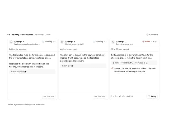
Agent Lanes
6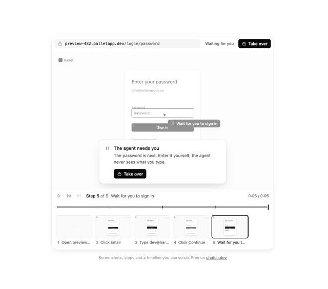
Computer View
3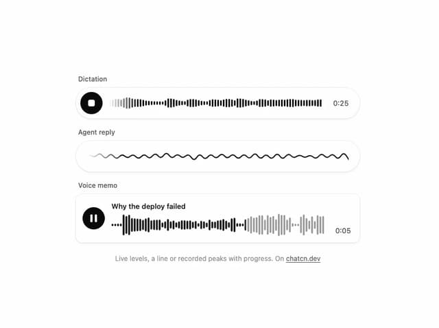
Waveform
2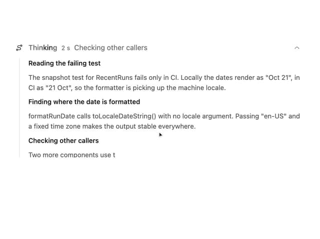
Reasoning
2
Voice Session
1